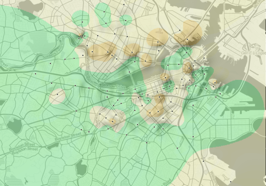
Hubway’s Bike Balance Landscape
Continuing where I left off yesterday, I went on to creating another visualization based on the assumption that people like to bike downhill but will be more reluctant to bike uphill.
As described in yesterday’s post, the Hubway network features stations with a negative bike balance (more bikes leaving than arriving) and others with a positive balance. Positively balanced stations are where people like biking to while negatively balanced stations are less attractive – like if they were on top of a hill and hard to reach.
Using this assumption and QGIS Grid Interpolation and Relief tool, I’ve created the following biking landscape:
With a negative balance of -2.76 bikes per day, Mayor Thomas M. Menino – Government Center station is the most unpopular station to bike to. Assuming the trip dataset is complete, this means that Hubway has to regularly transport bikes from positively balanced stations to this one to keep the system going.
Due to some trips containing NULL values in start/end station id, the total number of incoming and outgoing trips does not add up perfectly. But otherwise, this should represent the state of Hubway’s biking landscape pretty well.


hi, how can I do that beautiful shadow on the relief?
The relief tool creates a shadow automatically.
but there are no visible pixels in your shadow. It is so smooth.
Yes, because I generated a high-resolution raster.
What data do you use? Aster gdem, gmted2010 or other?
The surface visualized in this example is not a real elevation model. Instead, I visualized the the balance values.