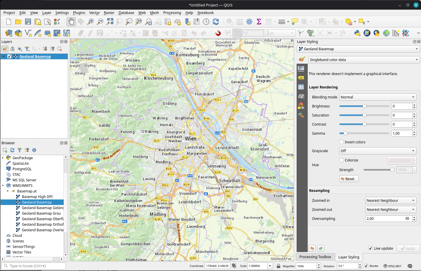
For many years now, we have been enjoying the basemap.at service with it’s various basemap options (color, gray, with/without labels, …) in WMTS and vector tiles.
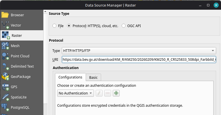
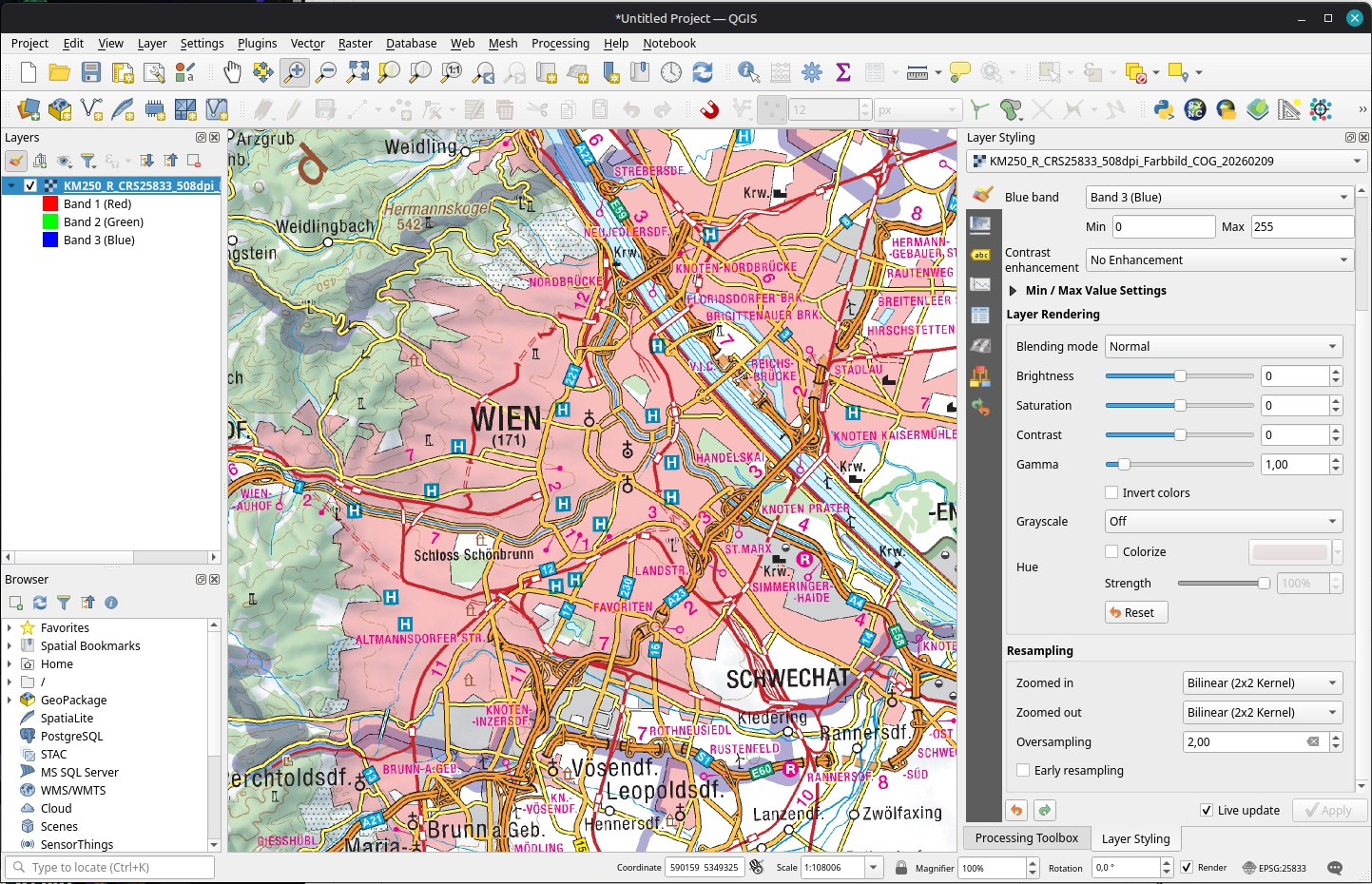
For a few weeks now, there is an additional service by BEV: Their cartographic models “Kartographischen Modelle (KM)” are now available as raster (KM-R) in COG-TIFF format.
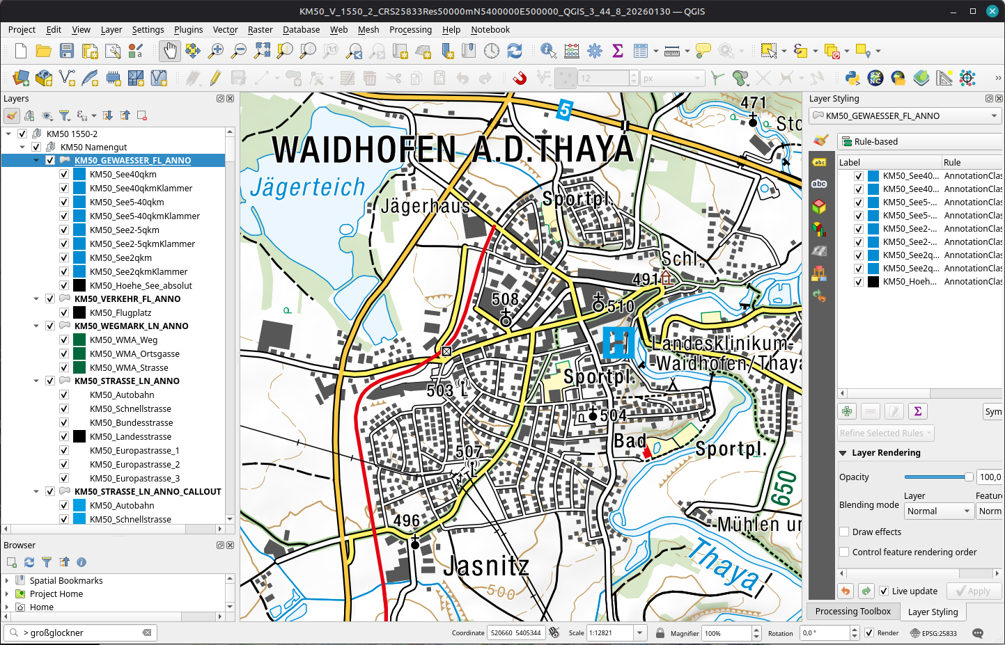
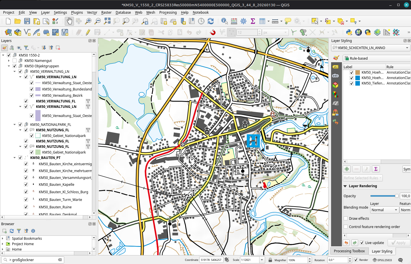
Some vector (KM-V) in GeoPackages with QGIS projects providing the layer style and label settings are already available for the Stichtag 30.01.2026 downloads. And they look awesome:
BEV KM-V project defaultsAnd without labels
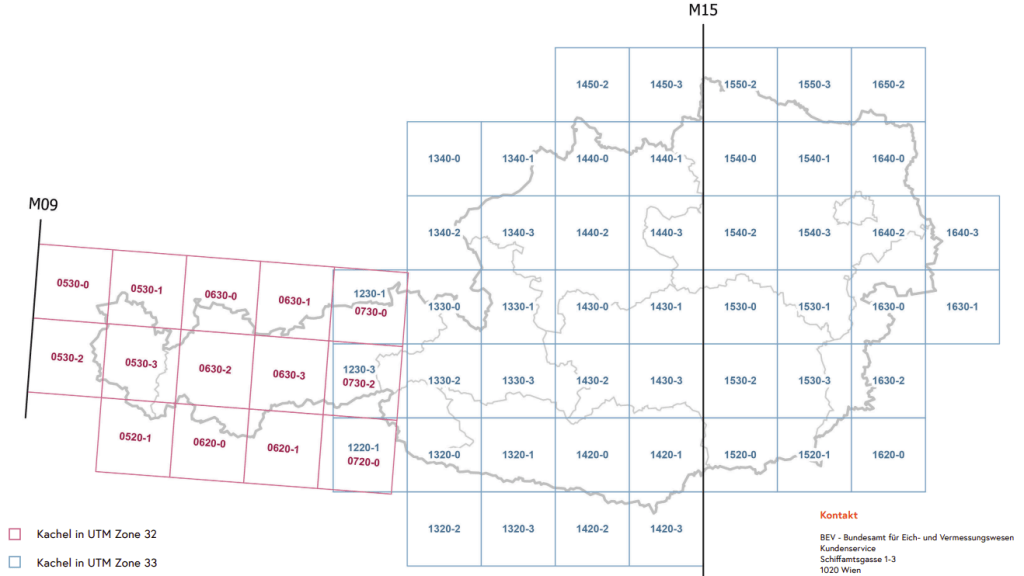
KM-V downloads are provided in tiles, so it’s not quite as simple as grabbing the COG URI:
It’s worth noting though, that the KM-V GeoPackages are still a work in progress and not all tiles are available for download yet.
I’ll keep an eye on the downloads to see when the rest of the tiles become available.
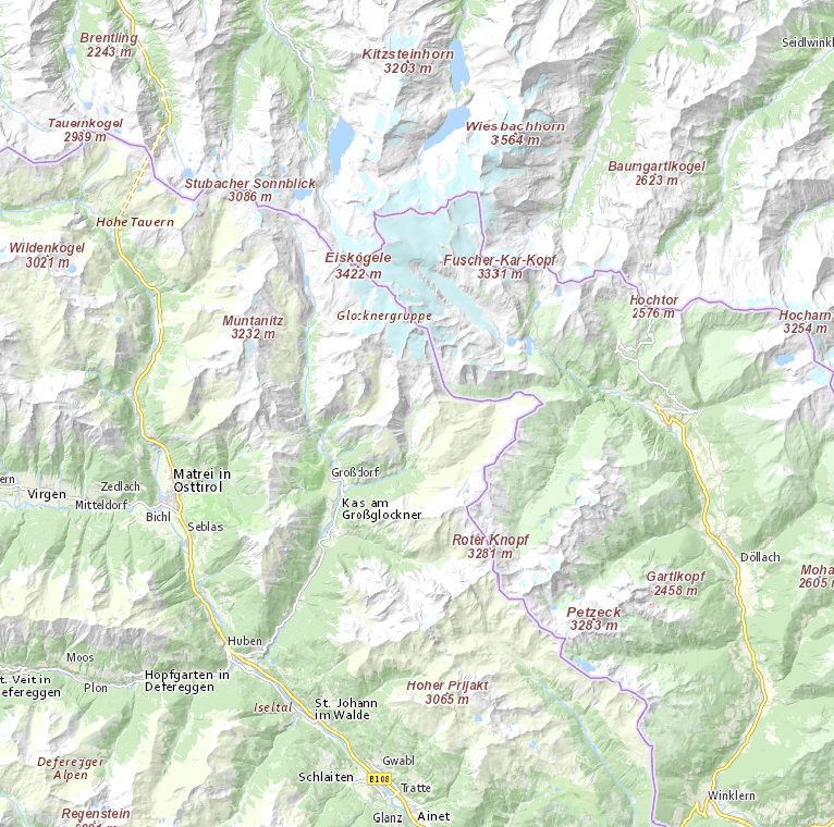
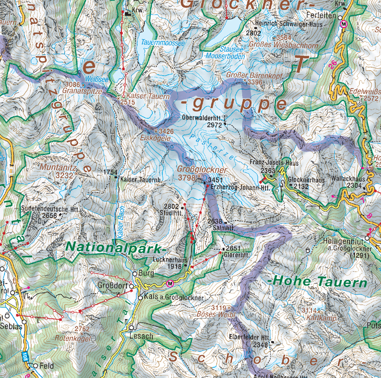
Until then, I leave you with a couple of examples of the Großglockner (highest mountain in Austria) area in basemap.at and KM-R side-by-side:
It’s been a couple of busy weeks, with the QGIS 4.2 release and meetings and conferences all over the place before a few, hopefully quieter, weeks of summer break.
QGIS
First, the Austrian QGIS user group met online on 25 June. The topic was webmapping, with multiple users presenting their webmapping solutions, ranging from Lizmap to QGIS Cloud.
A few days later, QGIS 4.2 was released on 3 July 2026. This release is named Belém do Pará, after the Brazilian city that hosted both FOSS4G and a QGIS user meeting back in 2024. MundoGEO has the details on the naming, if you’re curious about the backstory. Worth noting: 4.2 “Belém do Pará” will be the next LTR, so if you’re using the long-term release, this is the one to watch for.
On a side note, while designing the Belém splash screen, it was interesting to see that historic maps of Belém don’t have north at the top. Instead, they’re rotated with north pointing either left or right. A nice little reminder that “north-up” is a convention, not a law of cartography.
On the first day, I took part in the AGEO Podium discussion, together with Andreas Hocevar (the father of OpenLayers), on the OGC API standards, since many users aren’t even aware of these new standards yet.
Thursday was talk day for me: I presented MobiML, a new Python library designed to streamline the development of machine learning workflows for trajectory data. I hope this library can help make Mobility Data Science more approachable and results more reproducible.
Also relevant: the Birds of a Feather session on AI in OSGeo projects has spilled over onto the OSGeo discuss mailing list. Definitely a thread worth following or getting involved in if you maintain or contribute to open source geospatial projects.
What’s next
Besides MobiML, work also continues on the MovingPandas front. There are a few open pull requests I want to work through ahead of the next release.
For a more complete picture of what is going on in geospatial worldwide, check out (and don’t forget to bookmark) Jakub‘s comprehensive list of geospatial conferences at github.com/Nowosad/geospatial-conferences.
Finally it’s here: Jupyter notebooks inside QGIS. I don’t know about you but I’ve been hoping for someone to get around to doing this for quite a while.
Development is going fast (version 0.3.0 at the time of writing) so there will be new features when you install / update the plugin compared to both the tutorial and the video.
The user interface is pretty stripped down with just a few buttons to add new code or markdown cells and to run them. And there is a neat drop-down menu with all kinds of ready-made code snippets to get you started:
For other functionalities, for example, to delete cells, you need to right-click on the cell to access the function through the context menu. And, as far as I can tell, there is currently no way to rearrange cells (moving them up or down).
I also haven’t quite understood yet what kinds of outputs are displayed and which are not because – quite often – the cell output just stays empty, even though the same code generates output on the console:
Some of the plugin settings I would have liked to experiment with, such as adjusting the font size or enabling line numbers, don’t seem to work yet. So a little more patience seems to be necessary.
Plugin developers who want to use (Geo)Pandas-based functionality in their plugins regularly face the challenge of converting QGIS vector layers to (Geo)DataFrames. There is currently no built-in convenience function.
In Trajectools, so far, I have been performing the conversion manually, looping through all features and taking care of tricky column types, such as datetimes and geometries:
def df_from_layer_trajectools(layer,time_field_name="t"):
    # Original Trajectools 2.7 version
    names = [field.name() for field in layer.fields()]
    data = []
    for feature in layer.getFeatures():
        my_dict = {}
        for i, a in enumerate(feature.attributes()):
            if names[i] == time_field_name and isinstance(a, QDateTime):
                a = a.toPyDateTime()
            my_dict[names[i]] = a
        pt = feature.geometry().asPoint()
        my_dict["geom_x"] = pt.x()
        my_dict["geom_y"] = pt.y()
        data.append(my_dict)
    df = pd.DataFrame(data)
    return df
It works (mostly), but it’s far from fast. For the 25 million Geolife points, it takes 4 minutes:
In an attempt to speed-up (and make the conversion more robust, e.g. regarding datetime/timezone conversion and null values), I’ve spent some time at SDSL2025 with Joris Van den Bossche trying a workaround that writes the QGIS layer to an Arrow file and then reads that file with pyogrio:
Not only do we get a GeoDataFrame in return, this also runs in half the time, i.e. in 2 minutes instead of 4:
Switching to this approach will require adding pyogrio to the plugin dependencies. Looks like it could be worth it.
We also discussed another alternative: It would be faster to read the vector layer data source directly, in case it is a supported file format. However, this means we’d need separate handling for other input layers.
There’s also the issue of supporting the Processing feature that allows users to run the algorithm only on the selected features because selected features are only exposed through QgsProcessingParameterFeatureSource (and not through QgsProcessingParameterVectorLayer). Maybe the Export Selected Features algorithm can cover this case but it will export an empty layer if there is no selection.
Are you aware of any other / better ways to approach this issue? Any pointers are appreciated.
The last time I preprocessed the whole GeoLife dataset, I loaded it into PostGIS. Today, I want to share a new workflow that creates a (Geo)Parquet file and that is much faster.
The dataset (GeoLife)
“This GPS trajectory dataset was collected in (Microsoft Research Asia) Geolife project by 182 users in a period of over three years (from April 2007 to August 2012). A GPS trajectory of this dataset is represented by a sequence of time-stamped points, each of which contains the information of latitude, longitude and altitude. This dataset contains 17,621 trajectories with a total distance of about 1.2 million kilometers and a total duration of 48,000+ hours. These trajectories were recorded by different GPS loggers and GPS-phones, and have a variety of sampling rates. 91 percent of the trajectories are logged in a dense representation, e.g. every 1~5 seconds or every 5~10 meters per point.”
But today, we want to do to get a bit more involved …
DuckDB SQL magic
The issues we need to solve are:
Read all CSV files from all subdirectories
Parse the CSV, ignoring the first couple of lines, while assigning proper column names
Assign the CSV file name as the trajectory ID (because there is no ID in the original files)
Create point geometries that will work with our GeoParquet file
Create proper datetimes from the separate date and time fields
Luckily, DuckDB’s read_csv function comes with the necessary features built-in. Putting it all together:
CREATE OR REPLACE TABLE geolife AS
SELECT
  parse_filename(filename, true) as vehicle_id,
  strptime(date||' '||time, '%c') as t,
  ST_Point(lon, lat) as geometry -- do NOT use ST_MakePoint
FROM read_csv('/home/anita/Documents/Geodata/Geolife/Geolife Trajectories 1.3/Data/*/*/*.plt',
    skip=6,
    filename = true,
    columns = {
        'lat': 'DOUBLE',
        'lon': 'DOUBLE',
        'ignore': 'INT',
        'alt': 'DOUBLE',
        'epoch': 'DOUBLE',
        'date': 'VARCHAR',
        'time': 'VARCHAR'
    });
It’s blazingly fast:
I haven’t tested reading directly from ZIP archives yet, but there seems to be a community extension (zipfs) for this exact purpose.
Ready to QGIS
GeoParquet files can be drag-n-dropped into QGIS:
I’m running QGIS 3.42.1-Münster from conda-forge on Linux Mint.
Yes, it takes a while to render all 25 million points … But you know what? It get’s really snappy once we zoom in closer, e.g. to the situation in Germany:
Let’s have a closer look at what’s going on here.
Trajectools time
Selecting the 9,438 points in this extent, let’s compute movement metrics (speed & direction) and create trajectory lines:
Looks like we have some high-speed sections in there (with those red > 100 km/h streaks):
When we zoom in to Darmstadt and enable the trajectories layer, we can see each individual trip. Looks like car trips on the highway and walks through the city:
That looks like quite the long round trip:
Let’s see where they might have stopped to have a break:
If I had to guess, I’d say they stayed at the Best Western:
Conclusion
DuckDB has been great for this ETL workflow. I didn’t use much of its geospatial capabilities here but I was pleasantly surprised how smooth the GeoParquet creation process has been. Geometries are handled without any special magic and are recognized by QGIS. Same with the timestamps. All ready for more heavy spatiotemporal analysis with Trajectools.
If you haven’t tried DuckDB or GeoParquet yet, give it a try, particularly if you’re collaborating with data scientists from other domains and want to exchange data.
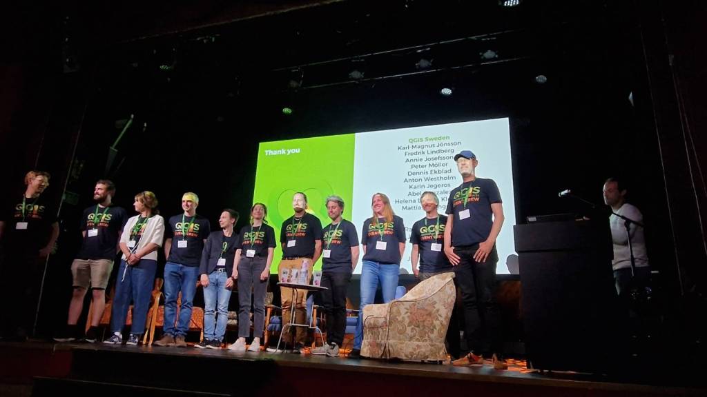
The QGISUC2025 team has done an awesome job recording and editing the conference presentations. All “presentation” type talks where the presenter has accepted to be published are now available in a dedicated list on the QGIS Youtube channel.
I also had the pleasure of presenting our Trajectools plugin and you can see this talk here:
Thank you to all the organizers, speakers, and participants for the great time!
The latest releases of MovingPandas and Trajectools come with many “under the hood” changes that aim to make your movement analytics faster:
Instead of immediately creating a GeoPandas GeoDataFrame and populating the geometry column with Point objects, MovingPandas now has “lazy geometry column creation” that holds off on this operation until / if the geometries are actually needed. This way, for many operations, no geometry objects have to be generated at all.
MovingPandas TrajectorySplitters now support parallel processing and Trajectools uses parallel processing whenever available (e.g. for adding speed & direction metrics, detecting stops, splitting trajectories).
When a minimum length is specified for trajectories, MovingPandas now avoids computing the total trajectory length and, instead, immediately stops once the threshold value has been reached (“early skip”).
Trajectools now offers the option to skip computation of movement metrics (speed & direction). This way, we can skip unnecessary computations and leverage the lazy geometry column creation, wherever applicable.
Let’s have a look at some example performance measurements!
Example 1: MovingPandas ValueChangeSplitter
The ValueChangeSplitter splits trajectories when it detects a value change in the specified column. This is useful, for example, to split up public trajectories that contain a “next_stop” column.
The following graph shows ValueChangeSplitter runtimes for different minimum trajectory length settings (from 0 to 1km, 100km, and 10,000km):
We see that the new, lazy geometry column initialization outperforms the old original code in all cases (e.g. 57% runtime reduction for 1km), except for the worst-case scenario, when the original implementation discards all trajectories as too short right from the start. (For most use cases, min_length will be set to rather small values to avoid creation of undesired short trajectory fragments, similar to sliver polygons in classic geometry operations.)
Additionally, we can engage multiprocessing by setting the n_processes parameter, e.g. to the number of CPUs to achieve further speedup:
Example 2: Trajectools
By applying all above-mentioned speedup techniques, Trajectools is now considerably faster. For example, the following runtime reductions can be achieved by deactivating the “Add movement metrics (speed, direction)” option in the algorithm dialog:
Create trajectories: 62%
Spatiotemporal generalization (TDTR): 78%
Temporal generalization: 81%
Split trajectories at stops: 53%
I have also updated the default trajectory points output style. It now uses a graduated renderer to visualize the speed values (if they have been calculated) instead of the previously used data-defined override. This makes the style faster to customize and provides a user-friendly legend:
At the end of yesterday’s TimeGPT for mobility post, we concluded that TimeGPT’s trainingset probably included a copy of the popular BikeNYC timeseries dataset and that, therefore, we were not looking at a fair comparison.
Naturally, it’s hard to find mobility timeseries datasets online that haven’t been widely disseminated and therefore may have slipped past the scrapers of foundation model builders.
So I scoured the Austrian open government data portal and came up with a bike-share dataset from Vienna.
Here are eight of the 120 stations in the dataset. I’ve resampled the number of available bicycles to the maximum hourly value and made a cutoff mid August (before a larger data collection cap and the less busy autumn and winter seasons):
Models
To benchmark TimeGPT, I computed different baseline predictions. I used statsforecast’s HistoricAverage, SeasonalNaive, and AutoARIMA models and computed predictions for horizons of 1 hour, 12 hours, and 24 hours.
Here are examples of the 12-hour predictions:
We can see how Historic Average is pretty much a straight line of the average past value. A little more sophisticated, SeasonalNaive assumes that the future will be a repeat of the past (i.e. the previous day), which results in the shifted curve we can see in the above examples. Finally, there’s AutoARIMA which seems to do a better job than the first two models but also takes much longer to compute.
For comparison, here’s TimeGPT with 12 hours horizon:
In the following table, you’ll find the best model highlighted in bold. Unsurprisingly, this best model is for the 1 hour horizon. The best models for 12 and 24 hours are marked in italics.
Model
Horizon
RMSE
HistoricAverage
1
7.0229
HistoricAverage
12
7.0195
HistoricAverage
24
7.0426
SeasonalNaive
1
7.8703
SeasonalNaive
12
7.7317
SeasonalNaive
24
7.8703
AutoARIMA
1
2.2639
AutoARIMA
12
5.1505
AutoARIMA
24
6.3881
TimeGPT
1
2.3193
TimeGPT
12
4.8383
TimeGPT
24
5.6671
AutoARIMA and TimeGPT are pretty closely tied. Interestingly, the SeasonalNaive model performs even worse than the very simple HistoricAverage, which is an indication of the irregular nature of the observed phenomenon (probably caused by irregular restocking of stations, depending on the system operator’s decisions).
Conclusion & next steps
Overall, TimeGPT struggles much more with the longer horizons than in the previous BikeNYC experiment. The error more than doubled between the 1 hour and 12 hours prediction. TimeGPT’s prediction quality barely out-competes AutoARIMA’s for 12 and 24 hours.
I’m tempted to test AutoARIMA for the BikeNYC dataset to further complete this picture.
Of course, the SharedMobility.ai dataset has been online for a while, so I cannot be completely sure that we now have a fair comparison. For that, we would need a completely new / previously unpublished dataset.


.jpg&oldid=1181181948)