The last time I preprocessed the whole GeoLife dataset, I loaded it into PostGIS. Today, I want to share a new workflow that creates a (Geo)Parquet file and that is much faster.
The dataset (GeoLife)
“This GPS trajectory dataset was collected in (Microsoft Research Asia) Geolife project by 182 users in a period of over three years (from April 2007 to August 2012). A GPS trajectory of this dataset is represented by a sequence of time-stamped points, each of which contains the information of latitude, longitude and altitude. This dataset contains 17,621 trajectories with a total distance of about 1.2 million kilometers and a total duration of 48,000+ hours. These trajectories were recorded by different GPS loggers and GPS-phones, and have a variety of sampling rates. 91 percent of the trajectories are logged in a dense representation, e.g. every 1~5 seconds or every 5~10 meters per point.”
But today, we want to do to get a bit more involved …
DuckDB SQL magic
The issues we need to solve are:
Read all CSV files from all subdirectories
Parse the CSV, ignoring the first couple of lines, while assigning proper column names
Assign the CSV file name as the trajectory ID (because there is no ID in the original files)
Create point geometries that will work with our GeoParquet file
Create proper datetimes from the separate date and time fields
Luckily, DuckDB’s read_csv function comes with the necessary features built-in. Putting it all together:
CREATE OR REPLACE TABLE geolife AS
SELECT
  parse_filename(filename, true) as vehicle_id,
  strptime(date||' '||time, '%c') as t,
  ST_Point(lon, lat) as geometry -- do NOT use ST_MakePoint
FROM read_csv('/home/anita/Documents/Geodata/Geolife/Geolife Trajectories 1.3/Data/*/*/*.plt',
    skip=6,
    filename = true,
    columns = {
        'lat': 'DOUBLE',
        'lon': 'DOUBLE',
        'ignore': 'INT',
        'alt': 'DOUBLE',
        'epoch': 'DOUBLE',
        'date': 'VARCHAR',
        'time': 'VARCHAR'
    });
It’s blazingly fast:
I haven’t tested reading directly from ZIP archives yet, but there seems to be a community extension (zipfs) for this exact purpose.
Ready to QGIS
GeoParquet files can be drag-n-dropped into QGIS:
I’m running QGIS 3.42.1-Münster from conda-forge on Linux Mint.
Yes, it takes a while to render all 25 million points … But you know what? It get’s really snappy once we zoom in closer, e.g. to the situation in Germany:
Let’s have a closer look at what’s going on here.
Trajectools time
Selecting the 9,438 points in this extent, let’s compute movement metrics (speed & direction) and create trajectory lines:
Looks like we have some high-speed sections in there (with those red > 100 km/h streaks):
When we zoom in to Darmstadt and enable the trajectories layer, we can see each individual trip. Looks like car trips on the highway and walks through the city:
That looks like quite the long round trip:
Let’s see where they might have stopped to have a break:
If I had to guess, I’d say they stayed at the Best Western:
Conclusion
DuckDB has been great for this ETL workflow. I didn’t use much of its geospatial capabilities here but I was pleasantly surprised how smooth the GeoParquet creation process has been. Geometries are handled without any special magic and are recognized by QGIS. Same with the timestamps. All ready for more heavy spatiotemporal analysis with Trajectools.
If you haven’t tried DuckDB or GeoParquet yet, give it a try, particularly if you’re collaborating with data scientists from other domains and want to exchange data.
The QGISUC2025 team has done an awesome job recording and editing the conference presentations. All “presentation” type talks where the presenter has accepted to be published are now available in a dedicated list on the QGIS Youtube channel.
I also had the pleasure of presenting our Trajectools plugin and you can see this talk here:
Thank you to all the organizers, speakers, and participants for the great time!
The latest releases of MovingPandas and Trajectools come with many “under the hood” changes that aim to make your movement analytics faster:
Instead of immediately creating a GeoPandas GeoDataFrame and populating the geometry column with Point objects, MovingPandas now has “lazy geometry column creation” that holds off on this operation until / if the geometries are actually needed. This way, for many operations, no geometry objects have to be generated at all.
MovingPandas TrajectorySplitters now support parallel processing and Trajectools uses parallel processing whenever available (e.g. for adding speed & direction metrics, detecting stops, splitting trajectories).
When a minimum length is specified for trajectories, MovingPandas now avoids computing the total trajectory length and, instead, immediately stops once the threshold value has been reached (“early skip”).
Trajectools now offers the option to skip computation of movement metrics (speed & direction). This way, we can skip unnecessary computations and leverage the lazy geometry column creation, wherever applicable.
Let’s have a look at some example performance measurements!
Example 1: MovingPandas ValueChangeSplitter
The ValueChangeSplitter splits trajectories when it detects a value change in the specified column. This is useful, for example, to split up public trajectories that contain a “next_stop” column.
The following graph shows ValueChangeSplitter runtimes for different minimum trajectory length settings (from 0 to 1km, 100km, and 10,000km):
We see that the new, lazy geometry column initialization outperforms the old original code in all cases (e.g. 57% runtime reduction for 1km), except for the worst-case scenario, when the original implementation discards all trajectories as too short right from the start. (For most use cases, min_length will be set to rather small values to avoid creation of undesired short trajectory fragments, similar to sliver polygons in classic geometry operations.)
Additionally, we can engage multiprocessing by setting the n_processes parameter, e.g. to the number of CPUs to achieve further speedup:
Example 2: Trajectools
By applying all above-mentioned speedup techniques, Trajectools is now considerably faster. For example, the following runtime reductions can be achieved by deactivating the “Add movement metrics (speed, direction)” option in the algorithm dialog:
Create trajectories: 62%
Spatiotemporal generalization (TDTR): 78%
Temporal generalization: 81%
Split trajectories at stops: 53%
I have also updated the default trajectory points output style. It now uses a graduated renderer to visualize the speed values (if they have been calculated) instead of the previously used data-defined override. This makes the style faster to customize and provides a user-friendly legend:
In today’s post, we (that is, Gaspard Merten from Universite Libre de Bruxelles and yours truly) are going to dive deep into how to analyze public transport data, using both schedule and real time information. This collaboration has been made possible by the EMERALDS project.
Today, we’ll discuss the aspect of handling realtime GTFS data and how we approach analytics that combine both data sources.
About Realtime GTFS
Many of us have come to rely on real-time public transport updates in apps like Google Maps. These apps are powered by standardized data formats that ensure different systems can communicate. Google first introduced GTFS in 2005, a format designed to organize transit schedules, stop locations, and other static transit information. Then, in 2011, they introduced GTFS Realtime (GTFS-RT), which added the capability to include live updates on vehicle positions, delays, speeds, and much more.
However, as the name suggests, GTFS Realtime is all about live data. This means that while GTFS-RT APIs are useful for providing real-time insights, they don’t hold historical data for analytics. Moreover, most transit agencies don’t keep past GTFS-RT records, and even fewer make them available to the public. This can be a significant challenge for anyone looking to analyze past trends and extract valuable insights from the data. For this reason, we had to implement our own solution to efficiently archive GTFS-RT files while making sure the files could be queried easily.
There are two main challenges in the implementation of such a solution:
Data Volume: While individual GTFS-RT files are relatively small—typically ranging from 50KB to 500KB depending on the public transport network size—the challenge lies in ingestion frequency. With an average file size of 100KB and updates every 5 seconds, a full day’s worth of data quickly scales up to 1.728GB.
Data Usability: GTFS-RT is a deeply nested format based on Protobuf, making direct conversion into a more accessible structure like a DataFrame difficult. Efficiently unnesting the data without losing critical details would significantly improve usability and streamline analysis.
Parquet to the Rescue
Storing and analyzing real-time transit data efficiently isn’t just about saving space—it’s about making the data easy to work with. Luckily, modern data formats have come a long way, allowing us to store massive amounts of data while keeping retrieval and analytics processing fast. One of the best tools for the job is Apache Parquet, a columnar storage format originally designed for Hadoop but now widely adopted in data science. With built-in support in libraries like Polars and Pandas, it’s become a go-to choice for handling large datasets efficiently. Moreover, Parquet can be converted to GeoParquet for smoother integration with GIS such as GeoPandas.
What makes Parquet particularly well-suited for GTFS Realtime data is the way it compresses columnar data. It leverages multiple compression algorithms and encodings, significantly reducing file sizes while keeping access speeds high. However, to get the most out of Parquet’s compression, we need to be smart about how we structure our data. Simply converting each GTFS-RT file into its own Parquet file might give us around 60% compression, which is decent. But if we group all GTFS-RT records for an entire hour into a single file, we can push that number up to 95%. The reason? A lot of transit data—like trip IDs and stop locations—doesn’t change much within an hour, while other values, such as coordinates, often share common elements. By organizing data in larger batches, we allow Parquet’s compression algorithms to work their magic, drastically reducing storage needs. And with a smaller disk footprint, retrieval is faster, making the entire analytics pipeline more efficient.
One more challenge to tackle is the structure of the data itself. GTFS-RT files tend to be highly nested, which isn’t an issue for Parquet but can be problematic for most data science tools. While Parquet technically supports nested structures, many analytical frameworks don’t handle them well. To fix this, we apply a lightweight preprocessing step to “unnest” the data. In the original GTFS-RT format, the vehicle position feed is deeply nested, making it difficult to work with. But once unnesting is applied, the structure becomes flat, with clear column names derived from the original hierarchy. This makes it easy to convert the data into a table format, ensuring smooth integration with tools commonly used by data scientists.
The GTFS-RT Pipelines
With this in mind, let’s walk through the two pipelines we built to store and retrieve GTFS-RT data efficiently.
The entire system relies on two key pipelines that work together. The first pipeline fetches GTFS-RT data from an API every five seconds, processes it, and stores it in an S3 bucket. The second pipeline runs hourly, gathering all the individual files from the past hour, merging them into a single Parquet file, and saving it back to the bucket in a structured format. We will now take a look at each pipeline in more detail.
Pipeline 1: Fetching and Storing Data
The first step in the process is retrieving GTFS-RT data. This is done via an API, which returns files in the Protocol Buffer (ProtoBuf) format. Fortunately, Google provides libraries (such as gtfs-realtime-bindings) that make it easy to parse ProtoBuf and convert it into a more accessible format like JSON.
Once we have the data in JSON format, we need to split it based on entity type. GTFS-RT files contain different types of data, such as TripUpdate, which provides updated arrival times for stops, and VehiclePosition, which tracks real-time locations and speeds. Not all GTFS-RT feeds contain every entity type, but TripUpdate and VehiclePosition are the most commonly used. The full list of entity types can be found in the GTFS Realtime documentation.
We separate entity types because they have different schemas, making it difficult to store them in a single Parquet file. Keeping each entity type separate not only improves organization but also enhances compression efficiency. Once split, we apply the same unnesting process as described earlier, ensuring the data is structured in a way that’s easy to analyze. After that, we convert the data into a data frame and store it as a Parquet file in memory before uploading it to an S3 bucket. The files follow a structured naming convention like this:
This format makes it easy to navigate the storage bucket manually while also ensuring seamless integration with the second pipeline.
Pipeline 2: Merging and Optimizing Storage
The second pipeline’s job is to take all the small Parquet files generated by Pipeline 1 and merge them into a single, optimized file per hour. To do this, it scans the storage bucket for the earliest unprocessed “hour folder” and begins processing from there. This design ensures that if the pipeline is temporarily interrupted, it can easily resume without skipping any data.
Once it identifies the files to merge, the pipeline loads them, assigns a proper timestamp to each record, and concatenates them into a single Parquet table. The final file is then uploaded to the S3 bucket using the following naming convention:
{feed_type}/YYYY-MM-DD/hour/HH.parquet
If any files fail to merge, they are renamed with the prefix unmerged_{date-isoformat}.parquet for manual inspection. After successfully storing the merged file, the pipeline deletes the individual files to keep storage clean and avoid unnecessary clutter.
One critical advantage of converting GTFS-RT data into Parquet early in the process is that it prevents memory overload. If we had to merge raw GTFS-RT files instead of pre-converted Parquet files, we would likely run into memory constraints, especially on standard servers with limited RAM. This makes Parquet not just a storage solution but an enabler of efficient large-scale processing.
Ready for Analytics
In this section, we will explore how to use the GTFS-RT data for public transport analytics. Specifically, we want to compute delays, that is, the difference between the scheduled travel time and the real travel time.
The previously created Parquet files can be loaded into QGIS as tables without geometries. To turn them into point layers, we use the “Create points layer from table” algorithm from the Processing “Vector creation” toolbox. And once we convert the unixtimes to datetimes (using the datetime_from_epoch function), we have a point layer that is ready for use in Trajectools.
Let’s have a look at one bus route. Bus 3 is one of the busiest routes in Riga. We apply a filter to the point layer which reveals the location of the route.
Computing segment travel times
Computing travel times on public transport segments, i.e. between two scheduled stops, comes with a couple of challenges:
The GTFS-RT location updates are provided in a rather sparse fashion with irregular reporting intervals. It is not clear that we “see” every stop that happens.
We cannot rely solely on stop detection since, sometimes, a vehicle will not come to a halt at scheduled stop locations (if nobody wants to get off or on)
The stop ID, representing the next stop the vehicle will visit, is not always exact. Updates are often delayed and happen some time after passing the stop.
Here’s an example visualization of the stop ID information of a single trip of bus 3, overlaid on top of the GTFS route and stops (in red):
To compute the desired delays, we decided to compare GTFS-RT travel times based on stop ID info with the scheduled travel times. To get the GTFS-RT travel times, we use Trajectools and create trajectories by splitting at stop ID change using the Split by value change algorithm:
Computing delays
The final step is to compute travel time differences between schedule and real time. For this, we implemented a SQL join that matches GTFS-RT trajectories with the corresponding entry in the GTFS schedule using route information and temporal information:
The temporal information is important since the schedule accounts for different travel times during peak hours and off peak:
This information is extracted from the GTFS schedule using the Trajectools Extract segments algorithm, if we chose the “Add scheduled speeds” option:
This will add the time windows, speeds, and runtimes per segment to the resulting segment layer:
Joining the GTFS-RT trajectories with the scheduled segment information, we compute delays for every segment and trip. For example, here are the resulting delays for trip ‘AUTO3-18-1-240501-ab-2230’:
Red lines mark segments where time is lost compared to the schedule, while blue lines indicate that the vehicle traversed the segment faster than the schedule suggested.
What’s next
When interpreting the results, it is important to acknowledge the effects caused by the timing of the next stop ID updates in the real-time GTFS feed. Sometimes, these updates come very late and thus introduce distortions where one segment’s travel time gets too long and the other too short.
We will continue refining the analytics and related libraries, including the QGIS Trajectools plugin, to facilitate analytics of GTFS-RT & GTFS.
After successful testing of this analytics approach in Riga, we aim to transfer it to other cities. But for this to work, public transport companies need ways to efficiently store their data and, ideally, to release them openly to allow for analysis.
The pipelines we described, help keep storage needs low, which allows us to drastically reduce costs (for a year we would only have a few gigabytes, which is inexpensive to store in S3 storage). Let us know if you would be interested in an online platform on which one could register a GTFS-RT feed & GTFS, which would then automatically start being archived (in exchange, the provider would only need to accept sharing the archives as open data, at no cost for them).
In this new release, you will find new algorithms, default output styles, and other usability improvements, in particular for working with public transport schedules in GTFS format, including:
Added GTFS algorithms for extracting stops, fixes #43
Added default output styles for GTFS stops and segments c600060
Added Trajectory splitting at field value changes 286fdbd
Added option to add selected fields to output trajectories layer, fixes #53
Improved UI of the split by observation gap algorithm, fixes #36
Note: To use this new version of Trajectools, please upgrade your installation of MovingPandas to >= 0.21.2, e.g. using
written together with my fellow co-authors and EMERALDS project team member Argyrios Kyrgiazos.
For the technically inclined, the highlight are the presented UDFs in Snowflake to process and transform the trajectory data. For example, here’s a TemporalSplitter UDF:
CREATE OR REPLACE FUNCTION CARTO_DATABASE.CARTO.TemporalSplitter(geom ARRAY, t ARRAY, mode STRING)
RETURNS ARRAY
LANGUAGE PYTHON
RUNTIME_VERSION = 3.11
PACKAGES = ('numpy','pandas', 'geopandas','movingpandas', 'shapely')
HANDLER = 'udf'
AS $$
import numpy as np
import pandas as pd
import geopandas as gpd
import movingpandas as mpd
import shapely
from shapely.geometry import shape, mapping, Point, Polygon
from shapely.validation import make_valid
from datetime import datetime, timedelta

def udf(geom, t, mode):
    valid_df = pd.DataFrame(geom, columns=['geometry'])
    valid_df['t'] = pd.to_datetime(t)
    valid_df['geometry'] = valid_df['geometry'].apply(lambda x:shapely.wkt.loads(x))
    gdf = gpd.GeoDataFrame(valid_df, geometry='geometry', crs='epsg:4326')
    gdf = gdf.set_index('t')
    traj = mpd.Trajectory(gdf, 1)
    traj_sm = mpd.TemporalSplitter(traj).split(mode=mode)
    if len(traj_sm.trajectories)>0:
        res = traj_sm.to_point_gdf()
        res['geometry'] = res['geometry'].apply(lambda x: shapely.wkt.dumps(x))
        return res.reset_index().values
    else:
        return []
$$;
tldr; Tired of working with large CSV files? Give GeoParquet a try!
“Parquet is a powerful column-oriented data format, built from the ground up to as a modern alternative to CSV files.”https://geoparquet.org/
(Geo)Parquet is both smaller and faster than CSV. Additionally, (Geo)Parquet columns are typed. Text, numeric values, dates, geometries retain their data types. GeoParquet also stores CRS information and support in GIS solutions is growing.
I’ll be giving a quick overview using AIS data in GeoPandas 1.0.1 (with pyarrow) and QGIS 3.38 (with GDAL 3.9.2).
File size
The example AIS dataset for this demo contains ~10 million rows with 22 columns. I’ve converted the original zipped CSV into GeoPackage and GeoParquet using GeoPandas to illustrate the huge difference in file size: ~470 MB for GeoParquet and zipped CSV, 1.6 GB for CSV, and a whopping 2.6 GB for GeoPackage:
Reading performance
Pandas and GeoPandas both support selective reading of files, i.e. we can specify the specific columns to be loaded. This does speed up reading, even from CSV files:
Whole file
Selected columns
CSV
27.9 s
13.1 s
Geopackage
2min 12s 😵
20.2 s
GeoParquet
7.2 s
4.1 s
Indeed, reading the whole GeoPackage is getting quite painful.
Here’s the code I used for timing the read times:
As you can see, these times include the creation of the GeoPandas.GeoDataFrame.
If we don’t need a GeoDataFrame, we can read the files even faster:
Non-spatial DataFrames
GeoParquet files can be read by non-GIS tools, such as Pandas. This makes it easier to collaborate with people who may not be familiar with geospatial data stacks.
And reading plain DataFrames is much faster than creating GeoDataFrames:
But back to GIS …
GeoParquet in QGIS
In QGIS, GeoParquet files can be loaded like any other vector layer, thanks to GDAL:
Loading the GeoParquet and GeoPackage files is pretty quick, especially if we zoom into a small region of interest (even though, unfortunately, it doesn’t seem possible to restrict the columns to further speed up loading). Loading the CSV, however, is pretty painful due to the lack of spatial indexing, which becomes apparent very quickly in the direct comparison:
(You can see how slowly the red CSV points are rendering. I didn’t have the patience to include the whole process in the GIF.)
As far as I can tell, my QGIS 3.38 ‘Grenoble’ does not support writing to or editing of GeoParquet files. So I’m limited to reading GeoParquet for now.
However, seeing how much smaller GeoParquets are compared to GeoPackages (and also faster to write), I hope that we will soon get the option to export to GeoParquet.
For now, I’ll start by converting my large CSV files to GeoParquet using GeoPandas.
Today marks the release of Trajectools 2.3 which brings a new set of algorithms, including trajectory generalizing, cleaning, and smoothing.
To give you a quick impression of what some of these algorithms would be useful for, this post introduces a trajectory preprocessing workflow that is quite general-purpose and can be adapted to many different datasets.
We start out with the Geolife sample dataset which you can find in the Trajectools plugin directory’s sample_data subdirectory. This small dataset includes 5908 points forming 5 trajectories, based on the trajectory_id field:
We first split our trajectories by observation gaps to ensure that there are no large gaps in our trajectories. Let’s make at cut at 15 minutes:
This splits the original 5 trajectories into 11 trajectories:
When we zoom, for example, to the two trajectories in the north western corner, we can see that the trajectories are pretty noisy and there’s even a spike / outlier at the western end:
If we label the points with the corresponding speeds, we can see how unrealistic they are: over 300 km/h!
Let’s remove outliers over 50 km/h:
Better but not perfect:
Let’s smooth the trajectories to get rid of more of the jittering.
(You’ll need to pip/mamba install the optional stonesoup library to get access to this algorithm.)
Depending on the noise values we chose, we get more or less smoothing:
Let’s zoom out to see the whole trajectory again:
Feel free to pan around and check how our preprocessing affected the other trajectories, for example:
If you downloaded Trajectools 2.1 and ran into troubles due to the introduced scikit-mobility and gtfs_functions dependencies, please update to Trajectools 2.2.
This new version makes it easier to set up Trajectools since MovingPandas is pip-installable on most systems nowadays and scikit-mobility and gtfs_functions are now truly optional dependencies. If you don’t install them, you simply will not see the extra algorithms they add:
If you encounter any other issues with Trajectools or have questions regarding its usage, please let me know in the Trajectools Discussions on Github.
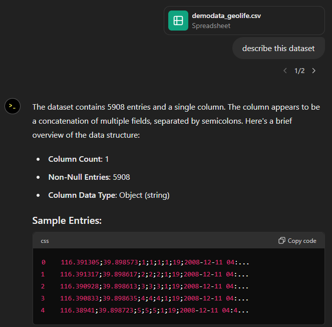
Today, I took ChatGPT’s Data Analyst for a spin. You’ve probably seen the fancy advertising videos: just drop in a dataset and AI does all the analysis for you?! Let’s see …
Of course, I’m not going to use some lame movie database or flower petals data. Instead, let’s go all in and test with a movement dataset.
You don’t get a second chance to make a first impression, they say. — Well, Data Analyst, you didn’t impress on the first try. How hard can it be to guess the delimiter and act accordingly?
Anyway, let’s help it a little:
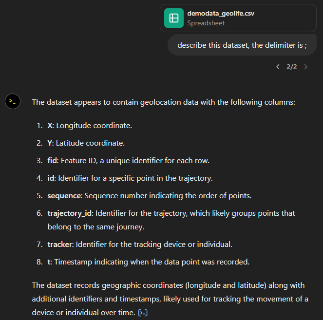
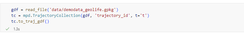
That looks much better. It makes an effort to guess what the columns could mean and successfully identifies the spatiotemporal information.
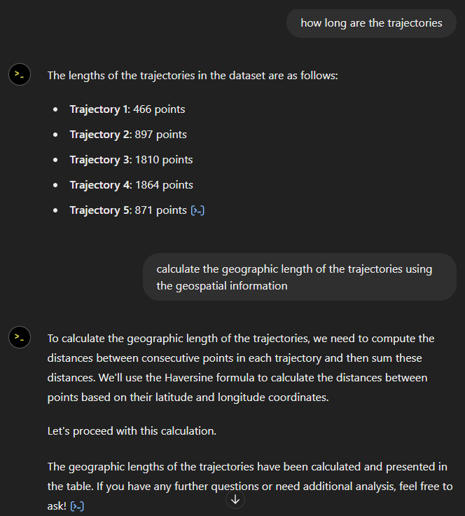
Now for some spatial analysis. On first try, it didn’t want to calculate the length of the trajectories in geographic terms, but we can make it to:
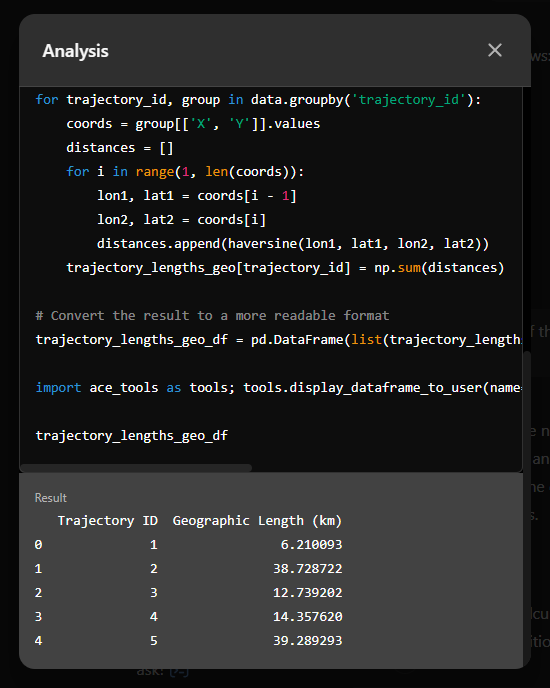
It will also show the code used to get to the results:
And indeed, these are close enough to the results computed using MovingPandas:
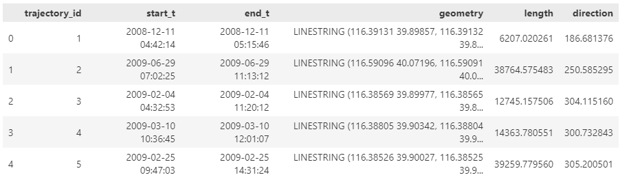
“What about plots?” I hear you ask.
For a first try, not bad at all:
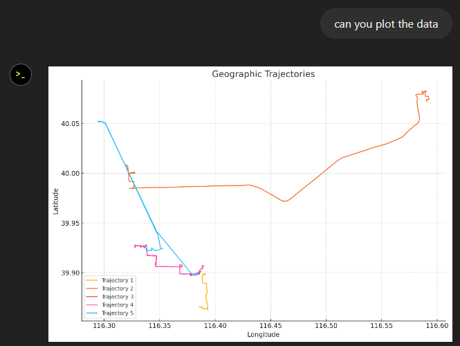
Let’s see if we can push it further:
Looks like poor Data Analyst ended up in geospatial library dependency hell 😈
It’s interesting to watch it try find a solution.
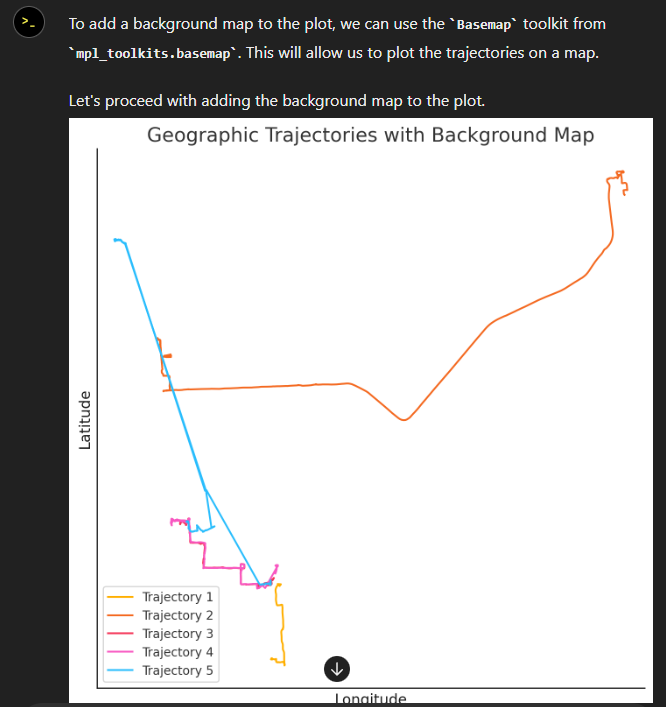
Alas, no background map appears:
Not giving up yet :)
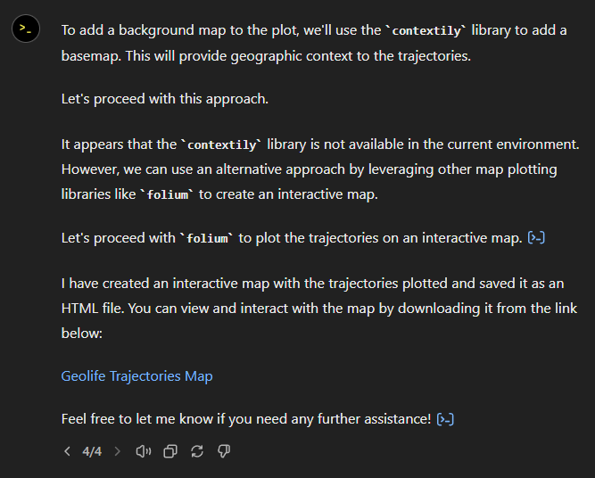
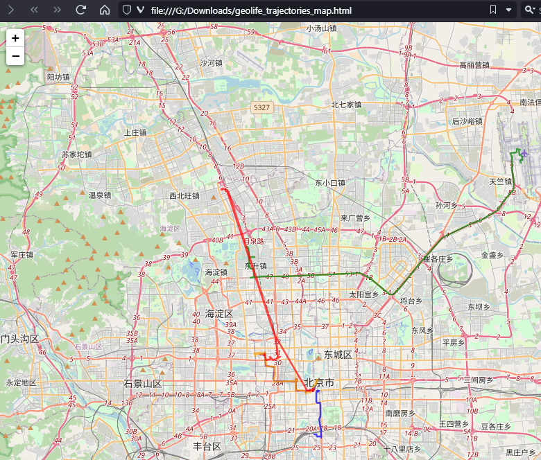
Woah, what happened here? It claims it created an interactive map in an HTML file.
And indeed it did:
This has been a very interesting experiment for me with many highs and lows. The whole process is a bit hit and miss. But when it does work, it’s fun.
I wasn’t sure what to expect with regards to Data Analyst’s spatial data processing capabilities. Looks like there are enough examples in its training data to find solutions for the basic trajectory analysis problems I asked it solve today, eventually, at least.
What’s the conclusion? Most AI marketing videos are severely overselling the capabilities of these tools. However, that doesn’t mean that they are completely useless, either. I’m looking forward to seeing the age of smaller open source models specifically trained for geospatial analysis to finally make it unnecessary for humans to memorize data analysis library syntax.