The last time I preprocessed the whole GeoLife dataset, I loaded it into PostGIS. Today, I want to share a new workflow that creates a (Geo)Parquet file and that is much faster.
The dataset (GeoLife)
“This GPS trajectory dataset was collected in (Microsoft Research Asia) Geolife project by 182 users in a period of over three years (from April 2007 to August 2012). A GPS trajectory of this dataset is represented by a sequence of time-stamped points, each of which contains the information of latitude, longitude and altitude. This dataset contains 17,621 trajectories with a total distance of about 1.2 million kilometers and a total duration of 48,000+ hours. These trajectories were recorded by different GPS loggers and GPS-phones, and have a variety of sampling rates. 91 percent of the trajectories are logged in a dense representation, e.g. every 1~5 seconds or every 5~10 meters per point.”
The GeoLife GPS Trajectories download contains 182 directories full of .plt files:

Basically, CSV files with a custom header:

Creating the (Geo)Parquet using DuckDB
DuckDB installation
Following the official instructions, installation is straightforward:
curl https://install.duckdb.org | sh
From there, I’ve been using the GUI which we can launch using:
duckdb -ui
The spatial extension is a DuckDB core extension, so it’s readily available. We can create a spatial db with:
ATTACH IF NOT EXISTS ':memory:' AS memory;
INSTALL spatial;
LOAD spatial;

Reading a spatial file is as simple as:
SELECT *
FROM '/home/anita/Documents/Codeberg/trajectools/sample_data/geolife.gpkg'
thanks to the GDAL integration.
But today, we want to do to get a bit more involved …
DuckDB SQL magic
The issues we need to solve are:
- Read all CSV files from all subdirectories
- Parse the CSV, ignoring the first couple of lines, while assigning proper column names
- Assign the CSV file name as the trajectory ID (because there is no ID in the original files)
- Create point geometries that will work with our GeoParquet file
- Create proper datetimes from the separate date and time fields
Luckily, DuckDB’s read_csv function comes with the necessary features built-in. Putting it all together:
CREATE OR REPLACE TABLE geolife AS
SELECT
  parse_filename(filename, true) as vehicle_id,
  strptime(date||' '||time, '%c') as t,
  ST_Point(lon, lat) as geometry -- do NOT use ST_MakePoint
FROM read_csv('/home/anita/Documents/Geodata/Geolife/Geolife Trajectories 1.3/Data/*/*/*.plt',
    skip=6,
    filename = true,
    columns = {
        'lat': 'DOUBLE',
        'lon': 'DOUBLE',
        'ignore': 'INT',
        'alt': 'DOUBLE',
        'epoch': 'DOUBLE',
        'date': 'VARCHAR',
        'time': 'VARCHAR'
    });
It’s blazingly fast:

I haven’t tested reading directly from ZIP archives yet, but there seems to be a community extension (zipfs) for this exact purpose.
Ready to QGIS
GeoParquet files can be drag-n-dropped into QGIS:

I’m running QGIS 3.42.1-Münster from conda-forge on Linux Mint.
Yes, it takes a while to render all 25 million points … But you know what? It get’s really snappy once we zoom in closer, e.g. to the situation in Germany:

Let’s have a closer look at what’s going on here.
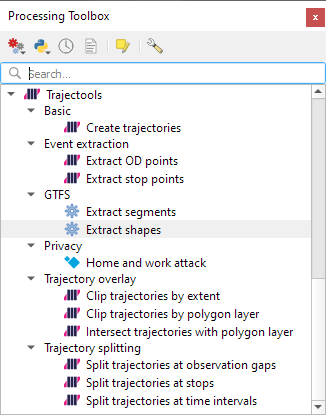
Trajectools time
Selecting the 9,438 points in this extent, let’s compute movement metrics (speed & direction) and create trajectory lines:

Looks like we have some high-speed sections in there (with those red > 100 km/h streaks):

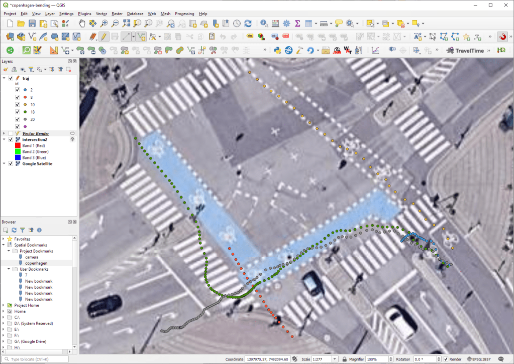
When we zoom in to Darmstadt and enable the trajectories layer, we can see each individual trip. Looks like car trips on the highway and walks through the city:

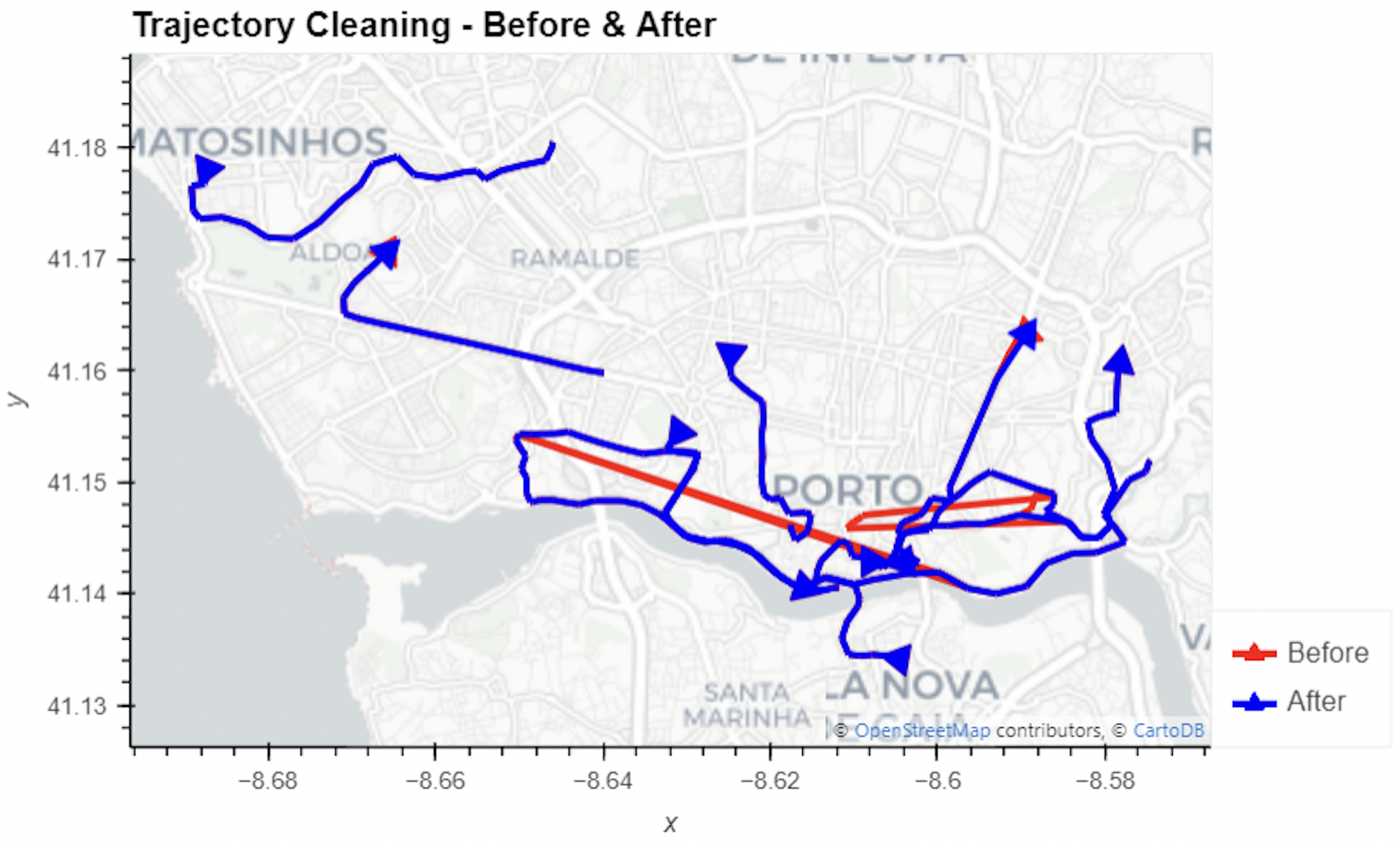
That looks like quite the long round trip:

Let’s see where they might have stopped to have a break:

If I had to guess, I’d say they stayed at the Best Western:

Conclusion
DuckDB has been great for this ETL workflow. I didn’t use much of its geospatial capabilities here but I was pleasantly surprised how smooth the GeoParquet creation process has been. Geometries are handled without any special magic and are recognized by QGIS. Same with the timestamps. All ready for more heavy spatiotemporal analysis with Trajectools.
If you haven’t tried DuckDB or GeoParquet yet, give it a try, particularly if you’re collaborating with data scientists from other domains and want to exchange data.