In the previous post, we — creatively ;-) — used MobilityDB to visualize stationary IOT sensor measurements.
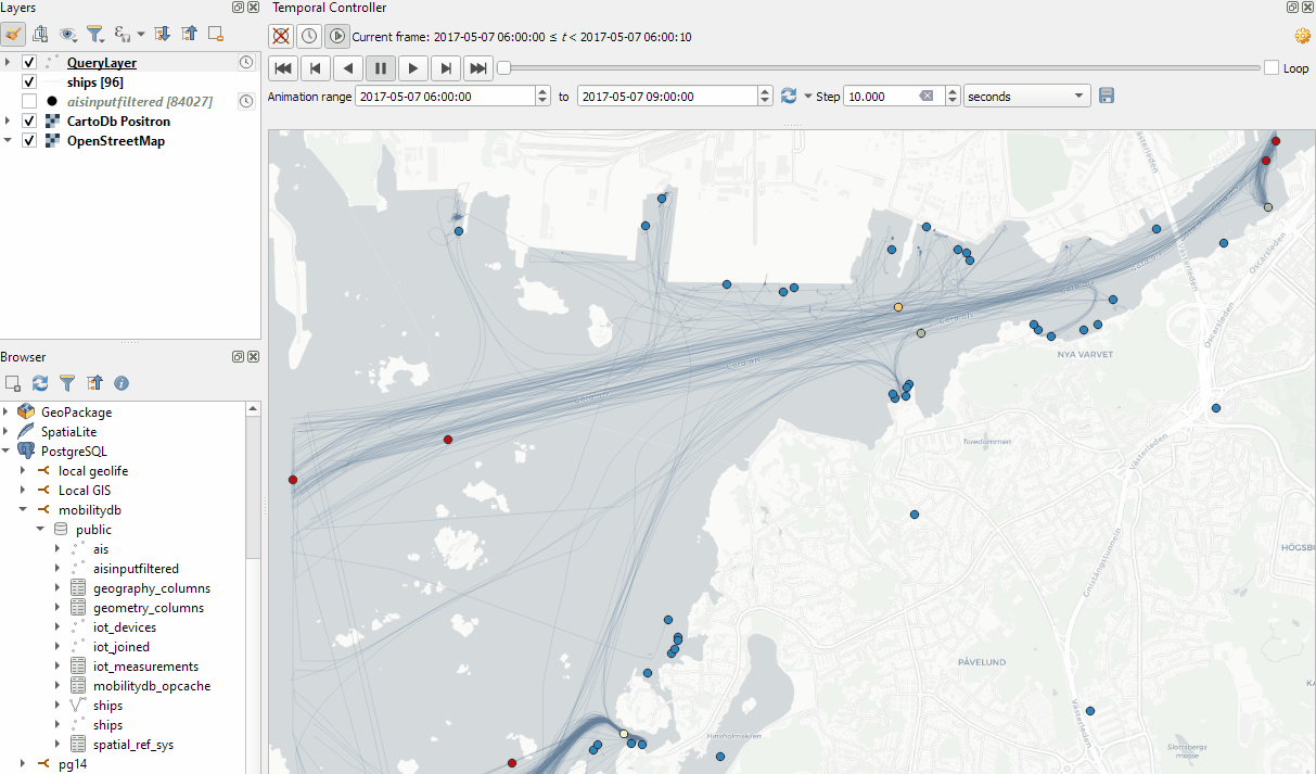
This post covers the more obvious use case of visualizing trajectories. Thus bringing together the MobilityDB trajectories created in Detecting close encounters using MobilityDB 1.0 and visualization using Temporal Controller.
Like in the previous post, the valueAtTimestamp function does the heavy lifting. This time, we also apply it to the geometry time series column called trip:
Today’s post presents an experiment in modelling a common scenario in many IOT setups: time series of measurements at stationary sensors. The key idea I want to explore is to use MobilityDB’s temporal data types, in particular the tfloat_inst and tfloat_seq for instances and sequences of temporal float values, respectively.
For info on how to set up MobilityDB, please check my previous post.
Setting up our DB tables
As a toy example, let’s create two IOT devices (in table iot_devices) with three measurements each (in table iot_measurements) and join them to create the tfloat_seq (in table iot_joined):
CREATE TABLE iot_devices (
    id integer,
    geom geometry(Point, 4326)
);

INSERT INTO iot_devices (id, geom) VALUES
(1, ST_SetSRID(ST_MakePoint(1,1), 4326)),
(2, ST_SetSRID(ST_MakePoint(2,3), 4326));

CREATE TABLE iot_measurements (
    device_id integer,
    t timestamp,
    measurement float
);

INSERT INTO iot_measurements (device_id, t, measurement) VALUES
(1, '2022-10-01 12:00:00', 5.0),
(1, '2022-10-01 12:01:00', 6.0),
(1, '2022-10-01 12:02:00', 10.0),
(2, '2022-10-01 12:00:00', 9.0),
(2, '2022-10-01 12:01:00', 6.0),
(2, '2022-10-01 12:02:00', 1.5);

CREATE TABLE iot_joined AS
SELECT
    dev.id,
    dev.geom,
    tfloat_seq(array_agg(
        tfloat_inst(m.measurement, m.t) ORDER BY t
    )) measurements
FROM iot_devices dev
JOIN iot_measurements m
  ON dev.id = m.device_id
GROUP BY dev.id, dev.geom;
We can load the resulting layer in QGIS but QGIS won’t be happy about the measurements column because it does not recognize its data type:
Query layer with valueAtTimestamp
Instead, what we can do is create a query layer that fetches the measurement value at a specific timestamp:
SELECT id, geom,
    valueAtTimestamp(measurements, '2022-10-01 12:02:00')
FROM iot_joined
Which gives us a layer that QGIS is happy with:
Time for TemporalController
Now the tricky question is: how can we wire our query layer to the Temporal Controller so that we can control the timestamp and animate the layer?
I don’t have a GUI solution yet but here’s a way to do it with PyQGIS: whenever the Temporal Controller signal updateTemporalRange is emitted, our update_query_layer function gets the current time frame start time and replaces the datetime in the query layer’s data source with the current time:
l = iface.activeLayer()
tc = iface.mapCanvas().temporalController()

def update_query_layer():
    tct = tc.dateTimeRangeForFrameNumber(tc.currentFrameNumber()).begin().toPyDateTime()
    s = l.source()
    new = re.sub(r"(\d{4})-(\d{2})-(\d{2}) (\d{2}):(\d{2}):(\d{2})", str(tct), s)
    l.setDataSource(new, l.sourceName(), l.dataProvider().name())

tc.updateTemporalRange.connect(update_query_layer)
Future experiments will have to show how this approach performs on lager datasets but it’s exciting to see how MobilityDB’s temporal types may be visualized in QGIS without having to create tables/views that join a geometry to each and every individual measurement.
The MovingPoint example seems to describe a storm, including its path (temporalGeometry), pressure, wind strength, and class values (temporalProperties):
You can give the current implementation a spin using this MyBinder notebook
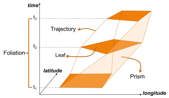
An exciting future step would be to experiment with extending MovingPandas to support the MovingPolygon MF-JSON examples. MovingPolygons can change their size and orientation as they move. I’m not yet sure, however, if the number of polygon nodes can change between time steps and how this would be reflected by the prism concept presented in the draft specification:
MovingPandas 0.9rc3 has just been released, including important fixes for local coordinate support. Sports analytics is just one example of movement data analysis that uses local rather than geographic coordinates.
Many movement data sources – such as soccer players’ movements extracted from video footage – use local reference systems. This means that x and y represent positions within an arbitrary frame, such as a soccer field.
Since Geopandas and GeoViews support handling and plotting local coordinates just fine, there is nothing stopping us from applying all MovingPandas functionality to this data. For example, to visualize the movement speed of players:
Of course, we can also plot other trajectory attributes, such as the team affiliation.
But one particularly useful feature is the ability to use custom background images, for example, to show the soccer field layout:
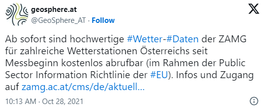
The Central Institution for Meteorology and Geodynamics (ZAMG) is Austrian’s meteorological and geophysical service. And as such, they have a large database of historical weather data which they have now made publicly available, as announced on 28th Oct 2021:
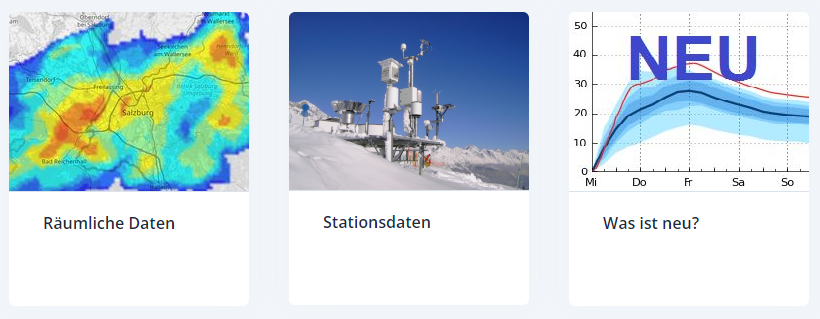
The new ZAMG Data Hub provides weather and station data, mainly in NetCDF and CSV formats:
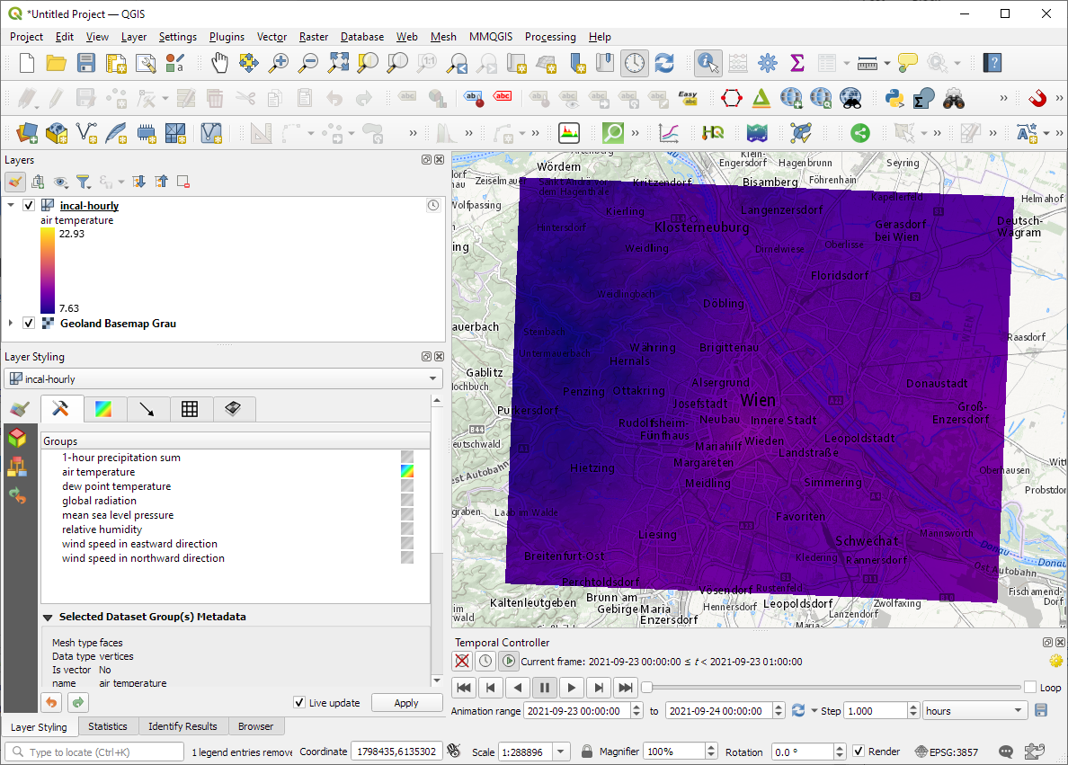
I decided to grab a NetCDF sample from their analysis and nowcasting system INCA. I went with all available parameters for a period of one day (the data has a temporal resolution of one hour) and a bounding box around Vienna:
The loading screen of QGIS 3.22 shows the different NetCDF layers:
After adding the incal-hourly layer to QGIS, the layer styling panel provides access to the different weather parameters. We can switch between these parameters by clicking the gradient icon next to the parameter names. Here you can see the air temperature:
And because the NetCDF layer is time-aware, we can also use the QGIS Temporal Controller to step through the hourly measurements / create an animation:
Make sure to grab the latest version of QGIS to get access to all the functionality shown here.
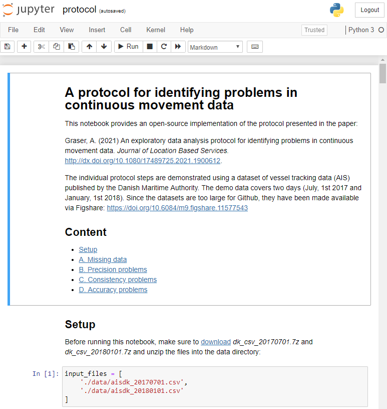
After writing “Towards a template for exploring movement data” last year, I spent a lot of time thinking about how to develop a solid approach for movement data exploration that would help analysts and scientists to better understand their datasets. Finally, my search led me to the excellent paper “A protocol for data exploration to avoid common statistical problems” by Zuur et al. (2010). What they had done for the analysis of common ecological datasets was very close to what I was trying to achieve for movement data. I followed Zuur et al.’s approach of a exploratory data analysis (EDA) protocol and combined it with a typology of movement data quality problems building on Andrienko et al. (2016). Finally, I brought it all together in a Jupyter notebook implementation which you can now find on Github.
There are two options for running the notebook:
The repo contains a Dockerfile you can use to spin up a container including all necessary datasets and a fitting Python environment.
Alternatively, you can download the datasets manually and set up the Python environment using the provided environment.yml file.
The dataset contains over 10 million location records. Most visualizations are based on Holoviz Datashader with a sprinkling of MovingPandas for visualizing individual trajectories.
Point density map of 10 million location records, visualized using Datashader
Line density map for detecting gaps in tracks, visualized using Datashader
Example trajectory with strong jitter, visualized using MovingPandas & GeoViews
I hope this reference implementation will provide a starting point for many others who are working with movement data and who want to structure their data exploration workflow.
(If you don’t have institutional access to the journal, the publisher provides 50 free copies using this link. Once those are used up, just leave a comment below and I can email you a copy.)
This time, Daniel O’Donohue and I talked about spatiotemporal data in GIS, including – of course – Time Manager, the new QGIS temporal support, and MovingPandas.
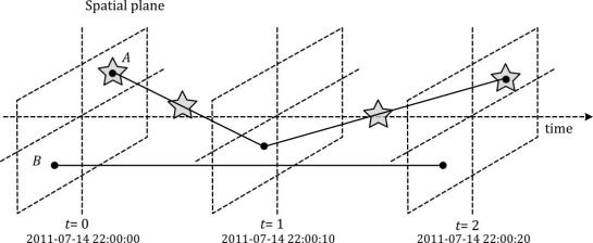
Since we need both data and tools to do spatiotemporal analysis, we also talked about file formats and data models. If you want to know more about data models for spatiotemporal (especially movement) data, have a look at the latest discussion paper I wrote together with Esteban Zimányi (MobilityDB) and Krishna Chaitanya Bommakanti (mobilitydb-sqlalchemy):
Data model of the Moving Features standard illustrated with two moving points A and B. Stars mark changes in attribute values. (Source: Graser et al. (2020))
For more details and all options for listening to this podcast, visit mapscaping.com.
TimeManager turns 10 this year. The code base has made the transition from QGIS 1.x to 2.x and now 3.x and it would be wrong to say that it doesn’t show ;-)
Now, it looks like the days of TimeManager are numbered. Four days ago, Nyall Dawson has added native temporal support for vector layers to QGIS. This is part of a larger effort of adding time support for rasters, meshes, and now also vectors.
The new Temporal Controller panel looks similar to TimeManager. Layers are configured through the new Temporal tab in Layer Properties. The temporal dimension can be used in expressions to create fancy time-dependent styles:
TimeManager Geolife demo converted to Temporal Controller (click for full resolution)
Obviously, this feature is brand new and will require polishing. Known issues listed by Nyall include limitations of supported time fields (only fields with datetime type are supported right now, strings cannot be used) and worse performance than TimeManager since features are filtered in QGIS rather than in the backend.
If you want to give the new Temporal Controller a try, you need to install the current development version, e.g. qgis-dev in OSGeo4W.
Update from May 16:
Many of the limitations above have already been addressed.
Last night, Nyall has recorded a one hour tutorial on this new feature, enjoy:
This post introduces Holoviz Panel, a library that makes it possible to create really quick dashboards in notebook environments as well as more sophisticated custom interactive web apps and dashboards.
The following example shows how to use Panel to explore a dataset (a trajectory collection in this case) and different parameter settings (relating to trajectory generalization). All the Panel code we need is a dict that defines the parameters that we want to explore. Then we can use Panel’s interact function to automatically generate a dashboard for our custom plotting function:
Click to view the resulting dashboard in full resolution:
The plotting function uses the parameters to generate a Holoviews plot. First it fetches a specific trajectory from the trajectory collection. Then it generalizes the trajectory using the specified parameter settings. As you can see, we can easily combine maps and other plots to visualize different aspects of the data:
Trajectory collections and generalization functions used in this example are part of the MovingPandas library. If you are interested in movement data analysis, you should check it out! You can find this example notebook in the MovingPandas tutorial section.