Vintage map design using QGIS
This post describes the three simple steps necessary to create a vintage-looking map using the blending feature in QGIS 2.0’s print composer. This is what we are aiming for:

1. Prepare the map
Like any other map, this one starts in the QGIS main window. Try to stick with earthy colors which will go well with the old paper look. For labels, try fonts which look like handwriting.

Once you are happy with your map
2. Prepare the composition background
To get that vintage feel, we need a background image with a great texture. You can find such textures on sites like lostandtaken.com. Download one you like and add it to an empty print composer. Make sure it covers the whole paper:
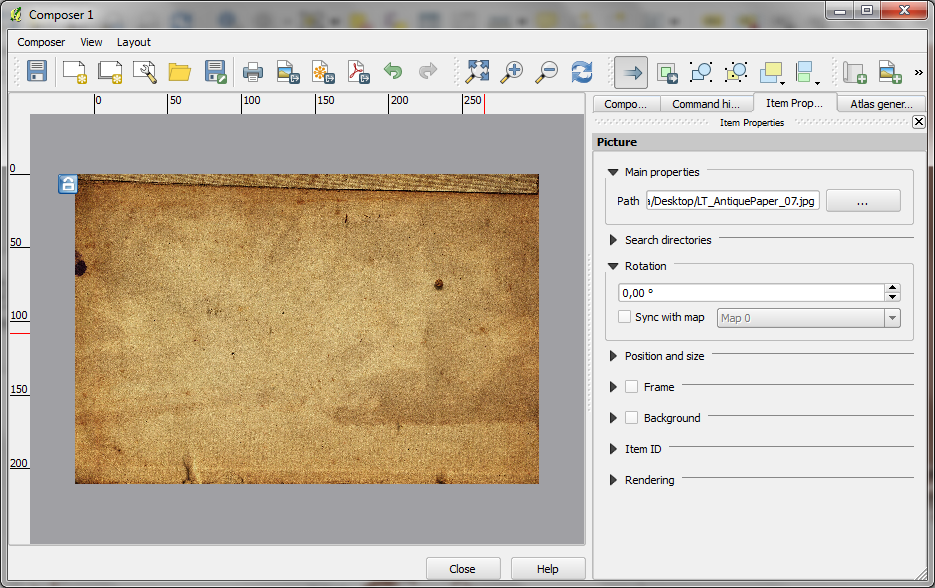
Lock the image by right-clicking it once – a small lock icon should appear in the upper left corner.
3. Finish the composition
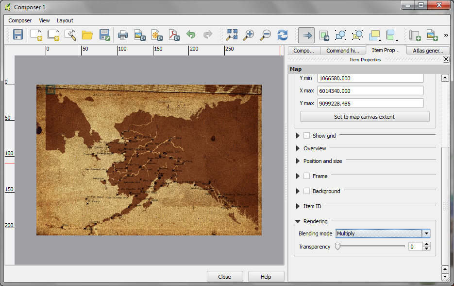
The final step is to add the map on top of the background image. To make our nice background texture shine through, we enable the “multiply” blending mode in the map’s rendering options:
Feel free to add north arrows or drawings of dragons as finishing touches.

This is great! The print composer is taking a HUGE step forward in the 2.0 release. I remember the first time trying to use it back in the .6 or .7 release, it was pretty rough. Congrats to the QGIS team!
Completely agree!!!
Reblogged this on The Spatial Blog and commented:
This is amazing, QGIS 2.0 is going from strength to strenth. Another great blog from Anita.
Reblogged this on AJG-Develop and commented:
QGIS is going to become a go-to piece of software. Amazing visualisations are now possible.
Pingback: QGIS – Vintage map design using open source GIS software | All Around GIS
Pingback: Renewing Love of Cartography - Geospatialate
This blend feature is amazing. The speed, ease of use and end result are amazing. No need for exporting to Photoshop and waiting hours for this sort of thing to render. Very Impressed!
Great demo. But don’t forget to include your sea monsters! http://news.yahoo.com/dragons-evolution-sea-monsters-medieval-maps-134711710.html
Thanks that looks great!
Pingback: QGIS 2.0 wydany! | GIS SUPPORT
Very fine demo. Have adopted this in a print composer blending exercise in one of my QGIS courses.
Some more sea monsters to blend in the texture background: http://www.wired.com/wiredscience/2013/10/here-be-sea-monsters/
Thanks they look great. Have to try adding them sometimes.
Great new additions! QGIS 2.0 really is a pleasure to work (and play) with!
Hi, very great demo. I’m interesting about the font you use in the map (the text “Beaufort sea”). Can you tell me which name of font it is please ?
The font is DF Scrawl and it was bundled with a photo software I’m using http://www.fotobuch.de/software/kreativitaet/fonts.
Thank you for your response and congratulations for your work about Qgis and your website