Archive

GIS

If you could not make it to Girona for this year’s QGIS user conference, here’s your chance to catch up with the many exciting presentations and workshops that made up the conference program on May 25-26th:

(Some resources are still missing but they’ll hopefully be added in the coming days.)

Update: Now you can also watch the talks online or even download them.

Thanks to everyone who was involved in making this second QGIS user conference a great experience for all participants!

https://twitter.com/timlinux/status/735744123374698497

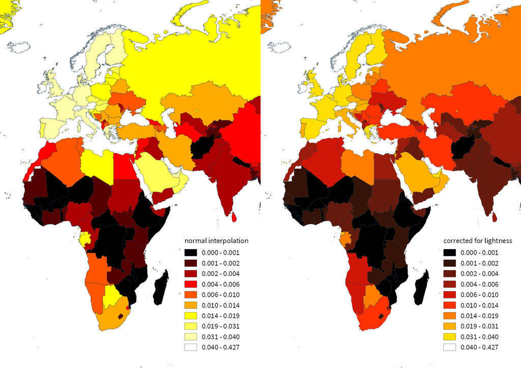
If you follow me on Twitter, you’ve probably seen previews of my experiments with round maps. These experiments were motivated by a recent question on GIS.stackexchange whether this type of map can be created in QGIS and while it’s not very convenient right now, it is definitely possible:

http://www.quantarctica.org

All maps in this post are created using data from the Quantarctica project.

I’ve been planing to try the Quantarctica datasets for a long time and this use case is just perfect. When you download and open their project, you’ll see that they have already clipped all datasets to a circle around Antarctica:

Quantarctica project with some custom styling

Quantarctica project with some custom styling

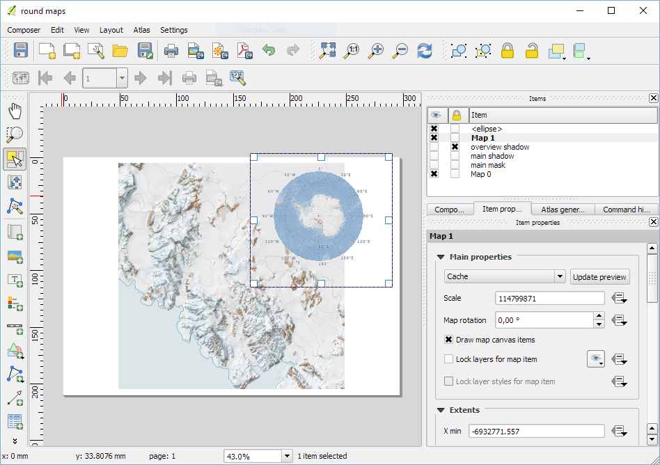
Since the map of the full extent of the dataset is already clipped to a circle, the overview map is easy to deal with. The detail map on the other hand is rectangular by default:

circle_maps_start

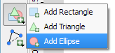
Since we cannot change the shape of the map item, we have to use a mask instead. To create a circular mask, we can add an ellipse shape:

circle_maps_addellipse

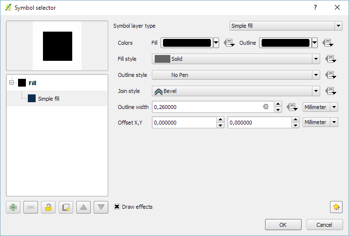
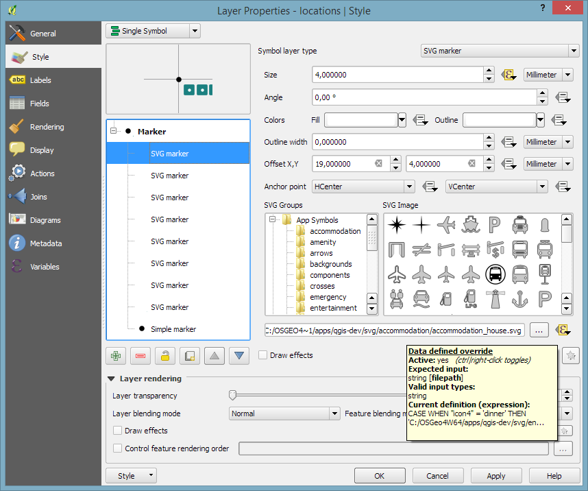
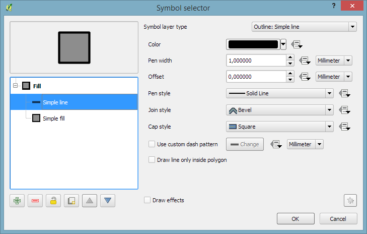
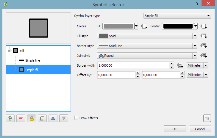
The main challenge when creating the mask is that there is no inverted polygon renderer for shapes in print composer. I’ve evaluated two workarounds: First, I created a style with a wide white outline that would cover all map parts outside the circle shape. But this solution slowed the print composer down a lot. An alternative, which doesn’t suffer from this slowdown is using draw effects:

circle_maps_mask_style

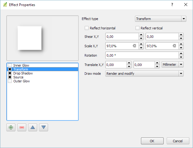
In particular, I created a big outer glow effect:

circle_maps_mask_style_effect

Note that the effect only works if the symbol itself is not transparent. That’s why I set the symbol fill to black and used the Lighten blending mode:

circle_maps_mask

Voilà! Both maps are nicely circular.

It is worth noting though that this workaround has a downside: it is not possible to create automatic grids/graticules for these maps. The graticule in the overview map only works because it is a layer in the main project that was already clipped to the circular shape.

Finally, you can add more depth to your map by adding shadows. To create the shadow effect, I added additional ellipse items which are styled with a drop shadow draw effect. If you only enable the drop shadow effect, you will notice that the shadow is cut off at the ellipse bounding box. To avoid this undesired effect, you can add a transform effect, which reduces the size of the drawn shape and it’s shadow so that the shadow fits into the bounding box:

circle_maps_mask_shadow_effect

It requires some manual adjustments to place the shadow at the optimal location on top of the mask:

circle_maps_mask_shadow

Add another ellipse to create the shadow for the overview map.

For more cartography tips and tricks check my new book QGIS Map Design or join my QGIS training courses.

Last year, I published the short post QGIS on the rise with journalists showcasing how QGIS is used by journalists with examples from the Los Angeles Times and Financial Times.

The latest QGIS case study now features an interview with Steven Bernard (Interactive Design Editor at the Financial Times) by A. Neumann and T. Sutton.

QGIS is now an integral part of our mapping workflow. (…) I would say 80% of our maps are now produced in QGIS. read more …

It’s great to see all the great examples of QGIS used to communicate international news. Thanks to everyone involved in this interview for sharing this case study with the community!

In time for QGIS 2.14 (soon to be LTR), I have updated “Learning QGIS” to reflect the latest improvements of our favorite GIS.

To celebrate, we are giving away 100 copies of the book at 30% (for print) and 50% (for eBook) discount if you use the following codes:

30% off  the Print version
Code: prt30LeaQS

50% off the eBook version
Code: LeaQSebok50

(Codes are valid until 30th April 2016 or we’ve reached 100 copies.)

B05278_MockupCover_Normal

Following up on last week’s post, Nyall has continued his work on the QGIS gradient editor:

Latest version of the new QGIS interactive gradient edit. This now includes an interactive plot of the color hue/saturation/lightness/alpha, allowing a visual overview of these color components and easy editing.

Another equally awesome demo has been posted by Nathan, who is currently working on usability improvements for labeling and styling without blocking dialogs:

This is going to be great for map design work because it makes many complex styles much easier to create since you can interact with the map and attribute table at the same time.

These are definitely two developments to follow closely!

Interesting developments going on if you like creating your own gradients. After all, that’s not as easy as it might initially seem, as Gregor Aisch describes in his post “Mastering Multi-hued Color Scales with Chroma.js”:

The issues with simple color interpolations, which include nonuniform changes in lightness between classes, also haunt us in cartography. Just have a look at the map and legend on the left-hand side, which has been created using a normal custom QGIS gradient with colors ranging from black to red, yellow and finally white. We end up with three classes in yellow which are nearly impossible to tell apart:

comparing_ramps

For comparison, on the right side, I’ve used Gregor’s corrected color ramp, which ensures that lightness changes evenly from one class to the next.

Wouldn’t it be great if the built-in gradient tool in QGIS could correct for lightness? Too bad the current dialog is not that great:

My first reaction therefore was to write a short script to import gradients from Gregor’s Chroma.js Color Scale Helper into QGIS:

https://twitter.com/underdarkGIS/status/716389969850404864

But we’ll probably have a much better solution in QGIS soon since Nyall Dawson has picked up the idea and is already working on a completely new version of the gradient tool. You can see a demo of the current work in progress here:

I’m really looking forward to trying this out once it hits master!

This is a short tip for you if you use QGIS on Windows and ended up with an error like this:

The program can't start because qgis_app.dll is missing from your computer. Try reinstalling the program to fix the problem.

Windows’ suggestion to reinstall probably won’t fix this issue. Instead, you want Windows to run qgis.bat instead of any .exe it is trying to use. Right-click a .qgs file and go to Open with | Choose default program:

Screenshot 2016-03-26 16.22.15

In OSGeo4W, the .bat file is located in the bin folder:

Screenshot 2016-03-26 16.27.01

Happy QGISing!

Today’s post was motivated by a question on GIS.StackExchange, which is looking for an automated way to symbolize the amenities available at a location using a series of icons, like this:

Screenshot 2016-03-19 23.02.30

Assuming the information is available in  a format similar to this example attribute table

Screenshot 2016-03-19 23.02.00

we can create a symbol, which adapts to the values in the icon columns using data-defined overrides:

Screenshot 2016-03-19 23.04.17

The five potential symbol locations are aligned next to each other using offsets. We use the following expression to determine the correct SVG symbol:

CASE
WHEN "icon4" = 'dinner'
 THEN 'C:/OSGeo4W64/apps/qgis-dev/svg/entertainment/amenity=restaurant.svg'
WHEN "icon4" = 'sleep'
 THEN 'C:/OSGeo4W64/apps/qgis-dev/svg/accommodation/accommodation_hotel2.svg'
WHEN "icon4" = 'ship'
 THEN 'C:/OSGeo4W64/apps/qgis-dev/svg/transport/amenity=ferry_terminal.svg'
WHEN "icon4" = 'house'
 THEN 'C:/OSGeo4W64/apps/qgis-dev/svg/accommodation/accommodation_house.svg'
 ELSE  ''
END

To hide icons if the icon value is NULL, the marker size is set to 0 using, for example:

CASE
WHEN "icon4" is not NULL
 THEN 4
 ELSE 0
END

Finally, to ensure that the labels don’t cover the icons, we can use the cartographic label placement with the position priority set to ‘TR,TL,BL’, which restricts labels to the top right, top left, and bottom left position.

Screenshot 2016-03-19 23.04.43

With these settings in place, we can zoom out and the labeling algorithm picks the most suitable position from the list of allowed positions:

Screenshot 2016-03-19 23.02.11

For more cartography tips and tricks check my new book QGIS Map Design or join my QGIS training courses.

Today’s post was motivated by a recent question on the #gistribe Twitter chat:

So what’s the issue?

Default polygon symbols come with a fill and a border color:

Screenshot 2016-03-12 15.40.37

When they are used in a graduated renderer, the fill color is altered for each class:

Screenshot 2016-03-12 15.40.26

What if you want to change the border color instead?

The simplest solution is to add an outline symbol layer to your polygon symbol:

Screenshot 2016-03-12 15.40.46

The outline layer has only one color property and it will be altered by the graduated renderer.

If you now hit ok, the graduated renderer will alter both the simple fill’s fill color and the outline’s color. To stop the fill color from changing, select the simple fill and lock it using the small lock icon below the list of symbol layers:

Screenshot 2016-03-12 15.40.50

Voilà:

Screenshot 2016-03-12 15.40.58

For more cartography tips and tricks check my new book QGIS Map Design or join my QGIS training courses.

Tracing button

If you are using QGIS for digitizing work, you have probably seen the 2.14 Changelog entry for Trace Digitizing. The main reason why this is a really cool new feature is that it speeds up digitizing a lot. When tracing is enabled, the digitizing tools take care to follow existing features (as configured in the snapping options). For a detailed howto and videos check Lutra’s blog.

https://twitter.com/Chobhamonian/status/704587930338267136