Archive

Tag Archives: labeling

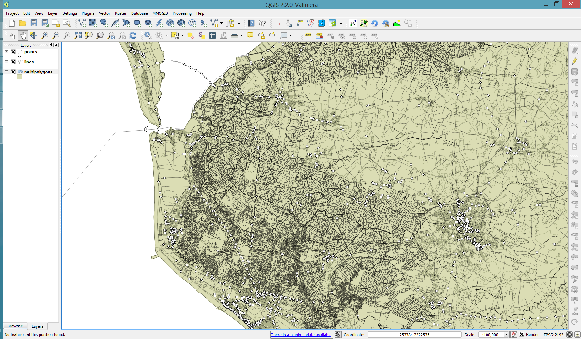
Cartographers use all kind of tricks to make their maps look deceptively simple. Yet, anyone who has ever tried to reproduce a cartographer’s design using only automatic GIS styling and labeling knows that the devil is in the details.

This post was motivated by Mika Hall’s retro map style.

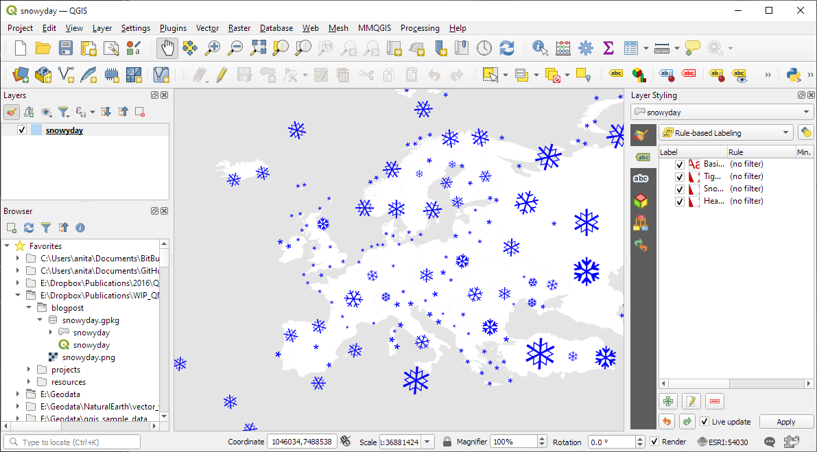
There are a lot of things going on in this design but I want to draw your attention to the labels – and particularly their background:

Detail of Mike’s map (c) Mike Hall. You can see that the rail lines stop right before they would touch the A in Valencia (or any other letters in the surrounding labels).

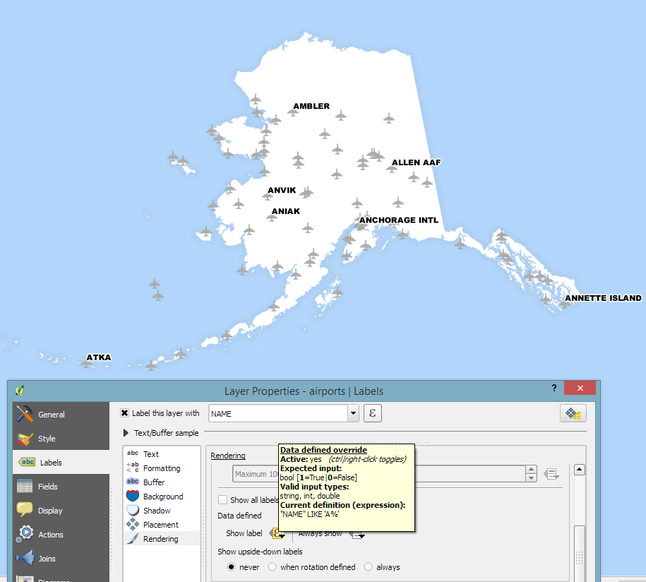
This kind of effect cannot be achieved by good old label buffers because no matter which color we choose for the buffer, there will always be cases when the chosen color is not ideal, for example, when some labels are on land and some over water:

Ordinary label buffers are not always ideal.

Label masks to the rescue!

Selective label masks enable more advanced designs.

Here’s how it’s done:

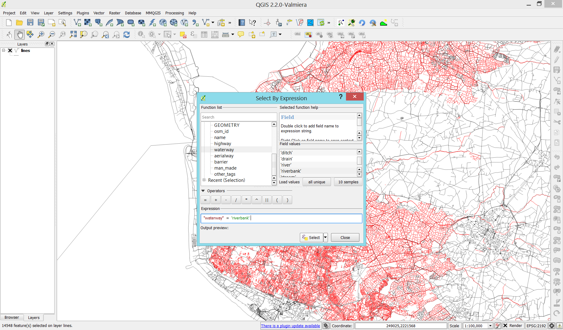
Selective masking has actually been around since QGIS 3.12. There are two things we need to take care of when setting up label masks:

1. First we need to enable masks in the label settings for all labels we want to mask (for example the city labels). The mask tab is conveniently located right next to the label buffer tab:

2. Then we can go to the layers we want to apply the masks to (for example the railroads layer). Here we can configure which symbol layers should be affected by which mask:

Note: The order of steps is important here since the “Mask sources” list will be empty as long as we don’t have any label masks enabled and there is currently no help text explaining this fact.

I’m also using label masks to keep the inside of the large city markers (the ones with a star inside a circle) clear of visual clutter. In short, I’m putting a circle-shaped character, such as ◍, over the city location:

In the text tab, we can specify our one-character label and – later on – set the label opacity to zero.
To ensure that the label stays in place, pick the center placement in “Offset from Point” mode.

Once we are happy with the size and placement of this label, we can then reduce the label’s opacity to 0, enable masks, and configure the railroads layer to use this mask.

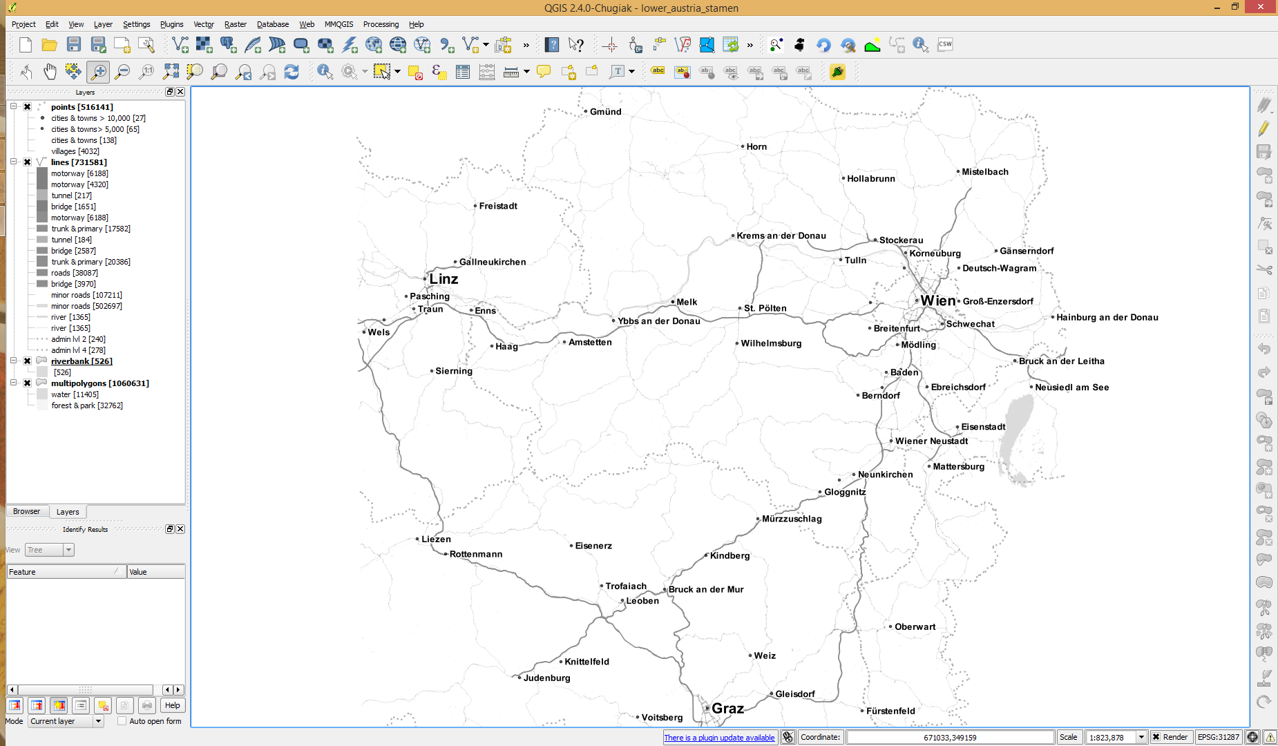
As a general rule of thumb, it makes sense to apply the masks to dark background features such as the railways, rivers, and lake outlines in our map design:

Resulting map with label masks applied to multiple labels including city and marine area labels masking out railway lines and ferry connections as well as rivers and lake outlines.

If you have never used label masks before, I strongly encourage you to give them a try next time you work on a map for public consumption because they provide this little extra touch that is often missing from GIS maps.

Happy QGISing! Make maps not war.

Advertisement

Today’s post is a follow-up and summary of my mapping efforts this December. It all started with a proof of concept that it is possible to create a nice looking snowfall effect using only labeling:

After a few more iterations, I even included the snowflake style in the first ever QGIS Map Design DLC: a free extra map recipe that shows how to create a map series of Antarctic expeditions. For more details (including project download links), check out my guest post on the Locate Press blog:

If you want to just use the snowflake style in your own projects, the easiest way is to grab the “Snowy Day” project from the QGIS hub (while the GeoPackage is waiting for approval on the official site, you can get it from my Dropbox):

The project is self-contained within the downloaded GeoPackage. One of the most convenient ways to open projects from GeoPackages is through the browser panel:

From here, you can copy-paste the layer style to any other polygon layer.

To change the snowflake color, go to the project properties and edit the “flake_color” variable.

Happy new year!

Following up on last week’s post, Nyall has continued his work on the QGIS gradient editor:

Latest version of the new QGIS interactive gradient edit. This now includes an interactive plot of the color hue/saturation/lightness/alpha, allowing a visual overview of these color components and easy editing.

Another equally awesome demo has been posted by Nathan, who is currently working on usability improvements for labeling and styling without blocking dialogs:

This is going to be great for map design work because it makes many complex styles much easier to create since you can interact with the map and attribute table at the same time.

These are definitely two developments to follow closely!

In 2011, I wrote “How to Label Only Selected Features in QGIS” which ends with the wish that

Another “data defined setting” like “show this label (true/false)” would be more intuitive.

… and now we have it!

It’s called Show label and you can find it in the Rendering section of the labeling dialog.

The following screenshot shows a quick example of how to label only airports starting with A by setting the expression

"NAME" LIKE 'A%'

labelselected

This post was motivated by a question by Eduardo here on this blog. Hope it helps!

Today’s post is inspired by a recent thread on the QGIS user mailing list titled “exporting text to Illustrator?”. The issue was that with the introduction of the new labeling system, all labels were exported as paths when creating an SVG. Unnoticed by almost everyone (and huge thanks to Alex Mandel for pointing out!) an option has been added to 2.4 by Larry Shaffer which allows exporting labels as texts again.

To export labels as text, open the Automatic Placement Settings (button in the upper right corner of the label dialog) and uncheck the Draw text as outlines option.

Screenshot 2014-09-20 21.03.26

Note that we are also cautioned that

For now the developers recommend you only toggle this option right
before exporting
and that you recheck it after.

Alex even recorded a video showcasing the functionality:

The point table of the Spatialite database created from OSM north-eastern Austria contains more than 500,000 points. This post shows how the style works which – when applied to the point layer – wil make sure that only towns and (when zoomed in) villages will be marked and labeled.

Screenshot 2014-07-12 12.30.21

In the attribute table, we can see that there are two tags which provide context for populated places: the place and the population tag. The place tag has it’s own column created by ogr2ogr when converting from OSM to Spatialite. The population tag on the other hand is listed in the other_tags column.

Screenshot 2014-07-12 13.00.15

for example

"opengeodb:lat"=>"47.5000237","opengeodb:lon"=>"16.0334769","population"=>"623"

Overview maps would be much too crowded if we simply labeled all cities and towns. Therefore, it is necessary to filter towns based on their population and only label the bigger ones. I used limits of 5,000 and 10,000 inhabitants depending on the scale.

Screenshot 2014-07-12 12.56.33

At the core of these rules is an expression which extracts the population value from the other_tags attribute: The strpos() function is used to locate the text "population"=>" within the string attribute value. The population value is then extracted using the left() function to get the characters between "population"=>" and the next occurrence of ". This value can ten be cast to integer using toint() and then compared to the population limit:

5000 < toint( 
   left (
      substr(
         "other_tags",
         strpos("other_tags" ,'"population"=>"')+16,
         8
      ),
      strpos(
         substr(
            "other_tags",
            strpos("other_tags" ,'"population"=>"')+16,
            8
         ),
        '"'
      )
   )
) 

There is also one additional detail concerning label placement in this style: When zoomed in closer than 1:400,000 the labels are placed on top of the points but when zoomed out further, the labels are put right of the point symbol. This is controlled using a scale-based expression in the label placement:

Screenshot 2014-07-12 13.32.47

As usual, you can find the style on Github: https://github.com/anitagraser/QGIS-resources/blob/master/qgis2/osm_spatialite/osm_spatialite_tonerlite_point.qml

Using OSM data in QGIS is a hot topic but so far, no best practices for downloading, preprocessing and styling the data have been established. There are many potential solutions with all their advantages and disadvantages. To give you a place to start, I thought I’d share a workflow which works for me to create maps like the following one from nothing but OSM:

osm_google_100k

Getting the data

Raw OSM files can be quite huge. That’s why it’s definitely preferable to download the compressed binary .pbf format instead of the XML .osm format.

As a download source, I’d recommend Geofabrik. The area in the example used in this post is part of the region Pays de la Loire, France.

Preparing the data for QGIS

In the preprocessing step, we will extract our area of interest and convert the .pbf into a spatialite database which can be used directly in QGIS.

This can be done in one step using ogr2ogr:

C:\Users\anita_000\Geodata\OSM_Noirmoutier>ogr2ogr -f "SQLite" -dsco SPATIALITE=YES -spat 2.59 46.58 -1.44 47.07 noirmoutier.db noirmoutier.pbf

where the -spat option controls the area of interest to be extracted.

When I first published this post, I suggested a two step approach. You can find it here for future reference:

For the first step: extracting the area of interest, we need Osmosis. (For Windows, you can get osmosis from openstreetmap.org. Unpack to use. Requires Java.)

When you have Osmosis ready, we can extract the area of interest to the .osm format:

C:\Users\anita_000\Geodata\OSM_Noirmoutier>..\bin\osmosis.bat --read-pbf pays-de-la-loire-latest.osm.pbf --bounding-box left=-2.59 bottom=46.58 right=-1.44 top=47.07 --write-xml noirmoutier.osm

While QGIS can also load .osm files, I found that performance and access to attributes is much improved if the .osm file is converted to spatialite. Luckily, that’s easy using ogr2ogr:

C:\Users\anita_000\Geodata\OSM_Noirmoutier>ogr2ogr -f "SQLite" -dsco SPATIALITE=YES noirmoutier.db noirmoutier.osm

Finishing preprocessing in QGIS

In QGIS, we’ll want to load the points, lines, and multipolygons using Add SpatiaLite Layer:

Screenshot 2014-05-31 11.39.40

When we load the spatialite tables, there are a lot of features and some issues:

  • There is no land polygon. Instead, there are “coastline” line features.
  • Most river polygons are missing. Instead there are “riverbank” line features.

Screenshot 2014-05-31 11.59.58

Luckily, creating the missing river polygons is not a big deal:

  1. First, we need to select all the lines where waterway=riverbank.
    Screenshot 2014-05-31 13.14.00
  2. Then, we can use the Polygonize tool from the processing toolbox to automatically create polygons from the areas enclosed by the selected riverbank lines. (Note that Processing by default operates only on the selected features but this setting can be changed in the Processing settings.)
    Screenshot 2014-05-31 13.40.16

Creating the land polygon (or sea polygon if you prefer that for some reason) is a little more involved since most of the time the coastline will not be closed for the simple reason that we are often cutting a piece of land out of the main continent. Therefore, before we can use the Polygonize tools, we have to close the area. To do that, I suggest to first select the coastline using "other_tags" LIKE '%"natural"=>"coastline"%' and create a new layer from this selection (save selection as …) and edit it (don’t forget to enable snapping!) to add lines to close the area. Then polygonize.

Screenshot 2014-05-31 14.38.48

Styling the data

Now that all preprocessing is done, we can focus on the styling.

You can get the styles used in the map from my Github QGIS-resources repository:

  • osm_spatialite_googlemaps_multipolygon.qml … rule-based renderer incl. rules for: water, natural, residential areas and airports
  • osm_spatialite_googlemaps_lines.qml … rule-based renderer incl. rules for roads, rails, and rivers, as well as rules for labels
  • osm_spatialite_googlemaps_roadshields.qml … special label style for road shields
  • osm_spatialite_googlemaps_places.qml … label style for populated places such as cities and towns

qgis_osm_google_100k

Yesterday, I received an interesting QGIS question:

is there a way to make road label font size depending on road lenght (with osm layer)?
Indeed, it could be interresting to see all roads, even the smallest, on a city map rendering.

Thanks to the data-defined labeling capabilities of the new QGIS version, we can!

Just click the slightly weird symbol right of the label text size and select Edit …

Since OSM data is in WGS84 by default, street length will be measured in degrees and therefore the values will be small. To get to a reasonable font size, I selected $length * 1000.

The second part of the question can be addressed using a setting in the Rendering section which is – very descriptively – called “Show all labels for this layer (including colliding labels)”.

labelexperiment

While I doubt that this simple method alone will create a great road map, I think it’s still an interesting exercise with sometimes surprising results.

With Martin’s latest addition of conditional statements it’s now even easier to get conditional labels in QGIS. Following up on the example used in my previous post, we can simplify

substr(osm_name, 0, (clazz = 11 or clazz = 13 or clazz = 15 or clazz = 21)*-1)

to

CASE WHEN (clazz = 11 or clazz = 13 or clazz = 15 or clazz = 21) THEN osm_name END

which is much easier to read and remember.

To avoid roads from being labeled with only their road numbers, I added an additional check that the “osm_name” is longer than six characters. Thanks to Nathan’s syntax highlighting this new and powerful expression based labeling is also comfortable to use.

Conditional labels for an osm2po layer

The latest QGIS development build (1.9.90) has a new feature “expression based labeling” which can be used to create conditional labels. One typical use case would be if you want to label only certain (high-level) road classes in your road layer. By default, QGIS labels the features rather randomly:

default labeling

How can we label only the more important roads? Here is an example using OSM data imported into PostGIS using osm2po:

If you have loaded OSM using osm2po, your OSM table will contain a “clazz” attribute. (Check osm2po.config for the exact mapping.) To label only motorways, trunks, primary and secondary roads and nothing else, I wrote this labeling expression:

substr(osm_name, 0, (clazz = 11 or clazz = 13 or clazz = 15 or clazz = 21)*-1)

If clazz equals 11, 13, 15 or 21, the expression returns the value of osm_name. Otherwise it returns an empty string. (All checks will return false or 0 which causes the function to evaluate to substr(osm_name,0,0).) Kudos to Giuseppe Sucameli who explained this on the mailing list.

expression based "conditional" labels

%d bloggers like this: