Dynamic Pie Charts for your Web Maps
Today, I have been exploring toolkits for web graphs and visualization. One impressive implementation is called Protovis (it is free and open-source, under BSD License). It uses JavaScript and SVG for visualizations.
Best thing: Protovis is spatial too!
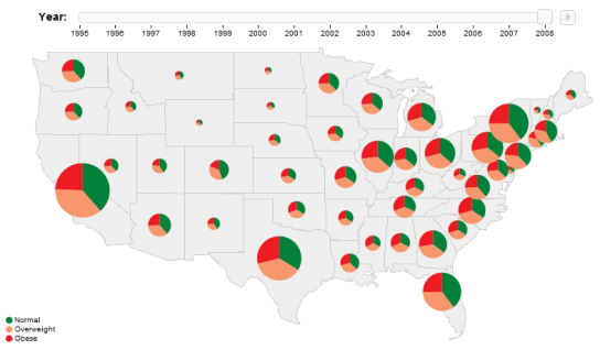
Protovis offers two ways of visualizing spatial data: either on top of existing map tools like OpenLayers, or using their own geo scales. One of their examples is this map with pie charts and a time slider:
Works and looks great!
They also offer a tool inspired by Charles Minard’s depiction of Napleon’s disastrous march to Moscow:
Definitely worth a closer look!

