Archive

Author Archives: underdark

So far, Time Manager has been limited to vector layers. Support for raster layers has been on the wish list for quite a while. I’ve been considering different approaches and for now I have settled with one that keeps the way how raster layers work as close to the workings of vector layers as possible:

All layers have to be loaded before they can be added to Time Manager. The layers are added one-by-one and start and end time values are defined. (This differs from vector layers where start/end attribute are defined instead.) All raster layers that are not within the current time frame are set to 100 % transparency.

I’m not certain yet whether this is a good approach though. I’ll probably keep trying different approaches for a while.

This is a screen cast of the current status:

The plugin source is available on Github, as usual. It’s still going to take a while until there will be a plugin package including this feature.

I’m looking forward to reading your comments here or on Youtube. Do you think this approach is usable?

This is a follow-up to my recent “Natural Earth Quick Start Kit” post in which I presented the great quick start kit provided by the Natural Earth team. The QGIS project file they provide was written in QGIS 1.4 with both old symbology and old labeling:

Original Natural Earth Quickstart map centered on the Mediterranean

Since then a lot has changed. QGIS has a new powerful labeling engine which avoids label collisions and more advanced layer symbology. If that’s not reason enough to switch, it is also worth noting that both old systems will most certainly be removed for QGIS 2.0 release. Luckily, switching is pretty easy:

Switching to new symbology

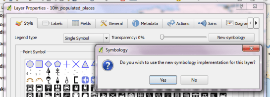
In QGIS 1.7.4, switching to new symbology is very straight forward: Click the “new symbology” button in the upper right corner of the style tab and confirm the popup message. That’s it.

Switching to new labeling

Changing from old to new labeling is less automated. It will help if you take notes about font, size and colors as well as scale ranges before deactivating labeling in layer properties. Enable new labeling from the labeling toolbar and fill in the settings you have written down.

One of the known issues with new labeling is that it is currently not possible to rotate the labels without also specifying the label position. In most projects, this won’t be an issue though.

Updating the Natural Earth project

Besides switching to the new infrastructure, I’ve applied some minor changes to increase readability:

  • Buffers for city labels help where labels overlap with equally black country borders.
  • Buffers for capital symbols (stars) make them stand out over border lines.
  • Suppressed labeling for marine polygons smaller than 10mm avoids clutter.
  • Thinner river line styles with rounded corners make the map look cleaner.
  • A little halo around the land masses looks friendly.

The same map with new labeling and new symbology

I’ve uploaded the new project file version to QGIS Ressources on Github if you want to give it a try.

This year we are celebrating Gerardus Mercator’s 500th birthday. We have all grown very accustomed to his Mercator projection but I want to take the chance to explore some alternatives:

Radical Cartography features an extensive projection reference compiled by Bill Rankin. One of the more exotic projections is “Van der Grinten I” by Alphons J. van der Grinten, 1898. It has a “pleasant balance of shape and scale distortion”. The “boundary is a circle” and “all parallels and meridians are circular arcs (spacing of parallels is arbitrary)”.

Using the name, we can try to find the projection definition on Spatialreference.org. One of the definitions that works well in QGIS is “ESRI:53029 Sphere Van der Grinten I” with the following proj4 string:

+proj=vandg +lon_0=0 +x_0=0 +y_0=0 +R_A +a=6371000 +b=6371000 +units=m +no_defs

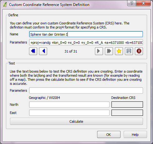
In QGIS Settings – Custom CRS, we can add this projection to the list of available CRS:

  1. Press the “Star” button to add a new empty entry”
  2. Add the Name and proj4 string
  3. Press the “Save” button to make the changes permanent

Custom projection dialog

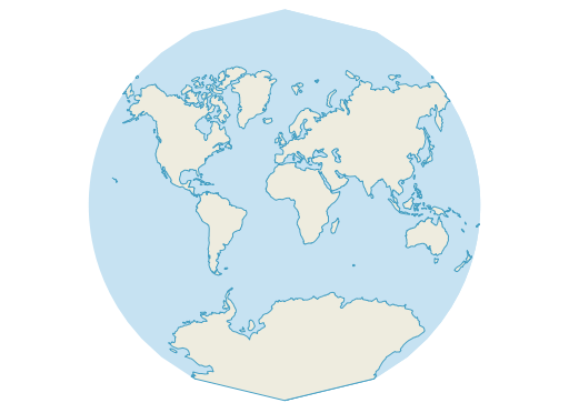
Once this is done, “Van der Grinten I” can be selected for on-the-fly reprojection. I’ve been using NaturalEarth’s land and ocean dataset. The result might not be a perfect circle (due to the coarseness of the dataset) but I find it very appealing:

Van der Grinten projection

Natural Earth is a great resource and you have probably already used it. One of the many nice things about Natural Earth is that it gets you started very quickly:
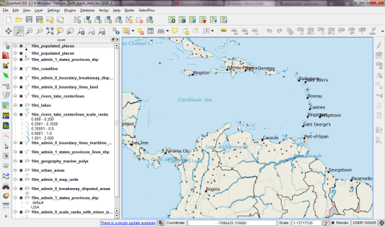
They offer a quick start kit that provides a sample of Natural Earth data as well as a QGIS project file. The project is really well done with appropriate scale-dependent styles and labels for all layers. A screenshot can capture only part of it:

The original Natural Earth Quick Start project

One potential point for improvement is labeling. The project uses old labeling and therefore suffers from label collisions. Changing to new labeling engine results in a clearer picture. (I’ve also added label buffers since both city symbols and labels are black and therefore can get difficult to distinguish.)

Another nice trick is to suppress labels for small features. The minimum size of features to be labeled can be set on the “advanced” tab of the new labeling dialog. In this case, I went with 10 mm to avoid labeling small marine polygons.

Changed to new labeling engine

I haven’t worked through all layers yet, but I am planning to share the updated project file back to the Natural Earth team.

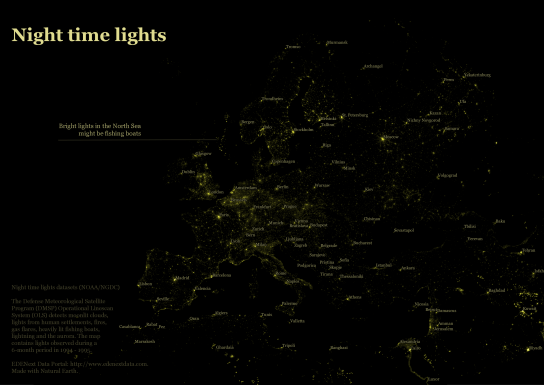
Most maps of night time lights show the land masses lit brightly by city lights. But the oceans are not as dark as these maps suggest. NOAA/NGDC datasets available through edenextdata.com show very bright spots in the North Sea:

Night time lights trace the coast but illuminate the sea too.

The dataset description mentions that the sensors pick up moonlit clouds, lights from human settlements, fires, gas flares, heavily lit fishing boats, lightning and the aurora. So might these spots be fishing boats?

Update: As many comments have pointed out, bright spots in the seas show the locations of oil drilling rigs.

A very common approach for mapping point density is to use heat maps. If you are aiming for a different style, give hexagonal grids a try. The workflow is very simple in QGIS:

  1. Load the point layer
  2. Create a hexagonal grid using MMQGIS – Create Grid Layer
  3. Count points per polygon (Vector menu)

I’ve applied this method to an OGD dataset of the Viennese tree cadastre containing 119,744 tree positions:

Default style: One dot per tree

Rendering tree counts per hexagonal grid cell reveals some of Vienna’s greenest spots, such as the Prater or Türkenschanzpark.

Tree density in a hexagonal grid

There’s also a printable version.

Some notes on the necessary steps:

MMQGIS – Create Grid Layer performs great. Creating the 18,400 hexagons in this map was very fast. Note though, that this tool doesn’t seem to write correct projection information to the resulting Shapefile. Therefore it is necessary to set the projection manually after loading the file.

As a result, it is very likely that the Points in Polygon tool will warn you that the point and polygon layer are not in the same projection. I ignored the warning and everything went fine. This step was reasonably fast considering the number of points (119,744) and polygons (18,400).

The default look of OSM plugin layers is not well-suited for background map usage. It’s too colorful and any overlay just gets lost:

Default look of OSM plugin layers

A good background map has enough detail to allow the reader to orient himself but at the same time must not overwhelm the overlays. For data to be overlaid onto OSM plugin layers, a more neutral style is needed. And this is my first attempt at such a style, containing rules for the polygon and line layers (no point style yet):

Light OSM style applied to polygon and line layer

As before, these styles can be downloaded from my “QGIS-resources” Github repository. They are called osm_light_line.qml and osm_light_polygon.qml and require QGIS trunk. They do not work in QGIS 1.7.x because they contain some new features that are only available in the developer version (aka trunk).

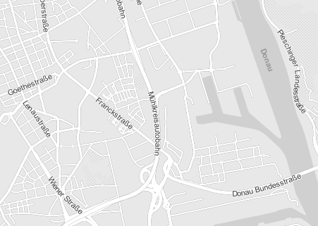
Inspired by the “OSM Bright Minimal” style for Tilemill, I’ve created a similar background map style for osm2po layers in QGIS trunk (uses features unavailable in 1.7.3): osm2po_light_style.qml. Together with a grey background (RGB:232,232,232) and an OSM natural layer (RGB:208,208,208 for water), the style looks like this:

example map using osm2po_light_style.qml

It’s plain and bright, so any overlay will stand out nicely. Hope you find it useful.

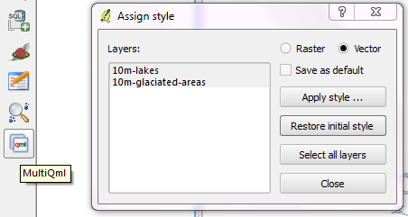
Ever had to apply the same style to multiple map layers? It’s a tedious task … if you don’t have MultiQML plugin by Gislab.

With MultiQML, you can apply a style to multiple raster or vector layers: First, select the layers you want to style (use shift/ctrl to select multiple layers), press “Apply style …” button and select the appropriate QML. That’s it!

MultiQML dialog

The tool even has an “undo” functionality called “Restore initial style”, which will certainly prove useful.

If you want to see MultiQML in action, Gislab provides a video tutorial on their plugin page.

The following Shell script performs a conversion and reprojection of a folder full of Shapefiles to CSVs:

for f in `ls *.shp`; do
ogr2ogr -s_srs EPSG:4326 -t_srs EPSG:3035 -f CSV $f.csv $f -lco GEOMETRY=AS_XYZ
done

Thanks OGR!