Archive

Author Archives: underdark

Twitter streams are curious things, especially the spatial data part. I’ve been using Tweepy to collect tweets from the public timeline and what did I discover? Tweets can have up to three different spatial references: “coordinates”, “geo” and “place”. I’ll still have to do some more reading on how to interpret these different attributes.

For now, I have been using “coordinates” to explore the contents of a stream which was collected over a period of five hours using

stream.filter(follow=None,locations=(-180,-90,180,90))

for global coverage. In the video, each georeferenced tweet produces a new dot on the map and if the user’s coordinates change, a blue arrow is drawn:

While pretty, these long blue arrows seem rather suspicious. I’ve only been monitoring the stream for around five hours. Any cross-Atlantic would take longer than that. I’m either misinterpreting the tweets or these coordinates are fake. Seems like it is time to dive deeper into the data.

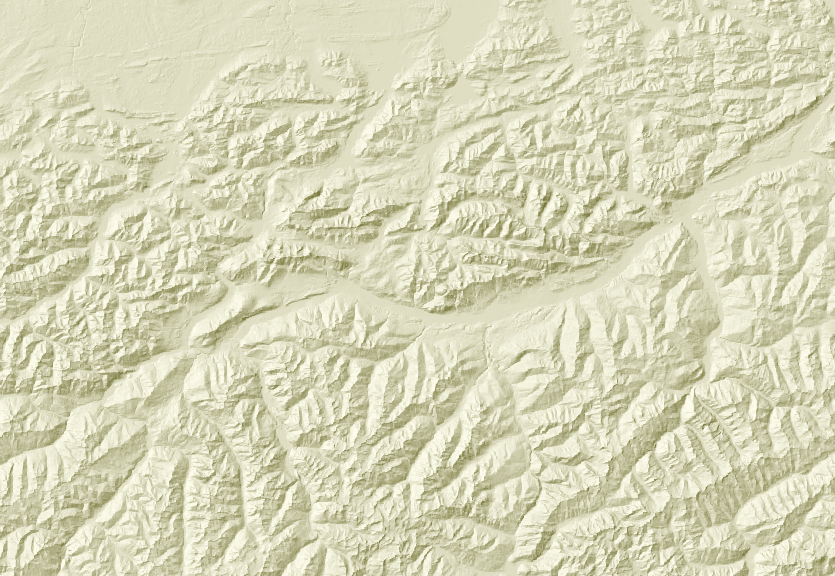
Corine Land Cover is a European program to create a land cover inventory of Europe. The data is freely available and a valuable input for many analyses. In this post, we’ll be using it to create a physical map.

For the background, reused the hillshade presented in “Mapping Open Data With Open GIS”

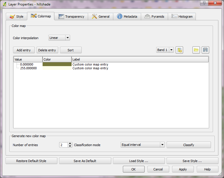
Instead of the standard grayscale, I defined a sand-colored colormap that looks warmer and more natural:

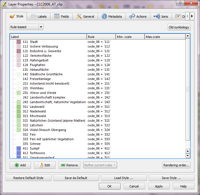
On top of this hillshade, I put the Corine land cover layer. Instead of the official, rather bright colors I selected a more neutral color palette and varying transparency values: Water areas are drawn with no transparency while forests are set to 50 % and built-up areas to up to 80 % transparency. I also skipped classes such as “bare rock” by setting them to be totally transparent:

On top of the land cover, I added a river dataset and styled it with the same color used for water surfaces in the Corine layer. Obviously, this is an optional step. Big rivers are visible within the land cover data too.

After adding a mask and labels, the map is ready to add the finishing touches in Print Composer: Title, explanatory text and a scale bar. I decided against adding a legend to this particular map since I hope that the color choices are intuitive enough.

If you want to create your own physical map, you can use Corine Land Cover for European regions or the National Vegetation Classification in the U.S.

Here’s a rainbow gradient for use with QGIS “Categorized” or “Graduated” vector renderer:

<!DOCTYPE qgis_style>
<qgis_style version="0">
  <symbols/>
  <colorramps>
    <colorramp type="gradient" name="rainbow">
      <prop k="color1" v="250,8,8,255"/>
      <prop k="color2" v="92,11,122,255"/>
      <prop k="stops" v="0.3;237,244,25,255:0.5;46,155,45,255:0.66;29,18,122,255:0.82;152,6,130,255"/>
    </colorramp>
  </colorramps>
</qgis_style>

(Save as .xml and import using QGIS Style Manager.)

I’ll put it on my QGIS Resources Github repository too. Soon.

After playing around with some twitter data for animation purposes (in Time Manager), I’m now looking into movement patterns. Series of successive georeferenced tweets can be connected to get an idea of how people move within a city as well as between cities and continents.

Currently, I’m still working on the basics of collecting relevant data. A first proof of concept can be seen in this map which contains locations of a handful of users in the greater Viennese area:

Each user is represented by a differently colored line.

Updates and code samples will follow.

This post explores some cartographic features of QGIS while mapping the river network of Tirol, Austria. All data used is freely available.

For the background, I downloaded NASA SRTM elevation data from CGIAR-CSI and created a hillshade using Terrain Analysis tools in QGIS 1.8.

To emphasize both state borders and the fact that Tirol consists of two separate areas, I created a mask using the Difference tool and styled it a transparent white.

The river network is too dense to label all rivers on an A4 map. Expression-based labels make it possible to only label selected features. For this dataset, the expression limits labeling to features with certain values of GEW_WRRL attribute:

CASE WHEN (GEW_WRRL = '10.000 km2 Fluss' OR "GEW_WRRL"= '4.000 km2 Fluss' OR "GEW_WRRL"='1.000 km2 Fluss') AND length("GEW_NAME_A") < 10 THEN "GEW_NAME_A" END

Labels of neighboring areas together with map title, descriptions and scale bar were added in Print Composer.

Working with Print Composer, it is useful to know that you can use Copy&Paste to duplicate map components and right-click to lock them from being moved. Also, every new component by default comes with a black outline and white background which can (and should) be disabled/changed in “General options”.

This is the final QGIS Print Composer output – without any further post-processing in Inkscape or Gimp:

The upcoming 1.8 release contains many new features for handling layer styles.

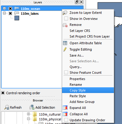
Copy-paste Styles

Very handy new entries in the layer list context menu: “Copy Style” and “Paste Style” make copying layer styles really fast. You don’t even have to open layer properties anymore.

SLD Support

Besides the classic QML layer style files, QGIS 1.8 supports the SLD standard. SLDs can be exported from and imported into new symbology.

One thing worth to note: SLDs can be exported from any type of renderer: single symbol, categorized, graduated or rule-based, but when importing an SLD, either a single symbol or rule-based renderer is created.

That means that categorized or graduated styles are converted to rule-based. If you want to preserve those renderers, you have to stick to the QML format. On the other hand, it could be very handy sometimes to have this easy way of converting styles to rule-based.

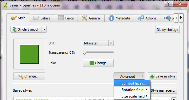
Symbol Levels

If you are looking for the “Symbol level” settings, they have been moved to the “Advanced” button:

Rule-based Renderer

The rule-based renderer GUI got a major face-lift. Just compare the 1.7 version

Rule-based renderer GUI in 1.7

to the new clean 1.8 version:

Rule-based renderer in 1.8

Grouping of styles has been overhauled too: Using drag-and-drop, layers can be arranged into groups in a more flexible manner than previously possible.

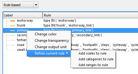
There is also a new context menu which enables workflows such as changing the transparency of multiple symbols at once:

Symbol levels for the rule-based renderer can now be accessed via “Rendering order”.

It’s obvious that a lot of work has been put into style handling since the 1.7 release and these improvements are just a small fraction of what’s been done to get closer to the big goal: releasing 2.0.

Today’s post is a short note-to-self.

This script lists available fonts and renders a small preview using Tkinter and pyprocessing.

from pyprocessing import *
import Tkinter
import tkFont

t = Tkinter.Toplevel() # without root window the following line fails
fonts = tkFont.families()
t.destroy()

size(1500,900)
fill(0)
rect(0,0,1500,900)
fill(255)

fontsize=14
lineheight=fontsize*1.2
y=lineheight
x=0

for font_name in fonts:
    print font_name
    font = createFont(font_name, fontsize)
    textFont(font)
    text("Hello world!   ("+font_name+")", x,y,1000,66)
    y+=lineheight
    if y >= 900:
        x+=500
        y=lineheight

run()

On the TODO list:

  • Find out how to turn these fonts bold or italics.

Waiting time is over, Gimp 2.8 is finally here. That is reason enough to take it for a quick test run!

How about a new look for the QGIS user map?

This “glowing hot” map was made using the Gimp filter of the same name:

For the user point layer, I selected a simple point style with high transparency and separately exported land and user points from print composer.

user points as exported from QGIS

In Gimp, I applied the “glowing hot” filter to the user points and combined the layers. The trick here is to first use “Color to alpha” on the user point layer and turn black to transparent. This way, the “glowing hot” filter will only be applied to the remaining points.

Gimp 2.8 RC1 is close enough to the previous version to get comfortable fast. I like the single-window mode even if it’s hard to tell which part of the GUI has the focus sometimes.

Open source GIS and image editing for a perfect work flow.

This is just a quick “note to self” on some interesting information I picked up from the QGIS mailing list today. Kudos to David J. Bakeman for sharing this:

If both the input and the output arguments to ogr2ogr are directories then it will clip all of the shapes in the source directory and write them to the output directory.

So: ogr2ogr -clipsrc mask.shp output source

Shapefiles are the default so you don’t even need the -f “ESRI Shapefile”.

Today’s hot topic on the mailing list was a recently added feature which enables QGIS to load data directly from ZIP archives.

To get the contents of a ZIP archive display in the browser dock, it is necessary to activate this feature in the Options dialog. The setting is called “Scan for contents of compressed files (.zip) in browser dock” and is located right at the bottom of the first tab. Both “basic scan” and “full scan” settings seem to work fine:

Settings – Options

In the file browser panel, archives are now listed like any other folder and their content can be added to the map through both double click and drag and drop.

This can help save tons of disk space: The NaturalEarthData.zip in this example is 280 MB big while the unzipped folders take more than 700 MB.