Archive

Author Archives: underdark

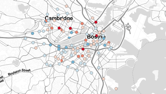
Today, I’ve been working on some station statistics. From the trip data, I calculated incoming and outgoing trips per station as well as the station’s first day of operations. Combining this information makes it possible to calculate the average day’s “bike balance”. A balanced station has the same number of incoming and outgoing trips while an unbalanced station will either run out of bikes or empty slots for returns.

I’ve published the resulting station map on QGIS Cloud (http://qgiscloud.com/anitagraser/hubway_cloud1) where you can have a look at the bike balance values.

Additionally, I’ve created a mashup in Leaflet pulling together background tiles from Stamen and the cloud-hosted WMS for better orientation:

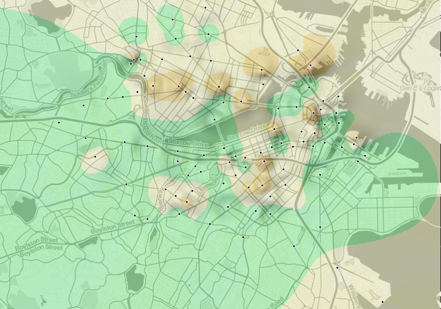
Today, I’ve been experimenting with a new way to visualize origin-destination pairs (ODs). The following image shows my first results:

The ideas was to add a notion of direction as well as uncertainty. The “flower petals” have a pointed origin and grow wider towards the middle. (Looking at the final result, they should probably go much narrower towards the end again.) The area covered by the petals is a simple approximation of where I’d expect the bike routes without performing any routing.

To get there, I reprojected the connection lines to EPSG:3857 and calculated connection length and line orientation using QGIS Field Calculator $length operator and the bearing formula given in QGIS Wiki:

(atan((xat(-1)-xat(0))/(yat(-1)-yat(0)))) * 180/3.14159 + (180 *(((yat(-1)-yat(0)) < 0) + (((xat(-1)-xat(0)) < 0 AND (yat(-1) - yat(0)) >0)*2)))

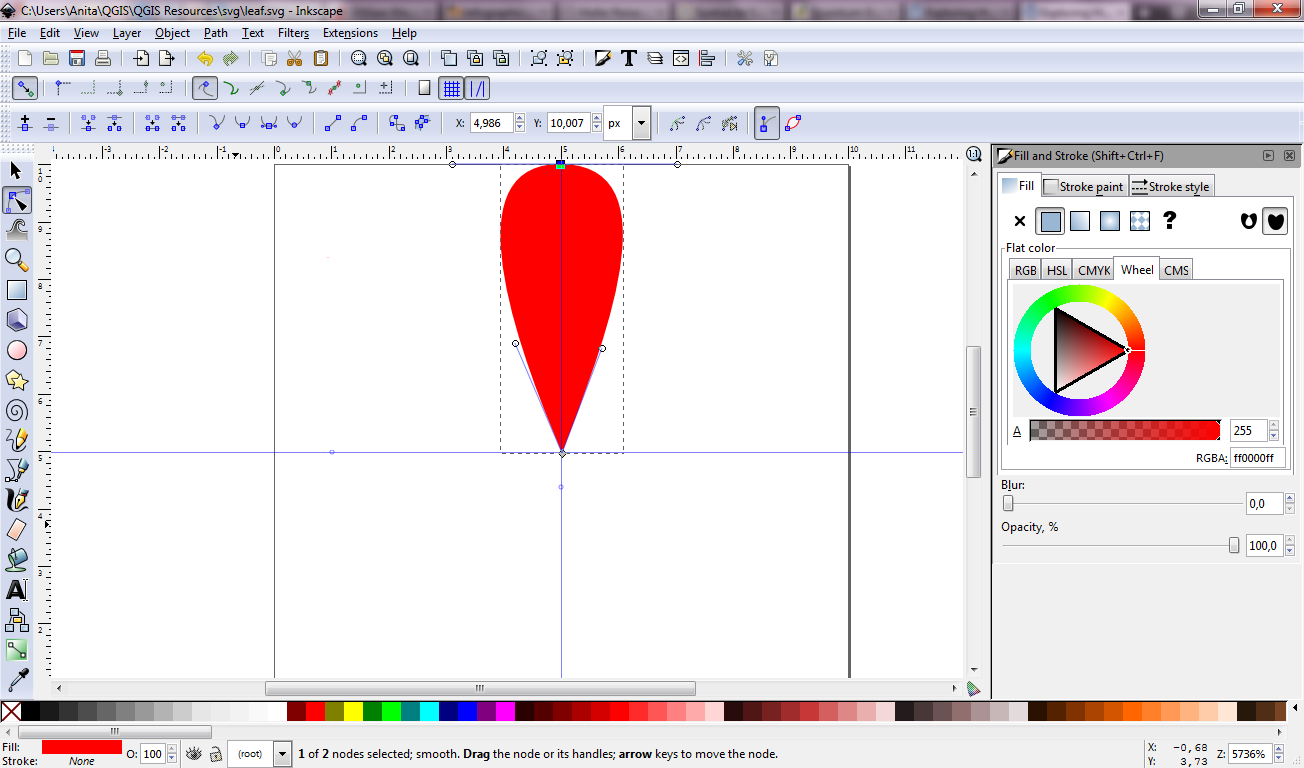
For the style, I created a new “flower petal” SVG symbol in Inkscape and styled it with varying transparency values: Rare connections are more transparent than popular ones. This style is applied to the connection start points. Using the advanced options “size scale” and “rotation”, it is possible to rotate the petals into the right direction as well as scale them using the previously calculated values for connection length and orientation.

Update

While the above example uses pretty wide petals this one is done with a much narrower petal. I think it’s more appropriate for the data at hand:

Most of the connections are clearly heading south east, across Charles River, except for that group of connections pointing the opposite direction, to Harvard Square.

Hubway is a bike sharing system in Boston and they are currently hosting a data visualization challenge. What a great chance to play with some real-world data!

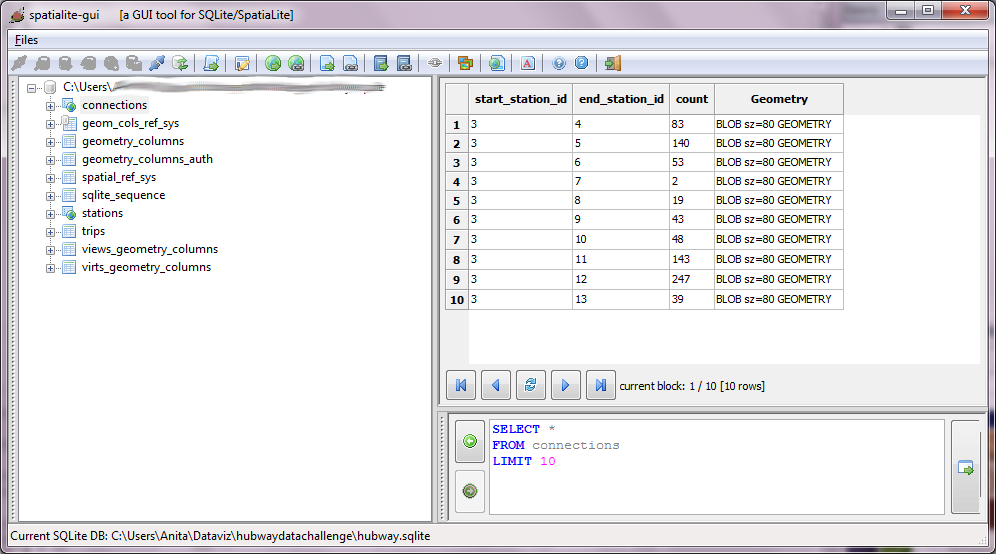
To get started, I loaded both station Shapefile and trip CSV into a new Spatialite database. The GUI is really helpful here – everything is done in a few clicks. Afterwards, I decided to look into which station combinations are most popular. The following SQL script creates my connections table:

create table connections (
start_station_id INTEGER,
end_station_id INTEGER,
count INTEGER,
Geometry GEOMETRY);


insert into connections select 
start_station_id, 
end_station_id, 
count(*) as count, 
LineFromText('LINESTRING('||X(a.Geometry)||' '||Y(a.Geometry)||','
                          ||X(b.Geometry)||' '||Y(b.Geometry)||')') as Geometry
 from trips, stations a, stations b
where start_station_id = a.ID 
and end_station_id = b.ID
and a.ID != b.ID
and a.ID is not NULL
and b.ID is not NULL
group by start_station_id, end_station_id;

(Note: This is for Spatialite 2.4, so there is no MakeLine() method. Use MakeLine if you are using 3.0.)

For a first impression, I decided to map popular connections with more than one hundred entries. Wider lines mean more entries. The points show the station locations and they are color coded by starting letter. (I’m not yet sure if they mean anything. They seem to form groups.)
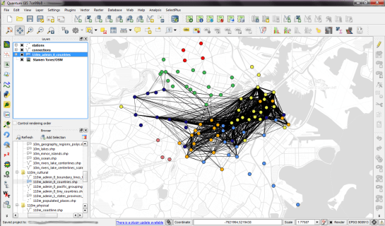
Some of the stations don’t seem to have any strong connections at all. Others are rather busy. The city center and the dark blue axis pointing west seem most popular.

I’m really looking forward to what everyone else will be finding in this dataset.

This is an update to my previous post “WFS to PostGIS in 3 Steps”. Thanks to Even Rouault’s comments and improvements to GDAL, it is now possible to load Latin1-encoded WFS (like the one by data.wien.gv.at) into PostGIS in just one simple step.

To use the following instructions, you’ll have to get the latest GDAL (release-1600-gdal-mapserver.zip)

You only need to run SDKShell.bat to set up the environment and ogr2ogr is ready for action:

C:\Users\Anita>cd C:\release-1600-gdal-mapserver
C:\release-1600-gdal-mapserver>SDKShell.bat
C:\release-1600-gdal-mapserver>ogr2ogr -overwrite -f PostgreSQL PG:"user=myuser password=mypassword dbname=wien_ogd" "WFS:http://data.wien.gv.at/daten/geoserver/ows?service=WFS&request=GetFeature&version=1.1.0&typeName=ogdwien:BEZIRKSGRENZEOGD&srsName=EPSG:4326"

Thanks everyone for your comments and help!

This is a quick note on how to download features from a WFS and import them into a PostGIS database. The first line downloads a zipped Shapefile from the WFS. The second one unzips it and the last one loads the data into my existing “gis_experimental” database:

wget "http://data.wien.gv.at/daten/geoserver/ows?service=WFS&request=GetFeature&version=1.1.0&typeName=ogdwien:BEZIRKSGRENZEOGD&srsName=EPSG:4326&outputFormat=shape-zip" -O BEZIRKSGRENZEOGD.zip
unzip -d /tmp BEZIRKSGRENZEOGD.zip
shp2pgsql -s 4326 -I -S -c -W Latin1 "/tmp/BEZIRKSGRENZEOGD.shp" | psql gis_experimental

Now, I’d just need a loop through the WFS Capabilities to automatically fetch all offered layers … Ideas anyone?

Thanks to Tim for his post “Batch importing shapefiles into PostGIS” which was very useful here.

Update: Many readers have pointed out that ogr2ogr is a great tool for this kind of use cases and can do the above in one line. That’s true – if it works. Unfortunately, it is picky about the supported encodings, e.g. doesn’t want to parse ISO-8859-15. In such cases, the three code lines above can be a good alternative.

Today’s post is a note-to-self on how to set up a really quick little Leaflet web map with Stamen’s “Toner” background and a WMS overlay served by QGIS Server.

Note the use of the map parameter when creating the QGIS Server WMS layer.

<!DOCTYPE html PUBLIC "-//W3C//DTD XHTML 1.0 Strict//EN" "http://www.w3.org/TR/xhtml1/DTD/xhtml1-strict.dtd">
<html xmlns="http://www.w3.org/1999/xhtml" xml:lang="en" lang="en">
<head>

<meta http-equiv="content-type" content="text/html; charset=utf-8" />
<meta http-equiv="content-language" content="en" />

<title>Leaflet, Stamen Toner and QGIS Server</title>

<link rel="stylesheet" href="http://leaflet.cloudmade.com/dist/leaflet.css" />
<link rel="stylesheet" href="my.css" type="text/css" />
 <!--[if lte IE 8]><link rel="stylesheet" href="http://leaflet.cloudmade.com/dist/leaflet.ie.css" /><![endif]-->

<script type="text/javascript" src="http://leaflet.cloudmade.com/dist/leaflet.js"></script>
<script type="text/javascript" src="http://maps.stamen.com/js/tile.stamen.js?v1.1.3"></script>
<script type="text/javascript">
function initialize() {
	var stamen = new L.StamenTileLayer("toner-lite");
	
	var myLayer = new L.TileLayer.WMS("http://10.101.21.28/cgi-bin/qgis_mapserv.fcgi", {
		map: "/usr/lib/cgi-bin/test/test.qgs",
		layers: 'mylayer',
		format: 'image/png',
		transparent: 'TRUE',
	});
	
	var map = new L.Map("map", {
		center: new L.LatLng(48.2,16.4),
		zoom: 13,
 		minZoom: 10,
 		maxZoom: 18,
		layers: [stamen,myLayer],
	});
}
</script>

</head>

<body onload="initialize()">
    <div id="map" class="map"></div>
</body>

</html>

With this my.css, the map will be displayed in “full screen”.

  div.map{
    display:block;
    position:absolute;
    top:0;
    left:0;
    width:100%;
    height:100%;
  }

Update

You can test an extended live example at http://anitagraser.github.com/Webmapping-Sandbox/leaflet.html

Data from various vehicles is collected for many purposes in cities worldwide. To get a feeling for just how much data is available, I created the following video using QGIS Time Manager which has been shown at the Austrian Museum of Applied Arts “MADE 4 YOU – Design for Change”. It shows one hour of taxi tracks in the city of Vienna:

If you like the video, please go to http://www.ertico.com/2012-its-video-competition-open-vote and vote for it in the category “Videos directed at the general public”.

  1. Since the release of QGIS 1.8, Plugin Installer no longer includes the “add 3rd party repositories” button. This was an intentional design choice!
  2. The new official plugin repository at plugins.qgis.org keeps everything in one place making it easier for users to find documentation and report issues. It will also provide many long-wanted features such as a rating system for plugins. You can already sort by number of downloads to discover the most popular plugins.
  3. Last but not least: New users will not be able to discover your plugin if it is not in the repository.

Go ahead to plugins.qgis.org and upload your plugin now!

Yesterday, Martin Dobias announced that Arun’s GSoC work on QGIS symbology has been merged into the developer version. So let’s have a look at todays nightly-build!

I’ll step through the features mentioned in the announcement to see how they look and work:

1. Style manager has been greatly improved: grouping of symbols, tagging, “smart” groups (showing only symbols matching some criteria), search

On opening new Style Manager, we can already see that it has changed considerably: There are groups on the left, tags at the bottom and a search field in the upper right corner.

new Style Manager

New groups are created with the “+” button and styles can be added using the context menu:

adding a style to a group

2. Symbol selector and properties dialogs have been integrated to just one dialog, improving the usability a lot

Instead of opening tons of nested windows, complex styles can now be easily edited using the symbol layer tree on the left:

new Properties window

3. Style database is now stored in a SQLite database rather than an XML file for better scalability. You can import all your saved symbols and color ramps from ~/.qgis/symbology-ng-style.xml – from now they will be stored in ~/.qgis/symbology-ng-style.db.

Importing through Style Manager works like a charm. All styles will be imported into the given group.

importing previous style.xml

4. Style import improvements: load style directly from given URL, saving imported symbols into a group

Instead of giving a path to a style XML, it’s also possible to specify a URL. That’s a great step towards shared symbol libraries!

5. SVG fill: shows directories for easier traversal through the SVG directories

Definitely a plus! It’s now much easier to work with big SVG symbol collections.

What a great result of this year’s Google Summer of Code for QGIS. Give these new features a try! I already fell in love with them.

This post continues my quest of exploring the spatial dimension of Twitter streams. I wanted to try one of the classic spatio-temporal visualization methods: Space-time cubes where the vertical axis represents time while the other two map space. Like the two previous examples, this visualization is written in pyprocessing, a Python port of the popular processing environment.

This space-time cube shows twitter trajectories that contain at least one tweet in New York Times Square. The 24-hour day starts at the bottom of the cube and continues to the top. Trajectories are colored based on the time stamp of their start tweet.

Additionally, all trajectories are also drawn in context of the coastline (data: OpenStreetMap) on the bottom of the cube.

While there doesn’t seem to be much going on in the early morning hours, we can see quite a busy coming and going during the afternoon and evening. From the bunch of vertical lines over Times Square, we can also assume that some of our tweet authors spent a considerable time at and near Times Square.

I’ve also created an animated version. Again, I recommend to watch it in HD.