Exploring Hubway’s Data I
Hubway is a bike sharing system in Boston and they are currently hosting a data visualization challenge. What a great chance to play with some real-world data!
To get started, I loaded both station Shapefile and trip CSV into a new Spatialite database. The GUI is really helpful here – everything is done in a few clicks. Afterwards, I decided to look into which station combinations are most popular. The following SQL script creates my connections table:
create table connections (
start_station_id INTEGER,
end_station_id INTEGER,
count INTEGER,
Geometry GEOMETRY);


insert into connections select
start_station_id,
end_station_id,
count(*) as count,
LineFromText('LINESTRING('||X(a.Geometry)||' '||Y(a.Geometry)||','
                          ||X(b.Geometry)||' '||Y(b.Geometry)||')') as Geometry
 from trips, stations a, stations b
where start_station_id = a.ID
and end_station_id = b.ID
and a.ID != b.ID
and a.ID is not NULL
and b.ID is not NULL
group by start_station_id, end_station_id;
(Note: This is for Spatialite 2.4, so there is no MakeLine() method. Use MakeLine if you are using 3.0.)
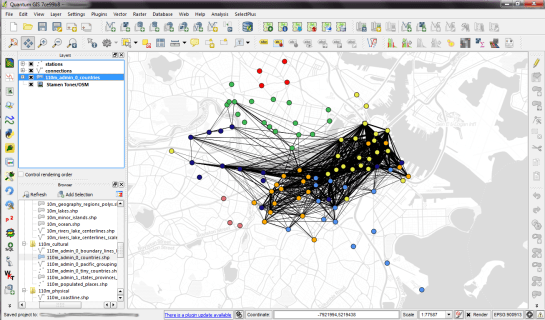
For a first impression, I decided to map popular connections with more than one hundred entries. Wider lines mean more entries. The points show the station locations and they are color coded by starting letter. (I’m not yet sure if they mean anything. They seem to form groups.)
Some of the stations don’t seem to have any strong connections at all. Others are rather busy. The city center and the dark blue axis pointing west seem most popular.
I’m really looking forward to what everyone else will be finding in this dataset.


I did comparable research recently on crime data for a dutch police departement and came up with a map that looks a lot like yours, but even busier…
In general I discovered that the average arrest is made approx. 3 kilometers from the scene of a crime. But because of the line-spaghetti it was really hard to draw other conclusions. I was hoping the map would give me insight on flee-routes and flee-directions.
I am looking forward to what others say about the opportunities for these kind of maps and if there are even more usable alternatives.
Thanks for your comment Milo! You’re right, mapping origin-destination data can be very tricky. Simple straight connections like shown above turn unusable very quickly.
Hi Anita,
One thing to bear in mind is that the Hubway network is in a state of expansion. For example, the green and red dots, which correspond to Cambridge and Somerville, were added in August and September 2012. So simply using the number of trips to measure the popularity of a route won’t work; you’ll probably need to get data about the date stations opened, and perhaps make allowances for the amount of time it takes people to get used to the new stations
(I live one minute’s walk from the southernmost red point on that map, and I can attest that it was added to the network in mid-August of this year, 2012 … but the data goes back to 2011, when Hubway was only available in Boston proper.)
Thanks Richard! That’s very valuable information indeed.
If you are also working with this dataset, I’d love to see your take on it.
Can I apply to OD (origin-destination)Matrix di urban transportation ?
Yes, that should be possible.
Hi Anita. Could explain how to do it ? If the trip person by car based district.
I’m afraid this topic is out of scope of the comments section here. Please use http://gis.stackexchange.com to ask such questions and include a detailed description of the data you want to use. Currently, I cannot answer because I don’t know your data.
Hi, Anita
If I have 4 zonal trip Matrix >> A, B, C and D. Trip from zonal A to : B (123 trip), C (334 trip), D (445 trip). From zonal B to : zonal A (665 trip), C (345 trip), D (776 trip). From zonal C to : zonal A (332 trip), B (112 trip) D (331 trip). From zonal D to : A (221 trip), B (100 trip), C (56 trip). How to make OD Matrix Map to visualization data ?
Thanks
Dear Anita,
these are beautiful maps and the description of the howto is so pedagogic! congratulations
My question is the following: is this easily replicated with MySQL? I mean simply use MySQL instead of PostGIS and type the equivalent query that would produce a table that would visualise in QGIS?
thanks for your help
Alain
I doubt MySQL would understand the SpatiaLite syntax given above. Try SpatiaLite! It’s even simpler than MySQL.
in fact I found the way: add a column of LINESTRING in my table, populate it with Well-Known Text coordinates of the lines and just open it in QGIS: it is magic when it shows all the lines in the GIS!
thanks for your reply anyway,
Alain
Glad to hear that you found a solution! Best wishes