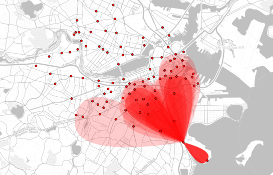
Today, I’ve been experimenting with a new way to visualize origin-destination pairs (ODs). The following image shows my first results:
The ideas was to add a notion of direction as well as uncertainty. The “flower petals” have a pointed origin and grow wider towards the middle. (Looking at the final result, they should probably go much narrower towards the end again.) The area covered by the petals is a simple approximation of where I’d expect the bike routes without performing any routing.
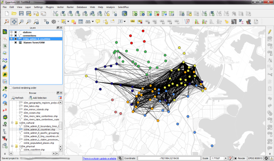
To get there, I reprojected the connection lines to EPSG:3857 and calculated connection length and line orientation using QGIS Field Calculator $length operator and the bearing formula given in QGIS Wiki:
(atan((xat(-1)-xat(0))/(yat(-1)-yat(0)))) * 180/3.14159 + (180 *(((yat(-1)-yat(0)) < 0) + (((xat(-1)-xat(0)) < 0 AND (yat(-1) - yat(0)) >0)*2)))
For the style, I created a new “flower petal” SVG symbol in Inkscape and styled it with varying transparency values: Rare connections are more transparent than popular ones. This style is applied to the connection start points. Using the advanced options “size scale” and “rotation”, it is possible to rotate the petals into the right direction as well as scale them using the previously calculated values for connection length and orientation.
Update
While the above example uses pretty wide petals this one is done with a much narrower petal. I think it’s more appropriate for the data at hand:
Most of the connections are clearly heading south east, across Charles River, except for that group of connections pointing the opposite direction, to Harvard Square.


