Archive

OpenGovermentData

Wrong navigation instructions can be annoying and sometimes even dangerous, but they happen. No dataset is free of errors. That’s why it’s important to assess the quality of datasets. One specific use case I previously presented at FOSS4G 2013 is the quality assessment of turn restrictions in OSM, which influence vehicle routing results.

The main idea is to compare OSM to another data source. For this example, I used turn restriction data from the City of Toronto. Of the more than 70,000 features in this dataset, I extracted a sample of about 500 turn restrictions around Ryerson University, which I had the pleasure of visiting in 2014.

As you can see from the following screenshot, OSM and the city’s dataset agree on 420 of 504 restrictions (83%), while 36 cases (7%) are in clear disagreement. The remaining cases require further visual inspection.

toronto_turns_overview

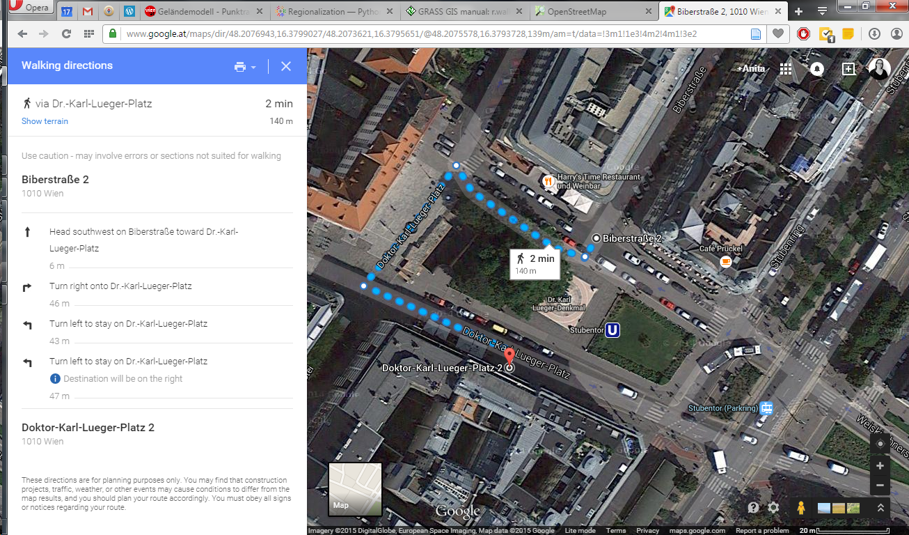
The following two examples show one case where the turn restriction is modelled in both datasets (on the left) and one case where OSM does not agree with the city data (on the right).
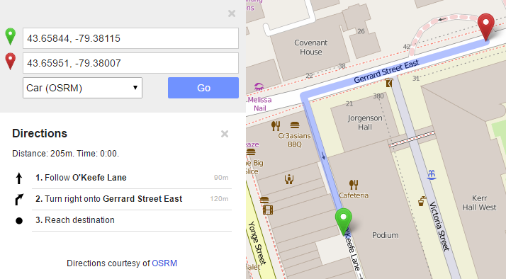
In the first case, the turn restriction (short green arrow) tells us that cars are not allowed to turn right at this location. An OSM-based router (here I used OpenRouteService.org) therefore finds a route (blue dashed arrow) which avoids the forbidden turn. In the second case, the router does not avoid the forbidden turn. We have to conclude that one of the two datasets is wrong.

If you want to learn more about the methodology, please check Graser, A., Straub, M., & Dragaschnig, M. (2014). Towards an open source analysis toolbox for street network comparison: indicators, tools and results of a comparison of OSM and the official Austrian reference graph. Transactions in GIS, 18(4), 510-526. doi:10.1111/tgis.12061.

Interestingly, the disagreement in the second example has been fixed by a recent edit (only 14 hours ago). We can see this in the OSM way history, which reveals that the line direction has been switched, but this change hasn’t made it into the routing databases yet:

This leads to the funny situation that the oneway is correctly displayed on the map but seemingly ignored by the routers:

toronto_okeefe_osrm

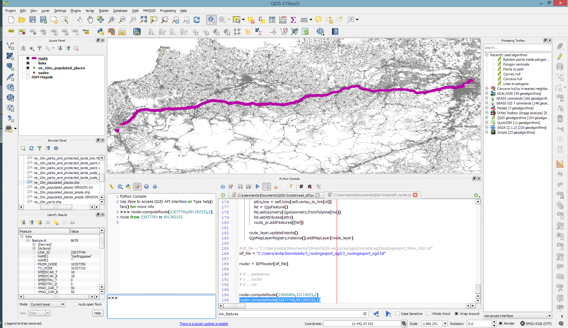
To evaluate the results of the automatic analysis, I wrote a QGIS script, which allows me to step through the results and visually compare turn restrictions and routing results. It provides a function called next() which updates a project variable called myvar. This project variable controls which features (i.e. turn restriction and associated route) are rendered. Finally, the script zooms to the route feature:

def next():
    f = features.next()
    id = f['TURN_ID']
    print "Going to %s" % (id)
    QgsExpressionContextUtils.setProjectVariable('myvar',id)
    iface.mapCanvas().zoomToFeatureExtent(f.geometry().boundingBox())
    if iface.mapCanvas().scale() < 500:
        iface.mapCanvas().zoomScale(500)

layer = iface.activeLayer()
features = layer.getFeatures()
next()

You can see it in action here:

I’d love to see this as an interactive web map where users can have a look at all results, compare with other routing services – or ideally the real world – and finally fix OSM where necessary.

This work has been in the making for a while. I’d like to thank the team of OpenRouteService.org who’s routing service I used (and who recently added support for North America) as well as my colleagues at Ryerson University in Toronto, who pointed me towards Toronto’s open data.

CKAN is for data portals what QGIS is for GIS. The project describes itself as

CKAN is a powerful data management system that makes data accessible – by providing tools to streamline publishing, sharing, finding and using data. CKAN is aimed at data publishers wanting to make their data open and available.

Many open (government) data platforms rely on CKAN and while the web interface is pretty good, there’s still the hassle of finding and downloading the data using a web browser.

This is where the QGIS CKAN-Browser plugin comes in useful. The plugin has been developed by BergWerkGIS for the state of Carinthia, Austria and added to the public plugin repo earlier this year. CKAN-Browser comes preconfigured with some Austrian and European CKAN URLs for testing, so you can get going really quickly. It is easy to search for specific datasets or explore the portal’s data categories and it is just one click to download and load the data into your QGIS map:

Screenshot 2016-06-26 22.25.00

Here’s a quick demo of loading a vector dataset as well as raster tiles:

For the full usage guide, visit the plugin’s Github page.

It’s great to see how well CKAN and QGIS can play together to enable seamless access to open data!

The upcoming 2.14 release of QGIS features a new renderer. For the first time in QGIS history, it will be possible to render 2.5D objects directly in the map window. This feature is the result of a successful crowd funding campaign organized by Matthias Kuhn last year.

In this post, I’ll showcase this new renderer and compare the achievable results to output from the Qgis2threejs plugin.

For this post, I’m using building parts data from the city of Vienna, which is publicly available through their data viewer:

This dataset is a pretty detailed building model, where each building is made up of multiple features that represent parts of the building with different height. Of course, if we just load the dataset in default style, we cannot really appreciate the data:

Loaded building parts layer

Loaded building parts layer

All this changes if we use the new 2.5D renderer. With just a few basic settings, we can create 2.5D representations of the building parts:

QGIS 2.5D renderer settings

QGIS 2.5D renderer settings

Compare the results to aerial images in Google Maps …

QGIS 2.5D renderer and view in Google Maps

QGIS 2.5D renderer and view in Google Maps

… not bad at all!

Except for a few glitches concerning the small towers at the corners of the building, and some situations where it seems like the wrong building part is drawn in the front, the 2.5D look is quite impressive.

Now, how does this compare to Qgis2threejs, one of the popular plugins which uses web technologies to render 3D content?

One obvious disadvantage of Qgis2threejs is that we cannot define a dedicated roof color. Thus the whole block is drawn in the same color.

On the other hand, Qgis2threejs does not suffer from the rendering order issues that we observe in the QGIS 2.5D renderer and the small towers in the building corners are correctly displayed as well:

QGIS 2.5D renderer and QGIS2threejs output

QGIS 2.5D renderer and Qgis2threejs output

Overall, the 2.5D renderer is a really fun and exciting new feature. Besides the obvious building usecase, I’m sure we will see a lot of thematic maps making use of this as well.

Give it a try!

In the next post, I’m planning a more in-depth look into how the 2.5D renderer works. Here’s a small teaser of what’s possible if you are not afraid to get your hands dirty:

Monday, January 4th 2016, was the open data release date of the official Austrian street network dataset called GIP.at. As far as I know, the dataset is not totally complete yet but it should be in the upcoming months. I’ve blogged about GIP.at before in Open source IDF parser for QGIS and Open source IDF router for QGIS where I was implementing tools based on the data samples that were available then. Naturally, I was very curious if my parser and particularly the router could handle the whole country release …

Some code tweaking, patience for loading, and 9GB of RAM later, QGIS happily routes through Austria, for example from my work place to Salzburg – maybe for some skiing:

Screenshot 2016-01-06 17.11.27

The routing request itself takes something between 1 and 2 seconds. (I should still add a timer to it.)

So far, I’ve implemented shortest distance routing for pedestrians, bikes, and cars. Since the data also contains travel speeds, it should be quite straight-forward to also add shortest travel time routing.

The code is available on Github for you to try. I’d appreciate any feedback!

IDF is the data format used by Austrian authorities to publish the official open government street graph. It’s basically a text file describing network nodes, links, and permissions for different modes of transport.

Since, to my knowledge, there hasn’t been any open source IDF parser available so far, I’ve started to write my own using PyQGIS. You can find the script which is meant to be run in the QGIS Python console in my Github QGIS-resources repo.

I haven’t implemented all details yet but it successfully parses nodes and links from the two example IDF files that have been published so far as can be seen in the following screenshot which shows the Klagenfurt example data:

Screenshot 2015-07-23 16.23.25

If you are interested in advancing this project, just get in touch here or on Github.

A few weeks ago, the city of Vienna released a great dataset: the so-called “Flächen-Mehrzweckkarte” (FMZK) is a polygon vector layer with an amazing level of detail which contains roads, buildings, sidewalk, parking lots and much more detail:

preview of the Flächen-Mehrzweckkarte

preview of the Flächen-Mehrzweckkarte

Now, of course we can use this dataset to create gorgeous maps but wouldn’t it be great to use it for analysis? One thing that has been bugging me for a while is routing for pedestrians and how it’s still pretty bad in many situations. For example, if I’d be looking for a route from the northern to the southern side of the square in the previous screenshot, the suggestions would look something like this:

Pedestrian routing in Google Maps

Pedestrian routing in Google Maps

… Great! Google wants me to walk around it …

Pedestrian routing on openstreetmap.org

Pedestrian routing on openstreetmap.org

… Openstreetmap too – but on the other side :P

Wouldn’t it be nice if we could just cross the square? There’s no reason not to. The routing graphs of OSM and Google just don’t contain a connection. Polygon datasets like the FMZK could be a solution to the issue of routing pedestrians over squares. Here’s my first attempt using GRASS r.walk:

Routing with GRASS r.walk

Routing with GRASS r.walk (Green areas are walk-friendly, yellow/orange areas are harder to cross, and red buildings are basically impassable.)

… The route crosses the square – like any sane pedestrian would.

The key steps are:

  1. Assigning pedestrian costs to different polygon classes
  2. Rasterizing the polygons
  3. Computing a cost raster for moving using r.walk
  4. Computing the route using r.drain

I’ve been using GRASS 7 for this example. GRASS 7 is not yet compatible with QGIS but it would certainly be great to have access to this functionality from within QGIS. You can help make this happen by supporting the crowdfunding initiative for the GRASS plugin update.

At FOSS4G2013, I had the pleasure to attend a presentation about the ODVIS.AT project by Marius Schebella from the FH Salzburg. The goal of the project – which ended in Summer 2014 – was “to display open data (demographic, open government data) in a quick and easy way to end users” by combining it with OpenStreetMap. Even though their visualization does not work for me (“unable to get datasets” error), not all is lost because they provide an SQL dump of their PostGIS database.

Checking the data, it quickly becomes apparent that each data publisher decided to publish a slightly different dataset: some published their population counts as timelines over multiple years, others classified population by migration background, age, or gender. Also, according to the metadata table, no data from Salzburg and Burgenland were included. Most datasets’ reference date is between 2011 and 2013 but the data of the westernmost state Vorarlberg seems to be from 2001.

Based on this database, I created a dataset combining the municipalities with the Viennese districts and joined the population data from the individual state tables. The following map shows the population density based on this dataset: it is easy to recognize the densely populated regions around Vienna, Linz, Graz, and in the big Alpine valleys.

odvis_popdens

Overall, it is incredibly time-consuming to create this seemingly simple dataset. It would be very helpful if the publishers would agree on a common scheme for releasing at least the most basic information.

Considering that OpenStreetMap already contains population data, it barely seems worth all the trouble to merge these OGD datasets. Granted, the time lines of population development would be interesting but they are not available for each state.

P.S. If anyone is interested in the edited database, I would be happy to share the SQL dump.

Correct turn restriction information is essential for the vehicle routing quality of any street network dataset – open or commercial. One of the challenges of this kind of information is that these restrictions are typically not directly visible on each map.

This post is inspired by a share on G+ which resurfaced in my notifications. In a post on the Mapbox blog, John Firebaugh presents the OSM iD editor which should make editing turn restrictions straight-forward: clicking on the source link turns the associated turn information visible. By clicking on the turn arrows, the user can easily toggle between allowed and forbidden.

iD, the web editor for OpenStreetMap, makes it even simpler to add turn restrictions to OpenStreetMap.

editing turn restrictions in iD, the web editor for OpenStreetMap. source: “Simple Editing for Turn Restrictions in OpenStreetMap” by John Firebaugh on June 06 2014

But the issue of identifying wrong turn restrictions remains. One approach to solving this issue is to compare restriction information in OSM with the information in a reference data set.

This is possible by comparing routes computed on OSM and the reference data using a method I presented at FOSS4G (video): a turn restriction basically is a forbidden combination of links. If we compute the route from the start link of the forbidden combination to the end link, we can check if the resulting route geometry violates the restriction or uses an appropriate detour:

read more about this method and results:

illustrative slide from my LBS2014 presentation on OSM vehicle routing quality – read more about this method and results for Vienna in our TGIS paper or the open pre-print version

It would be great to have an automated system comparing OSM and open government street network data to detect these differences. The quality of both data sets could benefit enormously by bundling their QA efforts. Unfortunately, the open government street network data sets I’m aware of don’t contain turn information.

A while ago I wrote about the 5 meter elevation model of the city of Vienna. In the meantime the 5 meter model has been replaced by a 10 meter version.

For future reference, I’ve therefore published the 5 meter version on opendataportal.at.

details from the Viennese elevation model

details of the Viennese elevation model

I’ve been using the dataset to compare it to EU-DEM and NASA SRTM for energy estimation:
A. Graser, J. Asamer, M. Dragaschnig: “How to Reduce Range Anxiety? The Impact of Digital Elevation Model Quality on Energy Estimates for Electric Vehicles” (2014).

I hope someone else will find it useful as well because assembling the whole elevation model was quite a challenge.

mosaicking the rasterized WFS responses

mosaicking the rasterized WFS responses

Over the last years, research on OpenStreetMap data quality has become increasingly popular. At this year’s FOSS4G, I had the honor to present some work we did at the AIT to assess OSM quality in Vienna, Austria. In the meantime, our paper “Towards an Open Source Analysis Toolbox for Street Network Comparison” has been published for early access. Thanks to the conference organizers who made this possible! I’ve implemented comparison tools found in related OSM literature as well as new tools for oneway street and turn restriction comparison using Sextante scripts and models for QGIS 1.8. All code is available on Github to enable collaboration. If you are interested in OSM data quality research, I’d like to invite you to give the tools a try.

Since most users probably don’t have access to QGIS 1.8 anymore, I’ll be updating the tools to QGIS 2.0 Processing. I’m starting today with the positional accuracy comparison tool. It is based on a method described by Goodchild & Hunter (1997). Here’s the corresponding slide from my FOSS4G presentation:

foss4g_osm_data_quality_10

The basic idea is to evaluate the positional accuracy of a street graph by comparing it with a reference graph. To do that, we check how much of the graph lies within a certain tolerance (buffer) of the reference graph.

The processing model uses the following input: the two street graphs which should be compared, the size of the buffer (tolerance for positional accuracy), a polygon layer with analysis regions, and the field containing the region id. This is how the model looks in Processing modeler:

graph_covered_by_buffered_reference_graph

First, all layers are reprojected into a common CRS. This will have to be adjusted if the tool is used in other geographic regions. Then the reference graph is buffered and – since I found that dissolving buffers directly in the buffer tool can become very slow with big datasets – the faster difference tool is used to dissolve the buffers before we calculate the graph length inside the buffer (inbufLEN) as well as the total graph length in the analysis region (totalLEN). Finally, the two results are joined based on the region id field and the percentage of graph length within the buffered reference graph (inbufPERC) is calculated. A high percentage shows that both graphs agree very well geometrically.

The following image shows the tool applied to a sample of OpenStreetMap (red) and official data published by the city of Vienna (purple) at Wien Handelskai. OSM was used as a reference graph and the buffer size was set to 10 meters.

ogd_osm_positional_accuracy

In general, both graphs agree quite well. The percentage of the official graph within 10 meters of the OSM graph is 93% in the 20th district. In the above image, we can see that links available in OSM are not contained in the official graph (mostly pedestrian/bike links) and there seem to be some connectivity issues as well in the upper right corner of the image.

In my opinion, Processing models are a great solution to document geoprocessing work flows and share them with others. If you want to collaborate on building more models for OSM-related analysis, just leave a comment bellow.