Last year, I published the short post QGIS on the rise with journalists showcasing how QGIS is used by journalists with examples from the Los Angeles Times and Financial Times.
The latest QGIS case study now features an interview with Steven Bernard (Interactive Design Editor at the Financial Times) by A. Neumann and T. Sutton.
QGIS is now an integral part of our mapping workflow. (…) I would say 80% of our maps are now produced in QGIS. read more …
It’s great to see all the great examples of QGIS used to communicate international news. Thanks to everyone involved in this interview for sharing this case study with the community!
Following up on last week’s post, Nyall has continued his work on the QGIS gradient editor:
Latest version of the new QGIS interactive gradient edit. This now includes an interactive plot of the color hue/saturation/lightness/alpha, allowing a visual overview of these color components and easy editing.
Another equally awesome demo has been posted by Nathan, who is currently working on usability improvements for labeling and styling without blocking dialogs:
This is going to be great for map design work because it makes many complex styles much easier to create since you can interact with the map and attribute table at the same time.
These are definitely two developments to follow closely!
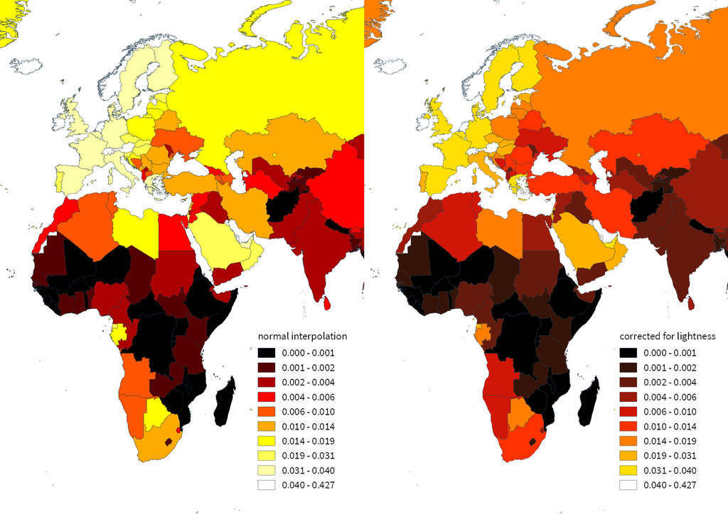
The issues with simple color interpolations, which include nonuniform changes in lightness between classes, also haunt us in cartography. Just have a look at the map and legend on the left-hand side, which has been created using a normal custom QGIS gradient with colors ranging from black to red, yellow and finally white. We end up with three classes in yellow which are nearly impossible to tell apart:
For comparison, on the right side, I’ve used Gregor’s corrected color ramp, which ensures that lightness changes evenly from one class to the next.
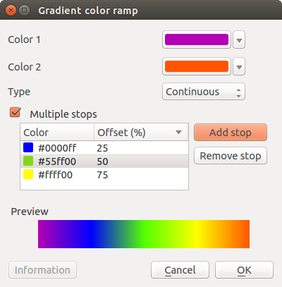
Wouldn’t it be great if the built-in gradient tool in QGIS could correct for lightness? Too bad the current dialog is not that great:
But we’ll probably have a much better solution in QGIS soon since Nyall Dawson has picked up the idea and is already working on a completely new version of the gradient tool. You can see a demo of the current work in progress here:
I’m really looking forward to trying this out once it hits master!
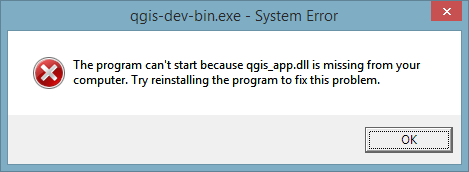
This is a short tip for you if you use QGIS on Windows and ended up with an error like this:
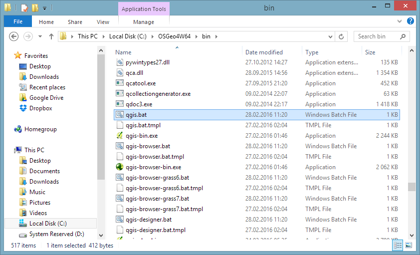
Windows’ suggestion to reinstall probably won’t fix this issue. Instead, you want Windows to run qgis.bat instead of any .exe it is trying to use. Right-click a .qgs file and go to Open with | Choose default program:
In OSGeo4W, the .bat file is located in the bin folder:
Today’s post was motivated by a question on GIS.StackExchange, which is looking for an automated way to symbolize the amenities available at a location using a series of icons, like this:
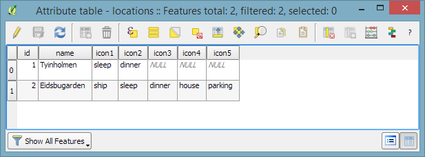
Assuming the information is available in a format similar to this example attribute table
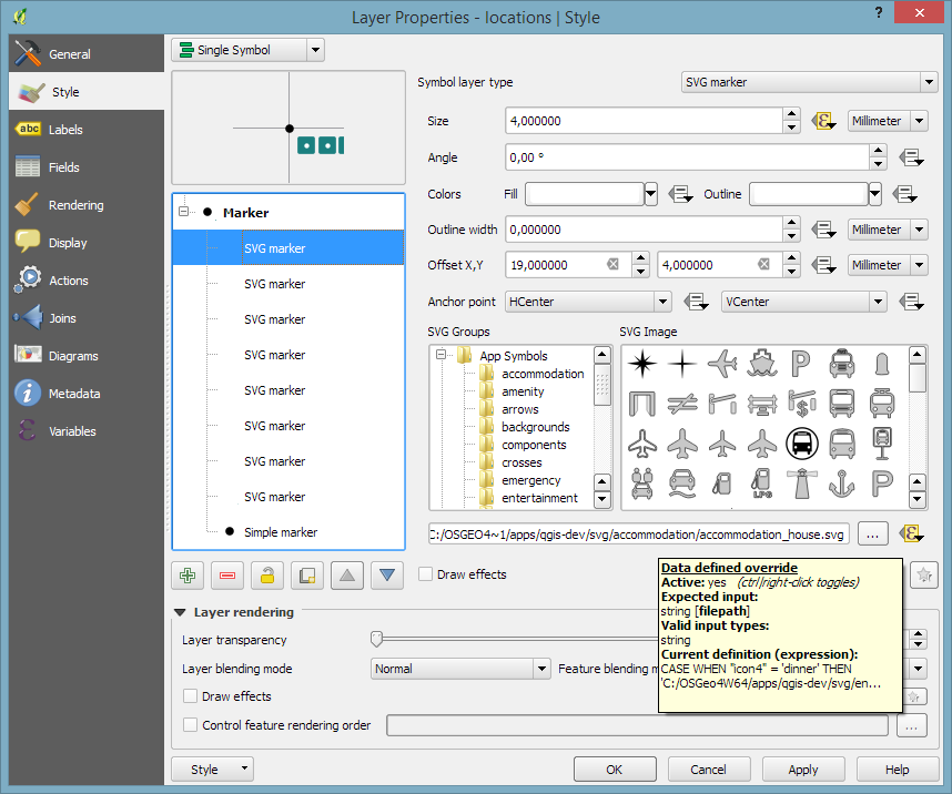
we can create a symbol, which adapts to the values in the icon columns using data-defined overrides:
The five potential symbol locations are aligned next to each other using offsets. We use the following expression to determine the correct SVG symbol:
CASE
WHEN "icon4" = 'dinner'
 THEN 'C:/OSGeo4W64/apps/qgis-dev/svg/entertainment/amenity=restaurant.svg'
WHEN "icon4" = 'sleep'
 THEN 'C:/OSGeo4W64/apps/qgis-dev/svg/accommodation/accommodation_hotel2.svg'
WHEN "icon4" = 'ship'
 THEN 'C:/OSGeo4W64/apps/qgis-dev/svg/transport/amenity=ferry_terminal.svg'
WHEN "icon4" = 'house'
 THEN 'C:/OSGeo4W64/apps/qgis-dev/svg/accommodation/accommodation_house.svg'
 ELSE  ''
END
To hide icons if the icon value is NULL, the marker size is set to 0 using, for example:
CASE
WHEN "icon4" is not NULL
 THEN 4
 ELSE 0
END
Finally, to ensure that the labels don’t cover the icons, we can use the cartographic label placement with the position priority set to ‘TR,TL,BL’, which restricts labels to the top right, top left, and bottom left position.
With these settings in place, we can zoom out and the labeling algorithm picks the most suitable position from the list of allowed positions:
Default polygon symbols come with a fill and a border color:
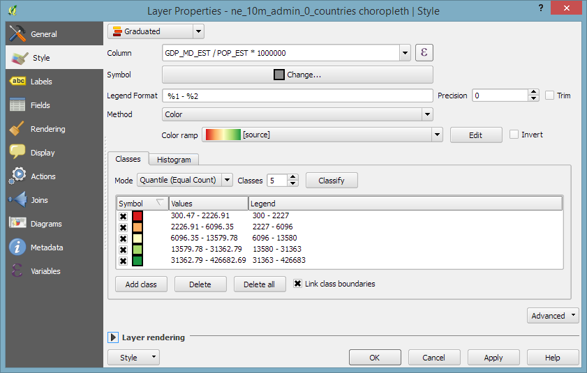
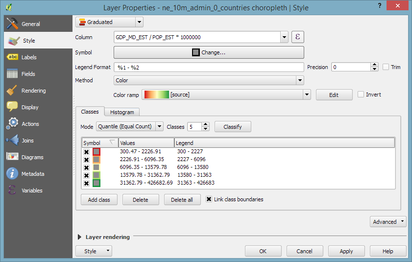
When they are used in a graduated renderer, the fill color is altered for each class:
What if you want to change the border color instead?
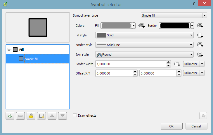
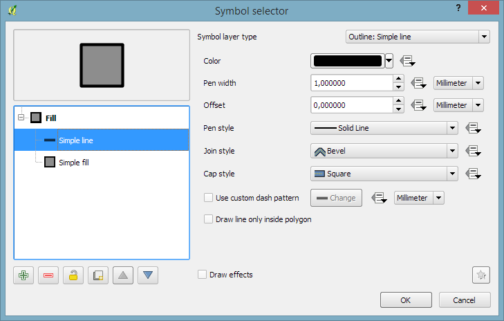
The simplest solution is to add an outline symbol layer to your polygon symbol:
The outline layer has only one color property and it will be altered by the graduated renderer.
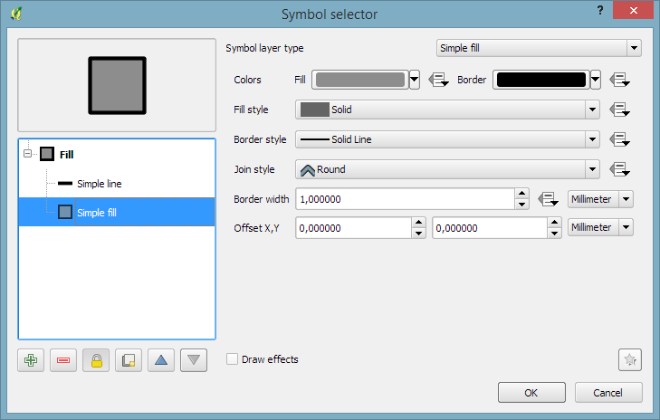
If you now hit ok, the graduated renderer will alter both the simple fill’s fill color and the outline’s color. To stop the fill color from changing, select the simple fill and lock it using the small lock icon below the list of symbol layers:
If you are using QGIS for digitizing work, you have probably seen the 2.14 Changelog entry for Trace Digitizing. The main reason why this is a really cool new feature is that it speeds up digitizing a lot. When tracing is enabled, the digitizing tools take care to follow existing features (as configured in the snapping options). For a detailed howto and videos check Lutra’s blog.
In three parts, the book covers layer styling, labeling, and designing print maps. All recipes come with data and project files so you can reproduce the maps yourself.
Check the book website for the table of contents and a sample chapter.
Just in time for the big QGIS 2.14 LTR release, the paperback will be available March 1st.
On a related note, I am also currently reviewing the latest proofs of the 3rd edition of “Learning QGIS”, which will be updated to QGIS 2.14 as well.
The upcoming 2.14 release of QGIS features a new renderer. For the first time in QGIS history, it will be possible to render 2.5D objects directly in the map window. This feature is the result of a successful crowd funding campaign organized by Matthias Kuhn last year.
In this post, I’ll showcase this new renderer and compare the achievable results to output from the Qgis2threejs plugin.
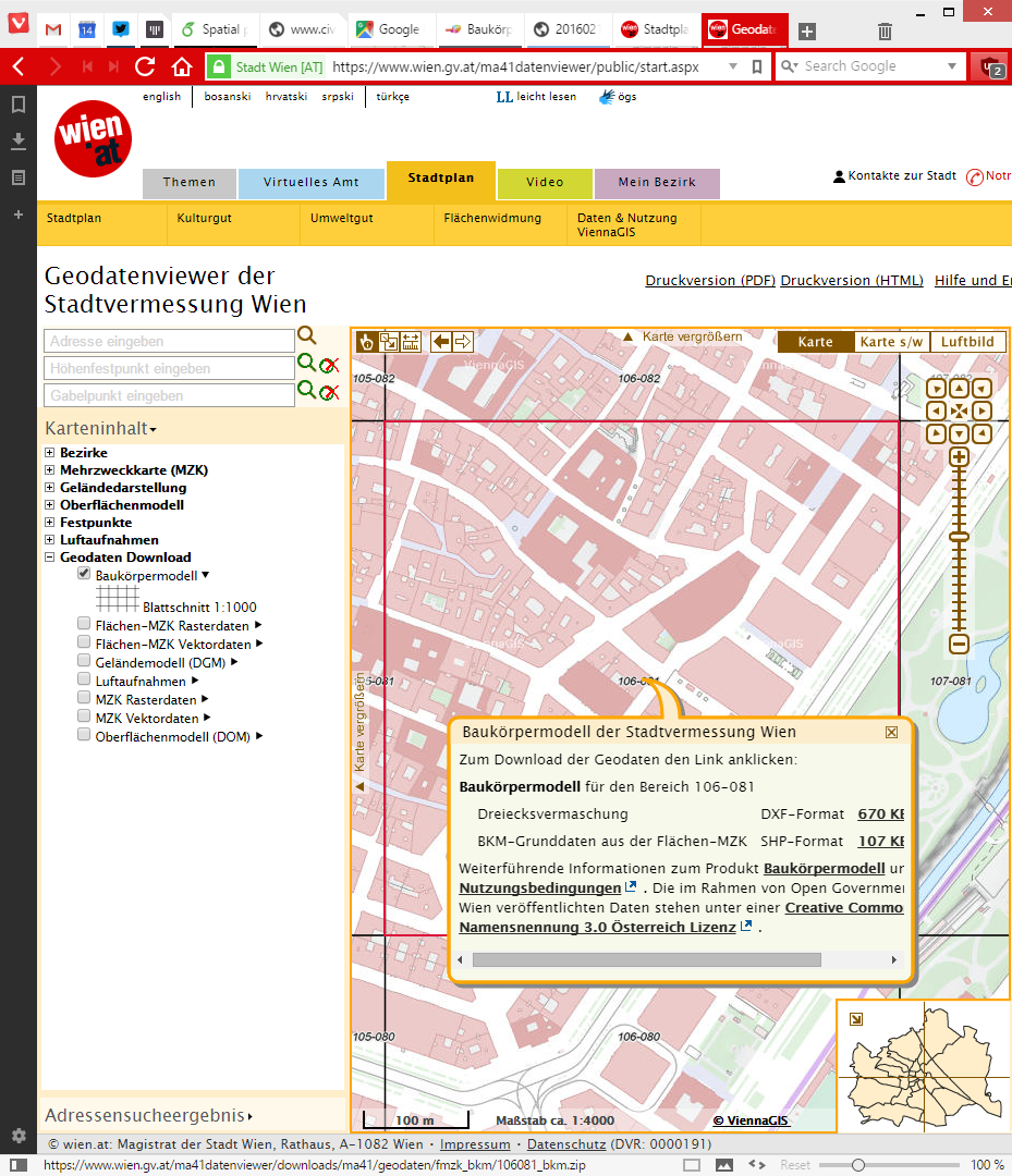
For this post, I’m using building parts data from the city of Vienna, which is publicly available through their data viewer:
This dataset is a pretty detailed building model, where each building is made up of multiple features that represent parts of the building with different height. Of course, if we just load the dataset in default style, we cannot really appreciate the data:
Loaded building parts layer
All this changes if we use the new 2.5D renderer. With just a few basic settings, we can create 2.5D representations of the building parts:
QGIS 2.5D renderer settings
Compare the results to aerial images in Google Maps …
QGIS 2.5D renderer and view in Google Maps
… not bad at all!
Except for a few glitches concerning the small towers at the corners of the building, and some situations where it seems like the wrong building part is drawn in the front, the 2.5D look is quite impressive.
Now, how does this compare to Qgis2threejs, one of the popular plugins which uses web technologies to render 3D content?
One obvious disadvantage of Qgis2threejs is that we cannot define a dedicated roof color. Thus the whole block is drawn in the same color.
On the other hand, Qgis2threejs does not suffer from the rendering order issues that we observe in the QGIS 2.5D renderer and the small towers in the building corners are correctly displayed as well:
QGIS 2.5D renderer and Qgis2threejs output
Overall, the 2.5D renderer is a really fun and exciting new feature. Besides the obvious building usecase, I’m sure we will see a lot of thematic maps making use of this as well.
Give it a try!
In the next post, I’m planning a more in-depth look into how the 2.5D renderer works. Here’s a small teaser of what’s possible if you are not afraid to get your hands dirty: