Archive

Yearly Archives: 2013

OSM place search and osmSearch are two plugins for QGIS which use the Nominatim service to find addresses and places. They are both still marked as “experimental” plugins, so users are expected to expect the unexpected.

Once installed, both plugins look very similar: There is an input text field and a results list.

osmsearch_giefinggasse

A simple search with street name and house number returns the expected results. Interacting with the result shows some differences:

  • OSM place search will highlight the location when you mouse-over the result in the list. On double-click, it will zoom to the result.
  • osmSearch will highlight the result and move the map center to the result if you double-click but won’t zoom.

Both plugins can deal with umlauts (ä,ö,ü) but only osmSearch works with háčeks.

osmsearch_hacek

A nice feature of osmSearch is that it remembers your previous searches and offers an auto-complete function.

OSM place search on the other hand offers a reverse “Where am I” function (the arrow pointing to the left” which tries to find a name for the current map center location. Additionally, there are functions to add the current object as a new layer or mask layer.

Both plugins have strong and weak points. Combined, they would make a really strong tool but then nothing prevents us from having them both and choosing the best one for the task at hand.

Profile Tool is a plugin for QGIS which makes it possible to generate (elevation) profiles for line features. The plugin is available through the default QGIS plugin repository. While testing the plugin, I found some aspects of using the tool might require additional instructions.

After installing and enabling the plugin, you will find the “Terrain profile” button in the plugin toolbar:

qgisprofiletool

The basic use case is as follows:

  1. Load the elevation raster and select this raster layer in the layer list.
  2. Press the “Terrain profile” button. This opens the plugin panel which consists of a graph area on the left and a raster layer list on the right. The raster layer you had selected will be added to the raster layer list.
  3. If you have “Selection: Temporary polyline” enabled, you can now draw a line in the map area. Double-click left to end drawing the line. (If you are paying close attention, you might have noticed the instructions in the status bar.)
  4. After you have finished drawing the line, the graph area will update and display the profile.

qgisprofiletool2

If you want to add another raster layer to the plugin, you need to first select the raster layer in the QGIS layer list and then press the “Add Layer” button in the Profile Tool panel.

To generate the profile for an existing line feature, you need to change the selection mode from “Temporary polyline” to “Selected polyline”. Then you need to select the vector layer which contains the line feature you want to use in the QGIS layer list. Finally, you can click on the line feature in the map area to select it. (Note that this selection is independent of any selections you might have going on using the default QGIS feature selection tools.)

If you change from the Profile Tool to any other tool such as “Pan Map” or “Identify”, you have to click the “Terrain profile” button again to re-enable drawing/selection a line for the Profile Tool.

Due to a bug, it is currently not possible to export the profile graph. An alternative is to open the “Table” tab of the Profile Tool panel which provides access to the profile data and copy the data into your preferred graphing application such as Calc or Excel.

If you want to see the Profile Tool in action, I recommend watching the introduction video by Lene Fischer (University of Copenhagen).

Since I finally managed to download the elevation model of the city of Vienna, I thought I’d share some eye candy with you: The map uses layer blending to combine hillshade and elevation raster, and the elevation raster’s color ramp is a modified “garish14” from QGIS’ cpt-city color ramp collection.

wien_elevation by underdarkGIS
wien_elevation, a photo by underdarkGIS on Flickr.

Update

Here is how you get access to the “garish14” color ramp:

Start by selecting the "new color ramp" option in the raster's style window.

Start by selecting the “new color ramp” option in the raster’s style window.

Chose the "cpt-city" color ramp type.

Chose the “cpt-city” color ramp type.

In the "cpt-city color ramp" window, you will find lots of different premade color ramps. "garish14" is part of the "Topography" collection.

In the “cpt-city color ramp” window, you will find lots of different premade color ramps. “garish14” is part of the “Topography” collection.

In my previous post, I presented a Processing model to determine positional accuracy of street networks. Today, I’ll cover another very popular tool to assess OSM quality in a region: network length comparison. Here’s the corresponding slide from my FOSS4G presentation which shows an example of this approach applied to OSM and OS data in the UK:

foss4g_osm_data_quality_12

One building block of this tool is the Total graph length model which calculates the length of a network within specified regions. Like the model for positional accuracy, this model includes reprojection steps to ensure all layers are in the same CRS before the actual geoprocessing starts:

total_graph_length

The final Compare total graph length model combines two instances of “Total graph length” whose results are then joined to eventually calculate the length difference (lenDIFF).

compare_total_graph_length

As usual, you can find the models on Github. If you have any questions, don’t hesitate to ask in the comments and if you find any issues please report them on Github.

Over the last years, research on OpenStreetMap data quality has become increasingly popular. At this year’s FOSS4G, I had the honor to present some work we did at the AIT to assess OSM quality in Vienna, Austria. In the meantime, our paper “Towards an Open Source Analysis Toolbox for Street Network Comparison” has been published for early access. Thanks to the conference organizers who made this possible! I’ve implemented comparison tools found in related OSM literature as well as new tools for oneway street and turn restriction comparison using Sextante scripts and models for QGIS 1.8. All code is available on Github to enable collaboration. If you are interested in OSM data quality research, I’d like to invite you to give the tools a try.

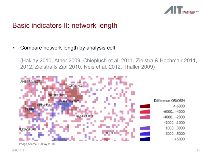
Since most users probably don’t have access to QGIS 1.8 anymore, I’ll be updating the tools to QGIS 2.0 Processing. I’m starting today with the positional accuracy comparison tool. It is based on a method described by Goodchild & Hunter (1997). Here’s the corresponding slide from my FOSS4G presentation:

foss4g_osm_data_quality_10

The basic idea is to evaluate the positional accuracy of a street graph by comparing it with a reference graph. To do that, we check how much of the graph lies within a certain tolerance (buffer) of the reference graph.

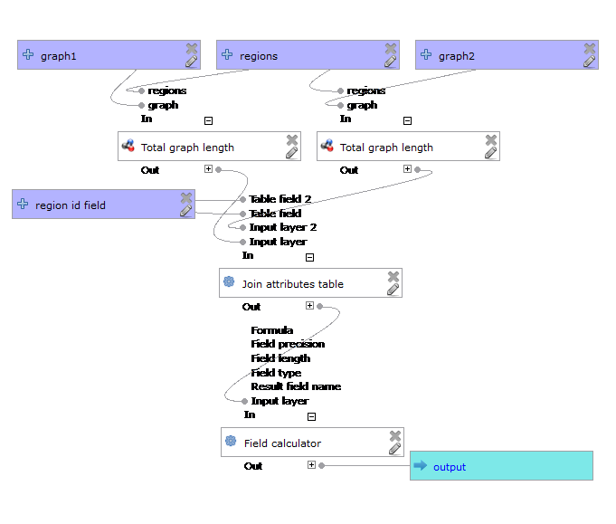
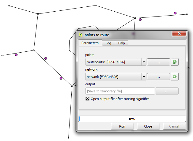
The processing model uses the following input: the two street graphs which should be compared, the size of the buffer (tolerance for positional accuracy), a polygon layer with analysis regions, and the field containing the region id. This is how the model looks in Processing modeler:

graph_covered_by_buffered_reference_graph

First, all layers are reprojected into a common CRS. This will have to be adjusted if the tool is used in other geographic regions. Then the reference graph is buffered and – since I found that dissolving buffers directly in the buffer tool can become very slow with big datasets – the faster difference tool is used to dissolve the buffers before we calculate the graph length inside the buffer (inbufLEN) as well as the total graph length in the analysis region (totalLEN). Finally, the two results are joined based on the region id field and the percentage of graph length within the buffered reference graph (inbufPERC) is calculated. A high percentage shows that both graphs agree very well geometrically.

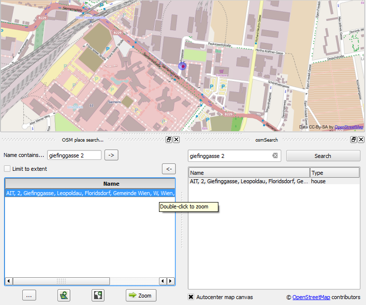
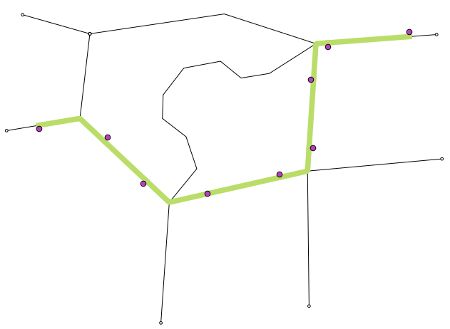
The following image shows the tool applied to a sample of OpenStreetMap (red) and official data published by the city of Vienna (purple) at Wien Handelskai. OSM was used as a reference graph and the buffer size was set to 10 meters.

ogd_osm_positional_accuracy

In general, both graphs agree quite well. The percentage of the official graph within 10 meters of the OSM graph is 93% in the 20th district. In the above image, we can see that links available in OSM are not contained in the official graph (mostly pedestrian/bike links) and there seem to be some connectivity issues as well in the upper right corner of the image.

In my opinion, Processing models are a great solution to document geoprocessing work flows and share them with others. If you want to collaborate on building more models for OSM-related analysis, just leave a comment bellow.

I’m very pleased to announce that Packt Publishing is organizing a giveaway contest for Learning QGIS 2.0. All you need to do is comment below the post and win a free copy of Learning QGIS 2.0. Read on for more details.

7488OS_cov

Amongst other topics, Learning QGIS 2.0 covers:

  • Loading and visualizing vector and raster data
  • Creating and editing spatial data and performing spatial analysis
  • Designing great maps and printing them

How to Enter?

Simply post your expectations for this book in comments section below and you could be one of the lucky participants to win a copy.

DeadLine: The contest will close in 7 days on December, 12th 2013. Winners will be contacted by email, so be sure to use your real email address when you comment!

Please note: Winners residing in the USA and Europe will receive print copies. Others will be provided with eBook copies.

Processing has received a series of updates since the release of QGIS 2.0. (I’m currently running 2.0-20131120) One great addition I want to highlight today is the improved script editor and the help file editor.

Script editor

The improved script editor features a toolbar with commonly used tools such as undo and redo, cut, copy and paste, save and save as …, as well as very useful run algorithm and edit script help buttons. It also shows the script line numbers which makes it easier to work with while debugging code.

processing_script_editor

The model editor has a similar toolbar now which allows to export the model representation as an image, run the model or edit the model help.

Help editor

When you press the edit script help button, you get access to the new help editor. It’s easy to use: On the top, it displays the current content of the help file. On the bottom-left, it lists the different sections of the help file which can be filled with information. In the input parameters and outputs section, the help editor automatically lists the all parameters specified in the script code. Finally, in the bottom-right, you can enter the description. The resulting help file is saved in the same location as the original script under the name <scriptname>.py.help.

processing_help_editor

It has been a real pleasure to chat with Caitlin Dempsey at GIS Lounge about open source GIS and how I got hooked on QGIS.

In related news: It’s great to see the many great and creative contributions to the QGIS Map Showcase on Flickr! If you have some maps you are proud of, please share them with the community. If you would like to see your image reused on the QGIS website or in other QGIS marketing material, please choose an appropriate license for your image.

I’ve also started to work on a new Processing script that identifies similar line features. It currently uses a length comparison and the Hausdorff distance between two line features to calculate the similarity value, but more on that in a future post!

Did you know that there is a network analysis library in QGIS core? It’s well hidden so far, but at least it’s documented in the PyQGIS Cookbook. The code samples from the cookbook can be used in the QGIS Python console and you can play around to get a grip of what the different steps are doing.

As a first exercise, I’ve decided to write a Processing script which will use the network analysis library to create a network-based route layer from a point layer input. You can find the result on Github.

You can get a Spatialite file with testdata from Github as well. It contains a network and a routepoints1 layer:

points_to_route1

The interface of the points_to_route tool is very simple. All it needs as an input is information about which layer should be used as a network and which layer contains the route points:

points_to_route0

The input points are considered to be ordered. The tool always routes between consecutive points.

The result is a line layer with one line feature for each point pair:

points_to_route2

The network analysis library is a really great new feature and I hope we will see a lot of tools built on top of it.

Today, I want to take the opportunity to thank everyone who made my first book “Learning QGIS 2.0” possible.

A big thanks goes to Werner Macho and Nathan Woodrow who took it on them to review the text and provided valuable feedback. I would also like to thank my publisher who had to be as patient as the rest of us while waiting for the 2.0 release. I’m also very thankful for all the encouragement from my friends and family who kept me going.

And of course I also want to thank everyone for making quite a buzz on the different social media channels and for the great feedback I’ve received so far! I hope you find it useful.