Flow maps in QGIS – no plugins needed!
If you’ve been following my posts, you’ll no doubt have seen quite a few flow maps on this blog. This tutorial brings together many different elements to show you exactly how to create a flow map from scratch. It’s the result of a collaboration with Hans-Jörg Stark from Switzerland who collected the data.
The flow data
The data presented in this post stems from a survey conducted among public transport users, especially commuters (available online at: https://de.surveymonkey.com/r/57D33V6). Among other questions, the questionnair asks where the commuters start their journey and where they are heading.
The answers had to be cleaned up to correct for different spellings, spelling errors, and multiple locations in one field. This cleaning and the following geocoding step were implemented in Python. Afterwards, the flow information was aggregated to count the number of nominations of each connection between different places. Finally, these connections (edges that contain start id, destination id and number of nominations) were stored in a text file. In addition, the locations were stored in a second text file containing id, location name, and co-ordinates.
Why was this data collected?
Besides travel demand, Hans-Jörg’s survey also asks participants about their coffee consumption during train rides. Here’s how he tells the story behind the data:
As a nearly daily commuter I like to enjoy a hot coffee on my train rides. But what has bugged me for a long time is the fact the coffee or hot beverages in general are almost always served in a non-reusable, “one-use-only-and-then-throw-away” cup. So I ended up buying one of these mostly ugly and space-consuming reusable cups. Neither system seem to satisfy me as customer: the paper-cup produces a lot of waste, though it is convenient because I carry it only when I need it. With the re-usable cup I carry it all day even though most of the time it is empty and it is clumsy and consumes the limited space in bag.
So I have been looking for a system that gets rid of the disadvantages or rather provides the advantages of both approaches and I came up with the following idea: Installing a system that provides a re-usable cup that I only have with me when I need it.
In order to evaluate the potential for such a system – which would not only imply a material change of the cups in terms of hardware but also introduce some software solution with the convenience of getting back the necessary deposit that I pay as a customer and some software-solution in the back-end that handles all the cleaning, distribution to the different coffee-shops and managing a balanced stocking in the stations – I conducted a survey
The next step was the geographic visualization of the flow data and this is where QGIS comes into play.
The flow map
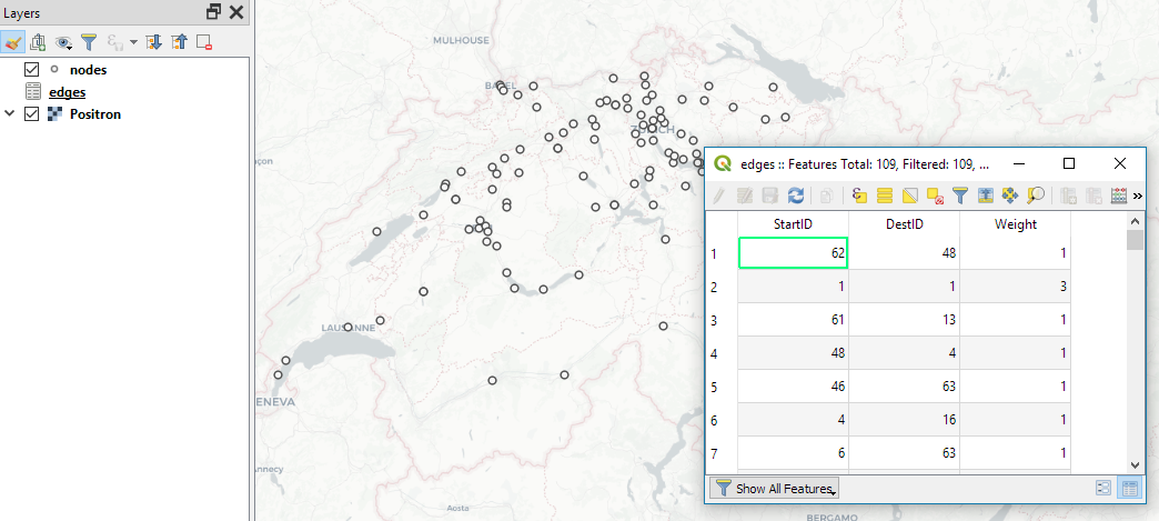
Survey data like the one described above is a common input for flow maps. There’s usually a point layer (here: “nodes”) that provides geographic information and a non-spatial layer (here: “edges”) that contains the information about the strength or weight of a flow between two specific nodes:
The first step therefore is to create the flow line features from the nodes and edges layers. To achieve our goal, we need to join both layers. Sounds like a job for SQL!
More specifically, this is a job for Virtual Layers: Layer | Add Layer | Add/Edit Virtual Layer
SELECT StartID, DestID, Weight,
       make_line(a.geometry, b.geometry)
FROM edges
JOIN nodes a ON edges.StartID = a.ID
JOIN nodes b ON edges.DestID = b.ID
WHERE a.ID != b.ID
This SQL query joins the geographic information from the nodes table to the flow weights in the edges table based on the node IDs. In the last line, there is a check that start and end node ID should be different in order to avoid zero-length lines.
By styling the resulting flow lines using data-driven line width and adding in some feature blending, it’s possible to create some half decent maps:

However, we can definitely do better. Let’s throw in some curved arrows!
The arrow symbol layer type automatically creates curved arrows if the underlying line feature has three nodes that are not aligned on a straight line.
Therefore, to turn our straight lines into curved arrows, we need to add a third point to the line feature and it has to have an offset. This can be achieved using a geometry generator and the offset_curve() function:
make_line(
   start_point($geometry),
   centroid(
      offset_curve(
         $geometry,
         length($geometry)/-5.0
      )
   ),
   end_point($geometry)
)
Additionally, to achieve the effect described in New style: flow map arrows, we extend the geometry generator to crop the lines at the beginning and end:
difference(
   difference(
      make_line(
         start_point($geometry),
         centroid(
            offset_curve(
               $geometry,
               length($geometry)/-5.0
            )
         ),
	 end_point($geometry)
      ),
      buffer(start_point($geometry), 0.01)
   ),
   buffer(end_point( $geometry), 0.01)
)
By applying data-driven arrow and arrow head sizes, we can transform the plain flow map above into a much more appealing map:

The two different arrow colors are another way to emphasize flow direction. In this case, orange arrows mark flows to the west, while blue flows point east.
CASE WHEN
 x(start_point($geometry)) - x(end_point($geometry)) < 0
THEN
 '#1f78b4'
ELSE
 '#ff7f00'
END
Conclusion
As you can see, virtual layers and geometry generators are a powerful combination. If you encounter performance problems with the virtual layer, it’s always possible to make it permanent by exporting it to a file. This will speed up any further visualization or analysis steps.

The map looks great. However, I have some problems whilst recreating the map. When trying to add the virtual layer I receive the following error: “Layer is not valid: The layer ?query=SELECT%20StartID,%20DestID,%20Weight,%20%0D%0A%20%20%20%20%20%20%20make_line(a.geometry,%20b.geometry)%0D%0AFROM%20edges%0D%0AJOIN%20nodes%20a%20ON%20edges.StartID%20%3D%20a.ID%0D%0AJOIN%20nodes%20b%20ON%20edges.DestID%20%3D%20b.ID%0D%0AWHERE%20a.ID%20!%3D%20b.ID%20 is not a valid layer and can not be added to the map. Reason: virtual Query preparation error on PRAGMA table_info(_tview): ambiguous column name: StartID”
Any idea why? Any help is much appreciated.
Are you certain that StartID is not ambiguous? Hard to debug without knowing your table schemas.
You are right. I was just checking the column names of one of my layer but the same name appeared also for a column in my nodes layer. However, now I am facing the following error!
Layer is not valid: The layer ?query=SELECT%20StartID,%20DestID,%20Weight,%20%0D%0A%20%20%20%20%20%20%20make_line(a.geometry,%20b.geometry)%0D%0AFROM%20edges%0D%0AJOIN%20nodes%20a%20ON%20edges.StartID%20%3D%20a.ID%0D%0AJOIN%20nodes%20b%20ON%20edges.DestID%20%3D%20b.ID%0D%0AWHERE%20a.ID%20!%3D%20b.ID%20 is not a valid layer and can not be added to the map. Reason: virtual Query preparation error on PRAGMA table_info(_tview): no such column: a.ID
argh
Does the layer have a column ID?
I had a similar issue. But found out it had to do with the attribute type wich was String, has to be integer.
Can I request you for the file pl…such a simple idea. Need to try it. Thank you
The data is not mine to share but you can contact Hans-Jörg at hans-joerg.stark(at)sbb.ch
Very nice post, I would love to try it out. Any chance of an additional screenshot on the nodes attribute table? Or do you recommend any specific resource to better understand the SQL functions like make_line?
I am having trouble understanding what a and b are in the SQL query. In my own dataset I have 28 nodes each with an ID and two coordinates, so I also don’t understand how you call only the “geometry” and not each of the coordinates which make up the geometry.
Hi Thomas. The attribute table of the nodes layer only contains one column with IDs.
As described in https://docs.qgis.org/3.4/en/docs/user_manual/working_with_vector/virtual_layers.html#supported-language: “The underlying engine uses SQLite and Spatialite to operate.” and “Functions of QGIS expressions can also be used in a virtual layer query.” make_line() is one of those functions (as listed in https://docs.qgis.org/3.4/en/docs/user_manual/working_with_vector/expression.html#functions-list).
a and b are references to the nodes table. That’s plain SQL, nothing QGIS specific.
geometry refers to the node geometry associated with each feature (and visualized by the points on the map). Since we are in a GIS environment, it is not necessary to deal with the individual geometry coordinates.
Thanks for the response – still struggling and it seems likely that the previous comments may be on a similar issue.
Specifically, in line 2: how do both a and b (a.geometry and b.geometry here) refer to separate nodes when the Nodes layer is only a long list of columns. I contacted Hans-Jörg who was happy to provide a snapshot of both data sources, but still can’t wrap my head around this part.
Are a and b “alias” references to each node ID set up in the Attribute Form of that layer? Are there specific column Widget types and setup required to make this happen?
I’m also unclear on line 3, as everything from lines 1-3 is related to the non-spatial edges layer, and yet we can already create a geometry from a and b?
My specific error code when testing the virtual layer is “no such column”.
Thanks, -Thomas
This goes beyond what can realistically be discussed in the comment section. I recommend starting a thread on http://gis.stackexchange.com where you show exactly what you did and where you’re stuck.
Like: did you load the node data from Hans-Jörg as a point layer? Is there no column name after “no such column”?
Show the SQL statement you wrote, maybe there’s a typo.
Paste a link to your thread on GIS.stackexchange here.
Lovely – just what I needed! Many thanks.
Hi Anita,
Thanks for sharing your work!
I’m really new to QGIS and I want to do a simple Migration map, but I don’t know how to do the datasets for the point layer and for the non-spatial llayer. Maybe you could show me your excel files? or an example?
that would really help me out!
kind regards,
Daniela
Hi Daniela,
The first screenshot shows the layout of the non-spatial layer. The point layer only needs an ID column.
Hi Anita,
Thank you for your answer! after a few hours, we did it!!
now we are struggling with the code part. As I told you, we are real beginners.
So here my second questions. How should the python code look like exactly?
thank you so much for you help!
That’s good to hear!
Concerning your new question: there’s no Python code needed for the flow maps presented here. There are only QGIS expressions and they are provided in full within the blog post. If you are unfamiliar with geometry generators, have a look at https://anitagraser.com/2017/04/08/a-guide-to-geometry-generator-symbol-layers/
Hello Anita, thanks for the post!
Could you just give a hint (e.g. screenshot) on what are your settings in the data-driven line width dialogue window ?
I tried to change the line width based on attribute value (weight) but my outcome is nonsense.
Whether the whole screen is in the line color or I cant see any any lines anymore. Got to say though that I created 959 lines to one point and my computer is already on the edge rendering the lines in the same width.
Is the type of the weight coloumn important?
Thx for any help!
Hi Philipp,
Appropriate data-driven line width settings depend on your project coordinate reference system as well as the value range of the flow data. In general, the size assistant is a good place to start. A good starting point is to scale the flow values to a line width range between 0.01 and 10 (or less) pixels. Then, fine-tune from there to get the desired result.
(Sometimes it can also be desired to use map units instead of pixels. Then you have to know if the units are meters or degrees or some other measure)
Hello Anita,
Thanks for the great post. I have been able to replicate the map above with some of my own data. However, when I am creating the layout and insert a legend, the symbols for the virtual layer are all the same size and do not reflect what is in the map. How can you create a legend displaying the graduated flow lines from the virtual layer?
Thanks,
Miguel
Dear Miguel,
Legends for symbology with data-driven overrides is tricky. I’ll look into it and write up a post if I have something good.
That’s what I had gathered. I had posted my question on GIS Stack Exchange as well and the general consensus was that legends for virtual layers with data-driven attributes is an area that could be improved in QGIS.
Hi, I managed to get the nodes up but when I make the virtual layer the line doesn’t appear
Sounds like a problem with the virtual layer definition
Many thanks for sharing the using techniques. How/where the color of arrow is implemented? I couldn’t find the place to insert the code of two different arrow colors.
Hi Mengyu,
The color is data-defined, as described in the end of the blog post: