Interesting developments going on if you like creating your own gradients. After all, that’s not as easy as it might initially seem, as Gregor Aisch describes in his post “Mastering Multi-hued Color Scales with Chroma.js”:
The issues with simple color interpolations, which include nonuniform changes in lightness between classes, also haunt us in cartography. Just have a look at the map and legend on the left-hand side, which has been created using a normal custom QGIS gradient with colors ranging from black to red, yellow and finally white. We end up with three classes in yellow which are nearly impossible to tell apart:
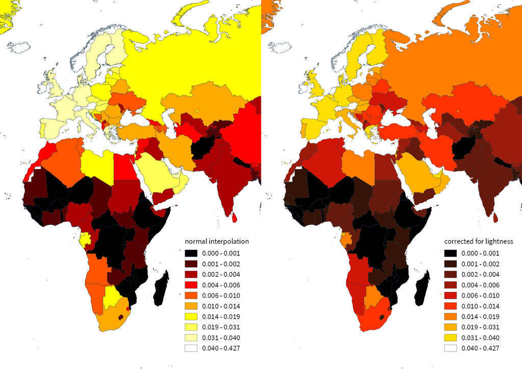
For comparison, on the right side, I’ve used Gregor’s corrected color ramp, which ensures that lightness changes evenly from one class to the next.
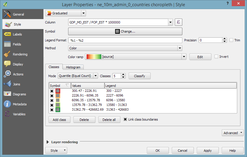
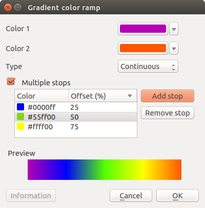
Wouldn’t it be great if the built-in gradient tool in QGIS could correct for lightness? Too bad the current dialog is not that great:
My first reaction therefore was to write a short script to import gradients from Gregor’s Chroma.js Color Scale Helper into QGIS:
https://twitter.com/underdarkGIS/status/716389969850404864But we’ll probably have a much better solution in QGIS soon since Nyall Dawson has picked up the idea and is already working on a completely new version of the gradient tool. You can see a demo of the current work in progress here:
I’m really looking forward to trying this out once it hits master!