For those wishing to get a stylized map on QGIS composer, I’ve been working on a tutorial to share with you a project I’m working on. Fan of web design and GIS user since few years, I wanted to merge Material Design Style with Map composer. Here is a tutorial to show you how to make simply a Material Design Map style on QGIS.
Over the last two weeks, I had the pleasure to attend both the international FOSS4G conference in Bonn, Germany, as well as the regional FOSS4G-NOR in Oslo, Norway. Both events were superbly organized and provided tons of possibilities to share experiences and find new inspiration.
Talks at both conferences have been recorded and can be watched online: Bonn / Oslo
I enjoyed having the opportunity to give two very different talks. In Bonn, I presented work on pedestrian routing and navigation, which was developed within the PERRON project:
It was particularly nice that we had plenty of time for Q&A after this presentation since only two talks were scheduled for this session rather than the usual three. I’d also like to thank everyone for the great feedback – both in person and on Twitter!
In Oslo, I had the honor to give the opening keynote on OpenSource in general and the QGIS project in particular:
Both conferences were packed with great sessions and talks. If I had to pick favorites from last week’s presentations, I would have to opt for Iván Sánchez presenting his latest projects, including what3fucks and geohaiku:
All three projects: OPPTUR, GISTYLE, and the flexible traffic web viewer were great demos of what can be achieved with open source tools. Mathilde’s GISTYLE project is also available on Github.
An inspiring GISummer comes to an end, but with so many videos to watch and workshop materials to explore, I’m convinced that the autumn will be no less exciting.
It’s been a great week in Bonn! I joined the other members of the QGIS project at the pre-FOSS4G code sprint at the Basecamp, the weirdest location we’ve had for a developer meeting so far. We used this opportunity to have a face-to-face meeting of the QGIS PSC with special guests Matthias Kuhn (on QGIS 3.0 and bug tracker discussions) and Lene Fischer (on community team issues) – notes here.
QGIS PSC meeting in action (from left to right: Otto Dassau, Paolo Cavallini, Anita Graser, Andreas Neumann, Jürgen E. Fischer), picture by Tim Sutton
The code sprint was also a great opportunity to present the results of Akbar Gumbira’s Google Summer of Code project: the QGIS Resource Sharing plugin. This plugin makes it possible to easily share resources (such as SVG icons, symbol definitions, QGIS styles, and Processing scripts) with other QGIS users through an interface that closely resembles the well-known QGIS Plugin Manager. Akbar has also prepared great presentation with background info and screencasts showcasing his project.
QGIS Resource Sharing presentation, picture by @foss4g
Thanks to all the organizers who worked hard to make this one of the most well-organized and enjoyable code sprints I’ve ever been to. You are awesome!
FOSS4G2016 is drawing closer quickly. To get in the mood for a week full of of geogeekery, Locate Press is offering a special FOSS4G discount for QGIS Map Design.
Use the code foss4gbonn to get 25% off your copy.
QGIS Map Design is the reference book to get if you want to bring your mapping skills up to speed. The book comes with a download for all our example map projects:
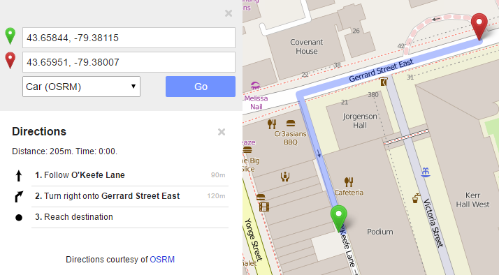
Wrong navigation instructions can be annoying and sometimes even dangerous, but they happen. No dataset is free of errors. That’s why it’s important to assess the quality of datasets. One specific use case I previously presented at FOSS4G 2013 is the quality assessment of turn restrictions in OSM, which influence vehicle routing results.
The main idea is to compare OSM to another data source. For this example, I used turn restriction data from the City of Toronto. Of the more than 70,000 features in this dataset, I extracted a sample of about 500 turn restrictions around Ryerson University, which I had the pleasure of visiting in 2014.
As you can see from the following screenshot, OSM and the city’s dataset agree on 420 of 504 restrictions (83%), while 36 cases (7%) are in clear disagreement. The remaining cases require further visual inspection.
The following two examples show one case where the turn restriction is modelled in both datasets (on the left) and one case where OSM does not agree with the city data (on the right).
In the first case, the turn restriction (short green arrow) tells us that cars are not allowed to turn right at this location. An OSM-based router (here I used OpenRouteService.org) therefore finds a route (blue dashed arrow) which avoids the forbidden turn. In the second case, the router does not avoid the forbidden turn. We have to conclude that one of the two datasets is wrong.
Interestingly, the disagreement in the second example has been fixed by a recent edit (only 14 hours ago). We can see this in the OSM way history, which reveals that the line direction has been switched, but this change hasn’t made it into the routing databases yet:
now
before
This leads to the funny situation that the oneway is correctly displayed on the map but seemingly ignored by the routers:
To evaluate the results of the automatic analysis, I wrote a QGIS script, which allows me to step through the results and visually compare turn restrictions and routing results. It provides a function called next() which updates a project variable called myvar. This project variable controls which features (i.e. turn restriction and associated route) are rendered. Finally, the script zooms to the route feature:
def next():
    f = features.next()
    id = f['TURN_ID']
    print "Going to %s" % (id)
    QgsExpressionContextUtils.setProjectVariable('myvar',id)
    iface.mapCanvas().zoomToFeatureExtent(f.geometry().boundingBox())
    if iface.mapCanvas().scale() < 500:
        iface.mapCanvas().zoomScale(500)

layer = iface.activeLayer()
features = layer.getFeatures()
next()
You can see it in action here:
I’d love to see this as an interactive web map where users can have a look at all results, compare with other routing services – or ideally the real world – and finally fix OSM where necessary.
This work has been in the making for a while. I’d like to thank the team of OpenRouteService.org who’s routing service I used (and who recently added support for North America) as well as my colleagues at Ryerson University in Toronto, who pointed me towards Toronto’s open data.
Reducing the number of “Add layer” buttons in the QGIS GUI is a commonly voiced wish. Multiple approaches have been discussed but no decision has been made so far. One idea is to use the existing browser functionality to replace the “Add layer” dialogs. Others are envisioning completely novel approaches.
Since the topic came up again today on Twitter, I decided to implement a quick & dirty version of a unified Add layer button. This way, I can comfortably reduce my Layer toolbar to three buttons using Settings | Customization …
I pretty much just kept the “Create new layer” button and the “Add delimited text layer” button because, as far as I know, there is no way to call the dialog from the browser. (Instead, CSVs are opened with OGR, which doesn’t have nearly as many nice features.)
And here it is in action:
(I recommend to undock the Browser panel to get the dialog-like behavior that you see in the video.)
To install the plugin: download it and unzip it into your QGIS plugin folder, then activate it in the plugin manager.
I would love to hear what you think about this UX experiment.
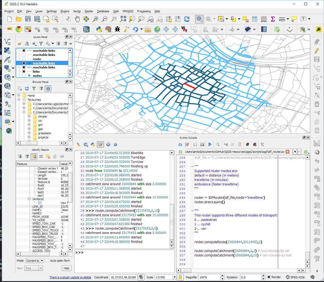
As announced in Salzburg a few days ago, I’m happy to present the lastest enhancement to my IDF router for QGIS: travel time routing and catchment computation.
Travel times for pedestrians and cyclists are computed using constant average speeds, while car travel times depend on the speed values provided by the road network data.
Catchment computations return the links that can be traversed completely within the given time (or distance limit). The current implementation does not deal with links at the edge of the catchment area, which can only be traversed partially.
Loading the whole network (2.7GB unzipped IDF) currently requires around 10GB of memory. One of the next plans therefore is to add a way to only load features within a specified bounding box.
Plans to turn this into a full-blown plugin will most likely have to wait for QGIS 3, which will ship with Python 3 and other updated libraries.
Last week I had the pleasure to attend the combined FOSSGIS, AGIT and GI_Forum conferences in Salzburg. It was a great joint event bringing together GIS user and developers from industry and academia, working with both open source and commercial GIS.
I was particularly impressed by the great FOSSGIS video team. Their tireless work makes it possible to re-watch all FOSSGIS talks (in German).
I also had the pleasure to give a few presentations. Most of all, it was an honor to give the AGIT opening keynote, which I dedicated to Open Source, Open Data & Open Science.
In addition, I also gave one talk related to an ongoing research project on pedestrian routing. It was really interesting to see that other people – in particular from the OSM community – also talked about this problem during FOSSGIS:
To wrap up this great week, Astrid Emde, Andreas Hocevar, and myself took the chance to celebrate the 10th anniversary of OSGeo during AGIT2016 OSGeo Day.
CKAN is for data portals what QGIS is for GIS. The project describes itself as
CKAN is a powerful data management system that makes data accessible – by providing tools to streamline publishing, sharing, finding and using data. CKAN is aimed at data publishers wanting to make their data open and available.
Many open (government) data platforms rely on CKAN and while the web interface is pretty good, there’s still the hassle of finding and downloading the data using a web browser.
This is where the QGIS CKAN-Browser plugin comes in useful. The plugin has been developed by BergWerkGIS for the state of Carinthia, Austria and added to the public plugin repo earlier this year. CKAN-Browser comes preconfigured with some Austrian and European CKAN URLs for testing, so you can get going really quickly. It is easy to search for specific datasets or explore the portal’s data categories and it is just one click to download and load the data into your QGIS map:
Here’s a quick demo of loading a vector dataset as well as raster tiles:
For the full usage guide, visit the plugin’s Github page.
It’s great to see how well CKAN and QGIS can play together to enable seamless access to open data!
We are looking forward to a hot geo summer here in Central Europe with both the German FOSSGIS (this year in conjunction with the annual AGIT conference) and the international FOSS4G just a few weeks away. It’s going to be exciting, and I still have a lot of talks (and a keynote) to prep for both events ;-)
If you speak German and want to enhance your geo skills, the FOSSGIS program offers some great opportunities and there is still the chance to sign up for a couple of great FOSSGIS workshops:
If you want to become a professional with projections, Claas Leiner’s workshop “Projektionsmanagement in QGIS” covers dealing with custom transformations. Claas is also running a Processing workshop on Wednesday.
Of course the program also features many non-QGIS workshops. If I’d have to pick one of them, it would most certainly be Marc Jansen’s and Andreas Hocevar’sOpenLayers 3 workshop because it’s always great to get the latest information first hand, directly from the developers.