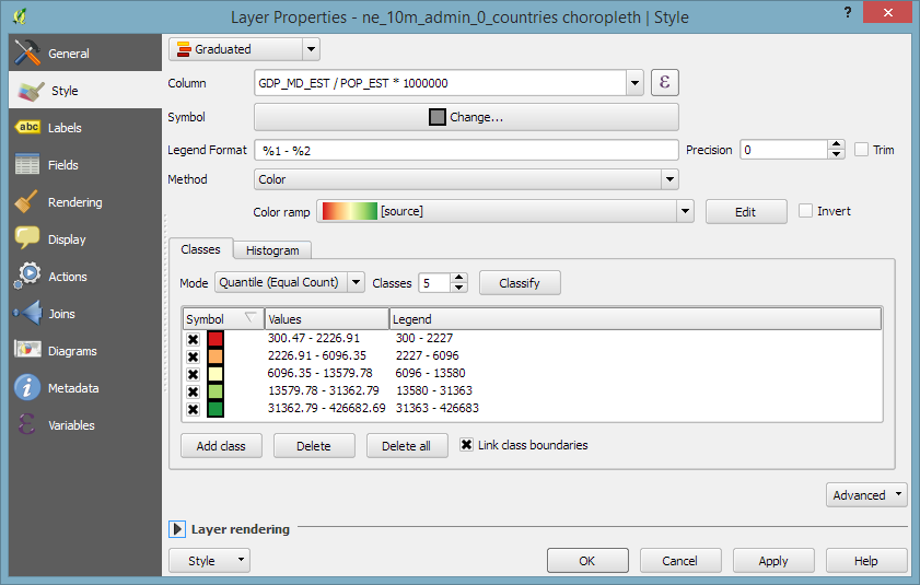
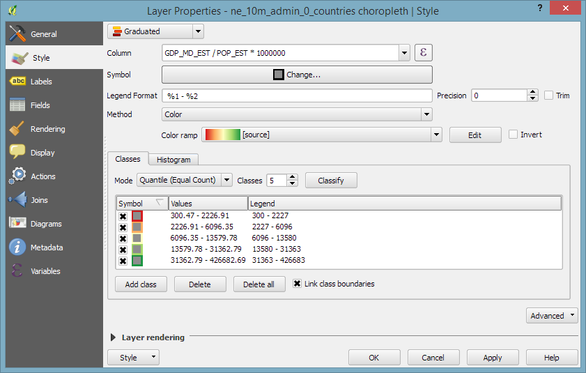
Default polygon symbols come with a fill and a border color:
When they are used in a graduated renderer, the fill color is altered for each class:
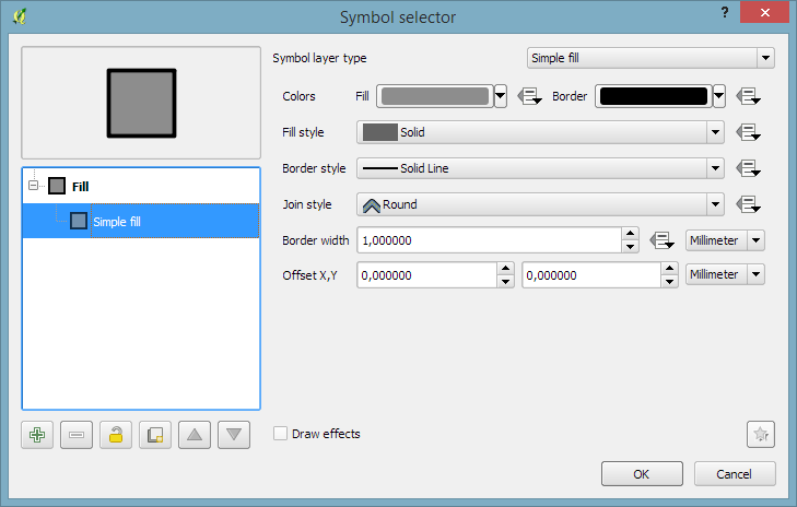
What if you want to change the border color instead?
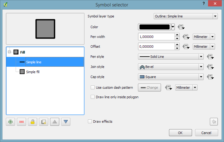
The simplest solution is to add an outline symbol layer to your polygon symbol:
The outline layer has only one color property and it will be altered by the graduated renderer.
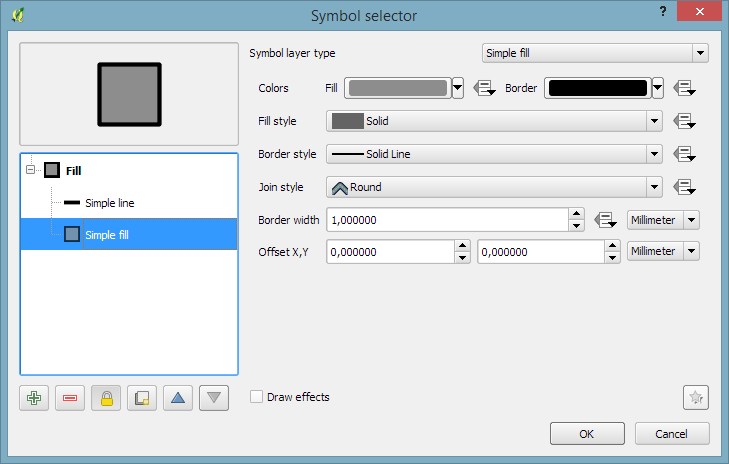
If you now hit ok, the graduated renderer will alter both the simple fill’s fill color and the outline’s color. To stop the fill color from changing, select the simple fill and lock it using the small lock icon below the list of symbol layers:
In three parts, the book covers layer styling, labeling, and designing print maps. All recipes come with data and project files so you can reproduce the maps yourself.
Check the book website for the table of contents and a sample chapter.
Just in time for the big QGIS 2.14 LTR release, the paperback will be available March 1st.
On a related note, I am also currently reviewing the latest proofs of the 3rd edition of “Learning QGIS”, which will be updated to QGIS 2.14 as well.
The upcoming 2.14 release of QGIS features a new renderer. For the first time in QGIS history, it will be possible to render 2.5D objects directly in the map window. This feature is the result of a successful crowd funding campaign organized by Matthias Kuhn last year.
In this post, I’ll showcase this new renderer and compare the achievable results to output from the Qgis2threejs plugin.
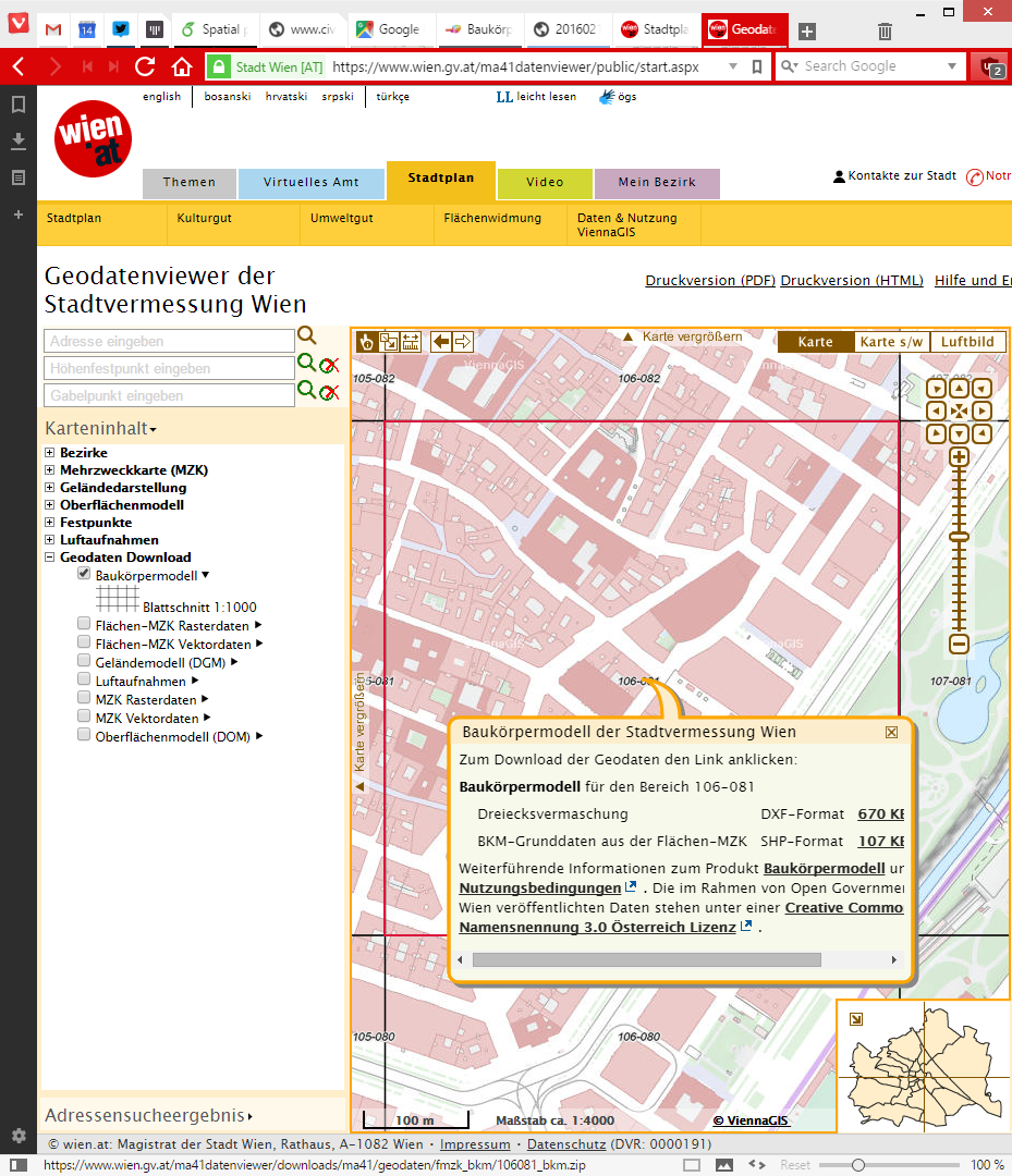
For this post, I’m using building parts data from the city of Vienna, which is publicly available through their data viewer:
This dataset is a pretty detailed building model, where each building is made up of multiple features that represent parts of the building with different height. Of course, if we just load the dataset in default style, we cannot really appreciate the data:
Loaded building parts layer
All this changes if we use the new 2.5D renderer. With just a few basic settings, we can create 2.5D representations of the building parts:
QGIS 2.5D renderer settings
Compare the results to aerial images in Google Maps …
QGIS 2.5D renderer and view in Google Maps
… not bad at all!
Except for a few glitches concerning the small towers at the corners of the building, and some situations where it seems like the wrong building part is drawn in the front, the 2.5D look is quite impressive.
Now, how does this compare to Qgis2threejs, one of the popular plugins which uses web technologies to render 3D content?
One obvious disadvantage of Qgis2threejs is that we cannot define a dedicated roof color. Thus the whole block is drawn in the same color.
On the other hand, Qgis2threejs does not suffer from the rendering order issues that we observe in the QGIS 2.5D renderer and the small towers in the building corners are correctly displayed as well:
QGIS 2.5D renderer and Qgis2threejs output
Overall, the 2.5D renderer is a really fun and exciting new feature. Besides the obvious building usecase, I’m sure we will see a lot of thematic maps making use of this as well.
Give it a try!
In the next post, I’m planning a more in-depth look into how the 2.5D renderer works. Here’s a small teaser of what’s possible if you are not afraid to get your hands dirty:
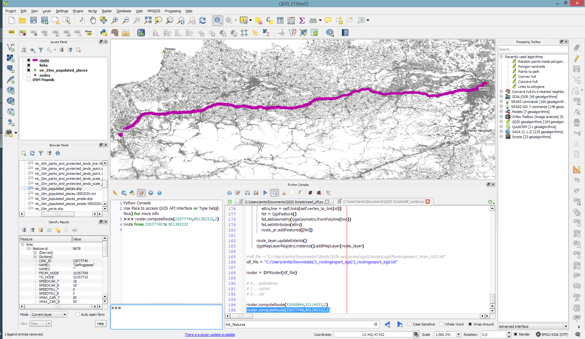
Monday, January 4th 2016, was the open data release date of the official Austrian street network dataset called GIP.at. As far as I know, the dataset is not totally complete yet but it should be in the upcoming months. I’ve blogged about GIP.at before in Open source IDF parser for QGIS and Open source IDF router for QGIS where I was implementing tools based on the data samples that were available then. Naturally, I was very curious if my parser and particularly the router could handle the whole country release …
Some code tweaking, patience for loading, and 9GB of RAM later, QGIS happily routes through Austria, for example from my work place to Salzburg – maybe for some skiing:
The routing request itself takes something between 1 and 2 seconds. (I should still add a timer to it.)
So far, I’ve implemented shortest distance routing for pedestrians, bikes, and cars. Since the data also contains travel speeds, it should be quite straight-forward to also add shortest travel time routing.
The code is available on Github for you to try. I’d appreciate any feedback!
Last summer, I had the pleasure to talk with UNIGIS Salzburg about the QGIS project: how it works and what makes it great. Now, finally, the video is out on Youtube:
Amongst other things, we are discussing the UNIGIS module on QGIS, which I have been teaching for the past few months.
The idea of this slide and several more was to show all the attention to detail which goes into designing a good road map. One aspect seemed particularly interesting to me since I had never considered it before: what do we communicate by our choice of line caps? The speaker argued that we need different caps for different situations, such as closed square caps at the end of a road and open flat caps when a road turns into a narrower path.
I’ve been playing with this idea to see how to reproduce the effect in QGIS …
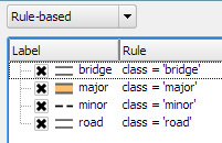
So first of all, I created a small test dataset with different types of road classes. The dataset is pretty simple but the key to recreating the style is in the attributes for the road’s end node degree values (degree_fro and degree_to), the link’s road class as well as the class of the adjacent roads (class_to and class_from). The degree value simply states how many lines connect to a certain network node. So a dead end as a degree of 1, a t-shaped intersection has a degree of 3, and so on. The adjacent class columns are only filled if the a neighbor is of class minor since I don’t have a use for any other values in this example. Filling the degree and adjacent class columns is something that certainly could be automated but I haven’t looked into that yet.
The layer is then styled using rules. There is one rule for each road class value. Rendering order is used to ensure that bridges are drawn on top of all other lines.
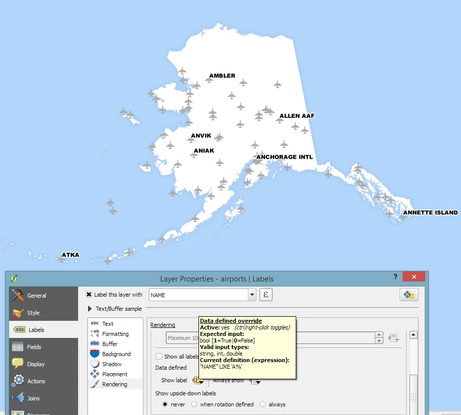
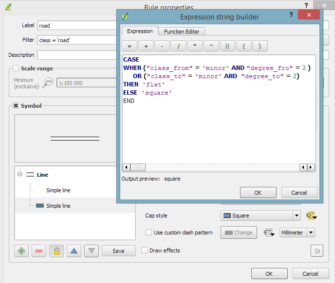
Now for the juicy part: the caps are defined using a data-defined expression. The goal of the expression is to detect where a road turns into a narrow path and use a flat cap there. In all other cases, square cap should be used.
Like some of you noted on Twitter after I posted the first preview, there is one issue and that is that we can only set one cap style per line and it will affect both ends of the line in the same way. In practice though, I’m not sure this will actually cause any issues in the majority of cases.
I wonder if it would be possible to automate this style in a way such that it doesn’t require any precomputed attributes but instead uses some custom functions in the data-defined expressions which determine the correct style on the fly. Let me know if you try it!
The QGIS project is asking for user feedback to gain a better understanding of the wishes and requirements of its user base. Please take part in the survey and share the links with other QGIS users. The survey is available in multiple languages:
In Publishing interactive web maps using QGIS, I presented two plugins for exporting web maps from QGIS. Today, I want to add an new member to this family: the qgis2web plugin is the successor of qgis-ol3 and combines exports to both OpenLayers3 as well as Leaflet.
The plugin is under active development and currently not all features are supported for both OpenLayers3 and Leaflet, but it’s a very convenient way to kick-off a quick webmapping project.
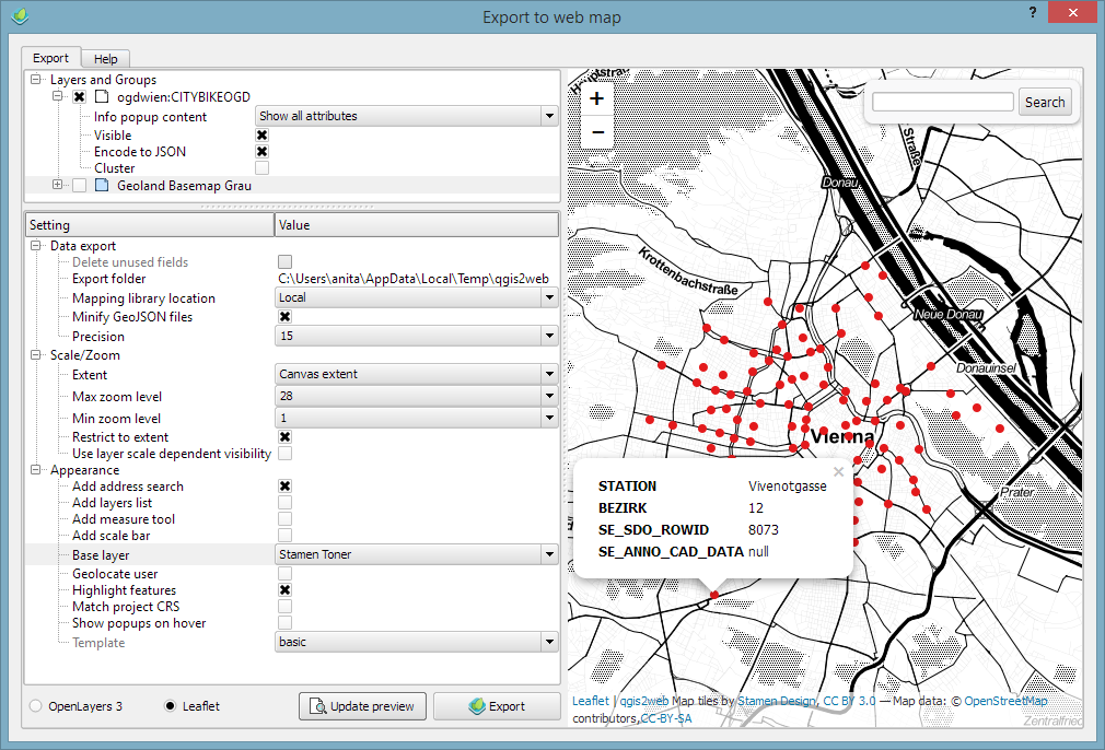
Here’s an example of an OpenLayers3 preview with enabled popups:
OpenLayers3 preview
And here is the same map in Leaflet with the added bonus of a nice address search bar which can be added automatically as well:
Leaflet preview
The workflow is really straight forward: select the desired layers and popup settings, pick some appearance extras, and then don’t forget to hit the Update preview button otherwise you might be wondering why nothing happens ;)
I’ll continue testing these plugins and am looking forward to seeing what features the future will bring.
This is a guest post by Karolina Alexiou (aka carolinux), Anita’s collaborator on the Time Manager plugin.
As of version 2.1.5, TimeManager provides some support for stepping through WMS-T layers, a format about which Anita has written in the past. From the official definition, the OpenGIS® Web Map Service Interface Standard (WMS) provides a simple HTTP interface for requesting geo-registered map images from one or more distributed geospatial databases. A WMS request defines the geographic layer(s) and area of interest to be processed. The response to the request is one or more geo-registered map images (returned as JPEG, PNG, etc) that can be displayed in a browser application. QGIS can display those images as a raster layer. The WMS-T standard allows the user of the service to set a time boundary in addition to a geographical boundary with their HTTP request.
From QGIS, go to Layer>Add Layer>Add WMS/WMST Layer and add a new server and connect to it. For the service we have chosen, we only need to specify a name and the url.
Select the top level layer, in our case named nexrad_base_reflect and click Add. Now you have added the layer to your QGIS project.
To add it to TimeManager as well, add it as a raster with the settings from the screenshot below. Start time and end time have the values 2005-08-29T03:10:00Z and 2005-08-30T03:10:00Z respectively, which is a period which overlaps with hurricane Katrina. Now, the WMS-T standard uses a handful of different time formats, and at this time, the plugin requires you to know this format and input the start and end values in this format. If there’s interest to sponsor this feature, in the future we may get the format directly from the web service description. The web service description is an XML document (see here for an example) which, among other information, contains a section that defines the format, default time and granularity of the time dimension.
If we set the time step to 2 hours and click play, we will see that TimeManager renders each interval by querying the web map service for it, as you can see in this short video.
Querying the web service and waiting for the response takes some time. So, the plugin requires some patience for looking at this particular layer format in interactive mode. If we export the frames, however, we can get a nice result. This is an animation showing hurricane Katrina progressing over a 30 minute interval.
If you want to sponsor further development of the Time Manager plugin, you can arrange a session with me – Karolina Alexiou – via Codementor.