Archive

Cartography

FOSS4G2016 is drawing closer quickly. To get in the mood for a week full of of geogeekery, Locate Press is offering a special FOSS4G discount for QGIS Map Design.

Use the code foss4gbonn to get 25% off your copy.

QGIS Map Design is the reference book to get if you want to bring your mapping skills up to speed. The book comes with a download for all our example map projects:

Looking forward to meeting you in Bonn!

Advertisement

If you follow me on Twitter, you’ve probably seen previews of my experiments with round maps. These experiments were motivated by a recent question on GIS.stackexchange whether this type of map can be created in QGIS and while it’s not very convenient right now, it is definitely possible:

http://www.quantarctica.org

All maps in this post are created using data from the Quantarctica project.

I’ve been planing to try the Quantarctica datasets for a long time and this use case is just perfect. When you download and open their project, you’ll see that they have already clipped all datasets to a circle around Antarctica:

Quantarctica project with some custom styling

Quantarctica project with some custom styling

Since the map of the full extent of the dataset is already clipped to a circle, the overview map is easy to deal with. The detail map on the other hand is rectangular by default:

circle_maps_start

Since we cannot change the shape of the map item, we have to use a mask instead. To create a circular mask, we can add an ellipse shape:

circle_maps_addellipse

The main challenge when creating the mask is that there is no inverted polygon renderer for shapes in print composer. I’ve evaluated two workarounds: First, I created a style with a wide white outline that would cover all map parts outside the circle shape. But this solution slowed the print composer down a lot. An alternative, which doesn’t suffer from this slowdown is using draw effects:

circle_maps_mask_style

In particular, I created a big outer glow effect:

circle_maps_mask_style_effect

Note that the effect only works if the symbol itself is not transparent. That’s why I set the symbol fill to black and used the Lighten blending mode:

circle_maps_mask

Voilà! Both maps are nicely circular.

It is worth noting though that this workaround has a downside: it is not possible to create automatic grids/graticules for these maps. The graticule in the overview map only works because it is a layer in the main project that was already clipped to the circular shape.

Finally, you can add more depth to your map by adding shadows. To create the shadow effect, I added additional ellipse items which are styled with a drop shadow draw effect. If you only enable the drop shadow effect, you will notice that the shadow is cut off at the ellipse bounding box. To avoid this undesired effect, you can add a transform effect, which reduces the size of the drawn shape and it’s shadow so that the shadow fits into the bounding box:

circle_maps_mask_shadow_effect

It requires some manual adjustments to place the shadow at the optimal location on top of the mask:

circle_maps_mask_shadow

Add another ellipse to create the shadow for the overview map.

For more cartography tips and tricks check my new book QGIS Map Design or join my QGIS training courses.

Following up on last week’s post, Nyall has continued his work on the QGIS gradient editor:

Latest version of the new QGIS interactive gradient edit. This now includes an interactive plot of the color hue/saturation/lightness/alpha, allowing a visual overview of these color components and easy editing.

Another equally awesome demo has been posted by Nathan, who is currently working on usability improvements for labeling and styling without blocking dialogs:

This is going to be great for map design work because it makes many complex styles much easier to create since you can interact with the map and attribute table at the same time.

These are definitely two developments to follow closely!

Interesting developments going on if you like creating your own gradients. After all, that’s not as easy as it might initially seem, as Gregor Aisch describes in his post “Mastering Multi-hued Color Scales with Chroma.js”:

The issues with simple color interpolations, which include nonuniform changes in lightness between classes, also haunt us in cartography. Just have a look at the map and legend on the left-hand side, which has been created using a normal custom QGIS gradient with colors ranging from black to red, yellow and finally white. We end up with three classes in yellow which are nearly impossible to tell apart:

comparing_ramps

For comparison, on the right side, I’ve used Gregor’s corrected color ramp, which ensures that lightness changes evenly from one class to the next.

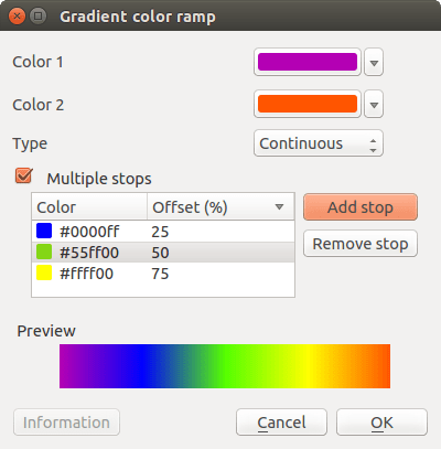
Wouldn’t it be great if the built-in gradient tool in QGIS could correct for lightness? Too bad the current dialog is not that great:

My first reaction therefore was to write a short script to import gradients from Gregor’s Chroma.js Color Scale Helper into QGIS:

But we’ll probably have a much better solution in QGIS soon since Nyall Dawson has picked up the idea and is already working on a completely new version of the gradient tool. You can see a demo of the current work in progress here:

I’m really looking forward to trying this out once it hits master!

Today’s post was motivated by a question on GIS.StackExchange, which is looking for an automated way to symbolize the amenities available at a location using a series of icons, like this:

Screenshot 2016-03-19 23.02.30

Assuming the information is available in  a format similar to this example attribute table

Screenshot 2016-03-19 23.02.00

we can create a symbol, which adapts to the values in the icon columns using data-defined overrides:

Screenshot 2016-03-19 23.04.17

The five potential symbol locations are aligned next to each other using offsets. We use the following expression to determine the correct SVG symbol:

CASE
WHEN "icon4" = 'dinner'
 THEN 'C:/OSGeo4W64/apps/qgis-dev/svg/entertainment/amenity=restaurant.svg'
WHEN "icon4" = 'sleep'
 THEN 'C:/OSGeo4W64/apps/qgis-dev/svg/accommodation/accommodation_hotel2.svg'
WHEN "icon4" = 'ship'
 THEN 'C:/OSGeo4W64/apps/qgis-dev/svg/transport/amenity=ferry_terminal.svg'
WHEN "icon4" = 'house'
 THEN 'C:/OSGeo4W64/apps/qgis-dev/svg/accommodation/accommodation_house.svg'
 ELSE  ''
END

To hide icons if the icon value is NULL, the marker size is set to 0 using, for example:

CASE
WHEN "icon4" is not NULL
 THEN 4
 ELSE 0
END

Finally, to ensure that the labels don’t cover the icons, we can use the cartographic label placement with the position priority set to ‘TR,TL,BL’, which restricts labels to the top right, top left, and bottom left position.

Screenshot 2016-03-19 23.04.43

With these settings in place, we can zoom out and the labeling algorithm picks the most suitable position from the list of allowed positions:

Screenshot 2016-03-19 23.02.11

For more cartography tips and tricks check my new book QGIS Map Design or join my QGIS training courses.

My latest book “QGIS Map Design”, co-authored with well-known cartography expert Gretchen Peterson and with a foreword by the founder of QGIS, Gary Sherman himself, is now available as e-book.

In three parts, the book covers layer styling, labeling, and designing print maps. All recipes come with data and project files so you can reproduce the maps yourself.

Check the book website for the table of contents and a sample chapter.

Just in time for the big QGIS 2.14 LTR release, the paperback will be available March 1st.

On a related note, I am also currently reviewing the latest proofs of the 3rd edition of “Learning QGIS”, which will be updated to QGIS 2.14 as well.

Happy QGISing!

It’s been a while since my last blog post mostly because I’ve been busy with some more long form writing. Most notably, I’ve been writing a paper on the QGIS Projcessing framework in the open access ISPRS International Journal of Geo-Information together with Victor Olaya and I’m still in the process of writing a new book titled “QGIS Map Design” together with Gretchen Peterson which is scheduled for early 2016.

Today’s post has been on my todo list for a while now. It’s inspired by a talk at a recent cartography conference I attended:

(For a summary of the whole event, check the storify I compiled.)

The idea of this slide and several more was to show all the attention to detail which goes into designing a good road map. One aspect seemed particularly interesting to me since I had never considered it before: what do we communicate by our choice of line caps? The speaker argued that we need different caps for different situations, such as closed square caps at the end of a road and open flat caps when a road turns into a narrower path.

I’ve been playing with this idea to see how to reproduce the effect in QGIS …

So first of all, I created a small test dataset with different types of road classes. The dataset is pretty simple but the key to recreating the style is in the attributes for the road’s end node degree values (degree_fro and degree_to), the link’s road class as well as the class of the adjacent roads (class_to and class_from). The degree value simply states how many lines connect to a certain network node. So a dead end as a degree of 1, a t-shaped intersection has a degree of 3, and so on. The adjacent class columns are only filled if the a neighbor is of class minor since I don’t have a use for any other values in this example. Filling the degree and adjacent class columns is something that certainly could be automated but I haven’t looked into that yet.

roadattributes


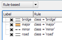
The layer is then styled using rules. There is one rule for each road class value. Rendering order is used to ensure that bridges are drawn on top of all other lines.

roadrules

Now for the juicy part: the caps are defined using a data-defined expression. The goal of the expression is to detect where a road turns into a narrow path and use a flat cap there. In all other cases, square cap should be used.

roadrule

Like some of you noted on Twitter after I posted the first preview, there is one issue and that is that we can only set one cap style per line and it will affect both ends of the line in the same way. In practice though, I’m not sure this will actually cause any issues in the majority of cases.

I wonder if it would be possible to automate this style in a way such that it doesn’t require any precomputed attributes but instead uses some custom functions in the data-defined expressions which determine the correct style on the fly. Let me know if you try it!

If you are following QGIS on Twitter you’ve probably noticed the increasing number of tweets by journalists using QGIS.

For example this map in the Financial Times by Hannah Dormido

or this one with overview maps and three different levels of details

or this map with semi-transparent label backgrounds and nice flag images

or even Time Manager animations by raoulranoa in the Los Angeles Times

I think this is a great development and a sign of how wide-spread QGIS usage is today.

If you know of any other examples or if you are a journalist using QGIS yourself, I’d love to see more!

In the category “last night on Twitter”, a challenge I couldn’t resist: creating illuminated contours (aka Tanaka contours) in QGIS. Daniel P. Huffman started the thread by posting this great example:

CFnWnA5UkAAuFm9

This was quickly picked up by Hannes Kröger who blogged about his first attempt at reproducing the effect using QGIS and GIMP. Obviously, that left the challenge of finding a QGIS-only solution.

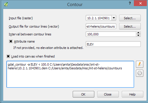
Everything that’s needed to create this effect is a DEM. As Hannes describes in his post, the DEM can then be used to compute the contour lines, e.g. with Raster | Extraction | Contour:

gdal_contour -a ELEV -i 100.0 C:\Users\anita\Geodata\misc\mt-st-helens\10.2.1.1043901.dem C:/Users/anita/Geodata/misc/mt-st-helens/countours
Screenshot 2015-05-24 11.17.49

contours

In order to be able to compute the brightness of the illuminated contours, we need to compute the orientation of every subsection of the contours. Therefore, we need to split the contour lines at each node. One way to do this is using v.split from the Processing toolbox:

Screenshot 2015-05-24 11.23.11

When we split the contours and visualize the result using arrows, we can see that they all wrap around the mountain in clockwise direction (light DEM cells equal higher elevation):

split_contours

After the split, we can compute the orientation of the contour subsections using, for example, a user-defined function:

Screenshot 2015-05-24 19.09.12

"""
Define new functions using @qgsfunction. feature and parent must always be the
last args. Use args=-1 to pass a list of values as arguments
"""

from qgis.core import *
from qgis.gui import *

@qgsfunction(args='auto', group='Custom')
def azimuth(x1,y1,x2,y2, feature, parent):
	p1 = QgsPoint(x1,y1)
	p2 = QgsPoint(x2,y2)
	a = p1.azimuth(p2)
	if a < 0:
		a += 360
	return a

This function can then be used in a Field calculator expression:

Screenshot 2015-05-24 19.11.53

Based on the orientation, we can then write an expression to control the contour line color. For example, if we want the sun to appear in the north west (-45°) we can use:

color_hsl( 0,0,
  scale_linear( abs(
    ( CASE WHEN "azimuth"-45 < 0
      THEN "azimuth"-45+360
      ELSE "azimuth"-45
    END )
  -180), 0, 180, 0, 100)
  )

This will color the lines which are directly exposed to the sun white hsl(0,0,100) while the ones in the shadows will be black hsl(0,0,0).

Screenshot 2015-05-24 11.55.50

Use the Overlay layer blending mode to blend contours and DEM color:

illuminated_contours

The final step, to get as close to the original design as possible, is to create the effect of discrete elevation classes instead of a smooth color gradient. This can easily be achieved by changing the color interpolation mode of the DEM from Linear to Discrete:

Screenshot 2015-05-24 12.11.01

This leaves us with the following gorgeous effect:

tanaka_contours

As Hannes pointed out, another important aspect of Tanaka’s method is to also alter the contour line width. Lines in the sun or shadow should be wider (1 in this example) than those in orthogonal direction (0.2 in this example):

scale_linear(
abs( abs(
  ( CASE WHEN "azimuth"-45 < 0
    THEN "azimuth"-45+360
    ELSE "azimuth"-45
  END )
-180) -90),
0, 90, 0.2, 1)

datadefined_line_width

Enjoy!

In my opinion, Stamen’s Toner-lite map is one of the best background maps to use together with colorful overlays. The only downsides of using it in QGIS are that the OpenLayers plugin can not provide the tiles at print resolution and that the projection is limited to Web Mercator. That’s why I’ve started to recreate the style for OSM Spatialite databases:

toner-lite

So far, there are styles for lines and polygons and they work quite well for the scale range between 1:1 and 1:250000. As always, you can download the styles from QGIS-resources on Github.

%d bloggers like this: