Archive

Visualization

How do you objectively define and compute which parts of a network are in the center? One approach is to use the concept of centrality.

Centrality refers to indicators which identify the most important vertices within a graph. Applications include identifying the most influential person(s) in a social network, key infrastructure nodes in the Internet or urban networks, and super spreaders of disease. (Source: http://en.wikipedia.org/wiki/Centrality)

Researching this topic, it turns out that some centrality measures have already been implemented in GRASS GIS. thumbs up!

v.net.centrality computes degree, betweeness, closeness and eigenvector centrality.

As a test, I’ve loaded the OSM street network of Vienna and run

v.net.centrality -a input=streets@anita_000 output=centrality degree=degree closeness=closeness betweenness=betweenness eigenvector=eigenvector

grass_centrality

The computations take a while.

In my opinion, the most interesting centrality measures for this street network are closeness and betweenness:

Closeness “measures to which extent a node i is near to all the other nodes along the shortest paths”. Closeness values are lowest in the center of the network and higher in the outskirts.

Betweenness “is based on the idea that a node is central if it lies between many other nodes, in the sense that it is traversed by many of the shortest paths connecting couples of nodes.” Betweenness values are highest on bridges and other important arterials while they are lowest for dead-end streets.

(Definitions as described in more detail in Crucitti, Paolo, Vito Latora, and Sergio Porta. “Centrality measures in spatial networks of urban streets.” Physical Review E 73.3 (2006): 036125.)

Centrality: low values in pink, high values in green

Centrality: low values in pink, high values in green

Works great! Unfortunately, v.net.centrality is not yet part of the QGIS Processing GRASS toolbox. It would certainly be a great addition.

This experiment is motivated by a discussion I had with Dr. Claus Rinner about introducing students to GIS concepts using Conway’s Game of Life. Conway’s Game of Life is a popular example to demonstrate cellular automata. Based on an input grid of “alive” and “dead” cells, new cell values are computed on each iteration based on four simple rules for the cell and its 8 neighbors:

  1. Any live cell with fewer than two live neighbours dies, as if caused by under-population.
  2. Any live cell with two or three live neighbours lives on to the next generation.
  3. Any live cell with more than three live neighbours dies, as if by overcrowding.
  4. Any dead cell with exactly three live neighbours becomes a live cell, as if by reproduction.

(Source: Wikipedia – Conway’s Game of Life)

Based on these simple rules, effects like the following “glider gun” can be achieved:

Gospers glider gun.gif
Gospers glider gun” by KieffOwn work. Licensed under CC BY-SA 3.0 via Wikimedia Commons.

There are some Game of Life implementations for GIS out there, e.g. scripts for ArcGIS or a module for SAGA. Both of these examples are raster-based. Since I couldn’t find any examples of raster manipulation like this in pyQGIS, I decided to instead implement a vector version: a Processing script which receives an input grid of cells and outputs the next iteration based on the rules of Game of Life. In the following screencast, you can see the Processing script being called repeatedly by a script from the Python console:

So far, it’s a quick and dirty first implementation. To make it more smooth, I’m considering adding spatial indexing and using memory layers instead of having Processing create a bunch of Shapefiles.

It would also be interesting to see a raster version done in PyQGIS. Please leave a comment if you have any ideas how this could be achieved.

In my opinion, Stamen’s Toner-lite map is one of the best background maps to use together with colorful overlays. The only downsides of using it in QGIS are that the OpenLayers plugin can not provide the tiles at print resolution and that the projection is limited to Web Mercator. That’s why I’ve started to recreate the style for OSM Spatialite databases:

toner-lite

So far, there are styles for lines and polygons and they work quite well for the scale range between 1:1 and 1:250000. As always, you can download the styles from QGIS-resources on Github.

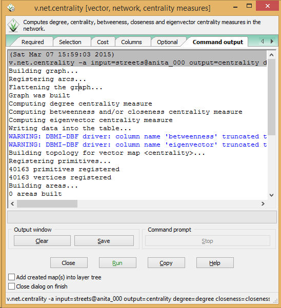
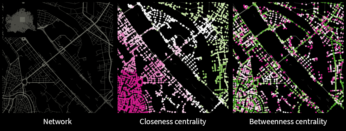
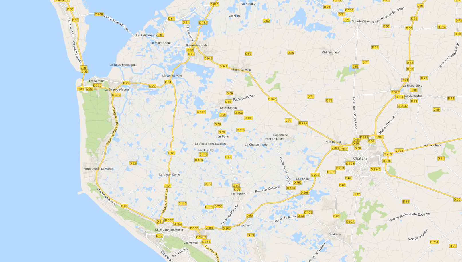
Using OSM data in QGIS is a hot topic but so far, no best practices for downloading, preprocessing and styling the data have been established. There are many potential solutions with all their advantages and disadvantages. To give you a place to start, I thought I’d share a workflow which works for me to create maps like the following one from nothing but OSM:

osm_google_100k

Getting the data

Raw OSM files can be quite huge. That’s why it’s definitely preferable to download the compressed binary .pbf format instead of the XML .osm format.

As a download source, I’d recommend Geofabrik. The area in the example used in this post is part of the region Pays de la Loire, France.

Preparing the data for QGIS

In the preprocessing step, we will extract our area of interest and convert the .pbf into a spatialite database which can be used directly in QGIS.

This can be done in one step using ogr2ogr:

C:\Users\anita_000\Geodata\OSM_Noirmoutier>ogr2ogr -f "SQLite" -dsco SPATIALITE=YES -spat 2.59 46.58 -1.44 47.07 noirmoutier.db noirmoutier.pbf

where the -spat option controls the area of interest to be extracted.

When I first published this post, I suggested a two step approach. You can find it here for future reference:

For the first step: extracting the area of interest, we need Osmosis. (For Windows, you can get osmosis from openstreetmap.org. Unpack to use. Requires Java.)

When you have Osmosis ready, we can extract the area of interest to the .osm format:

C:\Users\anita_000\Geodata\OSM_Noirmoutier>..\bin\osmosis.bat --read-pbf pays-de-la-loire-latest.osm.pbf --bounding-box left=-2.59 bottom=46.58 right=-1.44 top=47.07 --write-xml noirmoutier.osm

While QGIS can also load .osm files, I found that performance and access to attributes is much improved if the .osm file is converted to spatialite. Luckily, that’s easy using ogr2ogr:

C:\Users\anita_000\Geodata\OSM_Noirmoutier>ogr2ogr -f "SQLite" -dsco SPATIALITE=YES noirmoutier.db noirmoutier.osm

Finishing preprocessing in QGIS

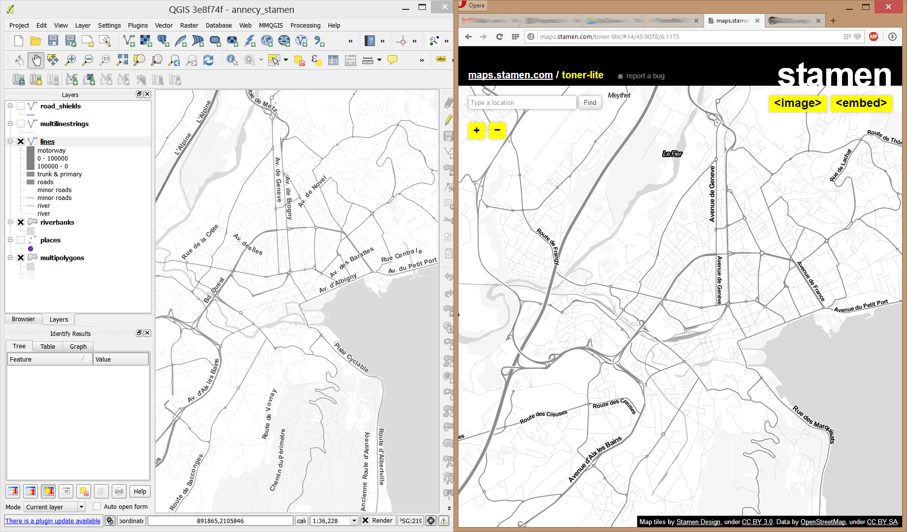
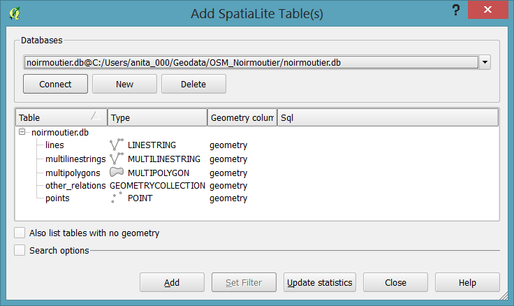
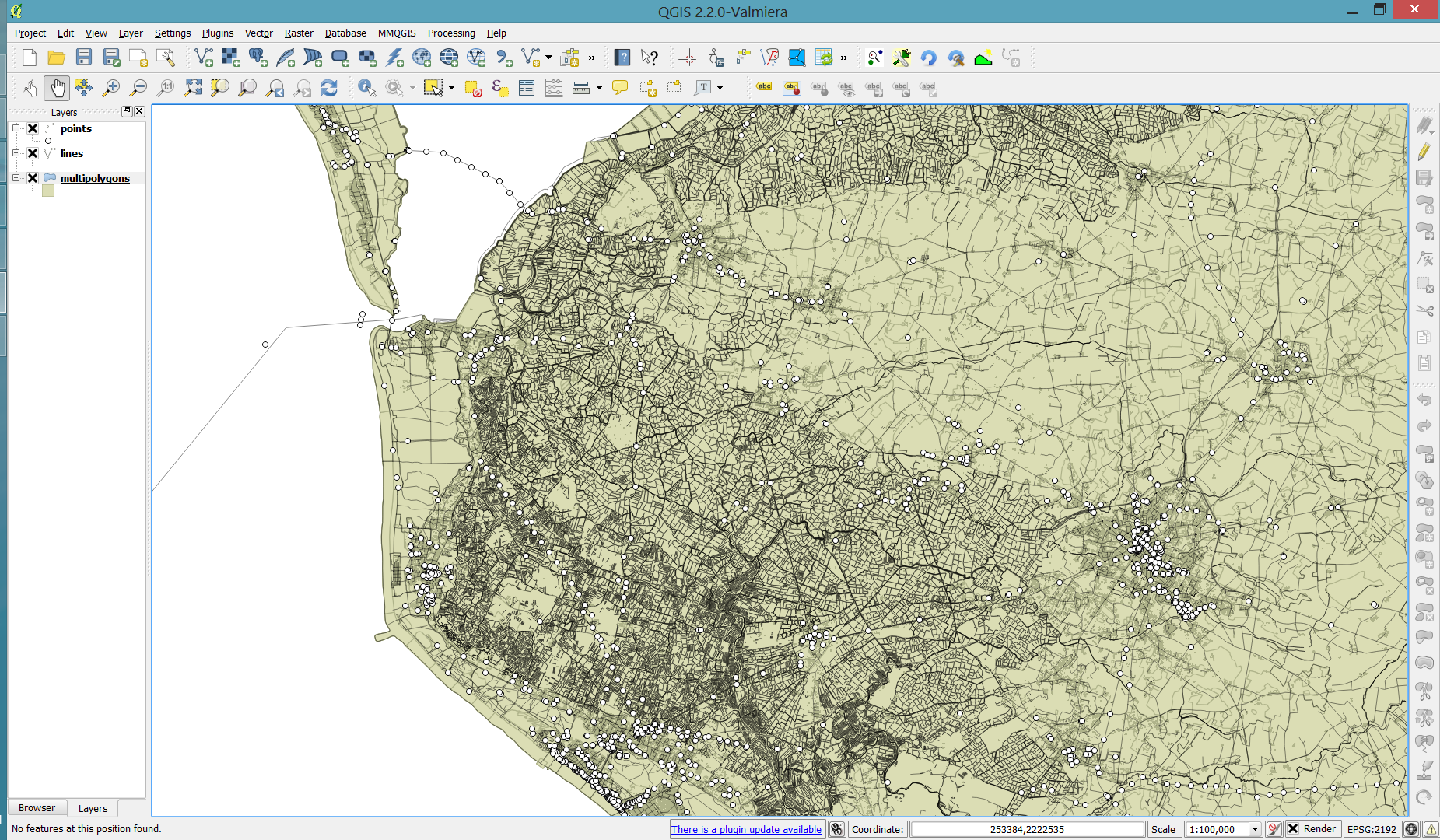
In QGIS, we’ll want to load the points, lines, and multipolygons using Add SpatiaLite Layer:

Screenshot 2014-05-31 11.39.40

When we load the spatialite tables, there are a lot of features and some issues:

  • There is no land polygon. Instead, there are “coastline” line features.
  • Most river polygons are missing. Instead there are “riverbank” line features.

Screenshot 2014-05-31 11.59.58

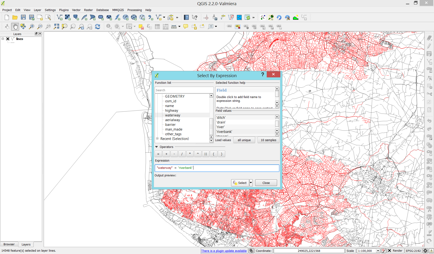
Luckily, creating the missing river polygons is not a big deal:

  1. First, we need to select all the lines where waterway=riverbank.
    Screenshot 2014-05-31 13.14.00
  2. Then, we can use the Polygonize tool from the processing toolbox to automatically create polygons from the areas enclosed by the selected riverbank lines. (Note that Processing by default operates only on the selected features but this setting can be changed in the Processing settings.)
    Screenshot 2014-05-31 13.40.16

Creating the land polygon (or sea polygon if you prefer that for some reason) is a little more involved since most of the time the coastline will not be closed for the simple reason that we are often cutting a piece of land out of the main continent. Therefore, before we can use the Polygonize tools, we have to close the area. To do that, I suggest to first select the coastline using "other_tags" LIKE '%"natural"=>"coastline"%' and create a new layer from this selection (save selection as …) and edit it (don’t forget to enable snapping!) to add lines to close the area. Then polygonize.

Screenshot 2014-05-31 14.38.48

Styling the data

Now that all preprocessing is done, we can focus on the styling.

You can get the styles used in the map from my Github QGIS-resources repository:

  • osm_spatialite_googlemaps_multipolygon.qml … rule-based renderer incl. rules for: water, natural, residential areas and airports
  • osm_spatialite_googlemaps_lines.qml … rule-based renderer incl. rules for roads, rails, and rivers, as well as rules for labels
  • osm_spatialite_googlemaps_roadshields.qml … special label style for road shields
  • osm_spatialite_googlemaps_places.qml … label style for populated places such as cities and towns

qgis_osm_google_100k

If you are looking for a tool to easily create 3D visualizations of your geodata, look no further! Qgis2threejs is a plugin by Minoru Akagi which exports terrain data combined with the map canvas image and optional vector data to an html file which can be viewed in 3D in any web browser which supports WebGL. To do that, this plugin uses the Three.js library.

This is the result of my first experiments with Qgis2threejs. In the following sections, I will show the steps to reproduce it.

Türkenschanzpark, Vienna

click for the interactive version (requires WebGL-capable browser)

1. The data

The building blocks of this visualization are:

  • elevation data and the hillshade derived from this data
  • a base map (WMTS from basemap.at in my case)
  • OSM building data provided by Geofabrik and
  • tree data from the city of Vienna

Load all datasets into QGIS.

2. Preparing the map

Qgis2threejs will overlay the map (as rendered in the QGIS map area) on top of the elevation model. You can combine any number of layers to create your map. I just loaded a basemap.at WMTS and a hillshade layer. To add a nice tree shadow effect, I also added the tree layer (dark grey, 50% transparency, multiply blending).

tuerkenschanzpark_map

3. Preparing the vector features

The vector features in the visualization are buildings and trees. The buildings are based on an OSM building layer. The trees are create from two point layers: one point layer to create the tree trunks (cylinder shape) and a duplicate of this point layer to create the tree crowns (sphere shape).

Load the data and choose the desired fill colors.

4. Using Qgis2threejs

Now we can start Qgis2threejs. The first tab is used to configure the terrain. Just pick the correct elevation data layer. I didn’t modify any of the other default settings.

qgis2threejs_dem

The second tab provides the settings for the vector data. As mentioned in the previous section, the trees are created from two point layers and the buildings are based on a polygon layer. The tree crowns are spheres with a radius size 3 and a z value of 5 above the surface. The tree trunks are cylinders. Finally, the buildings have a height of 10.

qgis2threejs_vector

That’s it! Just press “run” and wait. When the export is finished, your default browser (or a different one, if you specify another one in the plugin settings) will open automatically and display the results.
The visualization is interactive. You can tilt the visualization using the left mouse button, pan using the right mouse button, and zoom using the mouse wheel. I found that Firefox used around 1.6 GB of RAM to render this example.

5. Share your visualization

In the browser window, you will see where Qgis2threejs stored the html and associated Javascript files. To share your visualization, you just need to copy these files onto a webserver.

I would love to see what you come up with. Please share a link in the comments.

Since I finally managed to download the elevation model of the city of Vienna, I thought I’d share some eye candy with you: The map uses layer blending to combine hillshade and elevation raster, and the elevation raster’s color ramp is a modified “garish14” from QGIS’ cpt-city color ramp collection.

wien_elevation by underdarkGIS
wien_elevation, a photo by underdarkGIS on Flickr.

Update

Here is how you get access to the “garish14” color ramp:

Start by selecting the "new color ramp" option in the raster's style window.

Start by selecting the “new color ramp” option in the raster’s style window.

Chose the "cpt-city" color ramp type.

Chose the “cpt-city” color ramp type.

In the "cpt-city color ramp" window, you will find lots of different premade color ramps. "garish14" is part of the "Topography" collection.

In the “cpt-city color ramp” window, you will find lots of different premade color ramps. “garish14” is part of the “Topography” collection.

Did you know that there is a version of ColorBrewer that does not require Flash?

Enjoy! Pure Javascript and zero loading times: http://colorbrewer2.org/js/

colorbrewerjs

Yesterday, I described my process to generate a basic population density map from the city of Vienna’s open government data. In the end of that post, I described some ideas for further improvement. Today, I want to follow-up on those ideas using what is known as dasymetric mapping. GIS Dictionary defines it well (much better than Wikipedia):

Dasymetric mapping is a technique in which attribute data that is organized by a large or arbitrary area unit is more accurately distributed within that unit by the overlay of geographic boundaries that exclude, restrict, or confine the attribute in question.
For example, a population attribute organized by census tract might be more accurately distributed by the overlay of water bodies, vacant land, and other land-use boundaries within which it is reasonable to infer that people do not live.

That’s exactly what I want to do: Based on subdistricts with population density values and auxiliary data – Corine Land Cover to be exact – I want to create an improved representation of population density within the city.

This is the population density map I start out with:

… and this is the Corine Land Cover dataset for the same area:

It shows built-up areas (red), parks and natural areas (green) as well as water-covered regions (blue). For further analysis, I follow the assumption that people only live in areas with Corine code 111 “Continuous urban fabric” and 112 “Discontinuous urban fabric”. Therefore, I use the Intersection tool to clip only these residential areas from the subdistrict polygons. The subdistrict population can now be distributed over these new, smaller areas (use Field Calculator) to create a more realistic visualization of population density:

For easier comparison, I put the original density and the dasymetric map into a looping animation. Some subdistricts change their population density values quite drastically, especially in regions where big parts covered by water or rail infrastructure were removed:

Corine Land Cover is not too detailed but I think it still usable on this scale. One thing to note is that I used data from 2006 with population data from 2012 so some areas in the outer districts will have been turned residential in the meantime. But I hope this doesn’t distort the overall picture too much.

The city of Vienna provides both subdistrict geometries and population statistics. Mapping the city’s population density should be straightforward, right? Let’s see …

We should be able to join on ZBEZ and SUB_DISTRICT_CODE, check! But what about the actual population counts? Unfortunately, there is no file which simply lists population per subdistrict. The file I found contains four lines for each subdistrict: females 2011, males 2011, females 2012 and males 2012. That’s not the perfect format for mapping general population density.

A quick way to prepare our input data is applying pivot tables, eg. in Open Office: The goal is to have one row per subdistrict and columns for population in 2011 and 2012:

Export as CSV, add CSVT and load into QGIS. Finally, we can join geometries and CSV table:

A quick look at the joined data confirms that each subdistrict now has a population value. But visualizing absolute values results in misleading maps. Big subdistricts with only average density will overrule smaller but much denser subdistricts:

That’s why we need to calculate population density. This is easy to do using Field Calculator. The subdistrict file already contains area values but even if they were missing, we could calculate it using the $area operator: "pop2012" / ($area / 10000). The resulting population density in population per ha finally shows which subdistricts are the most densely populated:

One could argue that this is still no accurate representation of population density: Big parts of some subdistricts are actually covered by water – especially along the Danube – and therefore uninhabited. There are also big parks which could be excluded from the subdistrict area. But that’s going to be the topic of another post.

If you want to use my results so far, you can download the GeoJSON file from Github.

Today, I’ve finished my submission for the Hubway Data Visualization Challenge. All parts of the resulting dataviz were created using open source tools. My toolbox for this work contains: QGIS, Spatialite, Inkscape, Gimp and Open Office Calc. To see the complete submission and read more about it, check the project page.