Archive

Tag Archives: cartography

With the release of 2.10 right around the corner, it’s time to have a look at the new features this version of QGIS will bring. One area which has received a lot of development attention is layer styling. In particular, I want to point out the following new features:

1. Graduated symbol size

The graduated renderer has been expanded. Formerly, only color-graduated symbols could be created automatically. Now, it is possible to choose between color and size-graduated styles:

Screenshot 2015-06-21 18.39.25

2. Symbol size assistant

On a similar note, I’m sure you’ll enjoy the size assistant for data-defined size:

Screenshot 2015-06-21 23.16.10 Screenshot 2015-06-21 23.16.01

What’s particularly great about this feature is that it also creates a proper legend for the data-defined sizes:

Screenshot 2015-06-21 23.18.46

3. Interactive class exploration and definition

Another great addition to the graduated renderer dialog is the histogram tab which visualizes the distribution of values as well as the defined class borders. Additionally, the user can interactively change the classes by moving the class borders:

Screenshot 2015-06-21 18.43.09

4. Live layer effects

Since Nyall’s crowd funding initiative for live layer effects was a resounding success, it is now possible to create amazing effects for your vector styles such as shadows, glow, and blur effects:

Screenshot 2015-06-21 18.45.22

I’m very much looking forward to seeing all the new map designs this enables on the QGIS map Flickr group.

Thanks to everyone who was involved in developing and funding these new features!

In the category “last night on Twitter”, a challenge I couldn’t resist: creating illuminated contours (aka Tanaka contours) in QGIS. Daniel P. Huffman started the thread by posting this great example:

CFnWnA5UkAAuFm9

This was quickly picked up by Hannes Kröger who blogged about his first attempt at reproducing the effect using QGIS and GIMP. Obviously, that left the challenge of finding a QGIS-only solution.

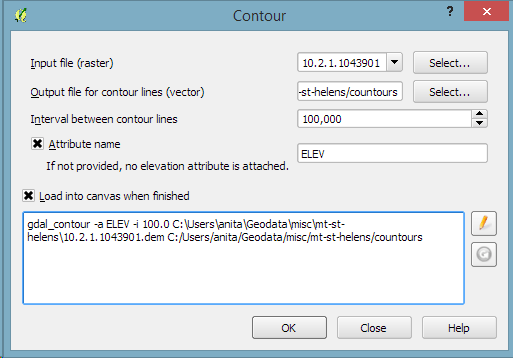
Everything that’s needed to create this effect is a DEM. As Hannes describes in his post, the DEM can then be used to compute the contour lines, e.g. with Raster | Extraction | Contour:

gdal_contour -a ELEV -i 100.0 C:\Users\anita\Geodata\misc\mt-st-helens\10.2.1.1043901.dem C:/Users/anita/Geodata/misc/mt-st-helens/countours

Screenshot 2015-05-24 11.17.49

contours

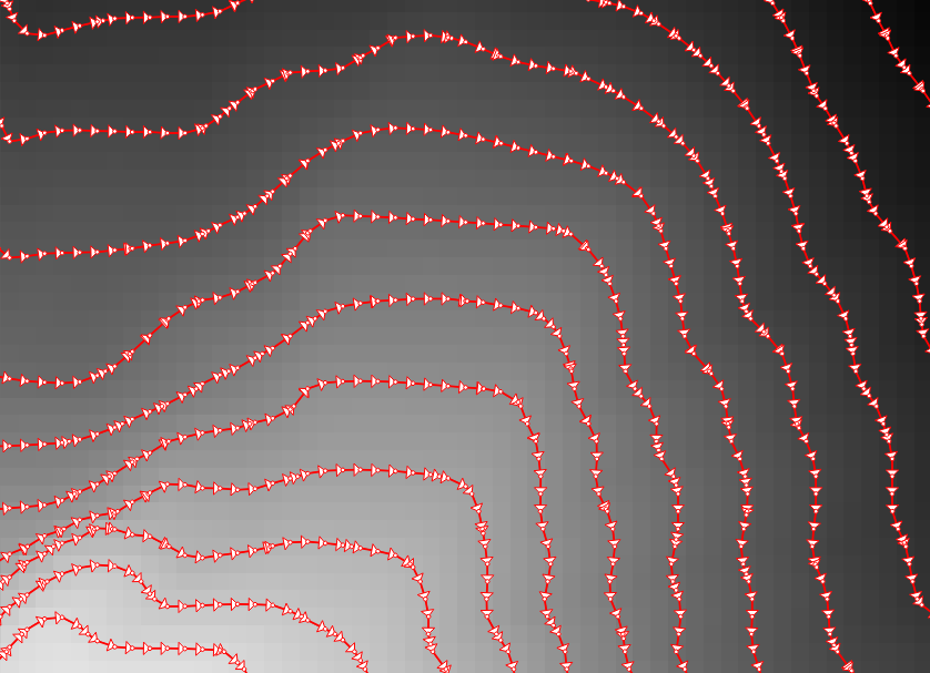
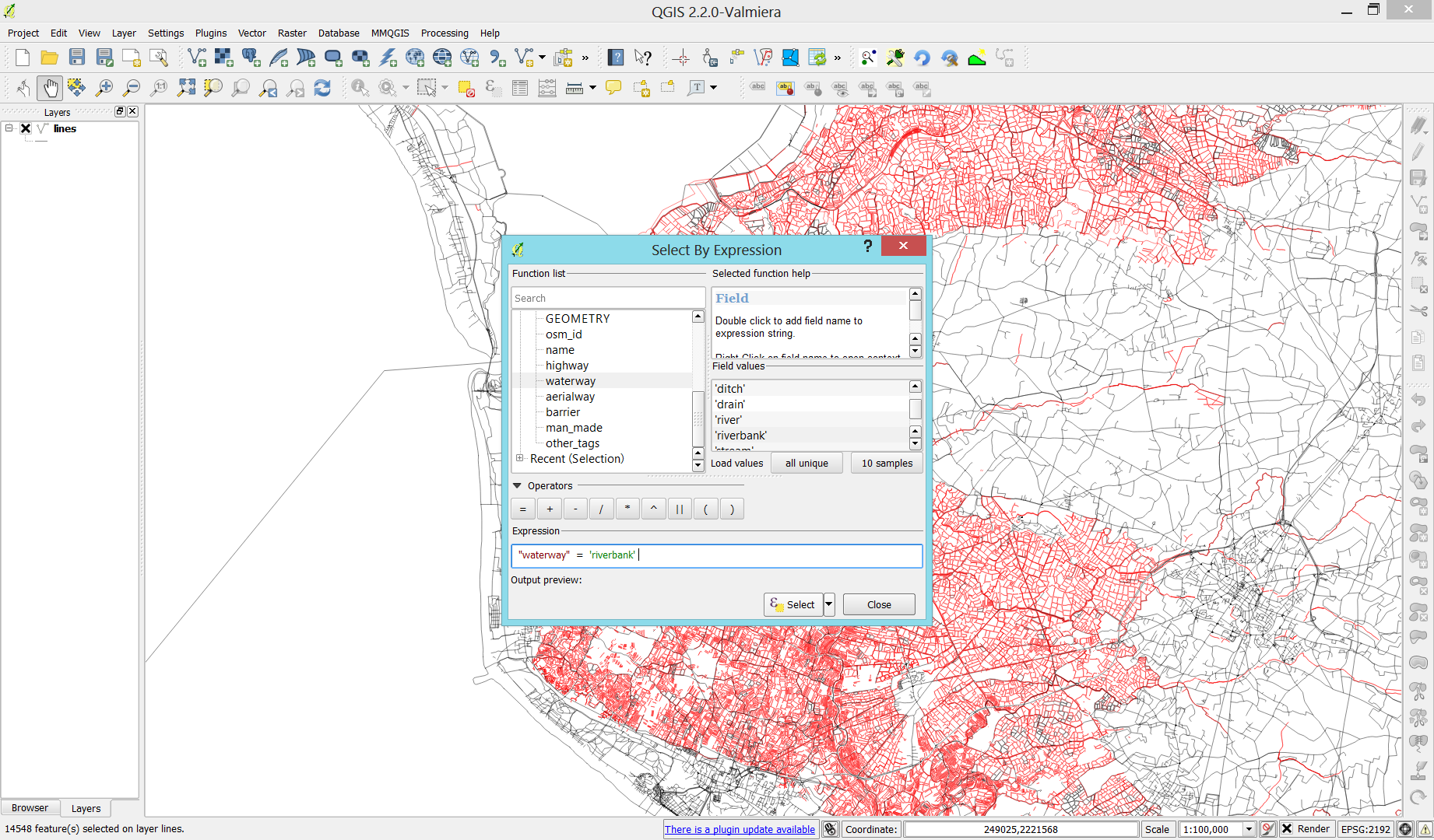
In order to be able to compute the brightness of the illuminated contours, we need to compute the orientation of every subsection of the contours. Therefore, we need to split the contour lines at each node. One way to do this is using v.split from the Processing toolbox:

Screenshot 2015-05-24 11.23.11

When we split the contours and visualize the result using arrows, we can see that they all wrap around the mountain in clockwise direction (light DEM cells equal higher elevation):

split_contours

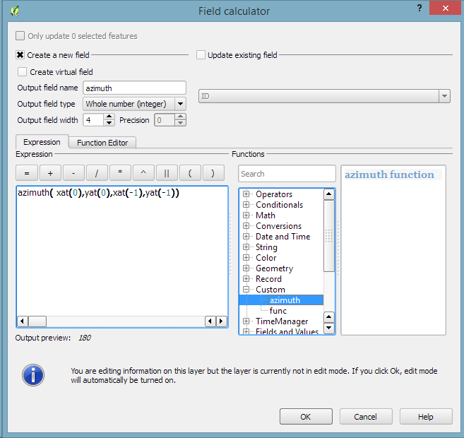
After the split, we can compute the orientation of the contour subsections using, for example, a user-defined function:

Screenshot 2015-05-24 19.09.12

"""
Define new functions using @qgsfunction. feature and parent must always be the
last args. Use args=-1 to pass a list of values as arguments
"""

from qgis.core import *
from qgis.gui import *

@qgsfunction(args='auto', group='Custom')
def azimuth(x1,y1,x2,y2, feature, parent):
	p1 = QgsPoint(x1,y1)
	p2 = QgsPoint(x2,y2)
	a = p1.azimuth(p2)
	if a < 0:
		a += 360
	return a

This function can then be used in a Field calculator expression:

Screenshot 2015-05-24 19.11.53

Based on the orientation, we can then write an expression to control the contour line color. For example, if we want the sun to appear in the north west (-45°) we can use:

color_hsl( 0,0,
  scale_linear( abs(
    ( CASE WHEN "azimuth"-45 < 0
      THEN "azimuth"-45+360
      ELSE "azimuth"-45
    END )
  -180), 0, 180, 0, 100)
  )

This will color the lines which are directly exposed to the sun white hsl(0,0,100) while the ones in the shadows will be black hsl(0,0,0).

Screenshot 2015-05-24 11.55.50

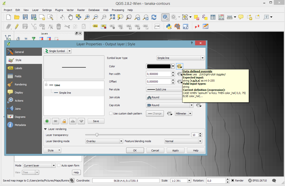
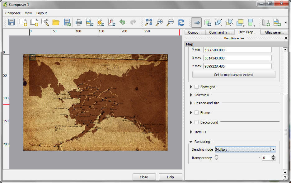
Use the Overlay layer blending mode to blend contours and DEM color:

illuminated_contours

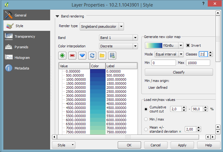
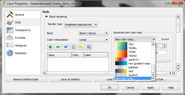
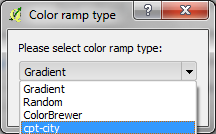
The final step, to get as close to the original design as possible, is to create the effect of discrete elevation classes instead of a smooth color gradient. This can easily be achieved by changing the color interpolation mode of the DEM from Linear to Discrete:

Screenshot 2015-05-24 12.11.01

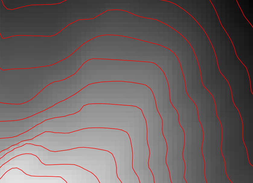
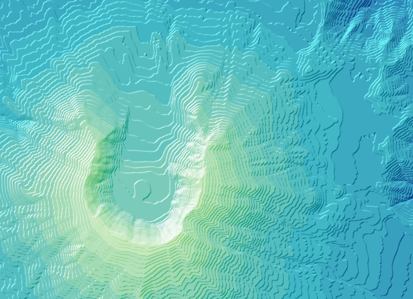
This leaves us with the following gorgeous effect:

tanaka_contours

As Hannes pointed out, another important aspect of Tanaka’s method is to also alter the contour line width. Lines in the sun or shadow should be wider (1 in this example) than those in orthogonal direction (0.2 in this example):

scale_linear(
abs( abs(
  ( CASE WHEN "azimuth"-45 < 0
    THEN "azimuth"-45+360
    ELSE "azimuth"-45
  END )
-180) -90),
0, 90, 0.2, 1)

datadefined_line_width

Enjoy!

Today’s post is a follow-up to a recent map experiment which I published in the QGIS Flickr group. It’s basically an inverted Stamen Toner style with an image in the map composition background instead of a solid color (similar to the approach described for vintage maps):

https://twitter.com/underdarkGIS/status/550340277257650176

That’s nice but with this approach we only get to enjoy the complete design in the print composer but not in the main window. So what other options do we have? – SVG fills to the rescue!

But first we need a suitable SVG with this nice pastel style. I used Gimp to create a seamless version of the pastel image and then embedded the image in an SVG using Inkscape:

LT_RemixedChalkPastel_snakk_seamless

In QGIS, this SVG can now be used in any SVG fill. It’s important to set the Texture width setting to a quite high value when working with SVGs containing big textures, otherwise the images will be rendered very small and the repeating patterns will be very obvious.

Screenshot 2015-01-04 17.49.11

Once the background is in place, we can add the line work and labels. The roads are white with black outlines for bridges which – together with the Lighten blending mode – produce the desired effect:

Screenshot 2015-01-04 17.37.33

Today’s post is inspired by a recent thread on the QGIS user mailing list titled “exporting text to Illustrator?”. The issue was that with the introduction of the new labeling system, all labels were exported as paths when creating an SVG. Unnoticed by almost everyone (and huge thanks to Alex Mandel for pointing out!) an option has been added to 2.4 by Larry Shaffer which allows exporting labels as texts again.

To export labels as text, open the Automatic Placement Settings (button in the upper right corner of the label dialog) and uncheck the Draw text as outlines option.

Screenshot 2014-09-20 21.03.26

Note that we are also cautioned that

For now the developers recommend you only toggle this option right
before exporting
and that you recheck it after.

Alex even recorded a video showcasing the functionality:

When mapping flows or other values which relate to a certain direction, styling these layers gets interesting. I faced the same challenge when mapping direction-dependent error values. Neighboring cell pairs were connected by two lines, one in each direction, with an associated error value. This is what I came up with:

srtm_errors_1200px

Each line is drawn with an offset to the right. The size of the offset depends on the width of the line which in turn depends on the size of the error. You can see the data-defined style properties here:

directed_error_style

To indicate the direction, I added a marker line with one > marker at the center. This marker line also got assigned the same offset to match the colored line bellow. I’m quite happy with how these turned out and would love to hear about your approaches to this issue.

srtm_errors_detail

These figures are part of a recent publication with my AIT colleagues: A. Graser, J. Asamer, M. Dragaschnig: “How to Reduce Range Anxiety? The Impact of Digital Elevation Model Quality on Energy Estimates for Electric Vehicles” (2014).

The point table of the Spatialite database created from OSM north-eastern Austria contains more than 500,000 points. This post shows how the style works which – when applied to the point layer – wil make sure that only towns and (when zoomed in) villages will be marked and labeled.

Screenshot 2014-07-12 12.30.21

In the attribute table, we can see that there are two tags which provide context for populated places: the place and the population tag. The place tag has it’s own column created by ogr2ogr when converting from OSM to Spatialite. The population tag on the other hand is listed in the other_tags column.

Screenshot 2014-07-12 13.00.15

for example

"opengeodb:lat"=>"47.5000237","opengeodb:lon"=>"16.0334769","population"=>"623"

Overview maps would be much too crowded if we simply labeled all cities and towns. Therefore, it is necessary to filter towns based on their population and only label the bigger ones. I used limits of 5,000 and 10,000 inhabitants depending on the scale.

Screenshot 2014-07-12 12.56.33

At the core of these rules is an expression which extracts the population value from the other_tags attribute: The strpos() function is used to locate the text "population"=>" within the string attribute value. The population value is then extracted using the left() function to get the characters between "population"=>" and the next occurrence of ". This value can ten be cast to integer using toint() and then compared to the population limit:

5000 < toint( 
   left (
      substr(
         "other_tags",
         strpos("other_tags" ,'"population"=>"')+16,
         8
      ),
      strpos(
         substr(
            "other_tags",
            strpos("other_tags" ,'"population"=>"')+16,
            8
         ),
        '"'
      )
   )
) 

There is also one additional detail concerning label placement in this style: When zoomed in closer than 1:400,000 the labels are placed on top of the points but when zoomed out further, the labels are put right of the point symbol. This is controlled using a scale-based expression in the label placement:

Screenshot 2014-07-12 13.32.47

As usual, you can find the style on Github: https://github.com/anitagraser/QGIS-resources/blob/master/qgis2/osm_spatialite/osm_spatialite_tonerlite_point.qml

In my opinion, Stamen’s Toner-lite map is one of the best background maps to use together with colorful overlays. The only downsides of using it in QGIS are that the OpenLayers plugin can not provide the tiles at print resolution and that the projection is limited to Web Mercator. That’s why I’ve started to recreate the style for OSM Spatialite databases:

toner-lite

So far, there are styles for lines and polygons and they work quite well for the scale range between 1:1 and 1:250000. As always, you can download the styles from QGIS-resources on Github.

Using OSM data in QGIS is a hot topic but so far, no best practices for downloading, preprocessing and styling the data have been established. There are many potential solutions with all their advantages and disadvantages. To give you a place to start, I thought I’d share a workflow which works for me to create maps like the following one from nothing but OSM:

osm_google_100k

Getting the data

Raw OSM files can be quite huge. That’s why it’s definitely preferable to download the compressed binary .pbf format instead of the XML .osm format.

As a download source, I’d recommend Geofabrik. The area in the example used in this post is part of the region Pays de la Loire, France.

Preparing the data for QGIS

In the preprocessing step, we will extract our area of interest and convert the .pbf into a spatialite database which can be used directly in QGIS.

This can be done in one step using ogr2ogr:

C:\Users\anita_000\Geodata\OSM_Noirmoutier>ogr2ogr -f "SQLite" -dsco SPATIALITE=YES -spat 2.59 46.58 -1.44 47.07 noirmoutier.db noirmoutier.pbf

where the -spat option controls the area of interest to be extracted.

When I first published this post, I suggested a two step approach. You can find it here for future reference:

For the first step: extracting the area of interest, we need Osmosis. (For Windows, you can get osmosis from openstreetmap.org. Unpack to use. Requires Java.)

When you have Osmosis ready, we can extract the area of interest to the .osm format:

C:\Users\anita_000\Geodata\OSM_Noirmoutier>..\bin\osmosis.bat --read-pbf pays-de-la-loire-latest.osm.pbf --bounding-box left=-2.59 bottom=46.58 right=-1.44 top=47.07 --write-xml noirmoutier.osm

While QGIS can also load .osm files, I found that performance and access to attributes is much improved if the .osm file is converted to spatialite. Luckily, that’s easy using ogr2ogr:

C:\Users\anita_000\Geodata\OSM_Noirmoutier>ogr2ogr -f "SQLite" -dsco SPATIALITE=YES noirmoutier.db noirmoutier.osm

Finishing preprocessing in QGIS

In QGIS, we’ll want to load the points, lines, and multipolygons using Add SpatiaLite Layer:

Screenshot 2014-05-31 11.39.40

When we load the spatialite tables, there are a lot of features and some issues:

  • There is no land polygon. Instead, there are “coastline” line features.
  • Most river polygons are missing. Instead there are “riverbank” line features.

Screenshot 2014-05-31 11.59.58

Luckily, creating the missing river polygons is not a big deal:

  1. First, we need to select all the lines where waterway=riverbank.
    Screenshot 2014-05-31 13.14.00
  2. Then, we can use the Polygonize tool from the processing toolbox to automatically create polygons from the areas enclosed by the selected riverbank lines. (Note that Processing by default operates only on the selected features but this setting can be changed in the Processing settings.)
    Screenshot 2014-05-31 13.40.16

Creating the land polygon (or sea polygon if you prefer that for some reason) is a little more involved since most of the time the coastline will not be closed for the simple reason that we are often cutting a piece of land out of the main continent. Therefore, before we can use the Polygonize tools, we have to close the area. To do that, I suggest to first select the coastline using "other_tags" LIKE '%"natural"=>"coastline"%' and create a new layer from this selection (save selection as …) and edit it (don’t forget to enable snapping!) to add lines to close the area. Then polygonize.

Screenshot 2014-05-31 14.38.48

Styling the data

Now that all preprocessing is done, we can focus on the styling.

You can get the styles used in the map from my Github QGIS-resources repository:

  • osm_spatialite_googlemaps_multipolygon.qml … rule-based renderer incl. rules for: water, natural, residential areas and airports
  • osm_spatialite_googlemaps_lines.qml … rule-based renderer incl. rules for roads, rails, and rivers, as well as rules for labels
  • osm_spatialite_googlemaps_roadshields.qml … special label style for road shields
  • osm_spatialite_googlemaps_places.qml … label style for populated places such as cities and towns

qgis_osm_google_100k

Since I finally managed to download the elevation model of the city of Vienna, I thought I’d share some eye candy with you: The map uses layer blending to combine hillshade and elevation raster, and the elevation raster’s color ramp is a modified “garish14” from QGIS’ cpt-city color ramp collection.

wien_elevation by underdarkGIS
wien_elevation, a photo by underdarkGIS on Flickr.

Update

Here is how you get access to the “garish14” color ramp:

Start by selecting the "new color ramp" option in the raster's style window.

Start by selecting the “new color ramp” option in the raster’s style window.

Chose the "cpt-city" color ramp type.

Chose the “cpt-city” color ramp type.

In the "cpt-city color ramp" window, you will find lots of different premade color ramps. "garish14" is part of the "Topography" collection.

In the “cpt-city color ramp” window, you will find lots of different premade color ramps. “garish14” is part of the “Topography” collection.

This post describes the three simple steps necessary to create a vintage-looking map using the blending feature in QGIS 2.0’s print composer. This is what we are aiming for:

alaska_oldpaper

1. Prepare the map

Like any other map, this one starts in the QGIS main window. Try to stick with earthy colors which will go well with the old paper look. For labels, try fonts which look like handwriting.

alaska_oldschool_overview

Once you are happy with your map

2. Prepare the composition background

To get that vintage feel, we need a background image with a great texture. You can find such textures on sites like lostandtaken.com. Download one you like and add it to an empty print composer. Make sure it covers the whole paper:

alaska_oldschool_bg

Lock the image by right-clicking it once – a small lock icon should appear in the upper left corner.

3. Finish the composition

The final step is to add the map on top of the background image. To make our nice background texture shine through, we enable the “multiply” blending mode in the map’s rendering options:

alaska_oldschool_print

Feel free to add north arrows or drawings of dragons as finishing touches.