Archive

Tag Archives: QGIS

You probably remember my Game of Life posts from last year: Experiments with Conway’s Game of Life & More experiments with Game of Life where I developed a vector-based version of GoL.

Richard Wen and Claus Rinner at Ryerson University now published a raster-based version.

Here’s a screenshot of the script in action:

Screenshot 2015-03-08 20.04.07

The code is hosted on Github and I’m sure there will be many other ideas which can build on code snippets to read and write raster cell values.

For more info, please visit the GIS at Ryerson blog.

Since the 2.8 release is done, the QGIS team has been busy with a small side project: setting up a series of shops for fans of QGIS. Right now, the following shops are available:

North America

There is a US and a Canadian shop. Additionally, there is also the possibility to design your own products (US, Canada).


qgis-shop

Europe

There’s also a series of European shops, for example for the UK, Germany, and France. There are more, if Spreadshirt has a site for your country, there’s probably a QGIS shop too.

Australia

Thanks to Nathan for pointing out the Australian shop!

For each product sold, the QGIS project receives around $3 (minus applicable fees) which will go directly towards improving your favorite GIS.

qgisorg_banner28

It’s finally here! QGIS 2.8 LTR “Wien” is officially available for download now.

What’s an LTR

LTR stands for “Long Term Release”. This means that QGIS now has a system in place to provide a one-year stable release with backported bug fixes. The idea behind LTR is to have a stable platform for enterprises and organizations that don’t want to update their software and training materials more often than once a year. To make the LTR a success, users and developers alike should be aware that bug fixes should be applied to both the LTR branch as well as the normal development branch. If you are interested in the details, you can find more info in the corresponding QGIS Enhancement Proposal.

Users who enjoy working with the cutting-edge version will be able to follow the regular four-monthly release cycle like last year.

What’s new?

This new version comes with many great new features which you can explore in the official visual changelog. It’s really hard to pick but my personal favorites are:

On the layer styling front, there are two great additions: raster image fills and a live heatmap renderer which makes it possible to create dynamic heatmaps on the fly.

raster image fill

Raster image fill symbol layer type

Another feature I’m sure many of you will enjoy is the support for custom prefixes for joins.

Custom join prefixes

Custom join prefixes

Last but not least, I want to point your attention to the great improvements to the rule-based legend which is now structured in a nice tree.

Rule-based renderer legend tree

Rule-based renderer legend tree

Don’t forget to check out the other new features!

Thanks!

None of this would have been possible without the great QGIS community and all the many different people involved in running the project. Thanks a lot to all of you and a special shout out for the sponsors! *applause*

sponsors

We all know that QGIS is great for designing maps but did you know that QGIS is also great for interactive web maps? It is! Just check out qgis2leaf and qgis2threejs.

To give these two plugins a test run and learn some responsive web design, I developed a small concept page presenting cycle routes in 3D.

Screenshot 2015-01-31 22.20.15

Qgis2leaf makes it possible to generate Leaflet maps from QGIS layers. It provides access to different background maps and it’s easy to replace them in the final HTML file in case you need something more exotic. I also added another layer with custom popups with images but that was done manually.

Daten CC-BY-3.0: Land Kärnten - data.ktn.gv.at

The web maps use data CC-BY-3.0: Land Kärnten – data.ktn.gv.at

Qgis2threejs on the other hand creates 3D visualizations based on three.js which uses WebGL. (If you follow my blog you might remember a post a while back which showcased Qgis2threejs rendering OSM buildings.)

This is a great way to explore elevation data. I also think that the labeling capabilities add an interesting touch. Controlling the 3D environment takes some getting used to, but if you can handle Google Earth in your browser, this is no different.

Image of Heiligenblut by Angie (Self-photographed) (GFDL (http://www.gnu.org/copyleft/fdl.html) or CC BY 3.0 (http://creativecommons.org/licenses/by/3.0)), via Wikimedia Commons

Image of Heiligenblut by Angie (Self-photographed) (GFDL (http://www.gnu.org/copyleft/fdl.html) or CC BY 3.0 (http://creativecommons.org/licenses/by/3.0)), via Wikimedia Commons

Today’s post was motivated by a question over on gis.stackexchange, basically: How to draw a line with a gradient?

The issue we have to deal with is there is no gradient line style yet … But there are polygon gradient fills. So we can buffer the line and style the buffers. It’s a bit of an exercise in data-defined styling though:

Screenshot 2015-01-11 22.49.41

Before creating the buffer layer, we need to add the coordinates of the line start and end node to the line attributes. This is easy to do using the Field Calculator functions xat and yat, for example xat(0) for the x coordinate of the start node and yat(-1) for the y coordinate of the end node.

Screenshot 2015-01-11 22.41.37

Then we can buffer the lines and start styling the buffers. As mentioned, we’ll use the Gradient fill Symbol layer type.

Screenshot 2015-01-11 22.49.54

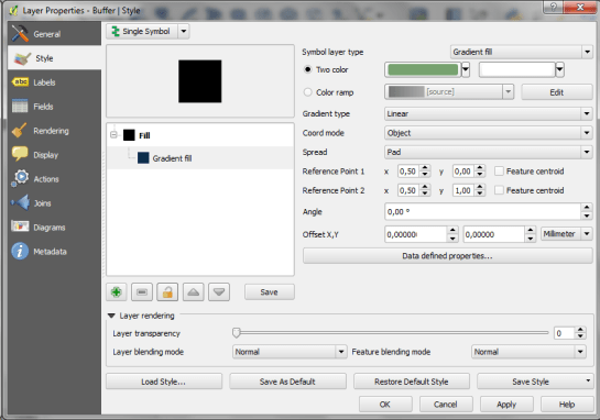
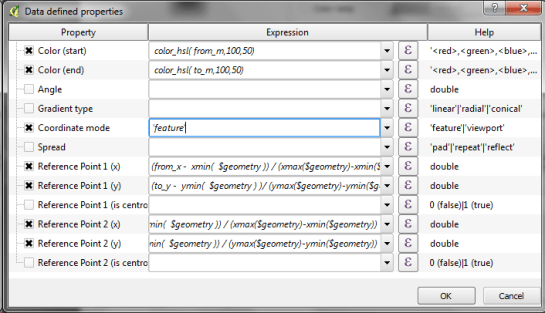
The interesting part happens in the Data-defined properties. The start and end colors are computed from the measurement values from_m and to_m. Next, it’s important to use the feature coordinate mode because this will ensure that the coordinate system for the color gradient is based on the feature extent (with [0,0] in the upper left corner of the feature bbox).

Once that’s set up, we can compute the gradient start and end positions based on the line start and end node locations which we added to the attribute table in the beginning. If you’re wondering why Reference point 1 y is based on to_y (y coordinate of the line end point) rather than from_y, it’s due to the difference in coordinate origins in the geometry and the color gradient coordinate space: [0,0] is the lower left corner for the geometries but the upper left corner for the color gradient.

Screenshot 2015-01-11 22.42.35

As the title suggests, this is a really hackish solution for gradient line symbols. It will only provide reasonable results for straight – or close to straight – lines. But I’m very confident that we’ll have a real gradient line style in QGIS sooner or later.

Today’s post is a follow-up to a recent map experiment which I published in the QGIS Flickr group. It’s basically an inverted Stamen Toner style with an image in the map composition background instead of a solid color (similar to the approach described for vintage maps):

https://twitter.com/underdarkGIS/status/550340277257650176

That’s nice but with this approach we only get to enjoy the complete design in the print composer but not in the main window. So what other options do we have? – SVG fills to the rescue!

But first we need a suitable SVG with this nice pastel style. I used Gimp to create a seamless version of the pastel image and then embedded the image in an SVG using Inkscape:

LT_RemixedChalkPastel_snakk_seamless

In QGIS, this SVG can now be used in any SVG fill. It’s important to set the Texture width setting to a quite high value when working with SVGs containing big textures, otherwise the images will be rendered very small and the repeating patterns will be very obvious.

Screenshot 2015-01-04 17.49.11

Once the background is in place, we can add the line work and labels. The roads are white with black outlines for bridges which – together with the Lighten blending mode – produce the desired effect:

Screenshot 2015-01-04 17.37.33

It’s the end of December and time to recap 2014. Therefore, I decided to have a look at what this year has brought us. There were plenty of great posts for both casual and power users as well as developers. Here is my pick of the top 10 posts from the QGIS Planet blog aggregator.

  1. Tons of colour improvements! (Nyall Dawson)
  2. The QGIS Field calculator is dead. Long live the Field calculator bar (Nathan Woodrow)
  3. Why QGIS Class Names Start with Qgs (Gary Sherman)
  4. Atlas Previews (Nyall Dawson)
  5. QGIS atlas on non geometry tables (Nathan Woodrow)
  6. Gradient Fills (Nyall Dawson)
  7. What are all these QGIS file types? Why do I need them (Nathan Woodrow)
  8. Getting Started Writing QGIS Python Plugins (Peter Wells)
  9. QGIS Layer Tree API (Martin Dobias)
  10. Shapeburst fill styles (Nyall Dawson)

More great features and posts are sure to come next year. For example, Nyall is currently running a campaign on Kickstarter to add Live Layer Effects such as drop shadow effects to QGIS. Please support it if you can.

It’s my pleasure to announce that the updated and extended 2nd edition of Learning QGIS is available now.

I also want to take this opportunity to thank everyone who made the 1st edition such a great success!

This second edition has been updated to QGIS 2.6 and it features a completely new 6th chapter on Expanding QGIS with Python. It introduces the QGIS Python Console, shows how to create custom Processing tools, and provides a starting point for developing plugins.

Overall, the book has grown by 40 pages and the price of the print version has dropped by 3€ :-)

Happy QGISing!

2031OSos_mockupcover_normal_0

The QGIS documentations team has released an updated version of the user guide:

qgisdocs26

I’d like to encourage everyone to have a look and explore the content, for example the great tips in the Actions menu section:

action_dialog

On my quest to create test data for spatial statistics, I’ve discovered income data for Austria per municipality on a news paper website:

Screenshot 2014-11-29 23.06.46

For further analysis, I decided to limit the area to Vienna and Lower Austria. Since the income data included GKZ “Gemeindekennzahl” IDs, it was possible to join them to municipalities extracted from OpenStreetMap using QuickOSM for QGIS. GRASS v.clean was used to clean the vector topology to the point where PySAL was able to compute spatial weights.

Using PySAL, I then computed income clusters: blue regions represent low clusters while red regions represent high clusters …

Municipality border data (c) OpenStreetMap and contributors Income data source: Statistik Austria via derStandard

Municipality border data (c) OpenStreetMap and contributors
Income data source: Statistik Austria via derStandard

The results show a statistically significant cluster of low income in the north west, in the area called Waldviertel, as well as a cluster of high income containing many of the municipalities surrounding Vienna, an area often referred to as the “Speckgürtel” (“bacon belt”).