Archive

Tag Archives: QGIS

In a recent post, we used aggregates for labeling purposes. This time, we will use them to create a dynamic data driven style, that is, a style that automatically adjusts to the minimum and maximum values of any numeric field … and that field will be specified in a variable!

But let’s look at this step by step. (This example uses climate.shp from the QGIS sample dataset.)

Here is a basic expression for data defined symbol color using a color ramp:

Similarly, we can configure a data defined symbol size to create a style like this:

Temperatures in July

To stretch the color ramp from the attribute field’s minimum to maximum value, we can use aggregate functions:

That’s nice but if we want to be able to quickly switch to a different attribute field, we now have two expressions (one for color and one for size) to change. This can get repetitive and can be the source of errors if we miss an expression and don’t update it correctly …

To avoid these issues, we use a layer variable to store the name of the field that we want to use. Layer variables can be configured in layer properties:

Then we adjust our expression to use the layer variable. Here is where it gets a bit tricky. We cannot simply replace the field name “T_F_JUL” with our new layer variable @style_field, since this creates an invalid expression. Instead, we have to use the attribute function:

With this expression in place, we can now change the layer variable to T_M_JAN and the style automatically adjusts accordingly:

Temperatures in January

Note how the style also labels the point with the highest temperature? That’s because the style also defines an expression for the show labels option.

It is worth noting that, in most cases, temperature maps should not be styled using a color ramp that adjusts to a specific dataset’s min and max values. Instead, we would want a style with fixed value to color mapping that makes different datasets comparable. In many other use cases, however, it is very convenient to have a style that can automatically adapt to the data.

In the previous post, I demonstrated the aggregation support in QGIS expressions. Another popular request is to aggregate or cluster point features that are close to each other. If you have been following the QGIS project on mailing list or social media, you probably remember the successful cluster renderer crowd-funding campaign by North Road.

The point cluster renderer is implemented and can be tested in the current developer version. The renderer is highly customizable, for example, by styling the cluster symbol and adjusting the distance between points that should be in the same cluster:

Beyond this basic use case, the point cluster renderer can also be combined with categorized visualizations and clusters symbols can be colored in the corresponding category color and scaled by cluster size, as demoed in this video by the developer Nyall Dawson:

In the past, aggregating field values was reserved to databases, virtual layers, or dedicated plugins, but since QGIS 2.16, there is a way to compute aggregates directly in QGIS expressions. This means that we can compute sums, means, counts, minimum and maximum values and more!

Here’s a quick tutorial to get you started:

Load the airports from the QGIS sample dataset. We’ll use the elevation values in the ELEV field for the following examples:

QGIS sample airport dataset – categorized by USE attribute

The most straightforward expressions are those that only have one parameter: the name of the field that should be aggregated, for example:

mean(ELEV)

We can also add a second parameter: a group-by field, for example, to group by the airport usage type, we use:

mean(ELEV,USE)

To top it all off, we can add a third parameter: a filter expression, for example, to show only military airports, we use:

mean(ELEV,USE,USE='Military')

Last but not least, all this aggregating goodness also works across layers! For example, here is the Alaska layer labeled with the airport layer feature count:

aggregate('airports','count',"ID")

If you are using relations, you can even go one step further and calculate aggregates on feature relations.

There are tons of things going on under the hood of QGIS for the move from version 2 to version 3. Besides other things, we’ll have access to new versions of Qt and Python. If you are using a HiDPI screen, you should see some notable improvements in the user interface of QGIS 3.

But of course QGIS 3 is not “just” a move to updated dependencies. Like in any other release, there are many new features that we are looking forward to. This list is only a start, including tools that already landed in the developer version 2.99:

Improved geometry editing 

When editing geometries, the node tool now behaves more like editing tools in webmaps: instead of double-clicking to add a new node, the tool automatically suggests a new node when the cursor hovers over a line segment.

In addition, improvements include an undo and redo panel for quick access to previous versions.

Improved Processing dialogs

Like many other parts of the QGIS user interface, Processing dialogs now prominently display the function help.

In addition, GDAL/OGR tools also show the underlying GDAL/OGR command which can be copy-pasted to use it somewhere else.

New symbols and predefined symbol groups

The default symbols have been reworked and categorized into different symbol groups. Of course, everything can be customized in the Symbol Library.

Search in layer and project properties

Both the layer properties and the project properties dialog now feature a search field in the top left corner. This nifty little addition makes it much easier to find specific settings fast.

Save images at custom sizes

Last but not least, a long awaited feature: It’s finally possible to specify the exact size and properties of images created using Project | Save as image.

Of course, we still expect many other features to arrive in 3.0. For example, one of the successful QGIS grant applications was for adding 3D support to QGIS. Additionally, there is an ongoing campaign to fund better layout and reporting functionality in QGIS print composer. Please support it if you can!


From 28th April to 1st May the QGIS project organized another successful developer meeting at the Linuxhotel in Essen, Germany. Here is a quick summary of the key topics I’ve been working on during these days.

New logo rollout

It’s time to get the QGIS 3 logo out there! We’ve started changing our social media profile pictures and Website headers to the new design: 

Resource sharing platform 

In QGIS 3, the resource sharing platform will be available by default – just like the plugin manager is today in QGIS 2. We are constantly looking for people to share their mapping resources with the community. During this developer meeting Paolo Cavallini and I added two more SVG collections:

Road sign SVGs by Bertrand Bouteilles & Roulex_45 (CC BY-SA 3.0)

SVGs by Yury Ryabov & Pavel Sergeev (CC-BY 3.0)

Unified Add Layer button

We also discussed the unified add layer dialog and are optimistic that it will make its way into 3.0. The required effort for a first version is currently being estimated by the developers at Boundless.

TimeManager

The new TimeManager version 2.4 fixes a couple of issues related to window resizing and display on HiDPI screens. Additionally, it now saves all label settings in the project file. This is the change log:

- Fixed #222: hide label if TimeManager is turned off
- Fixed #156: copy parent style to interpolation layer
- Fixed #109: save label settings in project
- Fixed window resizing issues in label options gui
- Fixed window resizing issues in video export gui
- Fixed HiDPI issues with arch gui

After my previous posts on flow maps, many people asked me how to create the curved arrows that you see in these maps.

Arrow symbol layers were introduced in QGIS 2.16.

The following quick screencast shows how it is done. Note how additional nodes are added to make the curved arrows:

In 2012 I published a post on mapping the then newly released Tirol river dataset.

In the comments, reader Michal Zimmermann asked:

Do you think it would be possible to create a river stream which gains width along its way? I mean rivers are usually much narrower on their beginnings, then their width increases and the estuary should be the widest part, right?

For a long time, this kind of river style, also known as “tapered lines” could only be created in vector graphics software, such as Inkscape and Illustrator.

With the help of geometry generators, we can now achieve this look directly in QGIS:

Data cc-by Land Tirol

In the river dataset published by the state of Tirol, all rivers are digitized in upstream direction. For this styling to work, it is necessary that the line direction is consistent throughout the whole dataset.

We use a geometry generator symbol layer to split the river geometry into its individual segments:


Then we can use the information about the total number of segments (accessible via the expression variable @geometry_part_count) and the individual segment’s number (@geometry_part_num) to calculate the segment’s line width.

The stroke width expression furthermore uses the river category (GEW_GRKL) to vary the line width depending on the category:

CASE 
WHEN "GEW_GRKL" = '< 10 km2 Fluss' THEN 0.2
WHEN "GEW_GRKL" = '10 km2 Fluss' THEN 0.4
WHEN "GEW_GRKL" = '100 km2 Fluss' THEN 0.6
WHEN "GEW_GRKL" = '1.000 km2 Fluss' THEN 0.8
ELSE 1.0
END 
* ( 1- ( @geometry_part_num /  @geometry_part_count ))

If the rivers are digitized in downstream direction, you can simply remove the 1- term.

Happy mapping!

Geometry generator symbol layers are a feature that has been added in QGIS 2.14. They allow using the expression engine to modify geometries or even create new geometries while rendering.

Geometry generator symbol layers make it possible to use expression syntax to generate a geometry on the fly during the rendering process. The resulting geometry does not have to match with the original geometry type and we can add several differently modified symbol layers on top of each other.

The latest version of the QGIS user manual provides some example expressions, which served as a basis for the following examples:

Rendering the centroid of a feature

To add a geometry layer representing feature centroids, we need to set the geometry type to Point / Multipoint and enter the following expression:

centroid( $geometry )

It is worth noting that the correct geometry type has to be set manually. If a wrong type is set, the symbol layer can not be rendered.

Drawing buffers around features

Buffers are an example of a polygon geometry generator layer. The second parameter of the buffer function defines if the buffer is generated outside (for positive values) or inside (for negative values) of the feature. The value has to be provided in the layer’s CRS units, in this case, that means an inner buffer of 0.005 degrees:

buffer( $geometry, -0.005 )

Creating a line between features in different layers

The following expression creates lines from all district centroids (as shown in the first example) and a feature from the Citybike layer where the STATION attribute value is ‘Millennium Tower’:

make_line( 
  centroid( $geometry ),
  geometry( get_feature( 'Citybike', 'STATION', 'Millennium Tower' ) ) 
)

More advanced examples

Using these basic examples as a starting point, geometry generators open a wide field of advanced symbology options. For example, this sector light style presented on GIS.Stackexchange or my recently introduced conveyor belt flow style:

Today’s post was motivated by a question following up on my recent post “Details of good flow maps“: How to create arrows with gradients from transparent to opaque?

gradient_arrow

The key idea is to use a gradient fill to color the arrows:

gradient_arrow_settings

It all seems perfectly straightforward: determine the direction of the line and set the gradient rotation according to the line direction.

But wait! That doesn’t work!

The issue is that all default angle functions available in expressions return clockwise angles but the gradient rotation has to be set in counter-clockwise angles. So we need this expression:

360-angle_at_vertex($geometry,1)

Happy QGISing!

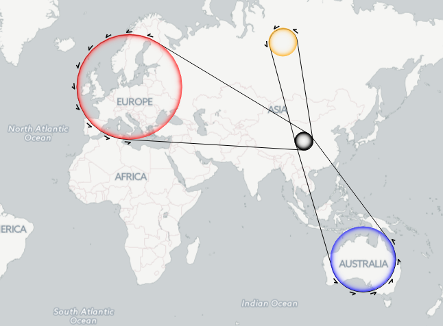
In my previous posts, I discussed classic flow maps that use arrows of different width to encode flows between regions. This post presents an alternative take on visualizing flows, without any arrows. This style is inspired by Go with the Flow by Robert Radburn and Visualisation of origins, destinations and flows with OD maps by J. Wood et al.

The starting point of this visualization is a classic OD matrix.

migration_raw_data

For my previous flow maps, I already converted this data into a more GIS-friendly format: a Geopackage with lines and information about the origin, destination and strength of the flow:

migration_attribute_table

In addition, I grabbed state polygons from Natural Earth Data.

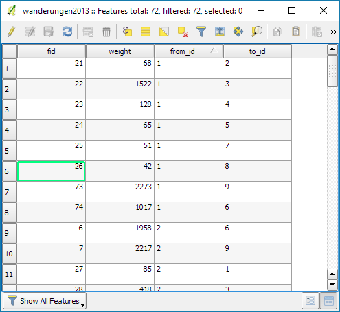
At this point, we have 72 flow features and 9 state polygon features. An ordinary join in the layer properties won’t do the trick. We’d still be stuck with only 9 polygons.

Virtual layers to the rescue!

The QGIS virtual layers feature (Layer menu | Add Layer | Add/Edit Virtual Layer) provides database capabilities without us having to actually set up a database … *win!*

Using a classic SQL query, we can join state polygons and migration flows into a new virtual layer:

virtual_layer

The resulting virtual layer contains 72 polygon features. There are 8 copies of each state.

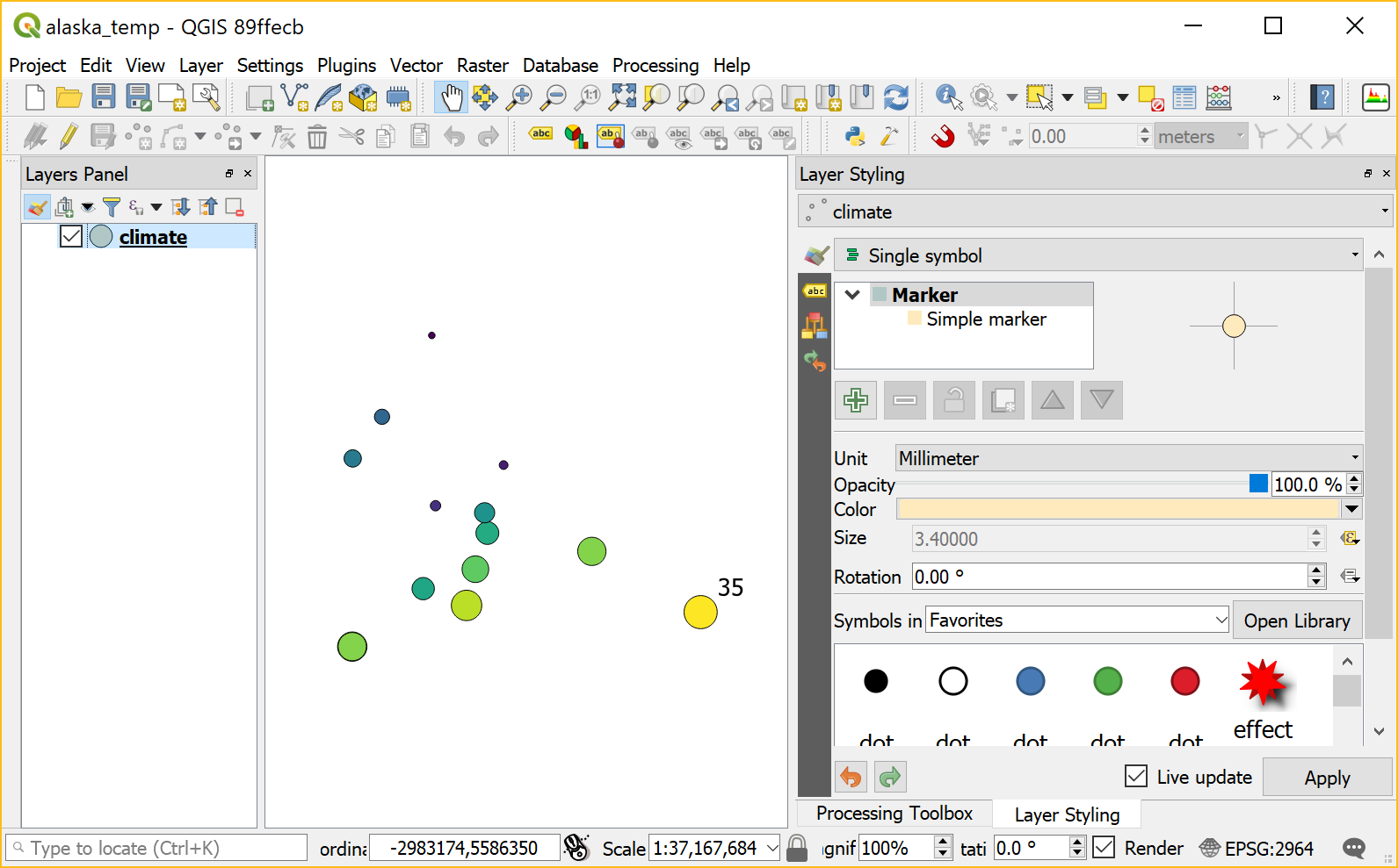
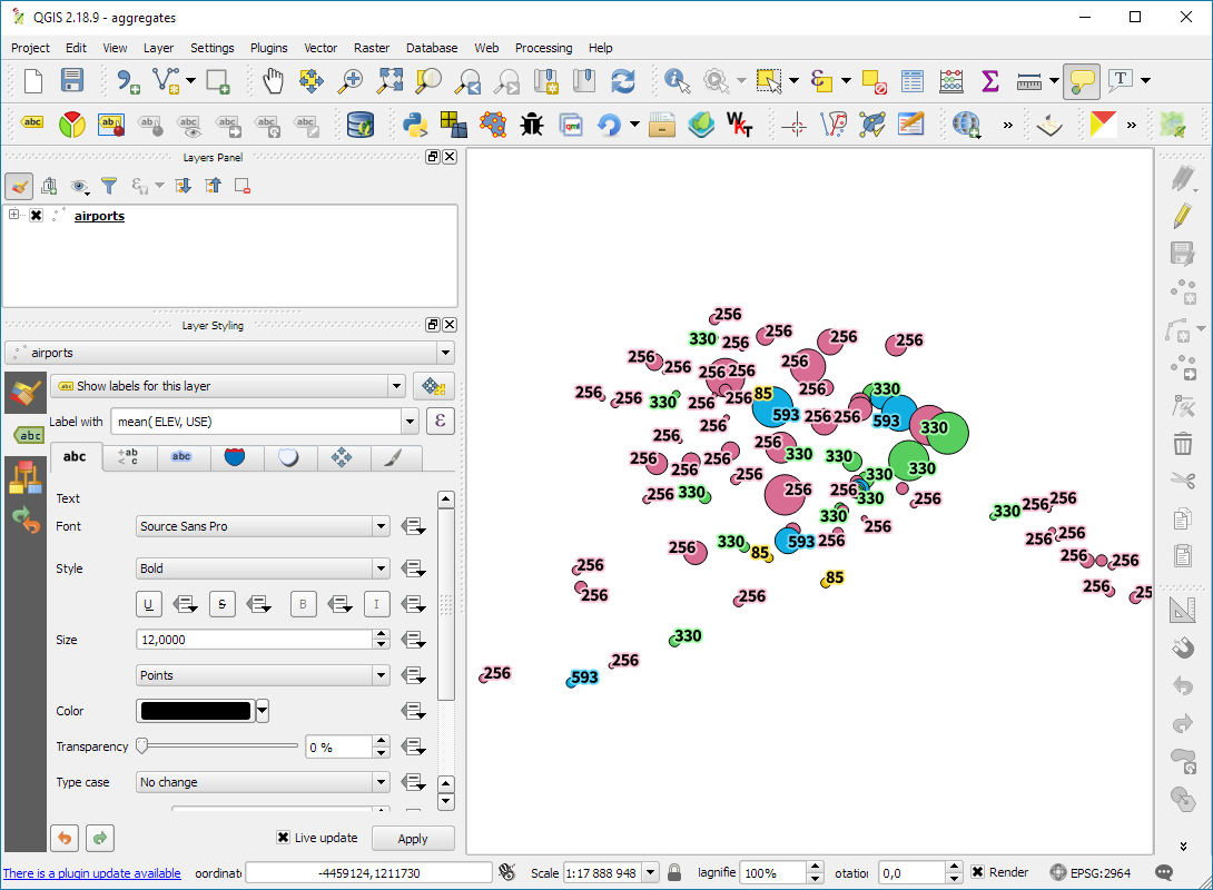
Now that the data is ready, we can start designing the visualization in the Print Composer.

This is probably the most manual step in this whole process: We need 9 map items, one for each mini map in the small multiples visualization. Create one and configure it to your liking, then copy and paste to create 8 more copies.

I’ve decided to arrange the map items in a way that resembles the actual geographic location of the state that is represented by the respective map, from the state of Vorarlberg (a proud QGIS sponsor by the way) in the south-west to Lower Austria in the north-east.

To configure which map item will represent the flows from which origin state, we set the map item ID to the corresponding state ID. As you can see, the map items are numbered from 1 to 9:

small_multiples_print_composer_init

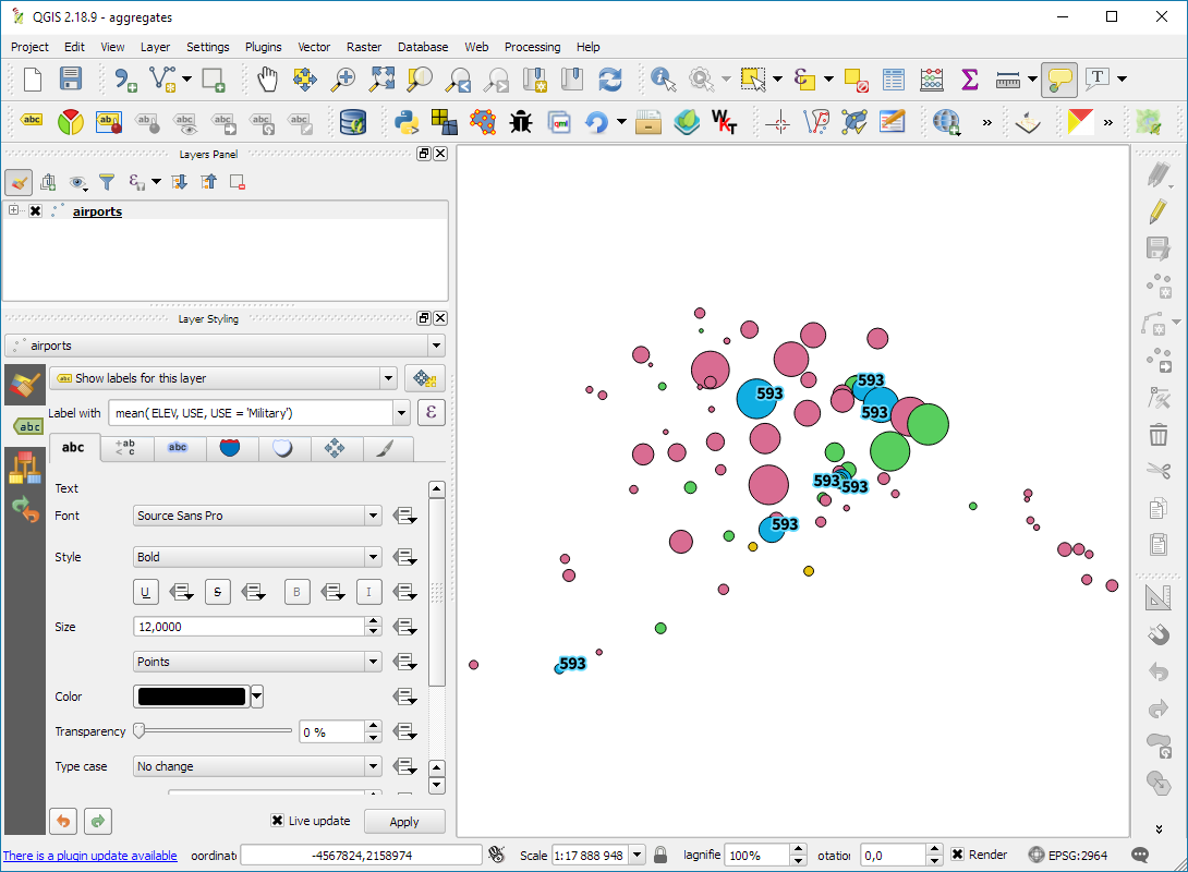
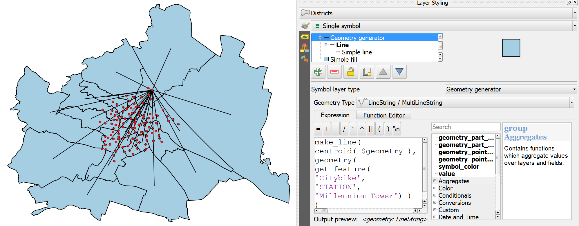
Once all map items are set up, we can use the map item IDs to filter the features in each map. This can be implemented using a rule based renderer:

small_multiples_style_rules

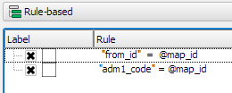
The first rule will ensure that the each map only shows flows originating from a specific state and the second rule will select the state itself.

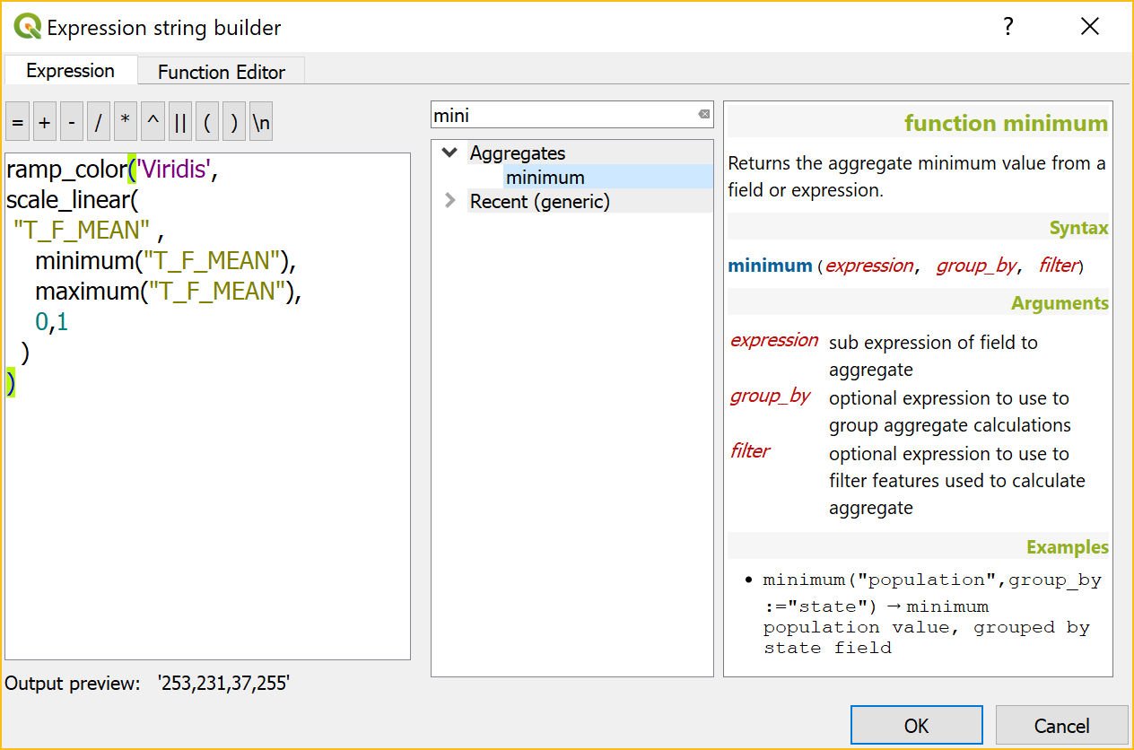
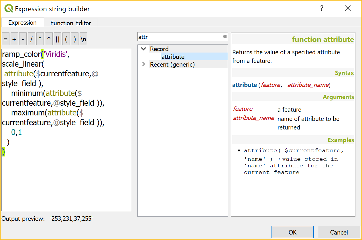
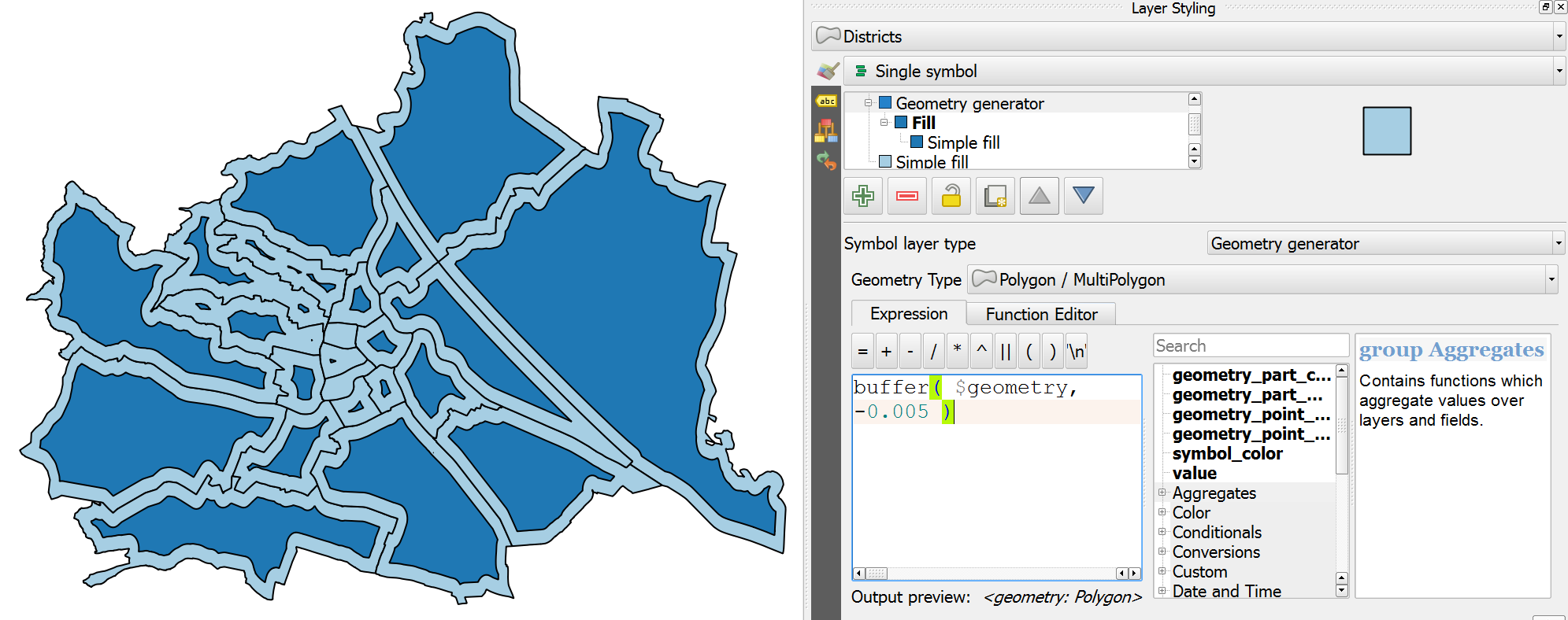
We configure the symbol of the first rule to visualize the flow strength. The color represents the number number of people moving to the respective district. I’ve decided to use a smooth gradient instead of predefined classes for the polygon fill colors. The following expression maps the feature’s weight value to a shade on the Viridis color ramp:

ramp_color( 'Viridis',
  scale_linear("weight",0,2000,0,1)
)

You can use any color ramp you like. If you want to use the Viridis color ramp, save the following code into an .xml file and import it using the Style Manager. (This color ramp has been provided by Richard Styron on rocksandwater.net.)

<!DOCTYPE qgis_style>
<qgis_style version="0">
  <symbols/>
    <colorramp type="gradient" name="Viridis">
      <prop k="color1" v="68,1,84,255"/>
      <prop k="color2" v="253,231,36,255"/>
      <prop k="stops" v="0.04;71,15,98,255:0.08;72,29,111,255:0.12;71,42,121,255:0.16;69,54,129,255:0.20;65,66,134,255:0.23;60,77,138,255:0.27;55,88,140,255:0.31;50,98,141,255:0.35;46,108,142,255:0.39;42,118,142,255:0.43;38,127,142,255:0.47;35,137,141,255:0.51;31,146,140,255:0.55;30,155,137,255:0.59;32,165,133,255:0.62;40,174,127,255:0.66;53,183,120,255:0.70;69,191,111,255:0.74;89,199,100,255:0.78;112,206,86,255:0.82;136,213,71,255:0.86;162,218,55,255:0.90;189,222,38,255:0.94;215,226,25,255:0.98;241,229,28,255"/>
    </colorramp>
  </colorramps>
</qgis_style>

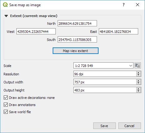
If we go back to the Print Composer and update the map item previews, we see it all come together:

small_multiples_print_composer

Finally, we set title, legend, explanatory texts, and background color:

migration

I think it is amazing that we are able to design a visualization like this without having to create any intermediate files or having to write custom code. Whenever a value is edited in the original migration dataset, the change is immediately reflected in the small multiples.