Archive

QGIS

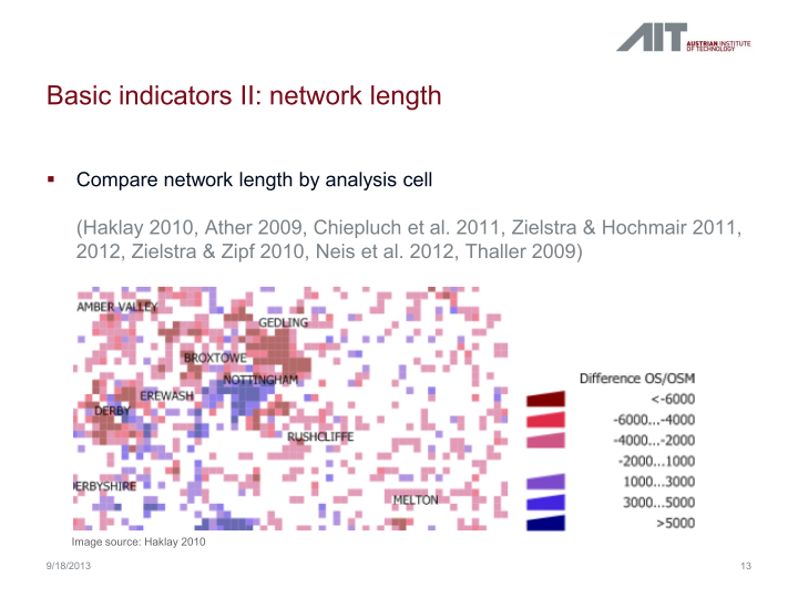
In my previous post, I presented a Processing model to determine positional accuracy of street networks. Today, I’ll cover another very popular tool to assess OSM quality in a region: network length comparison. Here’s the corresponding slide from my FOSS4G presentation which shows an example of this approach applied to OSM and OS data in the UK:

foss4g_osm_data_quality_12

One building block of this tool is the Total graph length model which calculates the length of a network within specified regions. Like the model for positional accuracy, this model includes reprojection steps to ensure all layers are in the same CRS before the actual geoprocessing starts:

total_graph_length

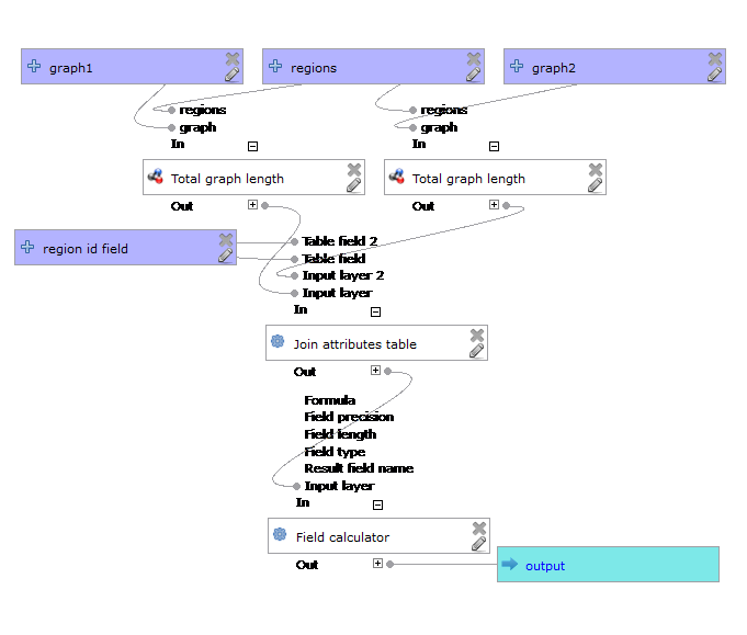
The final Compare total graph length model combines two instances of “Total graph length” whose results are then joined to eventually calculate the length difference (lenDIFF).

compare_total_graph_length

As usual, you can find the models on Github. If you have any questions, don’t hesitate to ask in the comments and if you find any issues please report them on Github.

Over the last years, research on OpenStreetMap data quality has become increasingly popular. At this year’s FOSS4G, I had the honor to present some work we did at the AIT to assess OSM quality in Vienna, Austria. In the meantime, our paper “Towards an Open Source Analysis Toolbox for Street Network Comparison” has been published for early access. Thanks to the conference organizers who made this possible! I’ve implemented comparison tools found in related OSM literature as well as new tools for oneway street and turn restriction comparison using Sextante scripts and models for QGIS 1.8. All code is available on Github to enable collaboration. If you are interested in OSM data quality research, I’d like to invite you to give the tools a try.

Since most users probably don’t have access to QGIS 1.8 anymore, I’ll be updating the tools to QGIS 2.0 Processing. I’m starting today with the positional accuracy comparison tool. It is based on a method described by Goodchild & Hunter (1997). Here’s the corresponding slide from my FOSS4G presentation:

foss4g_osm_data_quality_10

The basic idea is to evaluate the positional accuracy of a street graph by comparing it with a reference graph. To do that, we check how much of the graph lies within a certain tolerance (buffer) of the reference graph.

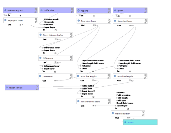
The processing model uses the following input: the two street graphs which should be compared, the size of the buffer (tolerance for positional accuracy), a polygon layer with analysis regions, and the field containing the region id. This is how the model looks in Processing modeler:
graph_covered_by_buffered_reference_graph

First, all layers are reprojected into a common CRS. This will have to be adjusted if the tool is used in other geographic regions. Then the reference graph is buffered and – since I found that dissolving buffers directly in the buffer tool can become very slow with big datasets – the faster difference tool is used to dissolve the buffers before we calculate the graph length inside the buffer (inbufLEN) as well as the total graph length in the analysis region (totalLEN). Finally, the two results are joined based on the region id field and the percentage of graph length within the buffered reference graph (inbufPERC) is calculated. A high percentage shows that both graphs agree very well geometrically.

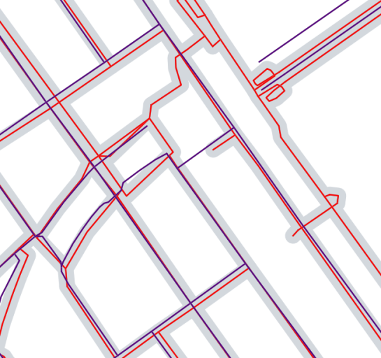
The following image shows the tool applied to a sample of OpenStreetMap (red) and official data published by the city of Vienna (purple) at Wien Handelskai. OSM was used as a reference graph and the buffer size was set to 10 meters.
ogd_osm_positional_accuracy

In general, both graphs agree quite well. The percentage of the official graph within 10 meters of the OSM graph is 93% in the 20th district. In the above image, we can see that links available in OSM are not contained in the official graph (mostly pedestrian/bike links) and there seem to be some connectivity issues as well in the upper right corner of the image.

In my opinion, Processing models are a great solution to document geoprocessing work flows and share them with others. If you want to collaborate on building more models for OSM-related analysis, just leave a comment bellow.

I’m very pleased to announce that Packt Publishing is organizing a giveaway contest for Learning QGIS 2.0. All you need to do is comment below the post and win a free copy of Learning QGIS 2.0. Read on for more details.

7488OS_cov

Amongst other topics, Learning QGIS 2.0 covers:

  • Loading and visualizing vector and raster data
  • Creating and editing spatial data and performing spatial analysis
  • Designing great maps and printing them

How to Enter?

Simply post your expectations for this book in comments section below and you could be one of the lucky participants to win a copy.

DeadLine: The contest will close in 7 days on December, 12th 2013. Winners will be contacted by email, so be sure to use your real email address when you comment!

Please note: Winners residing in the USA and Europe will receive print copies. Others will be provided with eBook copies.

Processing has received a series of updates since the release of QGIS 2.0. (I’m currently running 2.0-20131120) One great addition I want to highlight today is the improved script editor and the help file editor.

Script editor

The improved script editor features a toolbar with commonly used tools such as undo and redo, cut, copy and paste, save and save as …, as well as very useful run algorithm and edit script help buttons. It also shows the script line numbers which makes it easier to work with while debugging code.

processing_script_editor

The model editor has a similar toolbar now which allows to export the model representation as an image, run the model or edit the model help.

Help editor

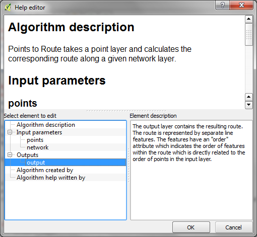
When you press the edit script help button, you get access to the new help editor. It’s easy to use: On the top, it displays the current content of the help file. On the bottom-left, it lists the different sections of the help file which can be filled with information. In the input parameters and outputs section, the help editor automatically lists the all parameters specified in the script code. Finally, in the bottom-right, you can enter the description. The resulting help file is saved in the same location as the original script under the name <scriptname>.py.help.

processing_help_editor

Did you know that there is a network analysis library in QGIS core? It’s well hidden so far, but at least it’s documented in the PyQGIS Cookbook. The code samples from the cookbook can be used in the QGIS Python console and you can play around to get a grip of what the different steps are doing.

As a first exercise, I’ve decided to write a Processing script which will use the network analysis library to create a network-based route layer from a point layer input. You can find the result on Github.

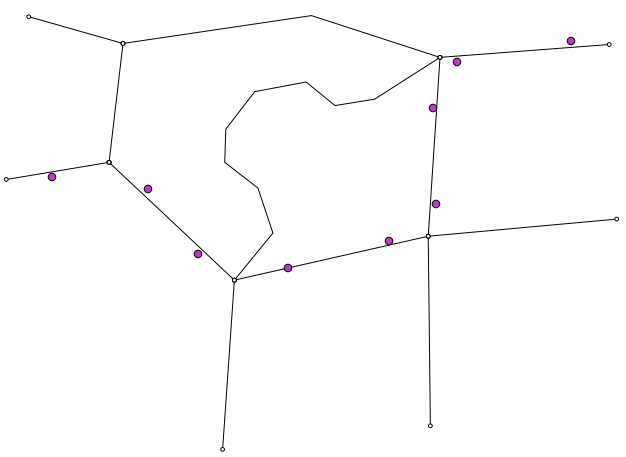
You can get a Spatialite file with testdata from Github as well. It contains a network and a routepoints1 layer:

points_to_route1

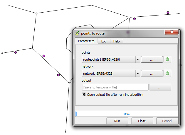
The interface of the points_to_route tool is very simple. All it needs as an input is information about which layer should be used as a network and which layer contains the route points:

points_to_route0

The input points are considered to be ordered. The tool always routes between consecutive points.

The result is a line layer with one line feature for each point pair:

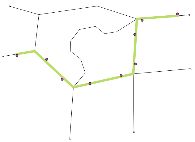
points_to_route2

The network analysis library is a really great new feature and I hope we will see a lot of tools built on top of it.

Update: I’ve revisited this comparison for QGIS 3 in Revisiting point & polygon joins

Joining polygon attributes to points is a pretty common geoprocessing step. There are multiple ways to solve the problem in QGIS, so I thought I’d have a look at how they perform. There is Join attributes by location in the Vector menu and Add polygon attributes to points in the Processing toolbox.

My test data: Two shapefiles with 18,713 points and 17,397 irregular polygons.

(Some system specs: 1.3GHz dualcore with 4GB RAM)

And here are the results:

SAGA Add polygon attributes to points: 44 seconds
Vector | Data management tools | Join attributes by location: killed after 16 hours

This point clearly goes to Processing and the SAGA algorithm it provides access to. Join attributes by location offers some nice options for aggregating data but it just can’t cope with the number of features in this test.

To measure execution time (in a very unscientific way), I just ran the tool from the python console using:

import datetime
import processing
print datetime.datetime.now()
processing.runalg("saga:addpolygonattributestopoints","C:/Users/Anita/poi_wien.shp","C:/Users/Anita/REALNUT2009OGD.shp","NUTZUNG_CO",None)
print datetime.datetime.now()

Some notes of caution:
SAGA comes readily installed in OSGeo4W. As far as I know, the stand-alone installer for Windows currently does not include SAGA but it can be installed manually. On Ubuntu, the standard repos only contain SAGA 2.0.8 but 2.1 is required.

Great shot! – photo by Kenneth Field

FOSS4G 2013 in Nottingham is history. It was my first FOSS4G and a great event. Meeting so many people for the first time in person is really exciting. I had the great chance to present some of the work I did at AIT on comparing street networks. If you couldn’t make it to the conference or missed my talk, here’s the chance to hear it again:


(Tip: You’ll find many more FOSS4G presentations on Youtube.)

Slides and the paper are listed on my publications page. If you are interested in the code, you can find it on Github.

So far, I couldn’t find Tim Sutton’s QGIS keynote video on Youtube. Maybe it will be uploaded later. In the meantime, you can enjoy his slides.

Of course, you already know that the release of QGIS 2.0 was also announced at FOSS4G. In case you haven’t seen the great list of new features yet, have a look at the visual changelog.

Map Gallery – photo by Kenneth Field

The results of the FOSS4G 2013 map contest have also been published now. Thanks to everyone who voted for my entry “FLEET Taxi Tracking” which made it to Runner-up: Best Anti-map Map!

Yesterday, I received an interesting QGIS question:

is there a way to make road label font size depending on road lenght (with osm layer)?
Indeed, it could be interresting to see all roads, even the smallest, on a city map rendering.

Thanks to the data-defined labeling capabilities of the new QGIS version, we can!

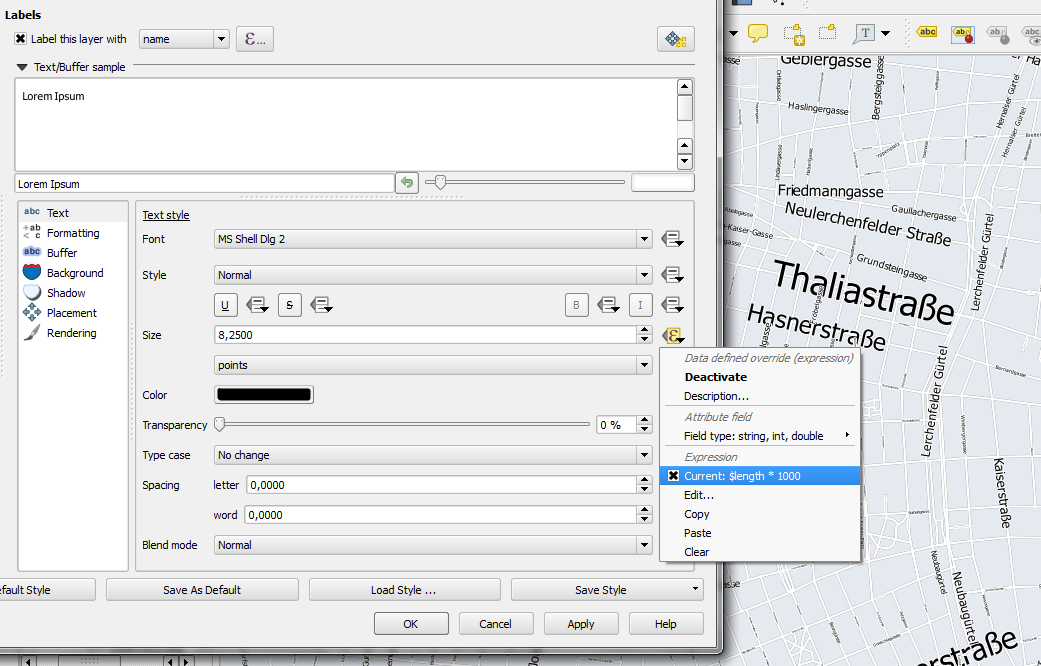
Just click the slightly weird symbol right of the label text size and select Edit …

Since OSM data is in WGS84 by default, street length will be measured in degrees and therefore the values will be small. To get to a reasonable font size, I selected $length * 1000.

The second part of the question can be addressed using a setting in the Rendering section which is – very descriptively – called “Show all labels for this layer (including colliding labels)”.

labelexperiment

While I doubt that this simple method alone will create a great road map, I think it’s still an interesting exercise with sometimes surprising results.

This post describes the three simple steps necessary to create a vintage-looking map using the blending feature in QGIS 2.0’s print composer. This is what we are aiming for:

alaska_oldpaper

1. Prepare the map

Like any other map, this one starts in the QGIS main window. Try to stick with earthy colors which will go well with the old paper look. For labels, try fonts which look like handwriting.

alaska_oldschool_overview

Once you are happy with your map

2. Prepare the composition background

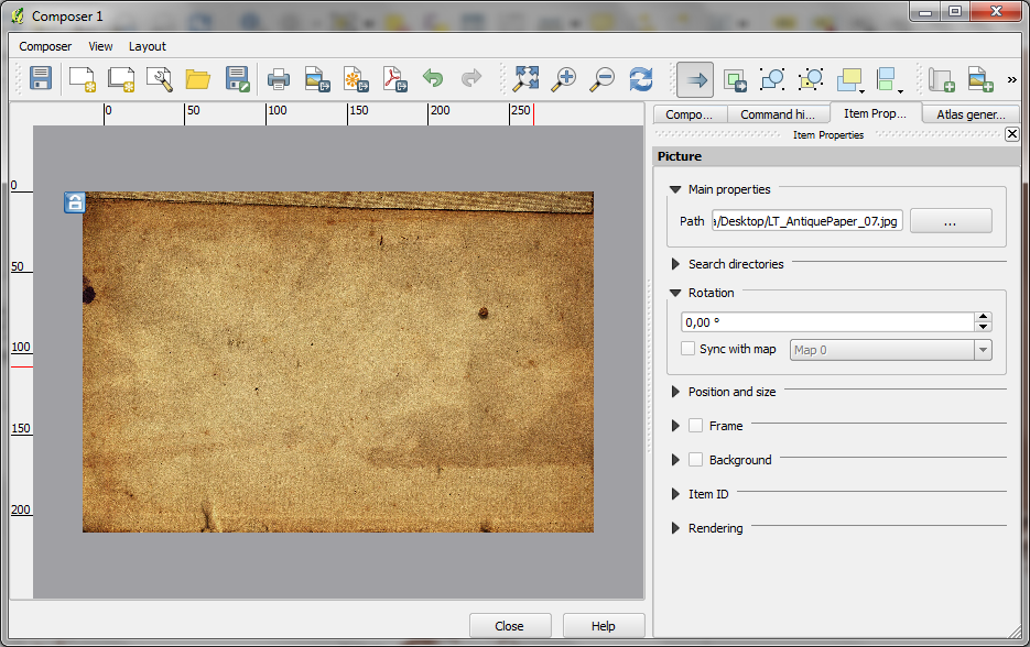
To get that vintage feel, we need a background image with a great texture. You can find such textures on sites like lostandtaken.com. Download one you like and add it to an empty print composer. Make sure it covers the whole paper:

alaska_oldschool_bg

Lock the image by right-clicking it once – a small lock icon should appear in the upper left corner.

3. Finish the composition

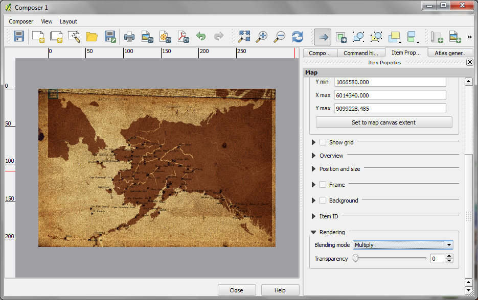
The final step is to add the map on top of the background image. To make our nice background texture shine through, we enable the “multiply” blending mode in the map’s rendering options:

alaska_oldschool_print

Feel free to add north arrows or drawings of dragons as finishing touches.

This post covers a simple approach to calculating isochrones in a public transport network using pgRouting and QGIS.

For this example, I’m using the public transport network of Vienna which is loaded into a pgRouting-enable database as network.publictransport. To create the routable network run:

select pgr_createTopology('network.publictransport', 0.0005, 'geom', 'id');

Note that the tolerance parameter 0.0005 (units are degrees) controls how far link start and end points can be apart and still be considered as the same topological network node.

To create a view with the network nodes run:

create or replace view network.publictransport_nodes as
select id, st_centroid(st_collect(pt)) as geom
from (
	(select source as id, st_startpoint(geom) as pt
	from network.publictransport
	) 
union
	(select target as id, st_endpoint(geom) as pt
	from network.publictransport
	) 
) as foo
group by id;

To calculate isochrones, we need a cost attribute for our network links. To calculate travel times for each link, I used speed averages: 15 km/h for buses and trams and 32km/h for metro lines (similar to data published by the city of Vienna).

alter table network.publictransport add column length_m integer;
update network.publictransport set length_m = st_length(st_transform(geom,31287));

alter table network.publictransport add column traveltime_min double precision;
update network.publictransport set traveltime_min = length_m  / 15000.0 * 60; -- average is 15 km/h
update network.publictransport set traveltime_min = length_m  / 32000.0 * 60 where "LTYP" = '4'; -- average metro is 32 km/h

That’s all the preparations we need. Next, we can already calculate our isochrone data using pgr_drivingdistance, e.g. for network node #1:

create or replace view network.temp as
 SELECT seq, id1 AS node, id2 AS edge, cost, geom
  FROM pgr_drivingdistance(
    'SELECT id, source, target, traveltime_min as cost FROM network.publictransport',
    1, 100000, false, false
  ) as di
  JOIN network.publictransport_nodes pt
  ON di.id1 = pt.id;

The resulting view contains all network nodes which are reachable within 100,000 cost units (which are minutes in our case).

Let’s load the view into QGIS to visualize the isochrones:

isochrone_publictransport_1

The trick is to use data-defined size to calculate the different walking circles around the public transport stops. For example, we can set up 10 minute isochrones which take into account how much time was used to travel by pubic transport and show how far we can get by walking in the time that is left:

1. We want to scale the circle radius to reflect the remaining time left to walk. Therefore, enable Scale diameter in Advanced | Size scale field:

scale_diameter

2. In the Simple marker properties change size units to Map units.
3. Go to data defined properties to set up the dynamic circle size.

datadefined_size

The expression makes sure that only nodes reachable within 10 minutes are displayed. Then it calculates the remaining time (10-"cost") and assumes that we can walk 100 meters per minute which is left. It additionally multiplies by 2 since we are scaling the diameter instead of the radius.

To calculate isochrones for different start nodes, we simply update the definition of the view network.temp.

While this approach certainly has it’s limitations, it’s a good place to start learning how to create isochrones. A better solution should take into account that it takes time to change between different lines. While preparing the network, more care should to be taken to ensure that possible exchange nodes are modeled correctly. Some network links might only be usable in one direction. Not to mention that there are time tables which could be accounted for ;)