Today, I’ve released TimeManager 1.2 which adds support for additional time formats: DD.MM.YYYY, DD/MM/YYYY, and DD-MM-YYYY (thanks to a pull request by vmora) as well as French translation (thanks to bbouteilles).

TimeManager now automatically detects formats such as DD.MM.YYYY

TimeManager now automatically detects formats such as DD.MM.YYYY

But there is more: the QGIS team has released a bugfix version 2.6.1 which you can already find in Ubuntu repos and the OSGeo4W installer. Go get it! And please support the bugfix release effort whenever you can.

As promised in my recent post “Experiments with Conway’s Game of Life”, I have been been looking into how to improve my first implementation. The new version which you can now find on Github is fully contained in one Python script which runs in the QGIS console. Additionally, the repository contains a CSV with the grid definition for a Gosper glider gun and the layer style QML.

Rather than creating a new Shapefile for each iteration like in the first implementation, this script uses memory layers to save the game status.

You can see it all in action in the following video:

(video available in HD)

Thanks a lot to Nathan Woodrow for the support in getting the animation running!

Sometimes there are still hick-ups causing steps to be skipped but overall it is running nicely now. Another approach would be to change the layer attributes rather than creating more and more layers but I like to be able to go through all the resulting layers after they have been computed.

20141108_175726_0A few weeks ago, I had the pleasure to give an interview about open source GIS for the American magazine XYHT. We talked about the open source development model and the motivation behind contributing to open source projects. You can read the full interview in the November issue.

XYHT is available as a classic print magazine as well as for free online and focuses on “positioning and measurement” topics:

http://www.xyht.com

This experiment is motivated by a discussion I had with Dr. Claus Rinner about introducing students to GIS concepts using Conway’s Game of Life. Conway’s Game of Life is a popular example to demonstrate cellular automata. Based on an input grid of “alive” and “dead” cells, new cell values are computed on each iteration based on four simple rules for the cell and its 8 neighbors:

  1. Any live cell with fewer than two live neighbours dies, as if caused by under-population.
  2. Any live cell with two or three live neighbours lives on to the next generation.
  3. Any live cell with more than three live neighbours dies, as if by overcrowding.
  4. Any dead cell with exactly three live neighbours becomes a live cell, as if by reproduction.

(Source: Wikipedia – Conway’s Game of Life)

Based on these simple rules, effects like the following “glider gun” can be achieved:

Gospers glider gun.gif
Gospers glider gun” by KieffOwn work. Licensed under CC BY-SA 3.0 via Wikimedia Commons.

There are some Game of Life implementations for GIS out there, e.g. scripts for ArcGIS or a module for SAGA. Both of these examples are raster-based. Since I couldn’t find any examples of raster manipulation like this in pyQGIS, I decided to instead implement a vector version: a Processing script which receives an input grid of cells and outputs the next iteration based on the rules of Game of Life. In the following screencast, you can see the Processing script being called repeatedly by a script from the Python console:

So far, it’s a quick and dirty first implementation. To make it more smooth, I’m considering adding spatial indexing and using memory layers instead of having Processing create a bunch of Shapefiles.

It would also be interesting to see a raster version done in PyQGIS. Please leave a comment if you have any ideas how this could be achieved.

Did you miss FOSS4G 2014? Don’t despair: the talks have been recorded and are available on Vimeo. I suggest to start with the following video of Pirmin’s talk wrapping up the developments since last year:

From Nottingham to PDX: QGIS 2014 roundup — Pirmin Kalberer, Sourcepole AG from FOSS4G on Vimeo.

Other talks include:

For the full list see https://vimeo.com/search/sort:plays/format:detail?q=qgis+foss4g

And of course – last but not least – watch Gary Sherman’s Sol Katz Award acceptance speech if you haven’t seen it yet. Congratulations Gary!

Gary Sherman’s Sol Katz Award acceptance from Gateway Geomatics on Vimeo.

Today’s post is inspired by a recent thread on the QGIS user mailing list titled “exporting text to Illustrator?”. The issue was that with the introduction of the new labeling system, all labels were exported as paths when creating an SVG. Unnoticed by almost everyone (and huge thanks to Alex Mandel for pointing out!) an option has been added to 2.4 by Larry Shaffer which allows exporting labels as texts again.

To export labels as text, open the Automatic Placement Settings (button in the upper right corner of the label dialog) and uncheck the Draw text as outlines option.

Screenshot 2014-09-20 21.03.26

Note that we are also cautioned that

For now the developers recommend you only toggle this option right
before exporting
and that you recheck it after.

Alex even recorded a video showcasing the functionality:

A while ago I wrote about the 5 meter elevation model of the city of Vienna. In the meantime the 5 meter model has been replaced by a 10 meter version.

For future reference, I’ve therefore published the 5 meter version on opendataportal.at.

details from the Viennese elevation model

details of the Viennese elevation model

I’ve been using the dataset to compare it to EU-DEM and NASA SRTM for energy estimation:
A. Graser, J. Asamer, M. Dragaschnig: “How to Reduce Range Anxiety? The Impact of Digital Elevation Model Quality on Energy Estimates for Electric Vehicles” (2014).

I hope someone else will find it useful as well because assembling the whole elevation model was quite a challenge.

mosaicking the rasterized WFS responses

mosaicking the rasterized WFS responses

When mapping flows or other values which relate to a certain direction, styling these layers gets interesting. I faced the same challenge when mapping direction-dependent error values. Neighboring cell pairs were connected by two lines, one in each direction, with an associated error value. This is what I came up with:

srtm_errors_1200px

Each line is drawn with an offset to the right. The size of the offset depends on the width of the line which in turn depends on the size of the error. You can see the data-defined style properties here:

directed_error_style

To indicate the direction, I added a marker line with one > marker at the center. This marker line also got assigned the same offset to match the colored line bellow. I’m quite happy with how these turned out and would love to hear about your approaches to this issue.

srtm_errors_detail

These figures are part of a recent publication with my AIT colleagues: A. Graser, J. Asamer, M. Dragaschnig: “How to Reduce Range Anxiety? The Impact of Digital Elevation Model Quality on Energy Estimates for Electric Vehicles” (2014).

Update 2017: Please follow the instructions on the OSGeo4W website: https://trac.osgeo.org/osgeo4w/wiki/ExternalPythonPackages


Update 2015: I now recommend this workflow based on Nathan’s post on installing Python setup tools:

  1. Download ez_setup.py
  2. Run python ez_setup.py in your OSGeo4W shell
  3. Run easy_install pysal in your OSGeo4W shell

Original post:

Today’s post is a summary of how to install PySAL on Windows for OSGeo4W Python.

The most important resource was https://trac.osgeo.org/osgeo4w/wiki/ExternalPythonPackages

In the OSGeo4W Shell run:

C:\Users\anita_000\Desktop>curl http://python-distribute.org/distribute_setup.py | python

Update: Note that python-distribute.org has gone down since I posted this. See http://www.gossamer-threads.com/lists/python/python/1158958 for more info.

Then download https://raw.githubusercontent.com/pypa/pip/master/contrib/get-pip.py to the Desktop and run:

C:\Users\anita_000\Desktop>python get-pip.py

When pip is ready, install PySAL:

C:\Users\anita_000\Desktop>pip install pysal

Test the installation:

C:\Users\anita_000\Desktop>python
Python 2.7.5 (default, May 15 2013, 22:44:16) [MSC v.1500 64 bit (AMD64)] on win 32
Type "help", "copyright", "credits" or "license" for more information.
>>> import pysal

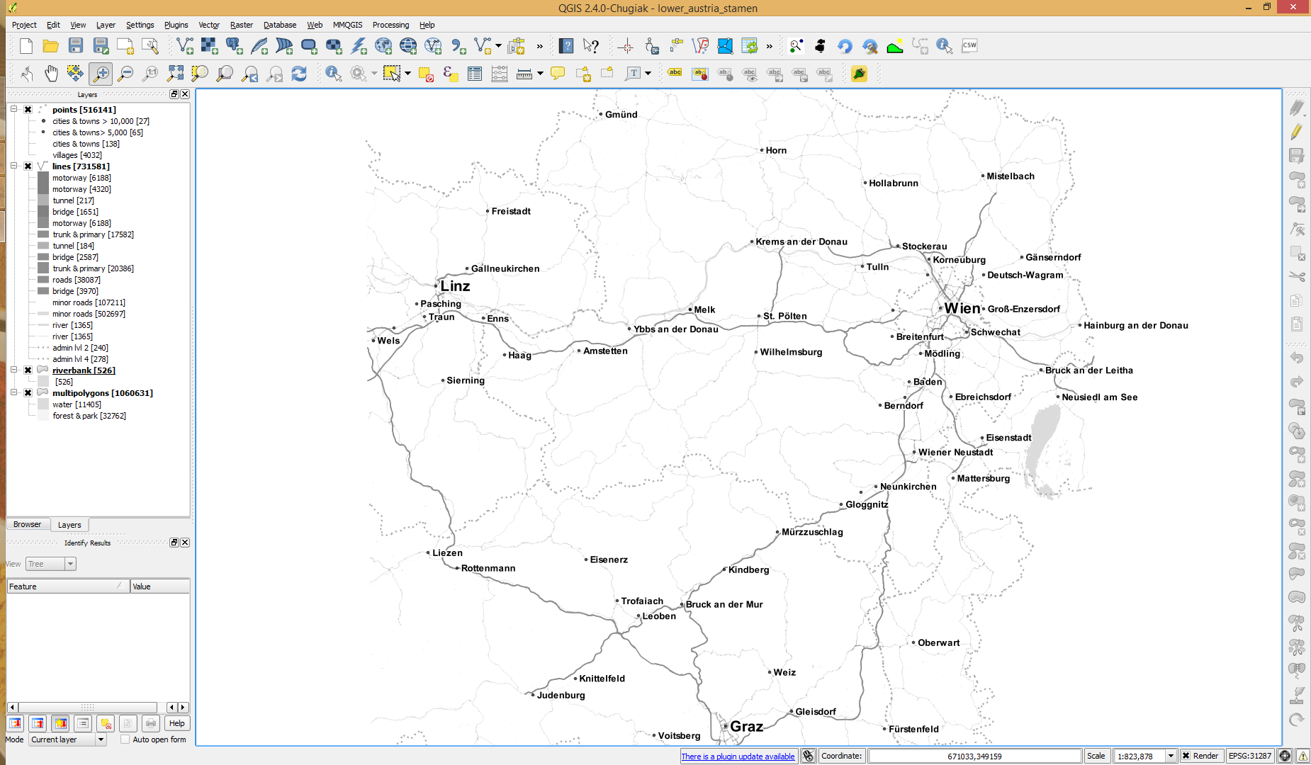
The point table of the Spatialite database created from OSM north-eastern Austria contains more than 500,000 points. This post shows how the style works which – when applied to the point layer – wil make sure that only towns and (when zoomed in) villages will be marked and labeled.

Screenshot 2014-07-12 12.30.21

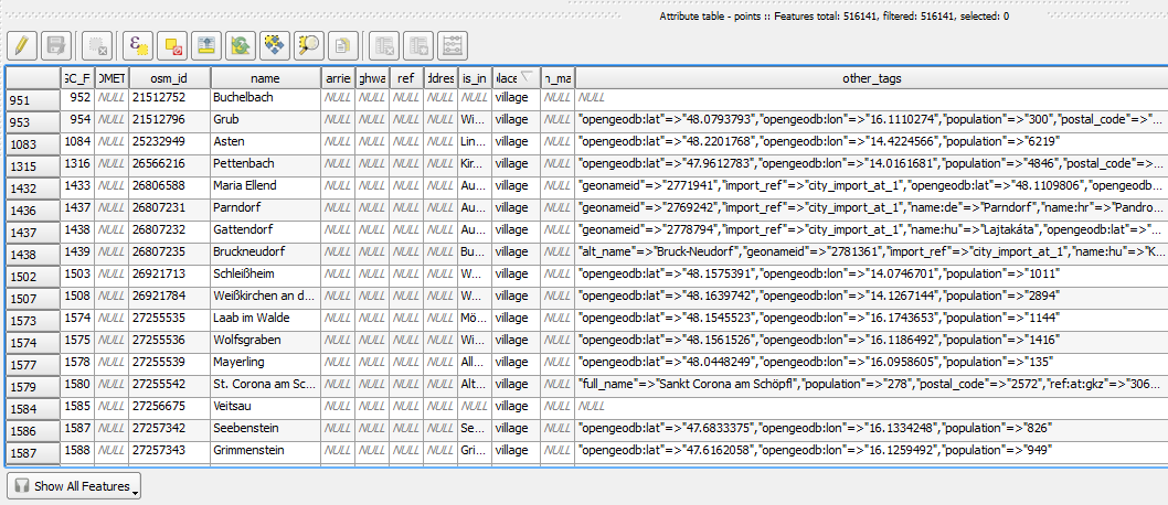
In the attribute table, we can see that there are two tags which provide context for populated places: the place and the population tag. The place tag has it’s own column created by ogr2ogr when converting from OSM to Spatialite. The population tag on the other hand is listed in the other_tags column.

Screenshot 2014-07-12 13.00.15

for example

"opengeodb:lat"=>"47.5000237","opengeodb:lon"=>"16.0334769","population"=>"623"

Overview maps would be much too crowded if we simply labeled all cities and towns. Therefore, it is necessary to filter towns based on their population and only label the bigger ones. I used limits of 5,000 and 10,000 inhabitants depending on the scale.

Screenshot 2014-07-12 12.56.33

At the core of these rules is an expression which extracts the population value from the other_tags attribute: The strpos() function is used to locate the text "population"=>" within the string attribute value. The population value is then extracted using the left() function to get the characters between "population"=>" and the next occurrence of ". This value can ten be cast to integer using toint() and then compared to the population limit:

5000 < toint( 
   left (
      substr(
         "other_tags",
         strpos("other_tags" ,'"population"=>"')+16,
         8
      ),
      strpos(
         substr(
            "other_tags",
            strpos("other_tags" ,'"population"=>"')+16,
            8
         ),
        '"'
      )
   )
) 

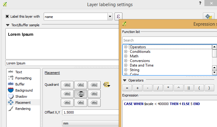
There is also one additional detail concerning label placement in this style: When zoomed in closer than 1:400,000 the labels are placed on top of the points but when zoomed out further, the labels are put right of the point symbol. This is controlled using a scale-based expression in the label placement:

Screenshot 2014-07-12 13.32.47

As usual, you can find the style on Github: https://github.com/anitagraser/QGIS-resources/blob/master/qgis2/osm_spatialite/osm_spatialite_tonerlite_point.qml