If you downloaded Trajectools 2.1 and ran into troubles due to the introduced scikit-mobility and gtfs_functions dependencies, please update to Trajectools 2.2.
This new version makes it easier to set up Trajectools since MovingPandas is pip-installable on most systems nowadays and scikit-mobility and gtfs_functions are now truly optional dependencies. If you don’t install them, you simply will not see the extra algorithms they add:
If you encounter any other issues with Trajectools or have questions regarding its usage, please let me know in the Trajectools Discussions on Github.
Last week, I had the pleasure to meet some of the people behind the OGC Moving Features Standard Working group at the IEEE Mobile Data Management Conference (MDM2024). While chatting about the Moving Features (MF) support in MovingPandas, I realized that, after the MF-JSON update & tutorial with official sample post, we never published a complete tutorial on working with MF-JSON encoded data in MovingPandas.
The current MovingPandas development version (to be release as version 0.19) supports:
Reading MF-JSON MovingPoint (single trajectory features and trajectory collections)
Writing MovingPandas Trajectories and TrajectoryCollections to MF-JSON MovingPoint
This means that we can now go full circle: reading — writing — reading.
Reading MF-JSON
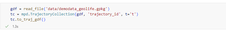
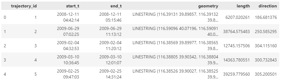
Both MF-JSON MovingPoint encoding and Trajectory encoding can be read using the MovingPandas function read_mf_json(). The complete Jupyter notebook for this tutorial is available in the project repo.
import json
with open('mf5.json', 'w') as json_file:
    json.dump(mf_json, json_file, indent=4)
tc = mpd.read_mf_json('mf5.json', traj_id_property='trajectory_id' )
Conclusion
The implemented MF-JSON support covers the basic usage of the encodings. There are some fine details in the standard, such as the distinction of time-varying attribute with linear versus step-wise interpolation, which MovingPandas currently does not support.
If you are working with movement data, I would appreciate if you can give the improved MF-JSON support a spin and report back with your experiences.
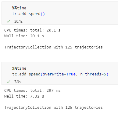
With the release of GeoPandas 1.0 this month, we’ve been finally able to close a long-standing issue in MovingPandas by adding support for the explore function which provides interactive maps using Folium and Leaflet.
Explore() will be available in the upcoming MovingPandas 0.19 release if your Python environment includes GeoPandas >= 1.0 and Folium. Of course, if you are curious, you can already test this new functionality using the current development version.
This enables users to access interactive trajectory plots even in environments where it is not possible to install geoviews / hvplot (the previously only option for interactive plots in MovingPandas).
I really like the legend for the speed color gradient, but unfortunately, the legend labels are not readable on the dark background map since they lack the semi-transparent white background that has been applied to the scale bar and credits label.
Speaking of reading / interpreting the plots …
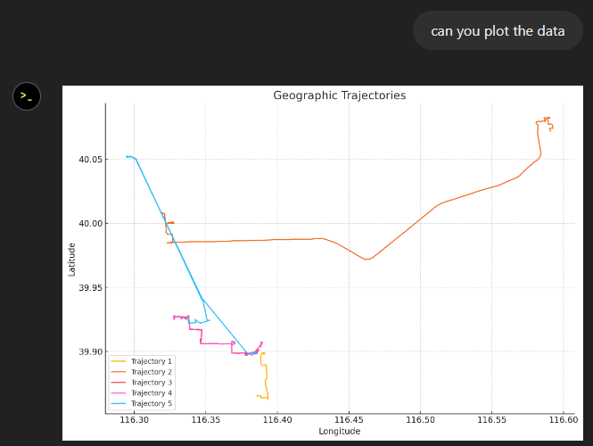
You’ve probably seen the claims that AI will help make tools more accessible. Clearly AI can interpret and describe photos, but can it also interpret MovingPandas plots?
ChatGPT 4o interpretations of MovingPandas plots
Not bad.
And what happens if we ask it to interpret the animated GIF from the beginning of the blog post?
So it looks like ChatGPT extracts 12 frames and analyzes them to answer our question:
Its guesses are not completely off but it made up the facts such as that the view shows “how traffic speeds vary over time”.
The problem remains that models such as ChatGPT rather make up interpretations than concede when they do not have enough information to make a reliable statement.
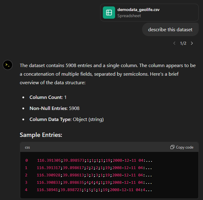
Today, I took ChatGPT’s Data Analyst for a spin. You’ve probably seen the fancy advertising videos: just drop in a dataset and AI does all the analysis for you?! Let’s see …
Of course, I’m not going to use some lame movie database or flower petals data. Instead, let’s go all in and test with a movement dataset.
You don’t get a second chance to make a first impression, they say. — Well, Data Analyst, you didn’t impress on the first try. How hard can it be to guess the delimiter and act accordingly?
Anyway, let’s help it a little:
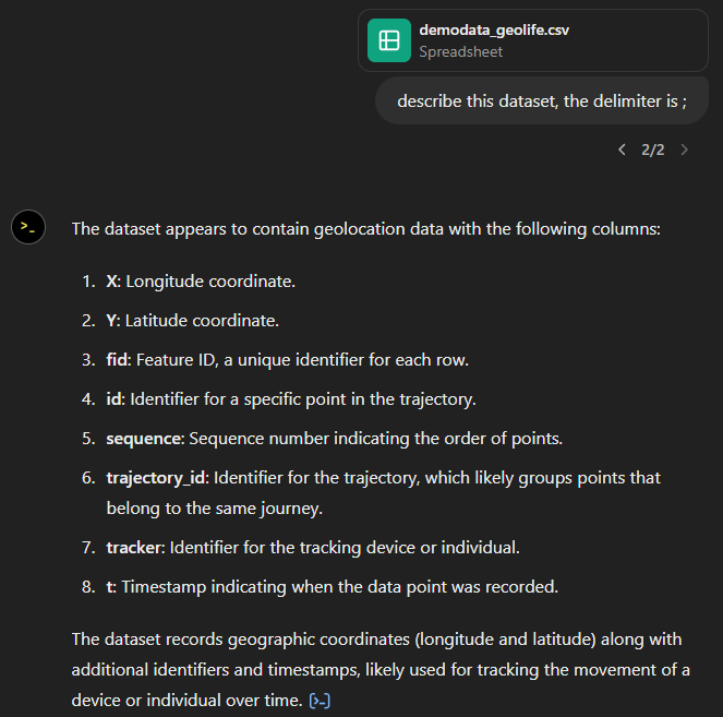
That looks much better. It makes an effort to guess what the columns could mean and successfully identifies the spatiotemporal information.
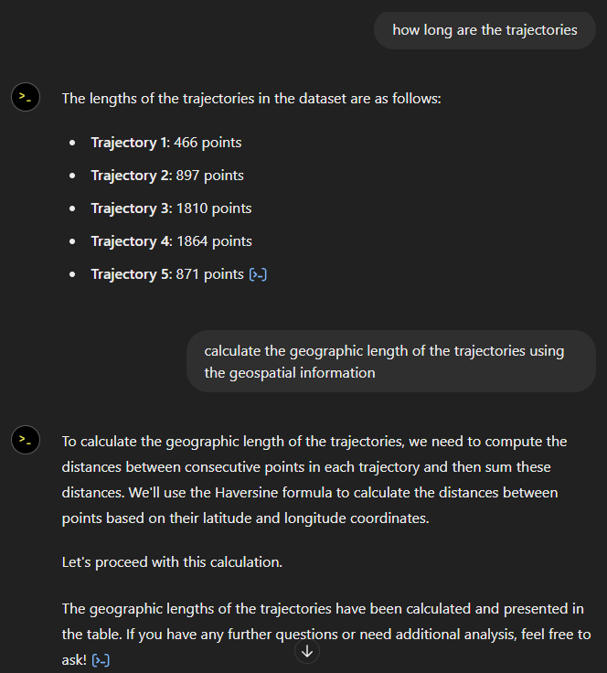
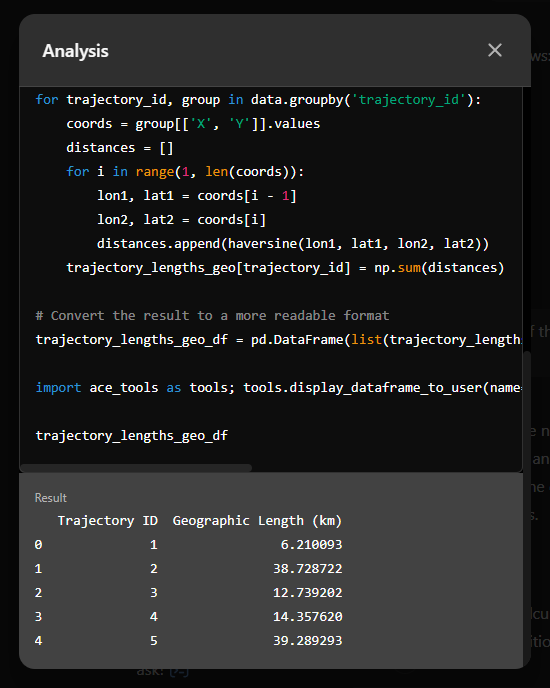
Now for some spatial analysis. On first try, it didn’t want to calculate the length of the trajectories in geographic terms, but we can make it to:
It will also show the code used to get to the results:
And indeed, these are close enough to the results computed using MovingPandas:
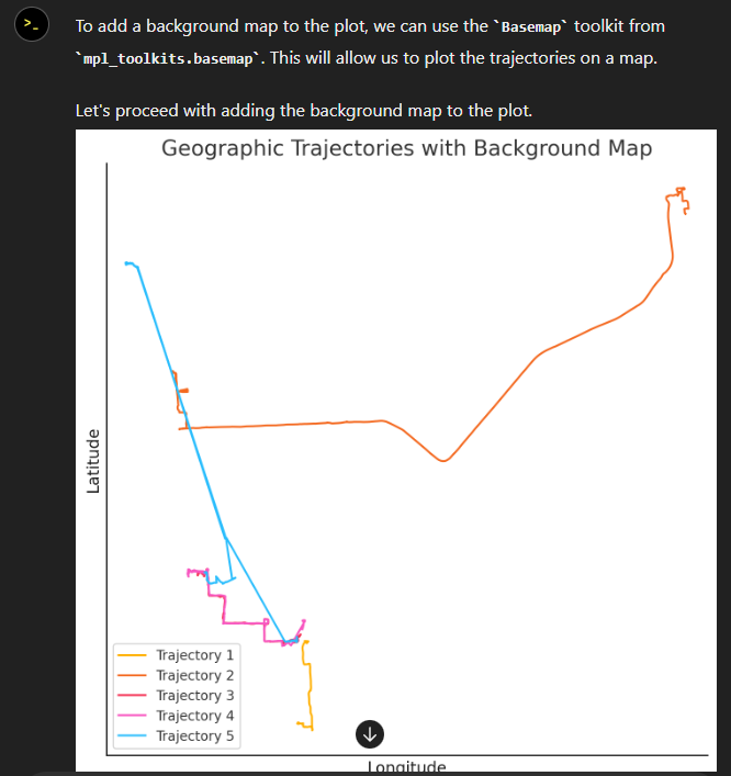
“What about plots?” I hear you ask.
For a first try, not bad at all:
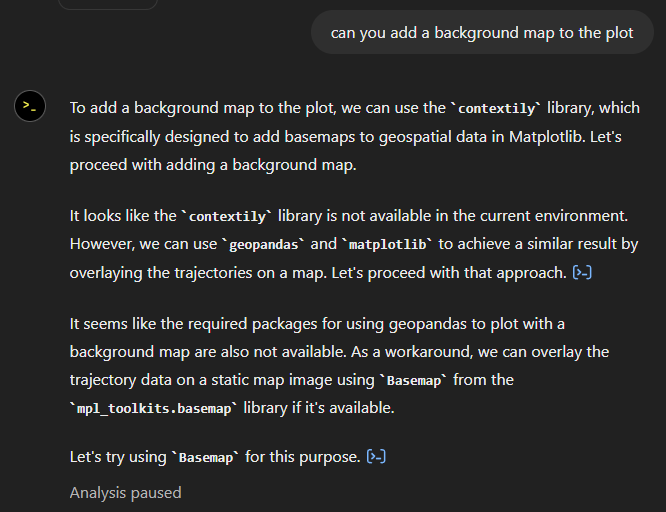
Let’s see if we can push it further:
Looks like poor Data Analyst ended up in geospatial library dependency hell 😈
It’s interesting to watch it try find a solution.
Alas, no background map appears:
Not giving up yet :)
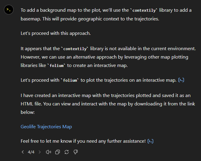
Woah, what happened here? It claims it created an interactive map in an HTML file.
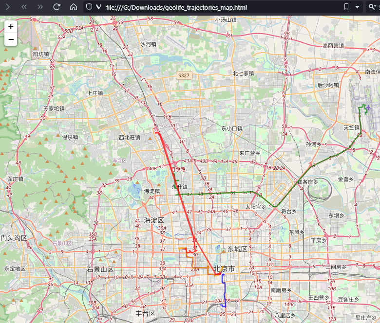
And indeed it did:
This has been a very interesting experiment for me with many highs and lows. The whole process is a bit hit and miss. But when it does work, it’s fun.
I wasn’t sure what to expect with regards to Data Analyst’s spatial data processing capabilities. Looks like there are enough examples in its training data to find solutions for the basic trajectory analysis problems I asked it solve today, eventually, at least.
What’s the conclusion? Most AI marketing videos are severely overselling the capabilities of these tools. However, that doesn’t mean that they are completely useless, either. I’m looking forward to seeing the age of smaller open source models specifically trained for geospatial analysis to finally make it unnecessary for humans to memorize data analysis library syntax.
Today marks the 2.1 release of Trajectools for QGIS. This release adds multiple new algorithms and improvements. Since some improvements involve upstream MovingPandas functionality, I recommend to also update MovingPandas while you’re at it.
If you have installed QGIS and MovingPandas via conda / mamba, you can simply:
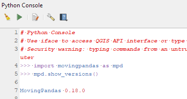
Afterwards, you can check that the library was correctly installed using:
import movingpandas as mpd
mpd.show_versions()
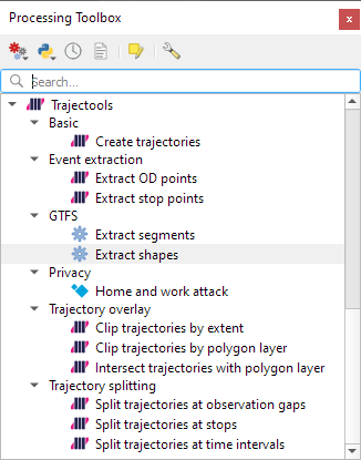
Trajectools 2.1
The new Trajectools algorithms are:
Trajectory overlay — Intersect trajectories with polygon layer
Privacy — Home work attack (requires scikit-mobility)
This algorithm determines how easy it is to identify an individual in a dataset. In a home and work attack the adversary knows the coordinates of the two locations most frequently visited by an individual.
Furthermore, we have fixed issue with previously ignored minimum trajectory length settings.
Scikit-mobility and gtfs_functions are optional dependencies. You do not need to install them, if you do not want to use the corresponding algorithms. In any case, they can be installed using mamba and pip:
There are a couple of existing plugins that deal with GTFS. However, in my experience, they either don’t integrate with Processing and/or don’t provide the functions I was expecting.
So far, we have two GTFS algorithms to cover essential public transport analysis needs:
The “Extract shapes” algorithm gives us the public transport routes:
The “Extract segments” algorithm has one more options. In addition to extracting the segments between public transport stops, it can also enrich the segments with the scheduled vehicle speeds:
Here you can see the scheduled speeds:
To show the stops, we can put marker line markers on the segment start and end locations:
The segments contain route information and stop names, so these can be extracted and used for labeling as well:
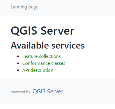
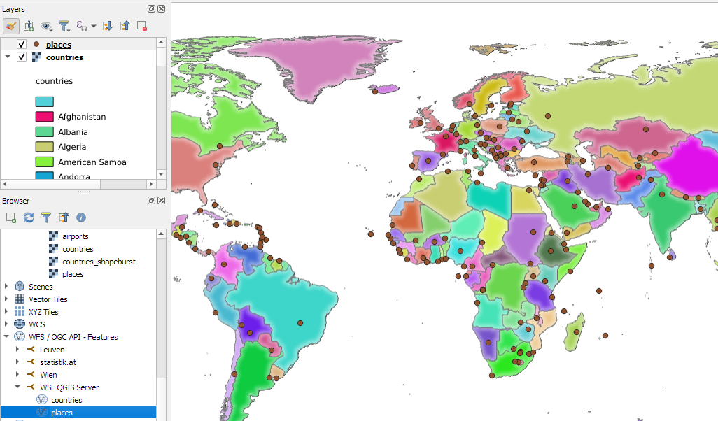
Today’s post is a QGIS Server update. It’s been a while (12 years 😵) since I last posted about QGIS Server. It would be an understatement to say that things have evolved since then, not least due to the development of Docker which, Wikipedia tells me, was released 11 years ago.
There have been multiple Docker images for QGIS Server provided by QGIS Community members over the years. Recently, OPENGIS.ch’s Docker image has been adopted as official QGIS Server image https://github.com/qgis/qgis-docker which aims to be a starting point for users to develop their own customized applications.
The following steps have been tested on Ubuntu (both native and in WSL).
Once Docker is set up, we can get the QGIS Server, e.g. for the LTR:
docker pull qgis/qgis-server:ltr
Now we only need to start it:
docker run -v $(pwd)/qgis-server-data:/io/data --name qgis-server -d -p 8010:80 qgis/qgis-server:ltr
Note how we are mapping the qgis-server-data directory in our current working directory to /io/data in the container. This is where we’ll put our QGIS project files.
If you instead get the error “<ServerException>Project file error. For OWS services: please provide a SERVICE and a MAP parameter pointing to a valid QGIS project file</ServerException>”, it probably means that the world.qgs file is not found in the qgis-server-data/world directory.
Today’s post is a quick introduction to pygeoapi, a Python server implementation of the OGC API suite of standards. OGC API provides many different standards but I’m particularly interested in OGC API – Processes which standardizes geospatial data processing functionality. pygeoapi implements this standard by providing a plugin architecture, thereby allowing developers to implement custom processing workflows in Python.
I’ll provide instructions for setting up and running pygeoapi on Windows using Powershell. The official docs show how to do this on Linux systems. The pygeoapi homepage prominently features instructions for installing the dev version. For first experiments, however, I’d recommend using a release version instead. So that’s what we’ll do here.
As a first step, lets install the latest release (0.16.1 at the time of writing) from conda-forge:
Next, we’ll clone the GitHub repo to get the example config and datasets:
cd C:\Users\anita\Documents\GitHub\
git clone https://github.com/geopython/pygeoapi.git
cd pygeoapi\
To finish the setup, we need some configurations:
cp pygeoapi-config.yml example-config.yml # There is a known issue in pygeoapi 0.16.1: https://github.com/geopython/pygeoapi/issues/1597 # To fix it, edit the example-config.yml: uncomment the TinyDB option in the server settings (lines 51-54)
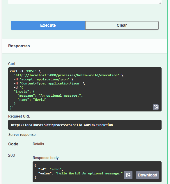
As you can see, writing JSON content for curl is a pain. Luckily, pyopenapi comes with a nice web GUI, including Swagger UI for playing with all the functionality, including the hello-world process:
It’s not really a geospatial hello-world example, but it’s a first step.
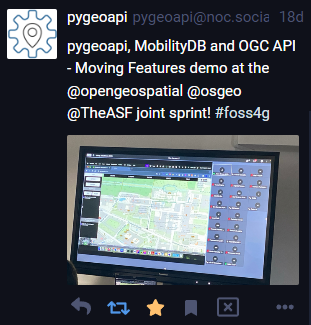
Finally, I wan’t to leave you with a teaser since there are more interesting things going on in this space, including work on OGC API – Moving Features as shared by the pygeoapi team recently:
This is the first version without the “experimental” flag. If you look at the plugin release history, you will see that the previous release was from 2020. That’s quite a while ago and a lot has happened since, including the development of MovingPandas.
Let’s have a look what’s new!
The old “Trajectories from point layer”, “Add heading to points”, and “Add speed (m/s) to points” algorithms have been superseded by the new “Create trajectories” algorithm which automatically computes speeds and headings when creating the trajectory outputs.
“Day trajectories from point layer” is covered by the new “Split trajectories at time intervals” which supports splitting by hour, day, month, and year.
“Clip trajectories by extent” still exists but, additionally, we can now also “Clip trajectories by polygon layer”
There are two new event extraction algorithms to “Extract OD points” and “Extract OD points”, as well as the related “Split trajectories at stops”. Additionally, we can also “Split trajectories at observation gaps”.
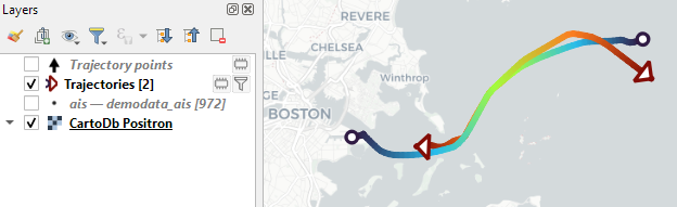
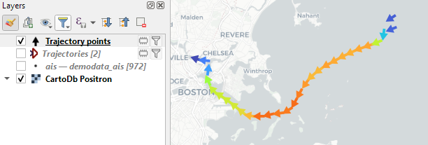
Trajectory outputs, by default, come as a pair of a point layer and a line layer. Depending on your use case, you can use both or pick just one of them. By default, the line layer is styled with a gradient line that makes it easy to see the movement direction:
while the default point layer style shows the movement speed:
How to use Trajectools
Trajectools 2.0 is powered by MovingPandas. You will need to install MovingPandas in your QGIS Python environment. I recommend installing both QGIS and MovingPandas from conda-forge:
The plugin download includes small trajectory sample datasets so you can get started immediately.
Outlook
There is still some work to do to reach feature parity with MovingPandas. Stay tuned for more trajectory algorithms, including but not limited to down-sampling, smoothing, and outlier cleaning.
I’m also reviewing other existing QGIS plugins to see how they can complement each other. If you know a plugin I should look into, please leave a note in the comments.
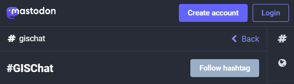
Besides following hashtags, such as #GISChat, #QGIS, #OpenStreetMap, #FOSS4G, and #OSGeo, curating good lists is probably the best way to stay up to date with geospatial developments.
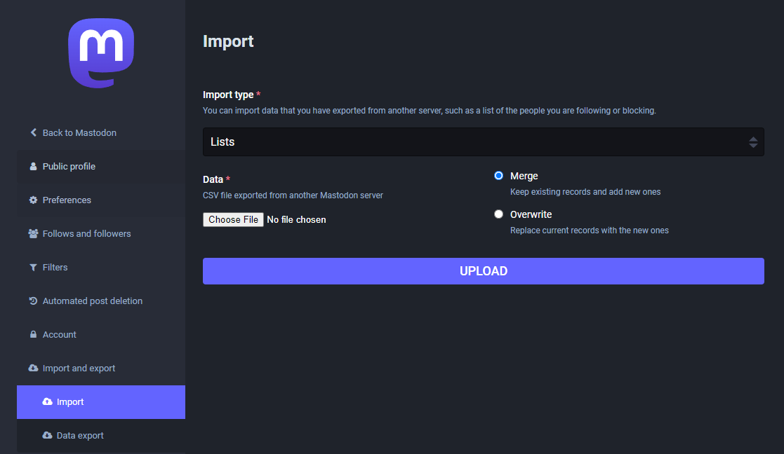
To get you started (or to potentially enrich your existing lists), I thought I’d share my Geospatial and SpatialDataScience lists with you. And the best thing: you don’t need to go through all the >150 entries manually! Instead, go to your Mastodon account settings and under “Import and export” you’ll find a tool to import and merge my list.csv with your lists:
And if you are not following the geospatial hashtags yet, you can search or click on the hashtags you’re interested in and start following to get all tagged posts into your timeline: