Besides following hashtags, such as #GISChat, #QGIS, #OpenStreetMap, #FOSS4G, and #OSGeo, curating good lists is probably the best way to stay up to date with geospatial developments.
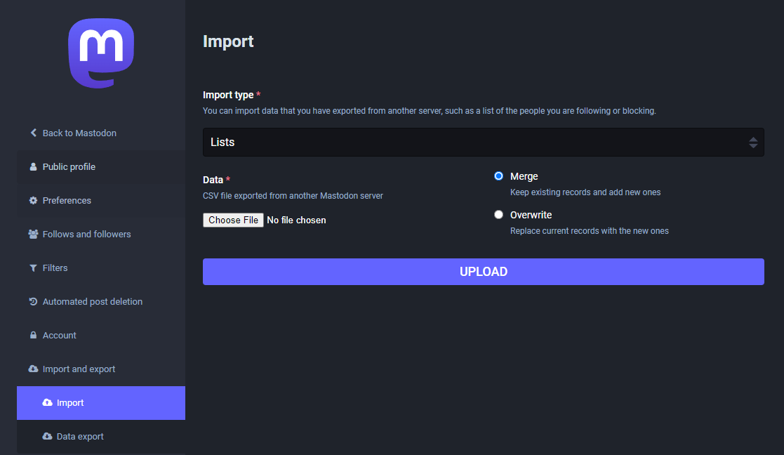
To get you started (or to potentially enrich your existing lists), I thought I’d share my Geospatial and SpatialDataScience lists with you. And the best thing: you don’t need to go through all the >150 entries manually! Instead, go to your Mastodon account settings and under “Import and export” you’ll find a tool to import and merge my list.csv with your lists:
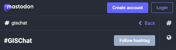
And if you are not following the geospatial hashtags yet, you can search or click on the hashtags you’re interested in and start following to get all tagged posts into your timeline:
I’m continuously testing the algorithms integrated so far to see if they work as GIS users would expect and can to ensure that they can be integrated in Processing model seamlessly.
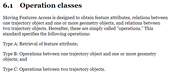
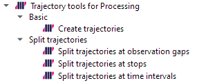
Because naming things is tricky, I’m currently struggling with how to best group the toolbox algorithms into meaningful categories. I looked into the categories mentioned in OGC Moving Features Access but honestly found them kind of lacking:
… but I’m not convinced yet. So take the above listed three categories with a grain of salt. Those may change before the release. (Any inputs / feedback / recommendation welcome!)
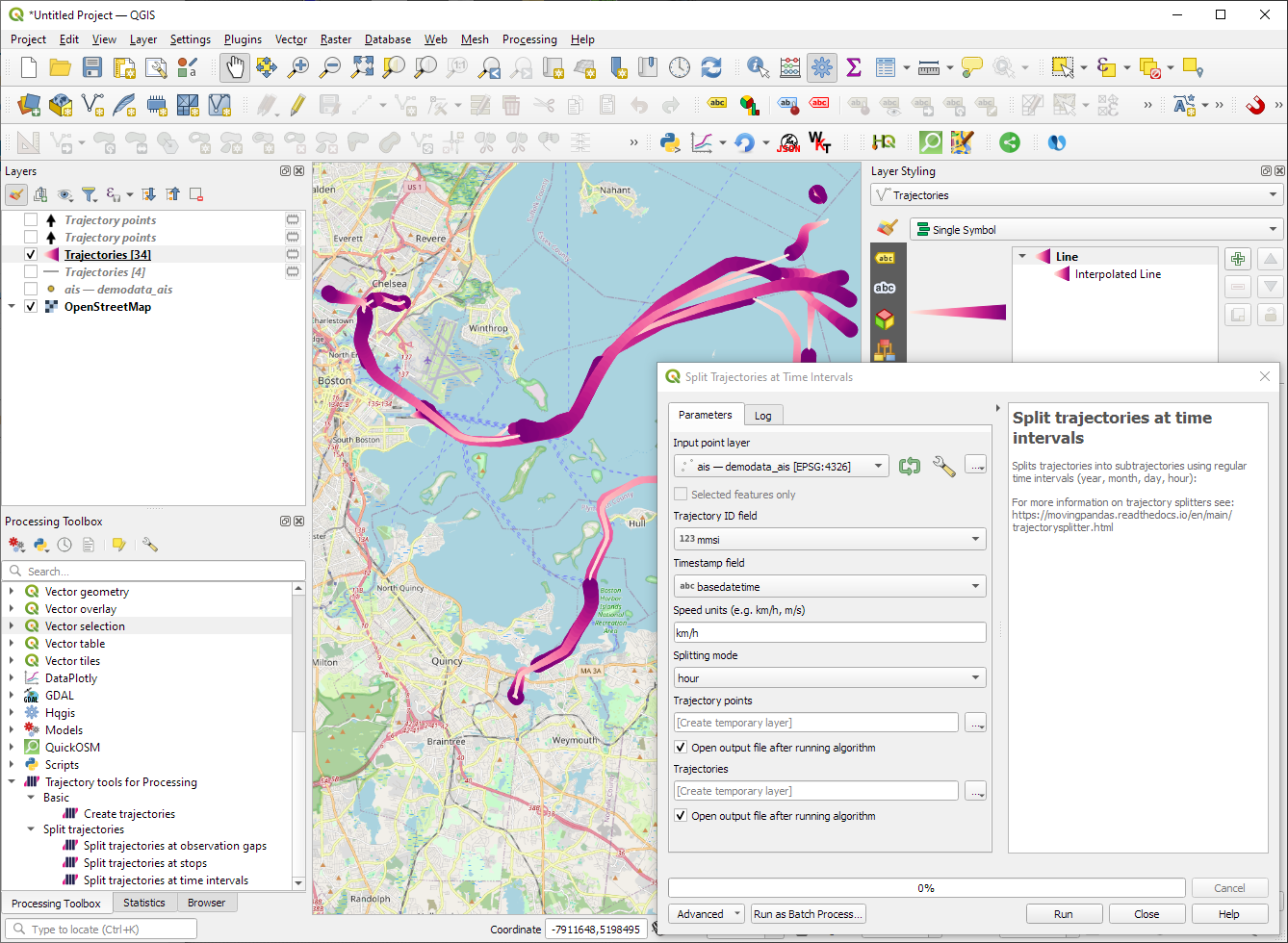
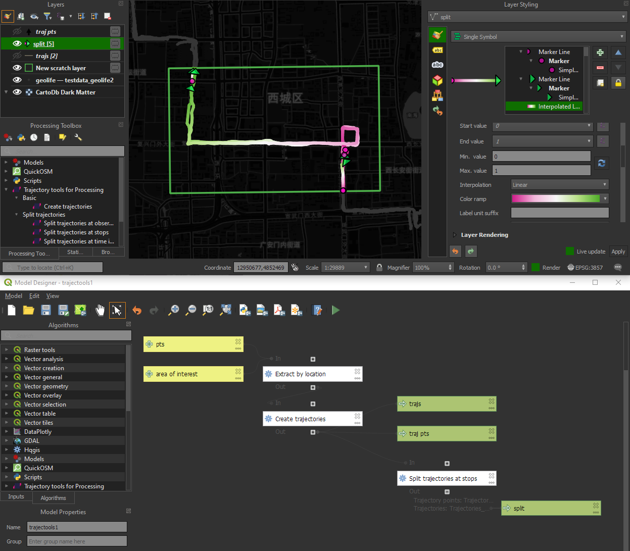
Let me close this quick status update with a screencast showcasing stop detection in AIS data, featuring the recently added trajectory styling using interpolated lines:
Trajectools development started back in 2018 but has been on hold since 2020 when I realized that it would be necessary to first develop a solid trajectory analysis library. With the MovingPandas library in place, I’ve now started to reboot Trajectools.
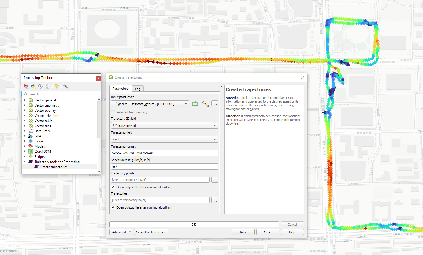
Trajectools v2 builds on MovingPandas and exposes its trajectory analysis algorithms in the QGIS Processing Toolbox. So far, I have integrated the basic steps of
Building trajectories including speed and direction information from timestamped points and
Splitting trajectories at observation gaps, stops, or regular time intervals.
The algorithms create two output layers:
Trajectory points with speed and direction information that are styled using arrow markers
Trajectories as LineStringMs which makes it straightforward to count the number of trajectories and to visualize where one trajectory ends and another starts.
So far, the default style for the trajectory points is hard-coded to apply the Turbo color ramp on the speed column with values from 0 to 50 (since I’m simply loading a ready-made QML). By default, the speed is calculated as km/h but that can be customized:
I don’t have a solution yet to automatically create a style for the trajectory lines layer. Ideally, the style should be a categorized renderer that assigns random colors based on the trajectory id column. But in this case, it’s not enough to just load a QML.
In the meantime, I might instead include an Interpolated Line style. What do you think?
Of course, the goal is to make Trajectools interoperable with as many existing QGIS Processing Toolbox algorithms as possible to enable efficient Mobility Data Science workflows.
The easiest way to set up QGIS with MovingPandas Python environment is to install both from conda. You can find the instructions together with the latest Trajectools development version at: https://github.com/movingpandas/qgis-processing-trajectory
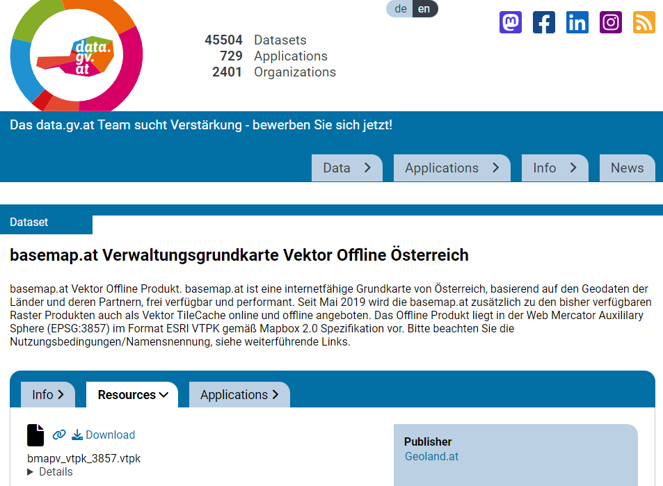
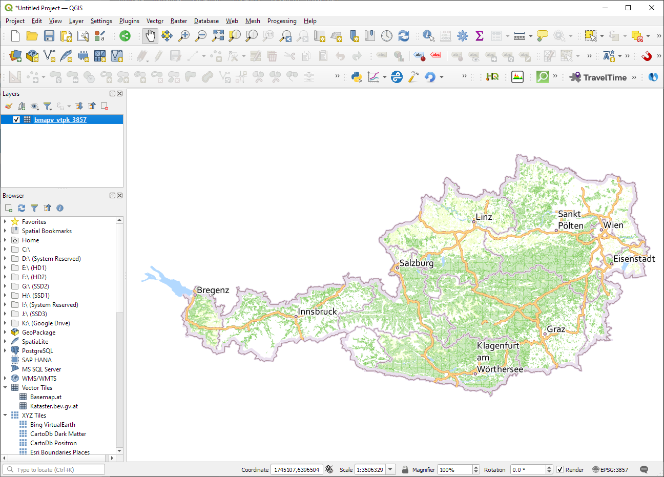
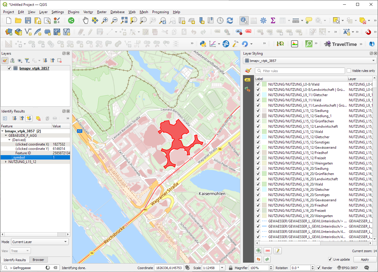
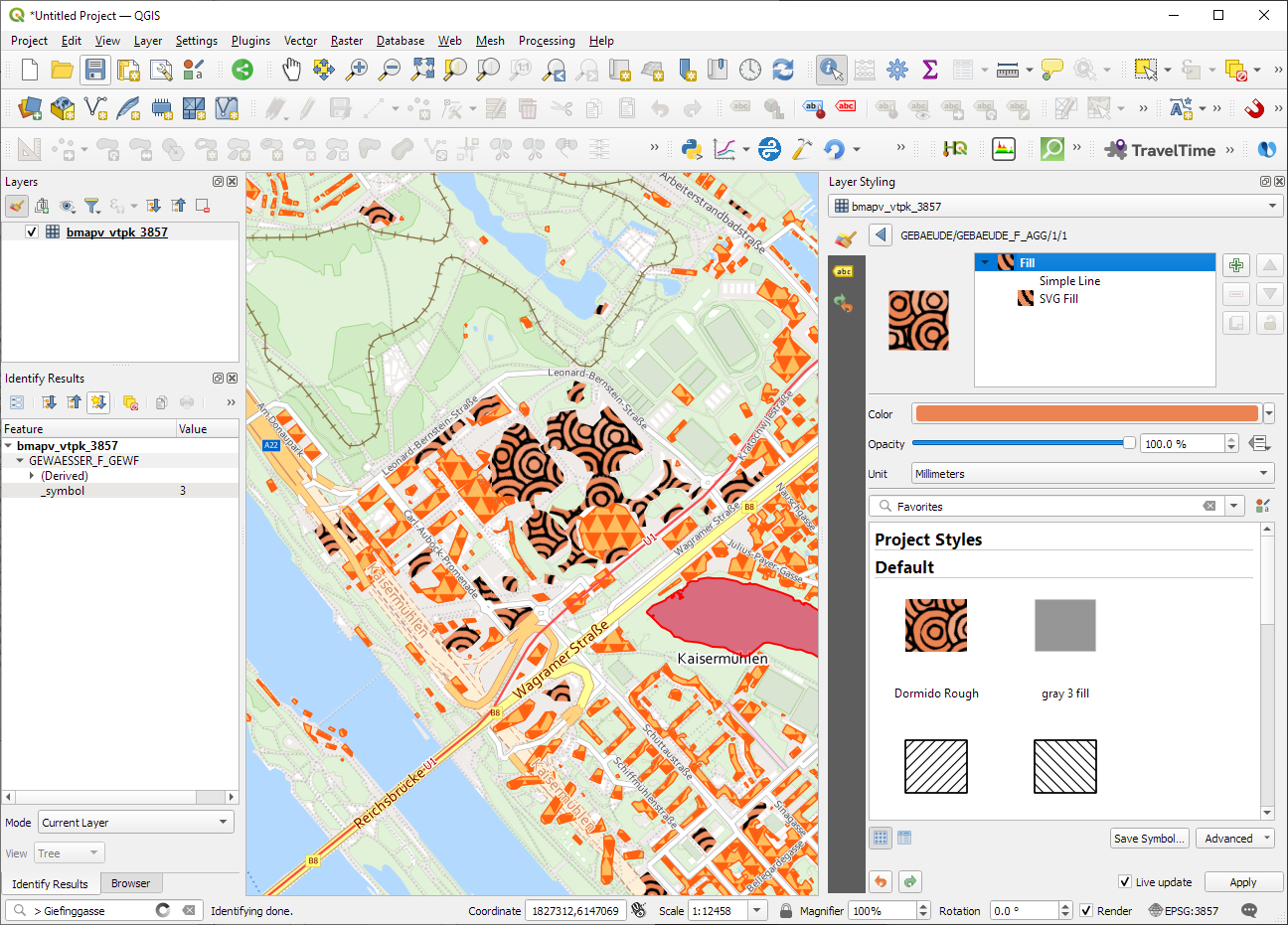
ESRI vector tile packages (VTPK files) can now be opened directly as vector tile layers via drag and drop, including support for style translation.
This is great news, particularly for users from Austria, since this makes it possible to use the open government basemap.at vector tiles directly, without any fuss:
In this post, Jakub Nowosad introduces our book “Geocomputation with Python”, also known as geocompy. It is an open-source book on geographic data analysis with Python, written by Michael Dorman, Jakub Nowosad, Robin Lovelace, and me with contributions from others. You can find it online at https://py.geocompx.org/
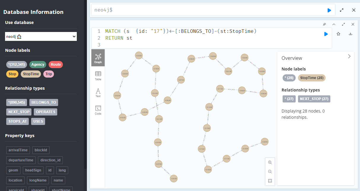
A prime example, are the relationships between GTFS StopTime and Trip nodes. For example, this is the Cypher query to get all StopTime nodes of Trip 17:
MATCH
    (t:Trip  {id: "17"})
    <-[:BELONGS_TO]-
    (st:StopTime)
RETURN st
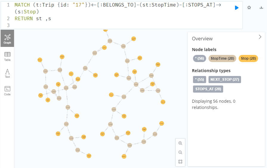
To get the stop locations, we also need to get the stop nodes:
MATCH
    (t:Trip {id: "17"})
    <-[:BELONGS_TO]-
    (st:StopTime)
    -[:STOPS_AT]->
    (s:Stop)
RETURN st ,s
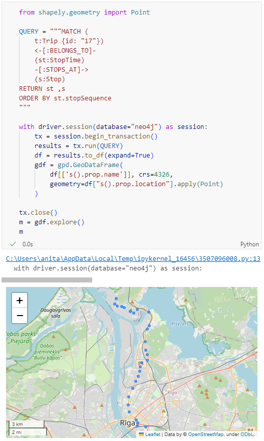
Adapting our code from the previous post, we can plot the stops:
from shapely.geometry import Point
QUERY = """MATCH (
t:Trip {id: "17"})
<-[:BELONGS_TO]-
(st:StopTime)
-[:STOPS_AT]->
(s:Stop)
RETURN st ,s
ORDER BY st.stopSequence
"""
with driver.session(database="neo4j") as session:
tx = session.begin_transaction()
results = tx.run(QUERY)
df = results.to_df(expand=True)
gdf = gpd.GeoDataFrame(
df[['s().prop.name']], crs=4326,
geometry=df["s().prop.location"].apply(Point)
)
tx.close()
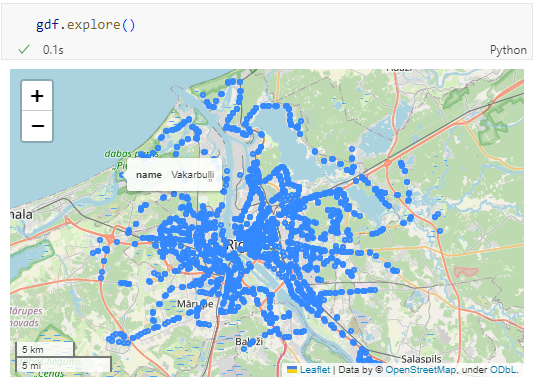
m = gdf.explore()
m
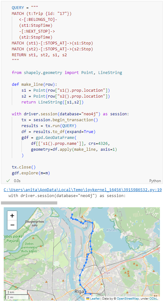
Ordering by stop sequence is actually completely optional. Technically, we could use the sorted GeoDataFrame, and aggregate all the points into a linestring to plot the route. But I want to try something different: we’ll use the NEXT_STOP relationships to get a DataFrame of the start and end stops for each segment:
QUERY = """
MATCH (t:Trip {id: "17"})
   <-[:BELONGS_TO]-
   (st1:StopTime)
   -[:NEXT_STOP]->
   (st2:StopTime)
MATCH (st1)-[:STOPS_AT]->(s1:Stop)
MATCH (st2)-[:STOPS_AT]->(s2:Stop)
RETURN st1, st2, s1, s2
"""

from shapely.geometry import Point, LineString

def make_line(row):
    s1 = Point(row["s1().prop.location"])
    s2 = Point(row["s2().prop.location"])
    return LineString([s1,s2])

with driver.session(database="neo4j") as session:
    tx = session.begin_transaction()
    results = tx.run(QUERY)
    df = results.to_df(expand=True)
    gdf = gpd.GeoDataFrame(
        df[['s1().prop.name']], crs=4326,
        geometry=df.apply(make_line, axis=1)
    )

tx.close()
gdf.explore(m=m)
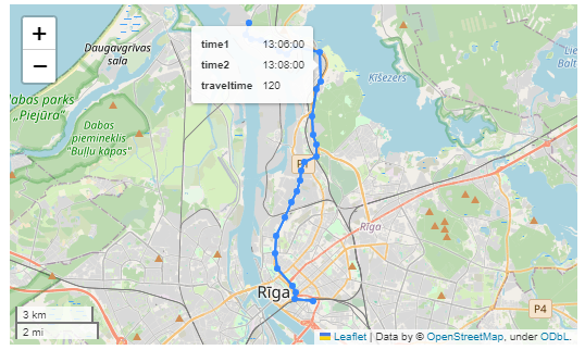
Finally, we can also use Cypher to calculate the travel time between two stops:
MATCH (t:Trip {id: "17"})
   <-[:BELONGS_TO]-
   (st1:StopTime)
   -[:NEXT_STOP]->
   (st2:StopTime)
MATCH (st1)-[:STOPS_AT]->(s1:Stop)
MATCH (st2)-[:STOPS_AT]->(s2:Stop)
RETURN st1.departureTime AS time1,
   st2.arrivalTime AS time2,
   s1.location AS geom1,
   s2.location AS geom2,
   duration.inSeconds(
      time(st1.departureTime),
      time(st2.arrivalTime)
   ).seconds AS traveltime
Then we can connect to our database. The default user name is neo4j and you get to pick the password when creating the database:
from neo4j import GraphDatabase

URI = "neo4j://localhost"
AUTH = ("neo4j", "password")

with GraphDatabase.driver(URI, auth=AUTH) as driver:
    driver.verify_connectivity()
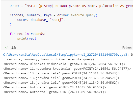
Once we have confirmed that the connection works as expected, we can run a query:
QUERY = "MATCH (p:Stop) RETURN p.name AS name, p.location AS geom"

records, summary, keys = driver.execute_query(
    QUERY, database_="neo4j",
)

for rec in records:
    print(rec)
Nice. There we have our GTFS stops, their names and their locations. But how to put them on a map?
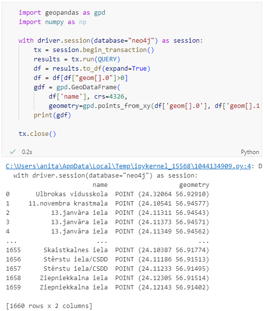
import geopandas as gpd
import numpy as np

with driver.session(database="neo4j") as session:
    tx = session.begin_transaction()
    results = tx.run(QUERY)
    df = results.to_df(expand=True)
    df = df[df["geom[].0"]>0]
    gdf = gpd.GeoDataFrame(
        df['name'], crs=4326,
        geometry=gpd.points_from_xy(df['geom[].0'], df['geom[].1']))
    print(gdf)

tx.close()
Since some of the nodes lack geometries, I added a quick and dirty hack to get rid of these nodes because — otherwise — gdf.explore() will complain about None geometries.
written together with my fellow co-authors and EMERALDS project team members Argyrios Kyrgiazos and Helen McKenzie.
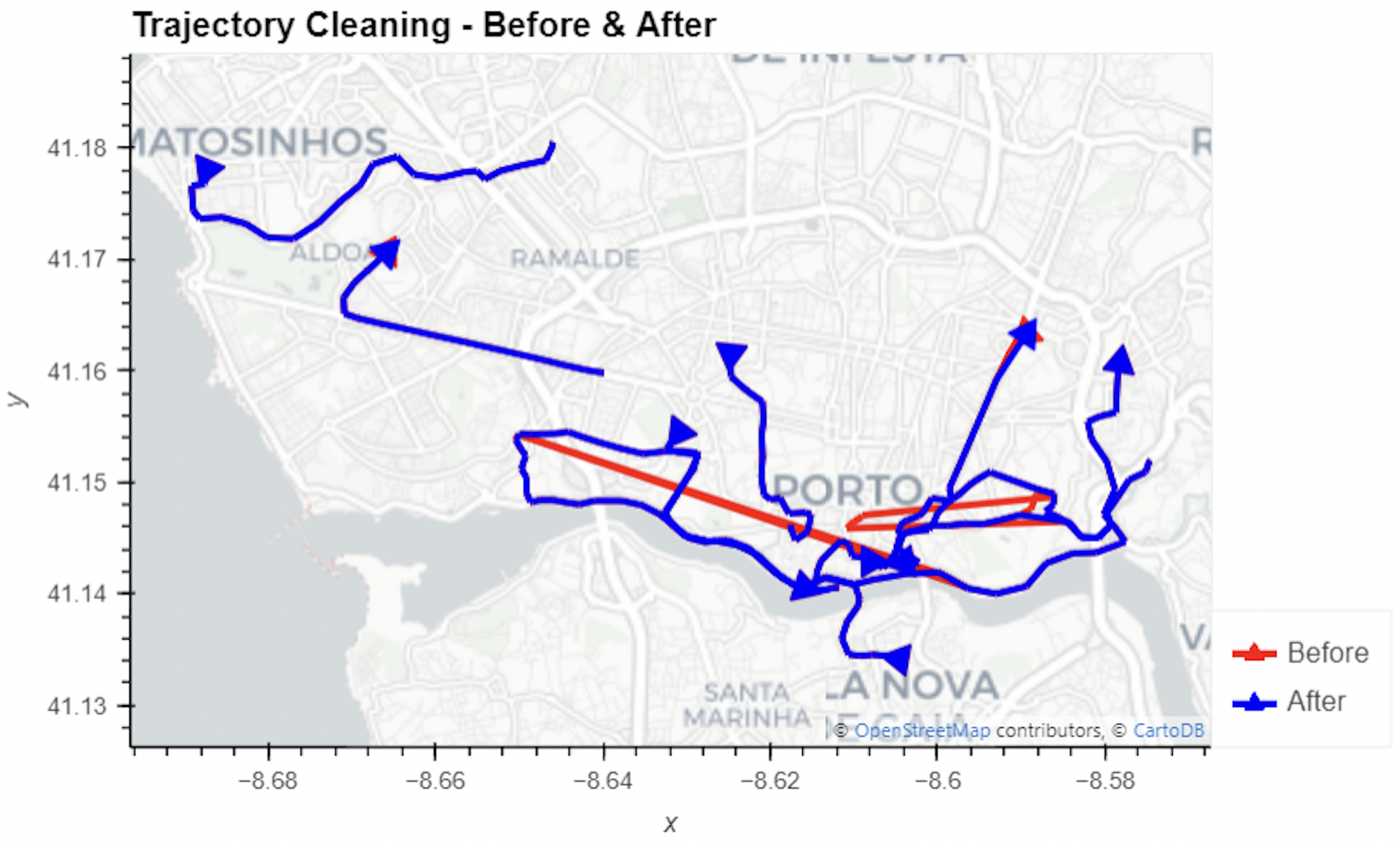
In this blog post, we walk you through a trajectory hotspot analysis using open taxi trajectory data from Kaggle, combining data preparation with MovingPandas (including the new OutlierCleaner illustrated above) and spatiotemporal hotspot analysis from Carto.
In a recent post, we looked into a graph-based model for maritime mobility data and how it may be represented in Neo4J. Today, I want to look into another type of mobility data: public transport schedules in GTFS format.
Since a GTFS export is basically a ZIP archive full of CSVs, we will be making good use of Neo4Js CSV loading capabilities. The basic script for importing the stops file and creating point geometries from lat and lon values would be:
LOAD CSV with headers
FROM "file:///stops.txt"
AS row
CREATE (:Stop {
   stop_id: row["stop_id"],
   name: row["stop_name"],
   location: point({
    longitude: toFloat(row["stop_lon"]),
    latitude: toFloat(row["stop_lat"])
    })
})
This requires that the stops.txt is located in the import directory of your Neo4J database. When we run the above script and the file is missing, Neo4J will tell us where it tried to look for it. In my case, the directory ended up being:
So, let’s put all GTFS CSVs into that directory and we should be good to go.
Let’s start with the agency file:
load csv with headers from
'file:///agency.txt' as row
create (a:Agency {
   id: row.agency_id,
   name: row.agency_name,
   url: row.agency_url,
   timezone: row.agency_timezone,
   lang: row.agency_lang
});
… Added 1 label, created 1 node, set 5 properties, completed after 31 ms.
The routes file does not include agency info but, luckily, there is only one agency, so we can hard-code it:
load csv with headers from
'file:///routes.txt' as row
match (a:Agency {id: "rigassatiksme"})
create (a)-[:OPERATES]->(r:Route {
   id: row.route_id,
   shortName: row.route_short_name,
   longName: row.route_long_name,
   type: toInteger(row.route_type)
});
… Added 81 labels, created 81 nodes, set 324 properties, created 81 relationships, completed after 28 ms.
From stops, I’m removing non-existent or empty columns:
load csv with headers from
'file:///stops.txt' as row
create (s:Stop {
   id: row.stop_id,
   name: row.stop_name,
   location: point({
      latitude: toFloat(row.stop_lat),
      longitude: toFloat(row.stop_lon)
   }),
   code: row.stop_code
});
… Added 1671 labels, created 1671 nodes, set 5013 properties, completed after 71 ms.
From trips, I’m also removing non-existent or empty columns:
load csv with headers from
'file:///trips.txt' as row
match (r:Route {id: row.route_id})
create (r)<-[:USES]-(t:Trip {
   id: row.trip_id,
   serviceId: row.service_id,
   headSign: row.trip_headsign,
   direction_id: toInteger(row.direction_id),
   blockId: row.block_id,
   shapeId: row.shape_id
});
… Added 14427 labels, created 14427 nodes, set 86562 properties, created 14427 relationships, completed after 875 ms.
Slowly getting there. We now have around 16k nodes in our graph:
Finally, it’s stop times time. This is where the serious information is. This file is much larger than all previous ones with over 300k lines (i.e. times when an PT vehicle stops).
:auto
load csv with headers from
'file:///stop_times.txt' as row
CALL { with row
match (t:Trip {id: row.trip_id}), (s:Stop {id: row.stop_id})
create (t)<-[:BELONGS_TO]-(st:StopTime {
   arrivalTime: row.arrival_time,
   departureTime: row.departure_time,
   stopSequence: toInteger(row.stop_sequence)})-[:STOPS_AT]->(s)
} IN TRANSACTIONS OF 10 ROWS;
… Added 351388 labels, created 351388 nodes, set 1054164 properties, created 702776 relationships, completed after 1364220 ms.
As you can see, this took a while. But now we have all nodes in place:
The final statement adds additional relationships between consecutive stop times:
call apoc.periodic.iterate('match (t:Trip) return t',
'match (t)<-[:BELONGS_TO]-(st) with st order by st.stopSequence asc
with collect(st) as stops
unwind range(0, size(stops)-2) as i
with stops[i] as curr, stops[i+1] as next
merge (curr)-[:NEXT_STOP]->(next)', {batchmode: "BATCH", parallel:true, parallel:true, batchSize:1});
This fails with: There is no procedure with the name apoc.periodic.iterate registered for this database instance. Please ensure you've spelled the procedure name correctly and that the procedure is properly deployed.
So, let’s install APOC. That’s a plugin which we can install into our database from within Neo4J Desktop:
After restarting the db, we can run the query:
No errors. Sounds good.
Let’s have a look at what we ended up with. Here are 25 random Trips. I expanded one of them to show its associated StopTimes. We can see the relations between consecutive StopTimes and I’ve expanded the final five StopTimes to show their linked Stops:
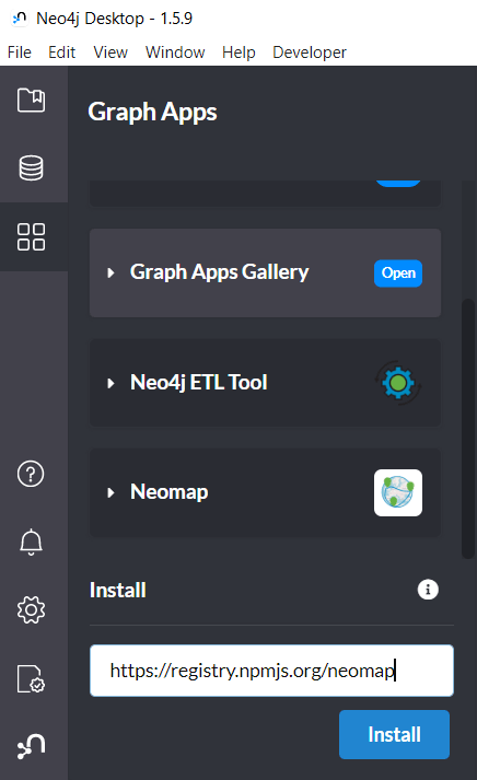
I also wanted to visualize the stops on a map. And there used to be a neat app called Neomap which can be installed easily:
Today, we’ll take the next step and add basemaps to our maps. This is trickier than I would have expected. In particular, I was fighting with “invalid” OSM tile layers until I realized that my QGIS application instance somehow lacked the “WMS” provider.
In addition, getting basemaps to work also means that we have to take care of layer and project CRSes and on-the-fly reprojections. So let’s get to work:
from IPython.display import Image
from PyQt5.QtGui import QColor
from PyQt5.QtWidgets import QApplication
from qgis.core import QgsApplication, QgsVectorLayer, QgsProject, QgsRasterLayer, \
    QgsCoordinateReferenceSystem, QgsProviderRegistry, QgsSimpleMarkerSymbolLayerBase
from qgis.gui import QgsMapCanvas
app = QApplication([])
qgs = QgsApplication([], False)
qgs.setPrefixPath(r"C:\temp", True)  # setting a prefix path should enable the WMS provider
qgs.initQgis()
canvas = QgsMapCanvas()
project = QgsProject.instance()
map_crs = QgsCoordinateReferenceSystem('EPSG:3857')
canvas.setDestinationCrs(map_crs)
print("providers: ", QgsProviderRegistry.instance().providerList())
To add an OSM basemap, we use the xyz tiles option of the WMS provider: