Archive

Tag Archives: geometry generator

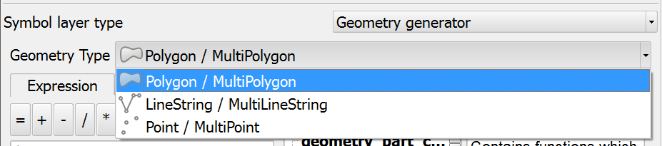
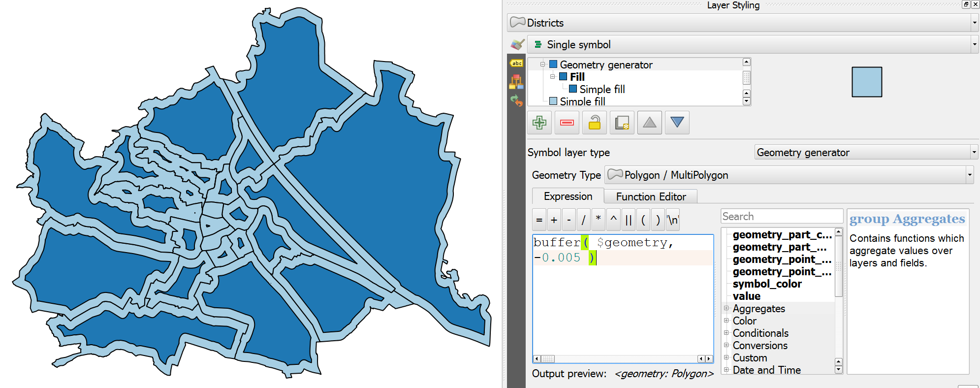
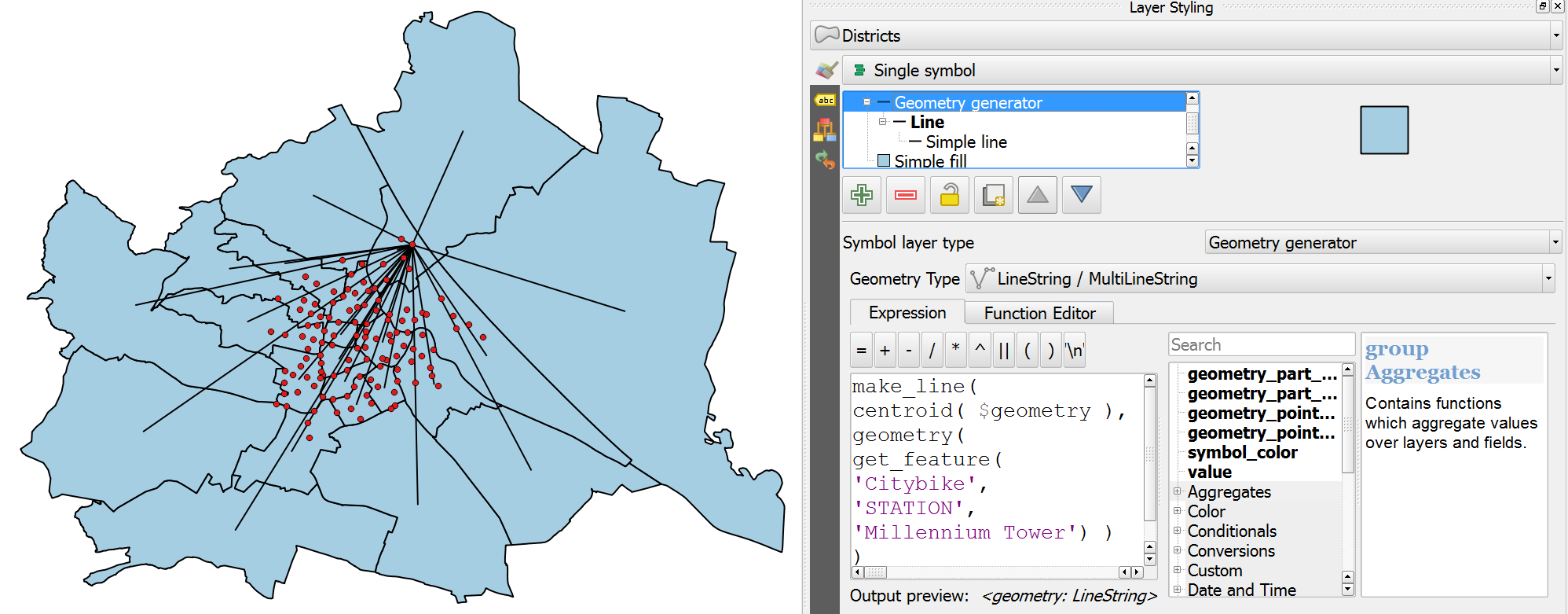
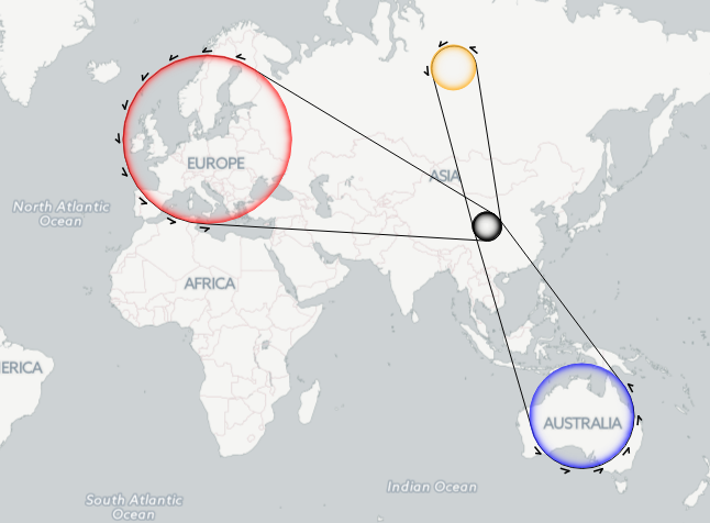
In this post, we use TimeManager to visualize the position of a moving object over time along a trajectory. This is another example of what is possible thanks to QGIS’ geometry generator feature. The result can look like this:

What makes this approach interesting is that the trajectory is stored in PostGIS as a LinestringM instead of storing individual trajectory points. So there is only one line feature loaded in QGIS:

(In part 2 of this series, we already saw how a geometry generator can be used to visualize speed along a trajectory.)

The layer is added to TimeManager using t_start and t_end attributes to define the trajectory’s temporal extent.

TimeManager exposes an animation_datetime() function which returns the current animation timestamp, that is, the timestamp that is also displayed in the TimeManager dock, as well as on the map (if we don’t explicitly disable this option).

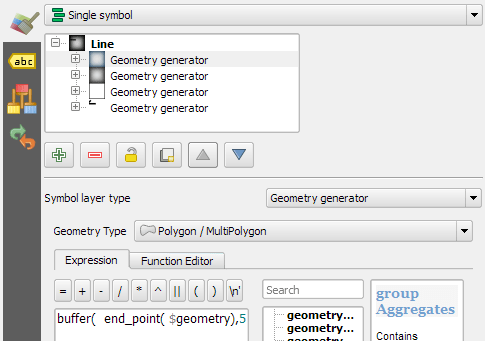
Once TimeManager is set up, we can edit the line style to add a point marker to visualize the position of the moving object at the current animation timestamp. To do that, we interpolate the position along the trajectory segments. The first geometry generator expression splits the trajectory in its segments:

The second geometry generator expression interpolates the position on the segment that contains the current TimeManager animation time:

The WHEN statement compares the trajectory segment’s start and end times to the current TimeManager animation time. Afterwards, the line_interpolate_point function is used to draw the point marker at the correct position along the segment:

CASE 
WHEN (
m(end_point(geometry_n($geometry,@geometry_part_num)))
> second(age(animation_datetime(),to_datetime('1970-01-01 00:00')))
AND
m(start_point(geometry_n($geometry,@geometry_part_num)))
<= second(age(animation_datetime(),to_datetime('1970-01-01 00:00')))
)
THEN
line_interpolate_point( 
  geometry_n($geometry,@geometry_part_num),
  1.0 * (
    second(age(animation_datetime(),to_datetime('1970-01-01 00:00')))
	- m(start_point(geometry_n($geometry,@geometry_part_num)))
  ) / (
    m(end_point(geometry_n($geometry,@geometry_part_num)))
	- m(start_point(geometry_n($geometry,@geometry_part_num)))
  ) 
  * length(geometry_n($geometry,@geometry_part_num))
)
END

Here is the animation result for a part of the trajectory between 08:00 and 09:00:


This post is part of a series. Read more about movement data in GIS.

Advertisement

In 2012 I published a post on mapping the then newly released Tirol river dataset.

In the comments, reader Michal Zimmermann asked:

Do you think it would be possible to create a river stream which gains width along its way? I mean rivers are usually much narrower on their beginnings, then their width increases and the estuary should be the widest part, right?

For a long time, this kind of river style, also known as “tapered lines” could only be created in vector graphics software, such as Inkscape and Illustrator.

With the help of geometry generators, we can now achieve this look directly in QGIS:

Data cc-by Land Tirol

In the river dataset published by the state of Tirol, all rivers are digitized in upstream direction. For this styling to work, it is necessary that the line direction is consistent throughout the whole dataset.

We use a geometry generator symbol layer to split the river geometry into its individual segments:


Then we can use the information about the total number of segments (accessible via the expression variable @geometry_part_count) and the individual segment’s number (@geometry_part_num) to calculate the segment’s line width.

The stroke width expression furthermore uses the river category (GEW_GRKL) to vary the line width depending on the category:

CASE 
WHEN "GEW_GRKL" = '< 10 km2 Fluss' THEN 0.2
WHEN "GEW_GRKL" = '10 km2 Fluss' THEN 0.4
WHEN "GEW_GRKL" = '100 km2 Fluss' THEN 0.6
WHEN "GEW_GRKL" = '1.000 km2 Fluss' THEN 0.8
ELSE 1.0
END 
* ( 1- ( @geometry_part_num /  @geometry_part_count ))

If the rivers are digitized in downstream direction, you can simply remove the 1- term.

Happy mapping!

Geometry generator symbol layers are a feature that has been added in QGIS 2.14. They allow using the expression engine to modify geometries or even create new geometries while rendering.

Geometry generator symbol layers make it possible to use expression syntax to generate a geometry on the fly during the rendering process. The resulting geometry does not have to match with the original geometry type and we can add several differently modified symbol layers on top of each other.

The latest version of the QGIS user manual provides some example expressions, which served as a basis for the following examples:

Rendering the centroid of a feature

To add a geometry layer representing feature centroids, we need to set the geometry type to Point / Multipoint and enter the following expression:

centroid( $geometry )

It is worth noting that the correct geometry type has to be set manually. If a wrong type is set, the symbol layer can not be rendered.

Drawing buffers around features

Buffers are an example of a polygon geometry generator layer. The second parameter of the buffer function defines if the buffer is generated outside (for positive values) or inside (for negative values) of the feature. The value has to be provided in the layer’s CRS units, in this case, that means an inner buffer of 0.005 degrees:

buffer( $geometry, -0.005 )

Creating a line between features in different layers

The following expression creates lines from all district centroids (as shown in the first example) and a feature from the Citybike layer where the STATION attribute value is ‘Millennium Tower’:

make_line( 
  centroid( $geometry ),
  geometry( get_feature( 'Citybike', 'STATION', 'Millennium Tower' ) ) 
)

More advanced examples

Using these basic examples as a starting point, geometry generators open a wide field of advanced symbology options. For example, this sector light style presented on GIS.Stackexchange or my recently introduced conveyor belt flow style:

Last time, I wrote about the little details that make a good flow map. The data in that post was made up and simpler than your typical flow map. That’s why I wanted to redo it with real-world data. In this post, I’m using domestic migration data of Austria.

Raw migration data

Raw migration data, line width scaled to flow strength

With 9 states, that makes 72 potential flow arrows. Since that’s too much to map, I’ve decided in a first step to only show flows with more than 1,000 people.

Following the recommendations mentioned in the previous post, I first designed a basic flow map where each flow direction is rendered as a black arrow:

migration_basic

Basic flow map

Even with this very limited number of flows, the map gets pretty crowded, particularly around the north-eastern node, the Austrian capital Vienna.

To reduce the number of incoming and outgoing lines at each node, I therefore decided to change to colored one-sided arrows that share a common geometry:

migration_twocolor

Colored one-sided arrows

The arrow color is determined automatically based on the arrow direction using the following expression:

CASE WHEN
 "weight" < 1000 THEN color_rgba( 0,0,0,0)
WHEN
 x(start_point( $geometry)) - x(end_point($geometry)) < 0
THEN
 '#1f78b4'
ELSE
 '#ff7f00'
END

The same approach is used to control the side of the one-sided arrow head. The arrow symbol layer has two “arrow type” options for rendering the arrow head: on the inside of the curve or on the outside. This means that, if we wouldn’t use a data-defined approach, the arrow head would be on the same side – independent of the line geometry direction.

CASE WHEN
 x(start_point( $geometry)) - x(end_point($geometry)) < 0
THEN
 1
ELSE
 2
END

Obviously, this ignores the corner case of start and end points at the same x coordinate but, if necessary, this case can be added easily.

Of course the results are far from perfect and this approach still requires manual tweaking of the arrow geometries. Nonetheless, I think it’s very interesting to see how far we can push the limits of data-driven styling for flow maps.

Give it a try! You’ll find the symbol and accompanying sample data on the QGIS resource sharing plugin platform:

resourcesharing_flowmap

The QGIS map style I want to share with you today was inspired by a hand-drawn map by Philippe Rekacewicz that I saw on Twitter:

The look reminds me of conveyor belts, thus the name choice.

You can download the symbol and a small sample dataset by adding my repo to the QGIS Resource Sharing plugin.

resourcesharing_conveyor

The conveyor belt is a line symbol that makes extensive use of Geometry generators. One generator for the circle at the flow line start and end point, respectively, another generator for the belt, and a final one for the small arrows around the colored circles. The color and size of the circle are data defined:

conveyor_details

The collection also contains a sample Geopackage dataset which you can use to test the symbol immediately. It is worth noting that the circle size has to be specified in layer CRS units.

It’s great fun playing with the power of Geometry generator symbol layers and QGIS geometry expressions. For example, this is the expression for the final geometry that is used to draw the small arrows around colored circles:

line_merge( 
  intersection(
    exterior_ring( 
      convex_hull( 
        union( 
          buffer( start_point($geometry), "start_size" ),
          buffer( end_point($geometry), 500000 )
        )
      )
    ),
    exterior_ring( 
      buffer( start_point( $geometry), "start_size" )
    )
  )
)

The expression constructs buffer circles, the belt geometry (convex_hull around buffers), and finally extracts the intersecting part from the start circle and the belt geometry.

Hope you enjoy it!

It’s holiday season, why not share one of your own symbols with the QGIS community?

%d bloggers like this: