Archive

GIS

Last October, I had the pleasure to speak at the Uni Liverpool’s Geographic Data Science Lab Brown Bag Seminar. The talk starts with examples from different movement datasets that illustrate why we need data exploration to better understand our datasets. Then we dive into different options for exploring movement data before ending on ongoing challenges for future development of the field.

Here’s the full recording of my talk and follow-up discussion:


This post is part of a series. Read more about movement data in GIS.

Data sourcing and preparation is one of the most time consuming tasks in many spatial analyses. Even though the Austrian data.gv.at platform already provides a central catalog, the individual datasets still vary considerably in their accessibility or readiness for use.

OGD.AT Lab is a new repository collecting Jupyter notebooks for working with Austrian Open Government Data and other auxiliary open data sources. The notebooks illustrate different use cases, including so far:

  1. Accessing geodata from the city of Vienna WFS
  2. Downloading environmental data (heat vulnerability and air quality)
  3. Geocoding addresses and getting elevation information
  4. Exploring urban movement data

Data processing and visualization are performed using Pandas, GeoPandas, and Holoviews. GeoPandas makes it straighforward to use data from WFS. Therefore, OGD.AT Lab can provide one universal gdf_from_wfs() function which takes the desired WFS layer as an argument and returns a GeoPandas.GeoDataFrame that is ready for analysis:

Many other datasets are provided as CSV files which need to be joined with spatial datasets to use them in spatial analysis. For example, the “Urban heat vulnerability index” dataset which needs to be joined to statistical areas.


Another issue with many CSV files is that they use German number formatting, where commas are used as a decimal separater instead of dots:

Besides file access, there are also open services provided by other developers, for example, Manfred Egger developed an elevation service that provides elevation information for any point in Austria. In combination with geocoding services, such as Nominatim, this makes is possible to, for example, find the elevation for any address in Austria:

Last but not least, the first version of the mobility notebook showcases open travel time data provided by Uber Movement:

The utility functions for data access included in this repository will continue to grow as new data sources are included. Eventually, it may make sense to extract the data access function into a dedicated library, similar to geofi (Finland) or geobr (Brazil).

If you’re aware of any interesting open datasets or services that should be included in OGD.AT, feel free to reach out here or on Github through the issue tracker or by providing a pull request.

If you are following QGIS topics on social media, you may have already seen this but if you don’t, I recommend having a look at Tim Sutton’s most recent adventures in building dashboards with QGIS:

https://twitter.com/timlinux/status/1333859727839784961

The dashboard is built using labeling and geometry generator functionality. This means that they work in the QGIS application map window as well as in layouts. As hinted at in the screenshot above, the dashboard can show information about whole layers as well as interactive selections.

Here’s a full walk-through Tim published yesterday:

You can follow the further development via Tim’s tweets or the dedicated Github issue (where you can even find an example QGIS dashboard project in a GeoPacakge for download).

Update July 2021: the style hub is now part of the official QGIS infrastructure at https://plugins.qgis.org/styles/


The 2016 post More icons & symbols for QGIS still regularly makes it to the top 10 list of posts by visitors. I wouldn’t attribute this popularity to the quality of this particular post, however. Instead, it’s a pretty clear sign that QGIS users are actively searching for more styling resources to add to their installations.

When it comes to styling resources, the person to follow right now is clearly Klas Karlsson who’s been keeping a steady stream of styling-related posts coming to Twitter:

Additionally, he’s the master-mind behind QGIS Hub, a – currently prototypical – platform for sharing styling resources and print layout templates:

If you are interested in sharing styling resources, head over there. Similarly, if you want to lend a hand developing QGIS Hub, get in touch!

The latest v0.5 release is now available from conda-forge.

New features include:

As always, all tutorials are available on MyBinder:

Detected stops (left) and trajectory split at stops (right)

On Thursday, I was awarded the 2020 Sol Katz award for Free and Open Source Software for Geospatial. I feel very honored to have been selected for this award and I’d like to take this opportunity to share a few words of thanks:

As people working in open source projects, we are constantly reminded that we are all standing on the shoulders of giants. However, particularly this year, we also see just how important small personal connections are. For me, my involvement with open source communities really took off when I joined the QGIS hackfest in Vienna in 2009 and I felt that my participation was really appreciated and welcome. I couldn’t imagine being without these connections anymore.

Thank you to the whole QGIS community, particularly my fellow PSC members both current and former: Tim, Andreas, Jürgen, Richard, Paolo, Otto, Marco Hugentobler, Alessandro, our new chair Marco Bernasocchi, and of course QGIS founder Gary Sherman for starting this awesome project and for still being around and actively promoting geospatial open source by publishing so many great books covering multiple different OSGeo projects.

I’d also like to thank my partner and my family for being incredibly understanding whenever I’m spend my time geeking out over a new programming project, data analysis, forum question, or conference talk.

Thank you also to my friends, colleagues and fellow members of the larger OSGeo community for sharing ideas, providing valuable feedback, and spreading the word about all the great work that’s going on all around us.

I’m constantly amazed by all the innovation happening to nourish and grow our community. And I’m looking forward to continue being a part of these efforts.

Thank you!


Rendering large sets of trajectory lines gets messy fast. Different aggregation approaches have been developed to address this issue. However, most approaches, such as mobility graphs or generalized flow maps, cannot handle large input datasets. Building on M³ prototypes, the following approach can be used in distributed computing environments to extracts flows from large datasets. 

This is part 3 of “Exploring massive movement datasets”.

This flow extraction is based on a two-step process, conceptually similar to Andrienko flow maps: first, we extract M³ prototypes from the movement data. In the second step, we determine flows between these prototypes, including information about: distribution of travel speeds and number of observed transitions. The resulting flows can be visualized, for example, to explore the popularity of different paths of movement:

After the prototypes have been computed, the flow algorithm computes transitions between pairs of prototypes. An object moving from prototype A to prototype B triggers an update of the corresponding flow. To allow for distributed processing, each node in the distributed computing environment needs a copy of the previously computed prototypes. Additionally, the raw movement data records need to be converted into trajectories. Afterwards, each trajectory is processed independently, going through its records in chronological order:

  1. Find the best matching prototype for the current record
  2. Ensure that the distance to the match is below the distance threshold and that the matched prototype is different from the previous prototype
  3. Get or create the flow between the two prototypes
  4. Ensure that the prototype and flow directions are a good match for the current record’s direction
  5. Update the flow properties: travel speed and number of transitions, as well as the previous prototype reference

This approach scales to large datasets since only the prototypes, the (intermediate) flow results, and the trajectory currently being worked on have to be kept in memory for each iteration. However, this algorithm does not allow for continuous updates. Flows would have to be recomputed (at least locally) whenever prototypes changed. Therefore, the algorithm does not support exploration of continuous data streams. However, it can be used to explore large historical datasets:

Flow example: passenger vessel speed patterns showing mean flow speeds (line color: darker colors equal higher speeds) and speed variation (line width)

If you want to dive deeper, here’s the full paper:

[1] Graser, A., Widhalm, P., & Dragaschnig, M. (2020). Extracting Patterns from Large Movement Datasets. GI_Forum – Journal of Geographic Information Science, 1-2020, 153-163. doi:10.1553/giscience2020_01_s153.


This post is part of a series. Read more about movement data in GIS.

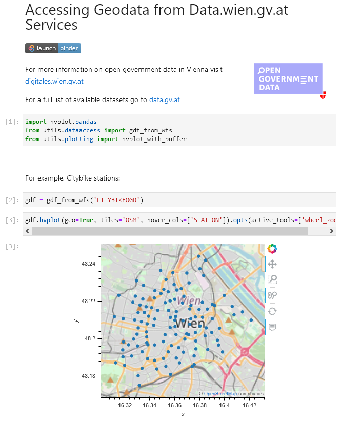
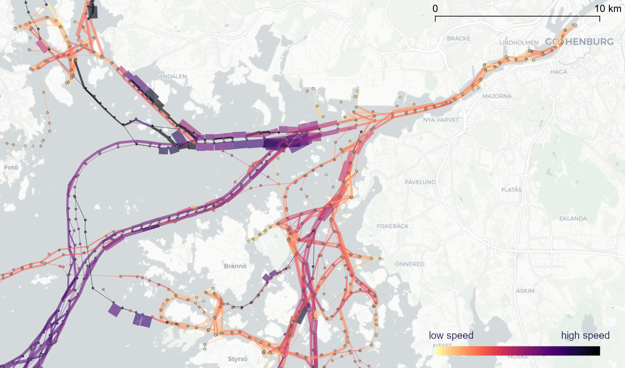
To explore travel patterns like origin-destination relationships, we need to identify individual trips with their start/end locations and trajectories between them. Extracting these trajectories from large datasets can be challenging, particularly if the records of individual moving objects don’t fit into memory anymore and if the spatial and temporal extent varies widely (as is the case with ship data, where individual vessel journeys can take weeks while crossing multiple oceans). 

This is part 2 of “Exploring massive movement datasets”.

Roughly speaking, trip trajectories can be generated by first connecting consecutive records into continuous tracks and then splitting them at stops. This general approach applies to many different movement datasets. However, the processing details (e.g. stop detection parameters) and preprocessing steps (e.g. removing outliers) vary depending on input dataset characteristics.

For example, in our paper [1], we extracted vessel journeys from AIS data which meant that we also had to account for observation gaps when ships leave the observable (usually coastal) areas. In the accompanying 10-minute talk, I went through a 4-step trajectory exploration workflow for assessing our dataset’s potential for travel time prediction:

Click to watch the recorded talk

Like the M³ prototype computation presented in part 1, our trajectory aggregation approach is implemented in Spark. The challenges are both the massive amounts of trajectory data and the fact that operations only produce correct results if applied to a complete and chronologically sorted set of location records.This is challenging because Spark core libraries (version 2.4.5 at the time) are mostly geared towards dealing with unsorted data. This means that, when using high-level Spark core functionality incorrectly, an aggregator needs to collect and sort the entire track in the main memory of a single processing node. Consequently, when dealing with large datasets, out-of-memory errors are frequently encountered.

To solve this challenge, our implementation is based on the Secondary Sort pattern and on Spark’s aggregator concept. Secondary Sort takes care to first group records by a key (e.g. the moving object id), and only in the second step, when iterating over the records of a group, the records are sorted (e.g. chronologically). The resulting iterator can be used by an aggregator that implements the logic required to build trajectories based on gaps and stops detected in the dataset.

If you want to dive deeper, here’s the full paper:

[1] Graser, A., Dragaschnig, M., Widhalm, P., Koller, H., & Brändle, N. (2020). Exploratory Trajectory Analysis for Massive Historical AIS Datasets. In: 21st IEEE International Conference on Mobile Data Management (MDM) 2020. doi:10.1109/MDM48529.2020.00059


This post is part of a series. Read more about movement data in GIS.

Exploring large movement datasets is hard because visualizations of movement data quickly get cluttered and hard to interpret. Therefore, we need to aggregate the data. Density maps are commonly used since they are readily available and quick to compute but they provide only very limited insight. In contrast, meaningful aggregations that can help discover patterns are computationally expensive and therefore slow to generate.

This post serves as a starting point for a series of new approaches to exploring massive movement data. This series will summarize parts of my PhD research and – for those of you who are interested in more details – there will be links to the relevant papers.

Starting with the raw location records, we use different forms of aggregation to learn more about what information a movement dataset contains:

  1. Summarizing movement using prototypes by aggregating raw location records using our flexible M³ Massive Movement Model [1]
  2. Generating trajectories by connecting consecutive records into continuous tracks and splitting them into meaningful trajectories [2]
  3. Extracting flows by summarizing trajectory-based transitions between prototypes [3]

Besides clever aggregation approaches, massive movement datasets also require appropriate computing resources. To ensure that we can efficiently explore large datasets, we have implemented the above mentioned aggregation steps in Spark. This enables us to run the computations on general purpose computing clusters that can be scaled according to the dataset size.

In the next post, we’ll look at how to summarize movement using M³ prototypes. So stay tuned!

But if you don’t want to wait, these are the original papers:

[1] Graser. A., Widhalm, P., & Dragaschnig, M. (2020). The M³ massive movement model: a distributed incrementally updatable solution for big movement data exploration. International Journal of Geographical Information Science. doi:10.1080/13658816.2020.1776293.
[2] Graser, A., Dragaschnig, M., Widhalm, P., Koller, H., & Brändle, N. (2020). Exploratory Trajectory Analysis for Massive Historical AIS Datasets. In: 21st IEEE International Conference on Mobile Data Management (MDM) 2020. doi:10.1109/MDM48529.2020.00059
[3] Graser, A., Widhalm, P., & Dragaschnig, M. (2020). Extracting Patterns from Large Movement Datasets. GI_Forum – Journal of Geographic Information Science, 1-2020, 153-163. doi:10.1553/giscience2020_01_s153.


This post is part of a series. Read more about movement data in GIS.

QGIS Temporal Controller is a powerful successor of TimeManager. Temporal Controller is a new core feature of the current development version and will be shipped with the 3.14 release. This post demonstrates two key advantages of this new temporal support:

  1. Expression support for defining start and end timestamps
  2. Integration into the PyQGIS API

These features come in very handy in many use cases. For example, they make it much easier to create animations from folders full of GPS tracks since the files can now be loaded and configured automatically:

Script & Temporal Controller in action (click for full resolution)

All tracks start at the same location but at different times. (Kudos for Andrew Fletcher for recordings these tracks and sharing them with me!) To create an animation that shows all tracks start simultaneously, we need to synchronize them. This synchronization can be achieved on-the-fly by subtracting the start time from all track timestamps using an expression:

directory = "E:/Google Drive/QGIS_Course/05_TimeManager/Example_Dayrides/"

def load_and_configure(filename):
    path = os.path.join(directory, filename)
    uri = 'file:///' + path + "?type=csv&escape=&useHeader=No&detectTypes=yes"
    uri = uri + "&crs=EPSG:4326&xField=field_3&yField=field_2"
    vlayer = QgsVectorLayer(uri, filename, "delimitedtext")
    QgsProject.instance().addMapLayer(vlayer)

    mode = QgsVectorLayerTemporalProperties.ModeFeatureDateTimeStartAndEndFromExpressions
    expression = """to_datetime(field_1) -
    make_interval(seconds:=minimum(epoch(to_datetime("field_1")))/1000)
    """

    tprops = vlayer.temporalProperties()
    tprops.setStartExpression(expression)
    tprops.setEndExpression(expression) # optional
    tprops.setMode(mode)
    tprops.setIsActive(True)

for filename in os.listdir(directory):
    if filename.endswith(".csv"):
        load_and_configure(filename)

The above script loads all CSV files from the given directory (field_1 is the timestamp, field_2 is y, and field_3 is x), enables sets the start and end expression as well as the corresponding temporal control mode and finally activates temporal rendering. The resulting config can be verified in the layer properties dialog:

To adapt this script to other datasets, it’s sufficient to change the file directory and revisit the layer uri definition as well as the field names referenced in the expression.


This post is part of a series. Read more about movement data in GIS.