Archive

QGIS

This is the first post in a series dedicated solely to Print Composer in QGIS 2.0 which you can already admire in recent nightly builds.

Guide lines & snapping for user-friendly map element arrangement

Arranging map elements has never been easier: Elements can be moved as freely as before but now they will automatically try to align with other elements on the page or the page borders. Additional red guide lines help interpret the snapping behavior.

printcomposer_guides

Group Stats is a plugin for QGIS which makes it easy to calculate statistics for feature groups in a vector layer. Note that the plugin is still marked “experimental” so you have to allow experimental plugins in order to install it. I tried this plugin for the first time today and decided to write this post because it didn’t seem immediately obvious how to use it.

The plugin button is added to the vector toolbar and of course you can access it via vector menu.

groupstatsicon

The example I want to show is: How to calculate the total area of each Corine Land Cover (CLC) class per state.

corineAT

After adding state information to the CLC datasets by intersecting CLC and state geometries from Natural Earth we can get started with Group Stats.

groupstats

The big area on the left will display the results. The input fields are on the right. The general idea is to drag and drop fields and/or functions into the “columns”, “rows” and “values” sections. (Double-clicking field names does not do anything.) To remove fields again, you have to drop them back into the field list.

To calculate the total area of of each Corine Land Cover (CLC) class per state, I chose land cover classes as columns, state names as rows and sum of areas as values:

groupstatsclc

It’s also possible to add multiple functions in the columns/rows input sections to calculate different statistics at once:

groupstats_functions

Group Stats can be used in many cases that otherwise require a Spreadsheet software. The results can be exported to CSV easily. Usability could certainly be improved by allowing common interactions such as removing fields by pressing the delete key or adding fields by double-clicking.

So far, QGIS does not come with many default symbols. Quite often one just needs two or three colors that go well together. That’s why I created a series of simple fill symbols based on ColorBrewer. They are available on Github QGIS-resources:

As always, these XMLs can be imported using Style Manager.

polysymbols

Another great addition to QGIS-resources was added this week by user aplannersguide. He shared his styles for osm2pgsql layers:

bdd73ba0-4ad3-11e2-8d74-1327374e522c

This post covers how to add you own tools to expand Sextante’s ftools toolbox.

I was looking through Sextante for a tool that inserts additional nodes into a linestring at intervals of my choice. I couldn’t find that exact tool but I found something similar: Densify Geometries in ftools which adds the same number of nodes to all line segments. So I decided to modify Densify Geometries to fit my requirements.

Ftools scripts (such as DensifyGeometries.py) are located in ~/.qgis/python/plugins/sextante/ftools. To create my modified version, I just copied the original and modified the code to accept a densification interval instead of a number of nodes. Since I didn’t know how to add my new tool to Sextante I contacted the developer mailing list and after a short coffee break I had the answer (thanks Alexander!):

The new algorithm has to be exposed in the provider FToolsAlgorithmProvider.py. To do that: Add an import statement for the new algorithm (using existing statements as examples) and add the algorithm to the list self.alglist in the __init__() method. That’s it!

sextante_with_mytool

Sextante automatically creates the input form you can see in above screenshot. Very handy! And the new tool can be added to geoprocessing models just like any of the original ones.

The current developer version makes it easier to share symbol libraries online. Here a quick example of how to share using Github.

This is one of the symbol libraries I uploaded:

import3

If you click on “Raw”, you get the url of the raw text file which can be used to import the symbols into Style Manager:

import2

The importer lets you select which symbols to import:

import1

The city of Vienna provides both subdistrict geometries and population statistics. Mapping the city’s population density should be straightforward, right? Let’s see …

We should be able to join on ZBEZ and SUB_DISTRICT_CODE, check! But what about the actual population counts? Unfortunately, there is no file which simply lists population per subdistrict. The file I found contains four lines for each subdistrict: females 2011, males 2011, females 2012 and males 2012. That’s not the perfect format for mapping general population density.

A quick way to prepare our input data is applying pivot tables, eg. in Open Office: The goal is to have one row per subdistrict and columns for population in 2011 and 2012:

Export as CSV, add CSVT and load into QGIS. Finally, we can join geometries and CSV table:

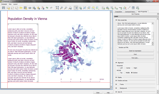
A quick look at the joined data confirms that each subdistrict now has a population value. But visualizing absolute values results in misleading maps. Big subdistricts with only average density will overrule smaller but much denser subdistricts:

That’s why we need to calculate population density. This is easy to do using Field Calculator. The subdistrict file already contains area values but even if they were missing, we could calculate it using the $area operator: "pop2012" / ($area / 10000). The resulting population density in population per ha finally shows which subdistricts are the most densely populated:

One could argue that this is still no accurate representation of population density: Big parts of some subdistricts are actually covered by water – especially along the Danube – and therefore uninhabited. There are also big parks which could be excluded from the subdistrict area. But that’s going to be the topic of another post.

If you want to use my results so far, you can download the GeoJSON file from Github.

Today, I’ve finished my submission for the Hubway Data Visualization Challenge. All parts of the resulting dataviz were created using open source tools. My toolbox for this work contains: QGIS, Spatialite, Inkscape, Gimp and Open Office Calc. To see the complete submission and read more about it, check the project page.

Continuing where I left off yesterday, I went on to creating another visualization based on the assumption that people like to bike downhill but will be more reluctant to bike uphill.

As described in yesterday’s post, the Hubway network features stations with a negative bike balance (more bikes leaving than arriving) and others with a positive balance. Positively balanced stations are where people like biking to while negatively balanced stations are less attractive – like if they were on top of a hill and hard to reach.

Using this assumption and QGIS Grid Interpolation and Relief tool, I’ve created the following biking landscape:

With a negative balance of -2.76 bikes per day, Mayor Thomas M. Menino – Government Center station is the most unpopular station to bike to. Assuming the trip dataset is complete, this means that Hubway has to regularly transport bikes from positively balanced stations to this one to keep the system going.

Due to some trips containing NULL values in start/end station id, the total number of incoming and outgoing trips does not add up perfectly. But otherwise, this should represent the state of Hubway’s biking landscape pretty well.

Today, I’ve been working on some station statistics. From the trip data, I calculated incoming and outgoing trips per station as well as the station’s first day of operations. Combining this information makes it possible to calculate the average day’s “bike balance”. A balanced station has the same number of incoming and outgoing trips while an unbalanced station will either run out of bikes or empty slots for returns.

I’ve published the resulting station map on QGIS Cloud (http://qgiscloud.com/anitagraser/hubway_cloud1) where you can have a look at the bike balance values.

Additionally, I’ve created a mashup in Leaflet pulling together background tiles from Stamen and the cloud-hosted WMS for better orientation:

Today, I’ve been experimenting with a new way to visualize origin-destination pairs (ODs). The following image shows my first results:

The ideas was to add a notion of direction as well as uncertainty. The “flower petals” have a pointed origin and grow wider towards the middle. (Looking at the final result, they should probably go much narrower towards the end again.) The area covered by the petals is a simple approximation of where I’d expect the bike routes without performing any routing.

To get there, I reprojected the connection lines to EPSG:3857 and calculated connection length and line orientation using QGIS Field Calculator $length operator and the bearing formula given in QGIS Wiki:

(atan((xat(-1)-xat(0))/(yat(-1)-yat(0)))) * 180/3.14159 + (180 *(((yat(-1)-yat(0)) < 0) + (((xat(-1)-xat(0)) < 0 AND (yat(-1) - yat(0)) >0)*2)))

For the style, I created a new “flower petal” SVG symbol in Inkscape and styled it with varying transparency values: Rare connections are more transparent than popular ones. This style is applied to the connection start points. Using the advanced options “size scale” and “rotation”, it is possible to rotate the petals into the right direction as well as scale them using the previously calculated values for connection length and orientation.

Update

While the above example uses pretty wide petals this one is done with a much narrower petal. I think it’s more appropriate for the data at hand:

Most of the connections are clearly heading south east, across Charles River, except for that group of connections pointing the opposite direction, to Harvard Square.