Hubway is a bike sharing system in Boston and they are currently hosting a data visualization challenge. What a great chance to play with some real-world data!
To get started, I loaded both station Shapefile and trip CSV into a new Spatialite database. The GUI is really helpful here – everything is done in a few clicks. Afterwards, I decided to look into which station combinations are most popular. The following SQL script creates my connections table:
create table connections (
start_station_id INTEGER,
end_station_id INTEGER,
count INTEGER,
Geometry GEOMETRY);


insert into connections select
start_station_id,
end_station_id,
count(*) as count,
LineFromText('LINESTRING('||X(a.Geometry)||' '||Y(a.Geometry)||','
                          ||X(b.Geometry)||' '||Y(b.Geometry)||')') as Geometry
 from trips, stations a, stations b
where start_station_id = a.ID
and end_station_id = b.ID
and a.ID != b.ID
and a.ID is not NULL
and b.ID is not NULL
group by start_station_id, end_station_id;
(Note: This is for Spatialite 2.4, so there is no MakeLine() method. Use MakeLine if you are using 3.0.)
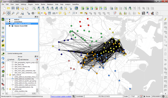
For a first impression, I decided to map popular connections with more than one hundred entries. Wider lines mean more entries. The points show the station locations and they are color coded by starting letter. (I’m not yet sure if they mean anything. They seem to form groups.)
Some of the stations don’t seem to have any strong connections at all. Others are rather busy. The city center and the dark blue axis pointing west seem most popular.
I’m really looking forward to what everyone else will be finding in this dataset.

