This post summarizes how to install sphinx on Windows to contribute to PyQGIS Cookbook. I’m writing this as I go, so this most likely won’t be perfect.
I used my Python 2.6 stand-alone installation (not the one in OSGeo4W).
It’s Dec, 23rd and this is my early present to the QGIS community: a package of ready-to-use road symbols that make your OpenStreetMap data look like Google Maps.
In a previous post, I did already show how to prepare a view that will help get similar looking road labels. And now, here are the necessary symbols: osm_symbols.xml (Load using “Style Manager”.)
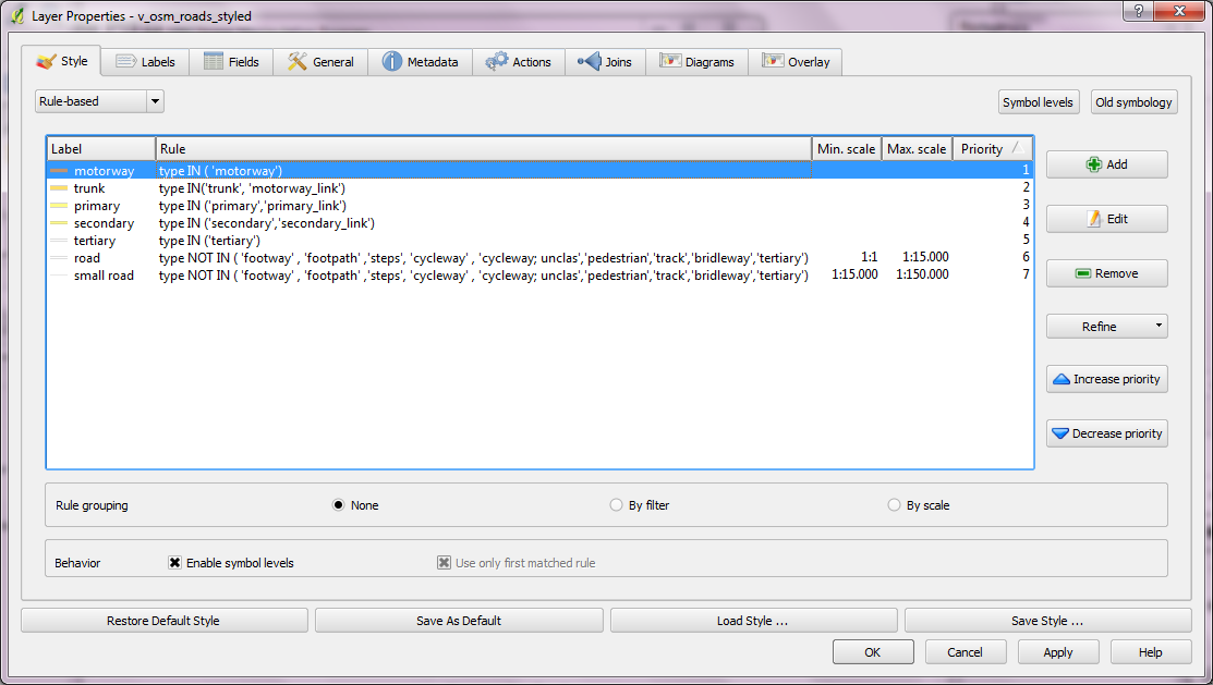
Now, you should have all necessary symbols available to create the style. I used the following rules to get the map shown above:
This is the follow up post to “An osm2po Quickstart” which covers loading the OSM network into PostGIS and using the result with pgRouting. After parsing the OSM file, e.g.
you should find a folder with the name of the prefix you chose inside the osm2po folder. It contains a log file which in turn provides a command line template for importing the OSM network into PostGIS, e.g.
Using “pgRouting Layer” plugin, it’s now straightforward to calculate shortest paths. I had to apply some changes to the plugin code, so please get the latest version from Github.
A shortest path in osm2po network
Using osm2po turned out to be far less painful than I expected and I hope you’ll find this post useful too.
PgRouting is great. But (Yes, there is always a “but”.) those queries are not easy to remember. That’s why I started work on a pgRouting GUI today. It’s actually a QGIS plugin which I’ll call “pgRouting Layer” and it is based on Pablo T. Carreira’s “Fast SQL Layer” plugin which can execute arbitrary SQL statements against a PostGIS or SpatiaLite database and add the results in a map layer.
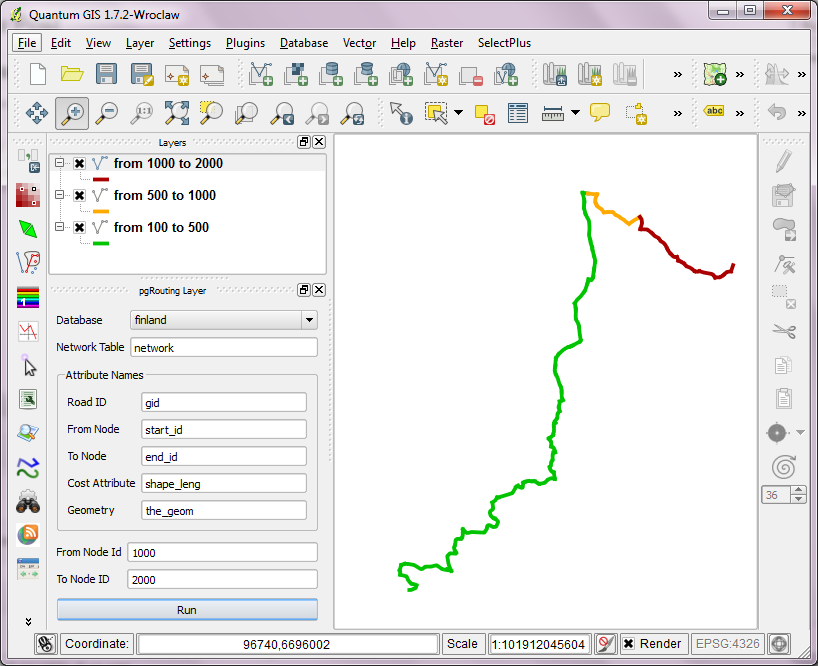
This first prototype supports pgRouting’s shortest_path() function as described in “A Beginners Guide to pgRouting”. Once supplied with the necessary information about attribute field names, the plugin allows you to route between pairs of nodes. For convenience, the resulting layer is named after its start and end node.
some shortest paths using "pgRouting Layer" plugin
Besides normal routing capabilities, I’d like to develop this plugin towards a user friendly tool for catchment zone analysis. If you are interested in teaming up to work towards this goal, let me know.
You probably know this video from my previous post “Tweets to QGIS”. Today, I want to show you how it is done.
After importing the Twitter JSON file, I saved it as a Shapefile.
Every point in the Shapefile contains the timestamp of the tweet. Additionally, I added a second field called “forever” which will allow me to configure Time Manager to show features permanently.
A "forever" field will help with showing features permanently.
To create the flash effect you see in the video, we load the tweet Shapefile three times. Every layer gets a different role and style in the final animation:
Layer “start_flash” is a medium sized dot that marks the appearance of a new tweet.
Layer “big_flash” is a bigger dot of the same color which will appear after “start_flash”.
Layer “permanent” is a small dot that will be visible even after the flash vanishes.
styling the tweet layers
We’ll plan the final animation with a time step size of 10 seconds. That means that every animation frame will cover a real-world timespan of 10 seconds.
We configure Time Manager by adding all three tweet layers:
Layer “start_flash” starts at the orginal time t. Layer “big_flash” gets an offset of -10 seconds, which means that it will display ten seconds after time t. Layer “permanent” gets an offset of -20 seconds and ends at time forever.
Layers can be timed using the "offset" feature.
Finally – in Time Manager dock – we can start the animation with a time step size of 10 seconds:
Use a time step size of 10 seconds so it fits to the offset values we specified earlier.
Besides watching the animation inside QGIS, Time Manager also enables you to export the animation to an image series using “Export Video” button. Actual video export is not implemented yet, but you can use mencoder (Windows users can download it from Gianluigi Tiesi’s site) on the resulting image series to create a video file:
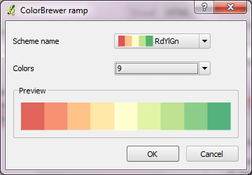
Colorbrewer is a great resource for visually pleasing gradients that can be used for mapping. It was already possible to use color brewer ramps in QGIS but it was necessary to create the ramp with the final number of classes in mind.
Creating a Colobrewer ramp
That’s why I sat down and created continuous ramps from the Colorbrewer data:
The latest development build version of QGIS contain a great new feature: Expression-based labeling, brought to you by Nathan.
QGIS new labeling dialog is extended by a new expression builder that facilitates building your own expressions using layer attributes together with various functions for data manipulation:
expression builder with function help
Thanks to it’s preview ability, it is easy to see how changes affect the final label output:
combine fields and follow changes in preview
For an in depth introduction into this new feature, check Nathan’s blog and enjoy!
“Rectangles ovals digitizing” plugin by Pavol Kapusta adds editing tools that make it really easy to create rectangles, squares, circles and ellipses. These are the tools provided by the new plugin: