In three parts, the book covers layer styling, labeling, and designing print maps. All recipes come with data and project files so you can reproduce the maps yourself.
Check the book website for the table of contents and a sample chapter.
Just in time for the big QGIS 2.14 LTR release, the paperback will be available March 1st.
On a related note, I am also currently reviewing the latest proofs of the 3rd edition of “Learning QGIS”, which will be updated to QGIS 2.14 as well.
The idea of this slide and several more was to show all the attention to detail which goes into designing a good road map. One aspect seemed particularly interesting to me since I had never considered it before: what do we communicate by our choice of line caps? The speaker argued that we need different caps for different situations, such as closed square caps at the end of a road and open flat caps when a road turns into a narrower path.
I’ve been playing with this idea to see how to reproduce the effect in QGIS …
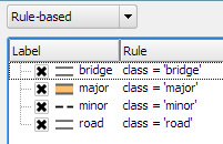
So first of all, I created a small test dataset with different types of road classes. The dataset is pretty simple but the key to recreating the style is in the attributes for the road’s end node degree values (degree_fro and degree_to), the link’s road class as well as the class of the adjacent roads (class_to and class_from). The degree value simply states how many lines connect to a certain network node. So a dead end as a degree of 1, a t-shaped intersection has a degree of 3, and so on. The adjacent class columns are only filled if the a neighbor is of class minor since I don’t have a use for any other values in this example. Filling the degree and adjacent class columns is something that certainly could be automated but I haven’t looked into that yet.
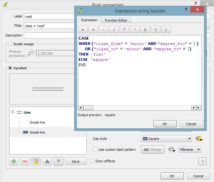
The layer is then styled using rules. There is one rule for each road class value. Rendering order is used to ensure that bridges are drawn on top of all other lines.
Now for the juicy part: the caps are defined using a data-defined expression. The goal of the expression is to detect where a road turns into a narrow path and use a flat cap there. In all other cases, square cap should be used.
Like some of you noted on Twitter after I posted the first preview, there is one issue and that is that we can only set one cap style per line and it will affect both ends of the line in the same way. In practice though, I’m not sure this will actually cause any issues in the majority of cases.
I wonder if it would be possible to automate this style in a way such that it doesn’t require any precomputed attributes but instead uses some custom functions in the data-defined expressions which determine the correct style on the fly. Let me know if you try it!
Granted, I could only follow FOSS4G 2015 remotely on social media but what I saw was quite impressive and will keep me busy exploring for quite a while. Here’s my personal pick of this year’s highlights which I’d like to share with you:
Marco Hugentobler’s keynote is just great, summing up the history of the QGIS project and discussing success factor for open source projects.
Marco also gave a second presentation on new QGIS features for power users, including live layer effects, new geometry support (curves!), and geometry checker.
Preview of Web App Builder from Victors presentation
Geocoding
If you work with messy, real-world data, you’ve most certainly been fighting with geocoding services, trying to make the best of a bunch of address lists. The Python Geocoder library promises to make dealing with geocoding services such as Google, Bing, OSM & many easier than ever before.
Let me know if you tried it.
Mobmap Visualizations
Mobmap – or more specifically Mobmap2 – is an extension for Chrome which offers visualization and analysis capabilities for trajectory data. I haven’t tried it yet but their presentation certainly looks very interesting:
This is a guest post by Karolina Alexiou (aka carolinux), Anita’s collaborator on the Time Manager plugin.
As of version 2.1.5, TimeManager provides some support for stepping through WMS-T layers, a format about which Anita has written in the past. From the official definition, the OpenGIS® Web Map Service Interface Standard (WMS) provides a simple HTTP interface for requesting geo-registered map images from one or more distributed geospatial databases. A WMS request defines the geographic layer(s) and area of interest to be processed. The response to the request is one or more geo-registered map images (returned as JPEG, PNG, etc) that can be displayed in a browser application. QGIS can display those images as a raster layer. The WMS-T standard allows the user of the service to set a time boundary in addition to a geographical boundary with their HTTP request.
From QGIS, go to Layer>Add Layer>Add WMS/WMST Layer and add a new server and connect to it. For the service we have chosen, we only need to specify a name and the url.
Select the top level layer, in our case named nexrad_base_reflect and click Add. Now you have added the layer to your QGIS project.
To add it to TimeManager as well, add it as a raster with the settings from the screenshot below. Start time and end time have the values 2005-08-29T03:10:00Z and 2005-08-30T03:10:00Z respectively, which is a period which overlaps with hurricane Katrina. Now, the WMS-T standard uses a handful of different time formats, and at this time, the plugin requires you to know this format and input the start and end values in this format. If there’s interest to sponsor this feature, in the future we may get the format directly from the web service description. The web service description is an XML document (see here for an example) which, among other information, contains a section that defines the format, default time and granularity of the time dimension.
If we set the time step to 2 hours and click play, we will see that TimeManager renders each interval by querying the web map service for it, as you can see in this short video.
Querying the web service and waiting for the response takes some time. So, the plugin requires some patience for looking at this particular layer format in interactive mode. If we export the frames, however, we can get a nice result. This is an animation showing hurricane Katrina progressing over a 30 minute interval.
If you want to sponsor further development of the Time Manager plugin, you can arrange a session with me – Karolina Alexiou – via Codementor.
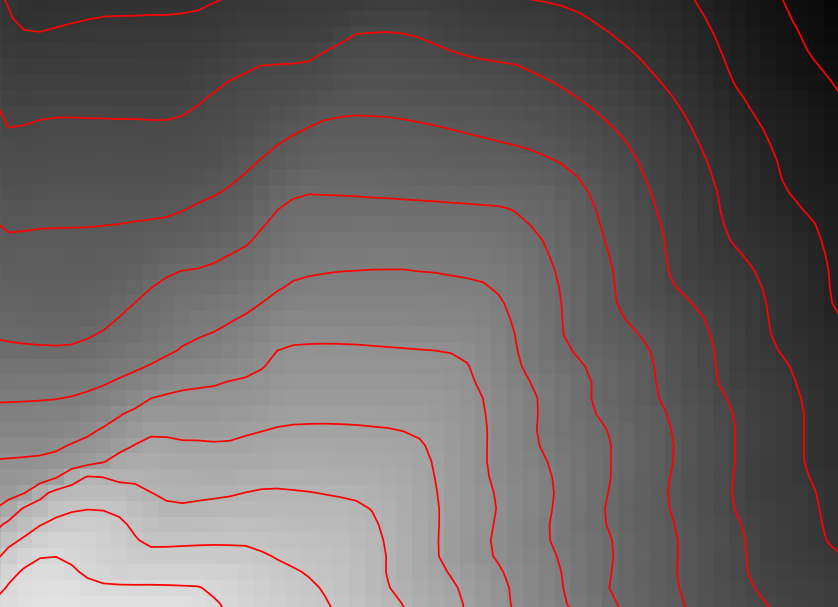
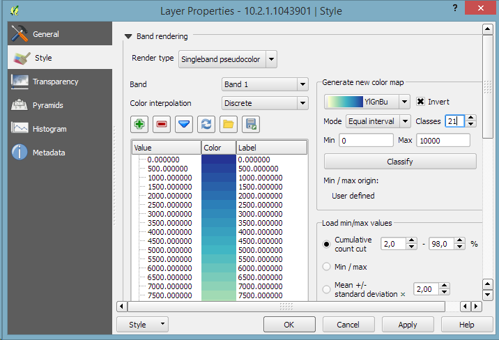
Everything that’s needed to create this effect is a DEM. As Hannes describes in his post, the DEM can then be used to compute the contour lines, e.g. with Raster | Extraction | Contour:
gdal_contour -a ELEV -i 100.0 C:\Users\anita\Geodata\misc\mt-st-helens\10.2.1.1043901.dem C:/Users/anita/Geodata/misc/mt-st-helens/countours
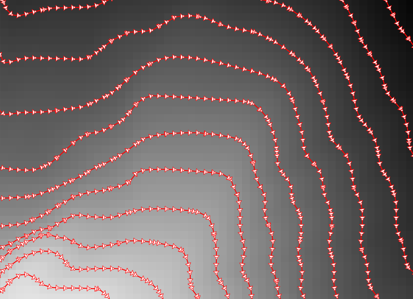
In order to be able to compute the brightness of the illuminated contours, we need to compute the orientation of every subsection of the contours. Therefore, we need to split the contour lines at each node. One way to do this is using v.split from the Processing toolbox:
When we split the contours and visualize the result using arrows, we can see that they all wrap around the mountain in clockwise direction (light DEM cells equal higher elevation):
After the split, we can compute the orientation of the contour subsections using, for example, a user-defined function:
"""
Define new functions using @qgsfunction. feature and parent must always be the
last args. Use args=-1 to pass a list of values as arguments
"""
from qgis.core import *
from qgis.gui import *
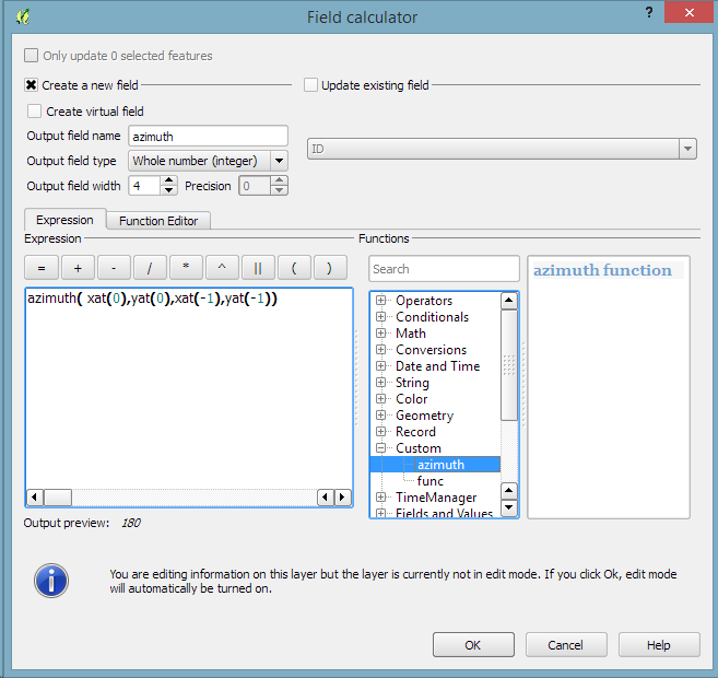
@qgsfunction(args='auto', group='Custom')
def azimuth(x1,y1,x2,y2, feature, parent):
p1 = QgsPoint(x1,y1)
p2 = QgsPoint(x2,y2)
a = p1.azimuth(p2)
if a < 0:
a += 360
return a
This function can then be used in a Field calculator expression:
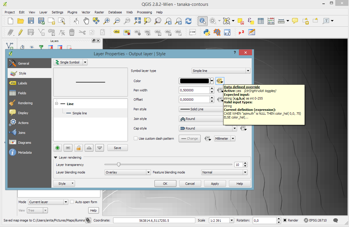
Based on the orientation, we can then write an expression to control the contour line color. For example, if we want the sun to appear in the north west (-45°) we can use:
color_hsl( 0,0,
  scale_linear( abs(
    ( CASE WHEN "azimuth"-45 < 0
      THEN "azimuth"-45+360
      ELSE "azimuth"-45
    END )
  -180), 0, 180, 0, 100)
  )
This will color the lines which are directly exposed to the sun white hsl(0,0,100) while the ones in the shadows will be black hsl(0,0,0).
Use the Overlay layer blending mode to blend contours and DEM color:
The final step, to get as close to the original design as possible, is to create the effect of discrete elevation classes instead of a smooth color gradient. This can easily be achieved by changing the color interpolation mode of the DEM from Linear to Discrete:
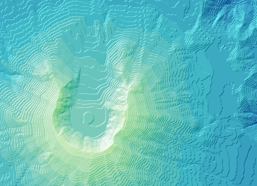
This leaves us with the following gorgeous effect:
As Hannes pointed out, another important aspect of Tanaka’s method is to also alter the contour line width. Lines in the sun or shadow should be wider (1 in this example) than those in orthogonal direction (0.2 in this example):
scale_linear(
abs( abs(
  ( CASE WHEN "azimuth"-45 < 0
    THEN "azimuth"-45+360
    ELSE "azimuth"-45
  END )
-180) -90),
0, 90, 0.2, 1)
The talk presents QGIS visualization tools with a focus on efficient use of layer styling to both explore and present spatial data. Examples include the recently added heatmap style as well as sophisticated rule-based and data-defined styles. The focus of this presentation is exploring and presenting spatio-temporal data using the Time Manager plugin. A special treat are time-dependent styles using expression-based styling which access the current Time Manager timestamp.
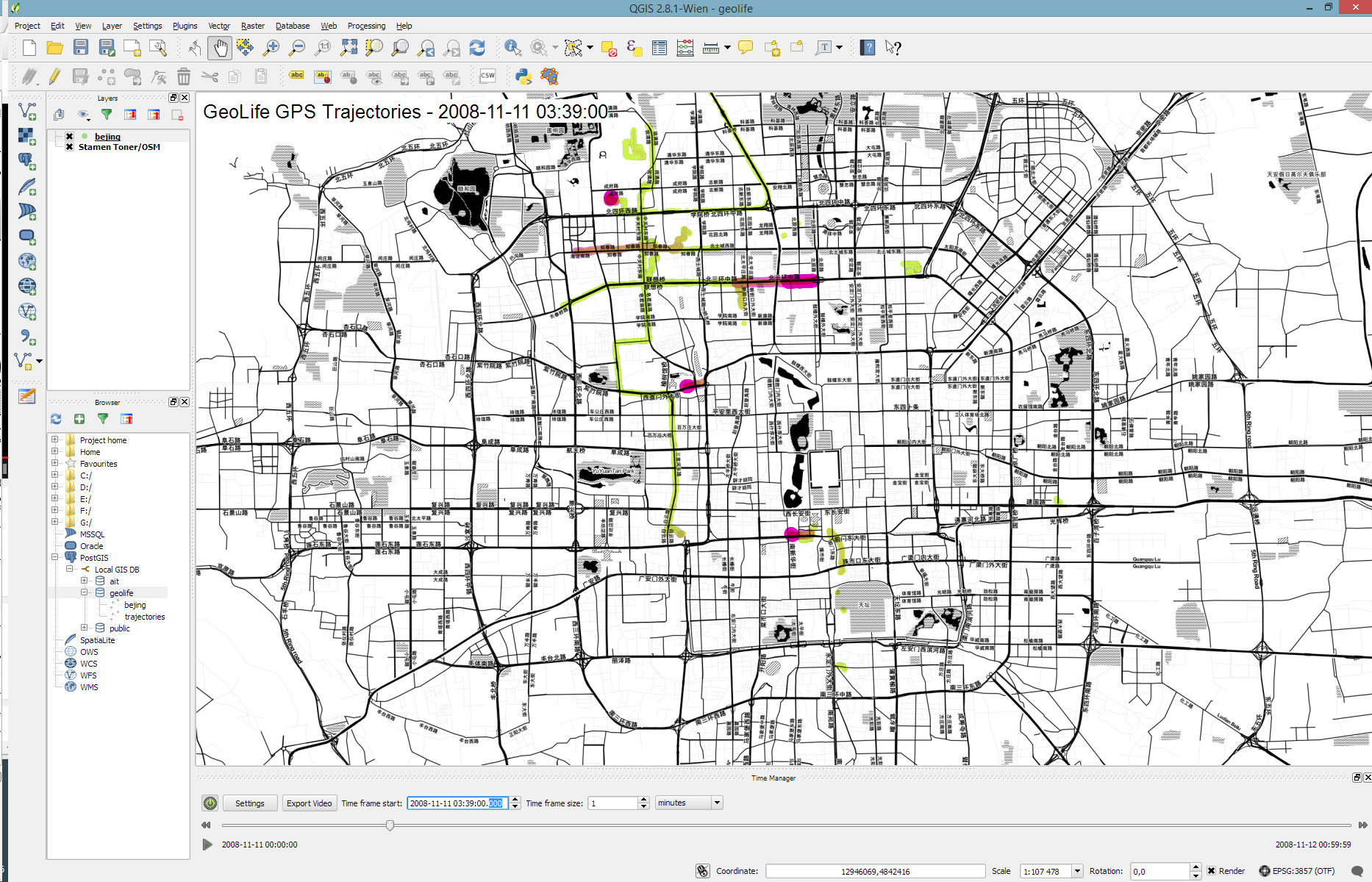
Today’s post is a short tutorial for creating trajectory animations with a fadeout effect using QGIS Time Manager. This is the result we are aiming for:
The animation shows the current movement in pink which fades out and leaves behind green traces of the trajectories.
About the data
GeoLife GPS Trajectories were collected within the (Microsoft Research Asia) Geolife project by 182 users in a period of over three years (from April 2007 to August 2012). [1,2,3] The GeoLife GPS Trajectories download contains many text files organized in multiple directories. The data files are basically CSVs with 6 lines of header information. They contain the following fields:
Field 1: Latitude in decimal degrees.
Field 2: Longitude in decimal degrees.
Field 3: All set to 0 for this dataset.
Field 4: Altitude in feet (-777 if not valid).
Field 5: Date – number of days (with fractional part) that have passed since 12/30/1899.
Field 6: Date as a string.
Field 7: Time as a string.
Data prep: PostGIS
Since any kind of GIS operation on text files will be quite inefficient, I decided to load the data into a PostGIS database. This table of millions of GPS points can then be sliced into appropriate chunks for exploration, for example, a day in Beijing:
CREATE MATERIALIZED VIEW geolife.beijing
AS SELECT trajectories.id,
    trajectories.t_datetime,
    trajectories.t_datetime + interval '1 day' as t_to_datetime,
    trajectories.geom,
    trajectories.oid
   FROM geolife.trajectories
   WHERE st_dwithin(trajectories.geom,
           st_setsrid(
             st_makepoint(116.3974589,
                           39.9388838),
             4326),
           0.1)
   AND trajectories.t_datetime >= '2008-11-11 00:00:00'
   AND trajectories.t_datetime < '2008-11-12 00:00:00'
WITH DATA
Trajectory viz: a fadeout effect for point markers
The idea behind this visualization is to show both the current movement as well as the history of the trajectories. This can be achieved with a fadeout effect which leaves behind traces of past movement while the most recent positions are highlighted to stand out.
Map tiles by Stamen Design, under CC BY 3.0. Data by OpenStreetMap, under ODbL.
This effect can be created using a Single Symbol renderer with a marker symbol with two symbol layers: one layer serves as the highlights layer (pink) while the second layer represents the traces (green) which linger after the highlights disappear. Feature blending is used to achieve the desired effect for overlapping markers.
The highlights layer has two expression-based properties: color and size. The color fades to white and the point size shrinks as the point ages. The age can be computed by comparing the point’s t_datetime timestamp to the Time Manager animation time $animation_datetime.
[1] Yu Zheng, Lizhu Zhang, Xing Xie, Wei-Ying Ma. Mining interesting locations and travel sequences from GPS trajectories. In Proceedings of International conference on World Wild Web (WWW 2009), Madrid Spain. ACM Press: 791-800.
[2] Yu Zheng, Quannan Li, Yukun Chen, Xing Xie, Wei-Ying Ma. Understanding Mobility Based on GPS Data. In Proceedings of ACM conference on Ubiquitous Computing (UbiComp 2008), Seoul, Korea. ACM Press: 312-321.
[3] Yu Zheng, Xing Xie, Wei-Ying Ma, GeoLife: A Collaborative Social Networking Service among User, location and trajectory. Invited paper, in IEEE Data Engineering Bulletin. 33, 2, 2010, pp. 32-40.
Over the last couple of weeks, Karolina has been very busy improving and expanding Time Manager. This post is to announce the 1.6 release of Time Manager which brings you many fixes and exciting new features.
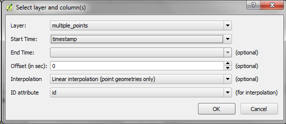
What’s this feature interpolation you’re talking about?
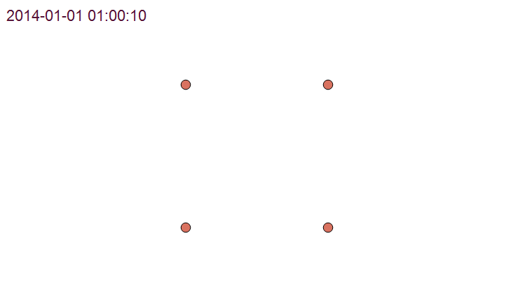
Interpolation is really helpful if you have multiple observations of the same (moving) real-world object at different points in time and you want to visualize the movement between the observations. This can be used to visualize animal paths, vehicle tracks, or any other movement in space.
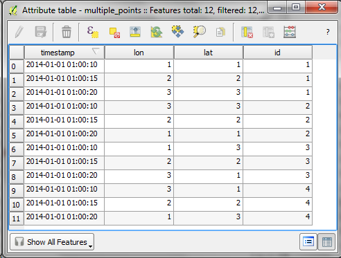
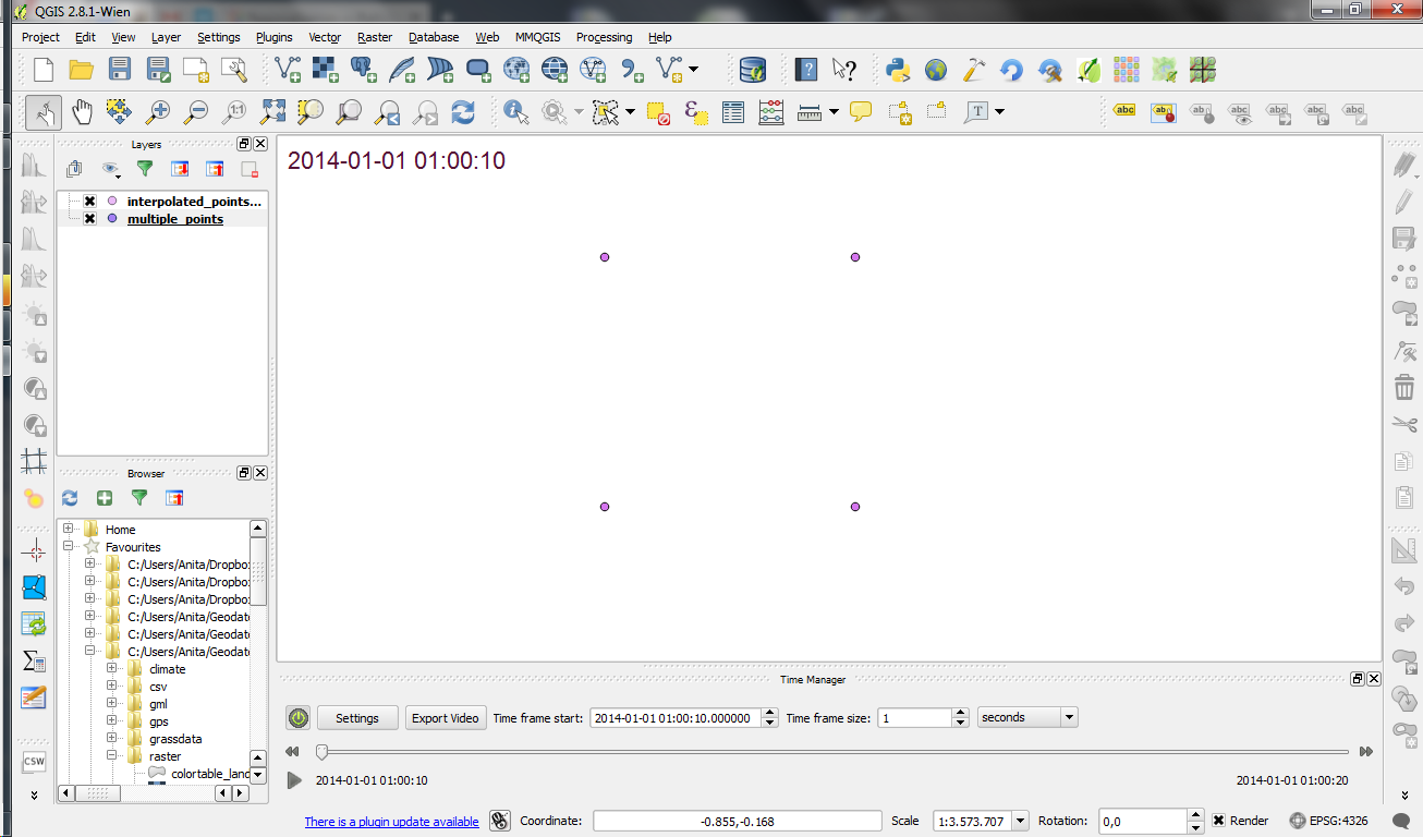
The following example shows a simple layer which contains 12 point features (3 for each id value).
Using Time Manager interpolation, it is easy to create animations with interpolated positions between observations:
How is it done?
When you open the Time Manager 1.6 Settings | Add layer dialog, you will find a new option for interpolation settings. This first version supports linear interpolation of point features but more options might be added in the future. Note how the id attribute is specified to let Time Manager know which features belong to the same real-world object.
For the interpolation, Time Manager creates a new layer which contains the interpolated features. You can see this layer in the layer list.
I’m really looking forward to seeing all the great animations this feature will enable. Thanks Karolina for making this possible!