If you follow my blog, you’ve most certainly seen the post How to create illuminated contours, Tanaka-style from earlier this year. As Victor Olaya noted correctly in the comments, the workflow to create this effect lends itself perfectly to being automated with a Processing model.
The model needs only two inputs: the digital elevation model raster and the interval at which we want the contours to be created:
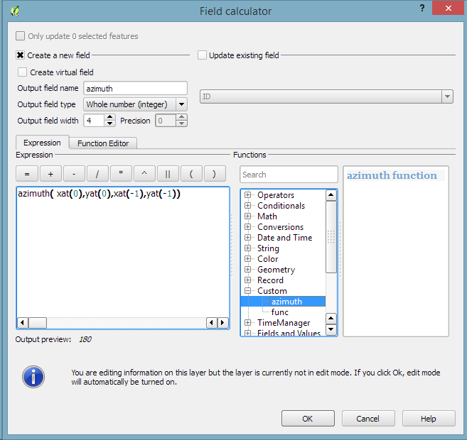
The model steps are straightforward: the contours are generated and split into short segments before the segment orientation is computed using the following code in the Advanced Python Field Calculator:
p1 = $geom.asPolyline()[0]
p2 = $geom.asPolyline()[-1]
a = p1.azimuth(p2)
if a < 0:
   a += 360
value = a
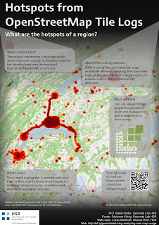
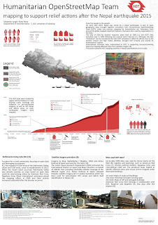
It’s my pleasure to report back from this year’s AGIT and GI_Forum conference (German and English speaking respectively). It was great to meet the gathered GIS crowd! If you missed it, don’t despair: I’ve compiled a personal summary on Storify, and papers (German, English) and posters are available online. Here’s a pick of my favorite posters:
I also had the pleasure to be involved in multiple presentations this year:
QGIS at the OSGeo Day
As part of the OSGeo Day, I had the chance to present the latest and greatest QGIS features for map design in front of a full house:
On a slightly different note, my colleague Markus Straub and I presented an introduction to routing with OpenStreetMap covering which kind of routing-related information is available in OSM as well as a selection of different tools to perform routing on OSM.
Solving the “unnamed link” problem
In this talk, I presented approaches to solving issues with route descriptions that contain unnamed pedestrian or cycle paths.
In this talk, my colleague Markus Straub presented our new approach to computing how popular a certain road is. The resulting popularity value can be used for planning as well as routing.
With the release of 2.10 right around the corner, it’s time to have a look at the new features this version of QGIS will bring. One area which has received a lot of development attention is layer styling. In particular, I want to point out the following new features:
1. Graduated symbol size
The graduated renderer has been expanded. Formerly, only color-graduated symbols could be created automatically. Now, it is possible to choose between color and size-graduated styles:
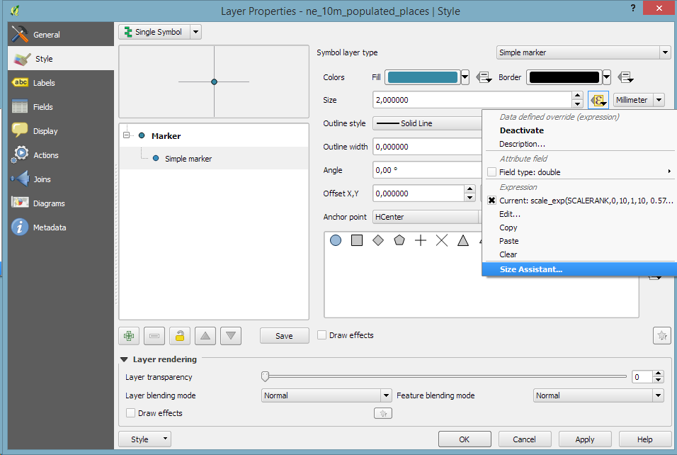
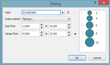
2. Symbol size assistant
On a similar note, I’m sure you’ll enjoy the size assistant for data-defined size:
What’s particularly great about this feature is that it also creates a proper legend for the data-defined sizes:
3. Interactive class exploration and definition
Another great addition to the graduated renderer dialog is the histogram tab which visualizes the distribution of values as well as the defined class borders. Additionally, the user can interactively change the classes by moving the class borders:
If you follow the QGIS developer mailing list, you’ve probably seen threads about the next major release: 3.0. The topic has been one of the many points we talked about at the latest QGIS developer meeting and Tim Sutton sums up the discussed plan in a post published today:
One hot topic was ‘when will QGIS 3.0 be released’. The short answer to that question is that ‘we don’t know’ – Jürgen Fischer and Matthias Kuhn are still investigating our options and once they have had enough time to understand the implications of upgrading to Qt5, Python 3 etc. they will make some recommendations. I can tell you that we agreed to announce clearly and long in advance (e.g. 1 year) the roadmap to moving to QGIS 3.0 so that plugin builders and others who are using QGIS libraries for building third party apps will have enough time to be ready for the transition. At the moment it is still uncertain if there even is a pressing need to make the transition, so we are going to hang back and wait for Jürgen & Matthias’ feedback.
The take-away message here is that the QGIS team is aware of the current developments around Python and Qt and will keep the community updated about the further development path well before any move.
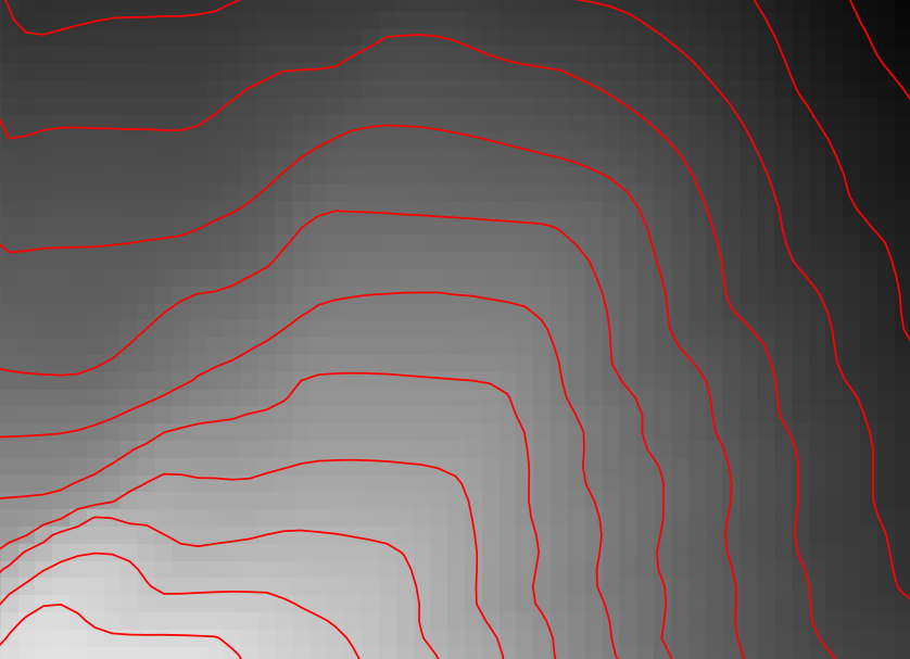
Everything that’s needed to create this effect is a DEM. As Hannes describes in his post, the DEM can then be used to compute the contour lines, e.g. with Raster | Extraction | Contour:
gdal_contour -a ELEV -i 100.0 C:\Users\anita\Geodata\misc\mt-st-helens\10.2.1.1043901.dem C:/Users/anita/Geodata/misc/mt-st-helens/countours
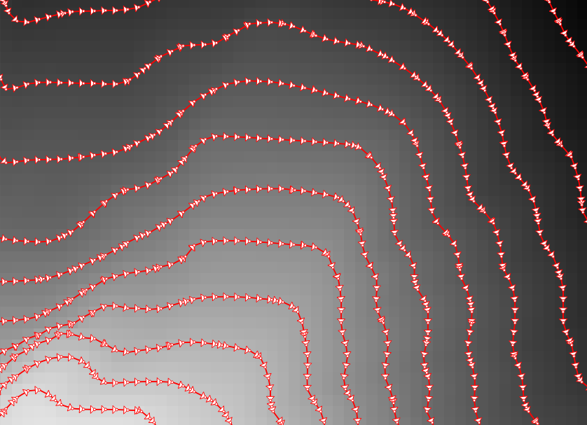
In order to be able to compute the brightness of the illuminated contours, we need to compute the orientation of every subsection of the contours. Therefore, we need to split the contour lines at each node. One way to do this is using v.split from the Processing toolbox:
When we split the contours and visualize the result using arrows, we can see that they all wrap around the mountain in clockwise direction (light DEM cells equal higher elevation):
After the split, we can compute the orientation of the contour subsections using, for example, a user-defined function:
"""
Define new functions using @qgsfunction. feature and parent must always be the
last args. Use args=-1 to pass a list of values as arguments
"""

from qgis.core import *
from qgis.gui import *

@qgsfunction(args='auto', group='Custom')
def azimuth(x1,y1,x2,y2, feature, parent):
	p1 = QgsPoint(x1,y1)
	p2 = QgsPoint(x2,y2)
	a = p1.azimuth(p2)
	if a < 0:
		a += 360
	return a
This function can then be used in a Field calculator expression:
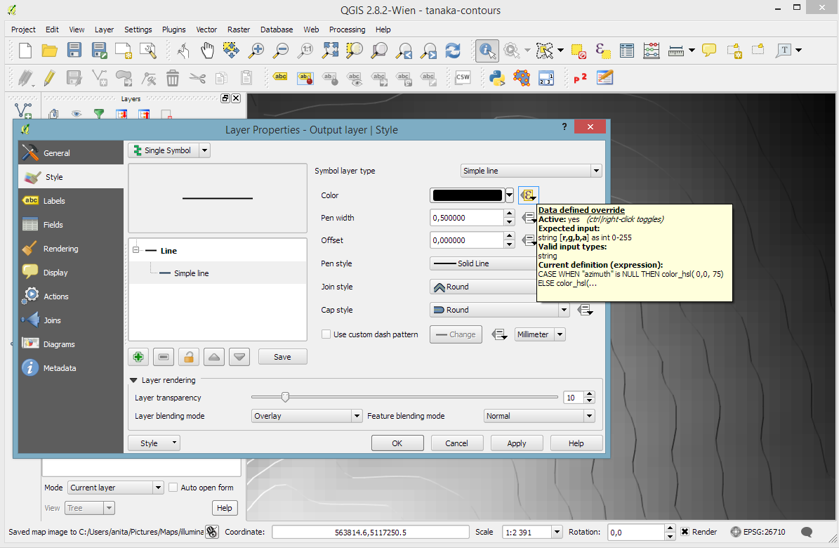
Based on the orientation, we can then write an expression to control the contour line color. For example, if we want the sun to appear in the north west (-45°) we can use:
color_hsl( 0,0,
  scale_linear( abs(
    ( CASE WHEN "azimuth"-45 < 0
      THEN "azimuth"-45+360
      ELSE "azimuth"-45
    END )
  -180), 0, 180, 0, 100)
  )
This will color the lines which are directly exposed to the sun white hsl(0,0,100) while the ones in the shadows will be black hsl(0,0,0).
Use the Overlay layer blending mode to blend contours and DEM color:
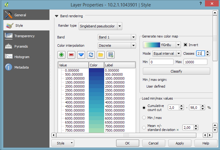
The final step, to get as close to the original design as possible, is to create the effect of discrete elevation classes instead of a smooth color gradient. This can easily be achieved by changing the color interpolation mode of the DEM from Linear to Discrete:
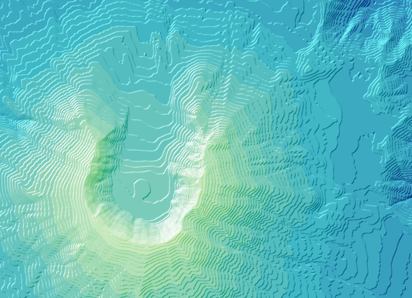
This leaves us with the following gorgeous effect:
As Hannes pointed out, another important aspect of Tanaka’s method is to also alter the contour line width. Lines in the sun or shadow should be wider (1 in this example) than those in orthogonal direction (0.2 in this example):
scale_linear(
abs( abs(
  ( CASE WHEN "azimuth"-45 < 0
    THEN "azimuth"-45+360
    ELSE "azimuth"-45
  END )
-180) -90),
0, 90, 0.2, 1)
The talk presents QGIS visualization tools with a focus on efficient use of layer styling to both explore and present spatial data. Examples include the recently added heatmap style as well as sophisticated rule-based and data-defined styles. The focus of this presentation is exploring and presenting spatio-temporal data using the Time Manager plugin. A special treat are time-dependent styles using expression-based styling which access the current Time Manager timestamp.
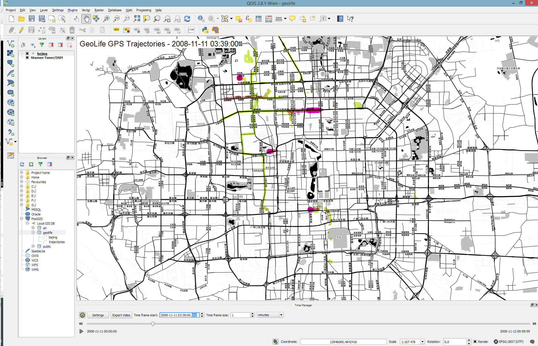
Today’s post is a short tutorial for creating trajectory animations with a fadeout effect using QGIS Time Manager. This is the result we are aiming for:
The animation shows the current movement in pink which fades out and leaves behind green traces of the trajectories.
About the data
GeoLife GPS Trajectories were collected within the (Microsoft Research Asia) Geolife project by 182 users in a period of over three years (from April 2007 to August 2012). [1,2,3] The GeoLife GPS Trajectories download contains many text files organized in multiple directories. The data files are basically CSVs with 6 lines of header information. They contain the following fields:
Field 1: Latitude in decimal degrees.
Field 2: Longitude in decimal degrees.
Field 3: All set to 0 for this dataset.
Field 4: Altitude in feet (-777 if not valid).
Field 5: Date – number of days (with fractional part) that have passed since 12/30/1899.
Field 6: Date as a string.
Field 7: Time as a string.
Data prep: PostGIS
Since any kind of GIS operation on text files will be quite inefficient, I decided to load the data into a PostGIS database. This table of millions of GPS points can then be sliced into appropriate chunks for exploration, for example, a day in Beijing:
CREATE MATERIALIZED VIEW geolife.beijing
AS SELECT trajectories.id,
    trajectories.t_datetime,
    trajectories.t_datetime + interval '1 day' as t_to_datetime,
    trajectories.geom,
    trajectories.oid
   FROM geolife.trajectories
   WHERE st_dwithin(trajectories.geom,
           st_setsrid(
             st_makepoint(116.3974589,
                           39.9388838),
             4326),
           0.1)
   AND trajectories.t_datetime >= '2008-11-11 00:00:00'
   AND trajectories.t_datetime < '2008-11-12 00:00:00'
WITH DATA
Trajectory viz: a fadeout effect for point markers
The idea behind this visualization is to show both the current movement as well as the history of the trajectories. This can be achieved with a fadeout effect which leaves behind traces of past movement while the most recent positions are highlighted to stand out.
Map tiles by Stamen Design, under CC BY 3.0. Data by OpenStreetMap, under ODbL.
This effect can be created using a Single Symbol renderer with a marker symbol with two symbol layers: one layer serves as the highlights layer (pink) while the second layer represents the traces (green) which linger after the highlights disappear. Feature blending is used to achieve the desired effect for overlapping markers.
The highlights layer has two expression-based properties: color and size. The color fades to white and the point size shrinks as the point ages. The age can be computed by comparing the point’s t_datetime timestamp to the Time Manager animation time $animation_datetime.
[1] Yu Zheng, Lizhu Zhang, Xing Xie, Wei-Ying Ma. Mining interesting locations and travel sequences from GPS trajectories. In Proceedings of International conference on World Wild Web (WWW 2009), Madrid Spain. ACM Press: 791-800.
[2] Yu Zheng, Quannan Li, Yukun Chen, Xing Xie, Wei-Ying Ma. Understanding Mobility Based on GPS Data. In Proceedings of ACM conference on Ubiquitous Computing (UbiComp 2008), Seoul, Korea. ACM Press: 312-321.
[3] Yu Zheng, Xing Xie, Wei-Ying Ma, GeoLife: A Collaborative Social Networking Service among User, location and trajectory. Invited paper, in IEEE Data Engineering Bulletin. 33, 2, 2010, pp. 32-40.
Over the last couple of weeks, Karolina has been very busy improving and expanding Time Manager. This post is to announce the 1.6 release of Time Manager which brings you many fixes and exciting new features.
What’s this feature interpolation you’re talking about?
Interpolation is really helpful if you have multiple observations of the same (moving) real-world object at different points in time and you want to visualize the movement between the observations. This can be used to visualize animal paths, vehicle tracks, or any other movement in space.
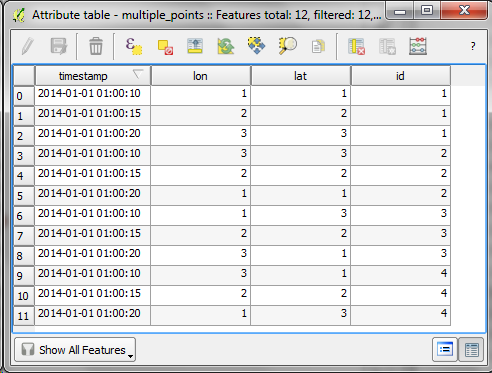
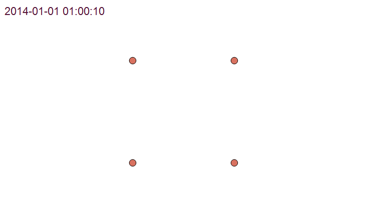
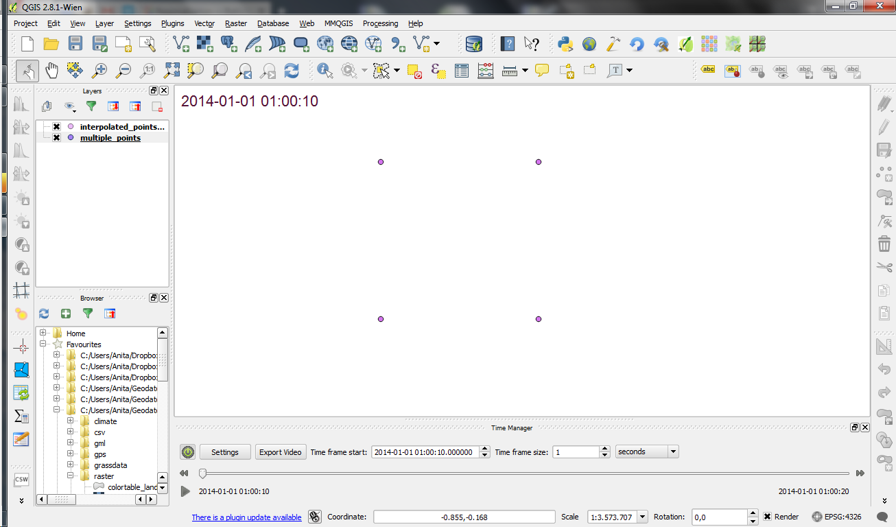
The following example shows a simple layer which contains 12 point features (3 for each id value).
Using Time Manager interpolation, it is easy to create animations with interpolated positions between observations:
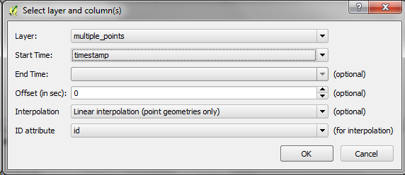
How is it done?
When you open the Time Manager 1.6 Settings | Add layer dialog, you will find a new option for interpolation settings. This first version supports linear interpolation of point features but more options might be added in the future. Note how the id attribute is specified to let Time Manager know which features belong to the same real-world object.
For the interpolation, Time Manager creates a new layer which contains the interpolated features. You can see this layer in the layer list.
I’m really looking forward to seeing all the great animations this feature will enable. Thanks Karolina for making this possible!