Archive

Tag Archives: Time Manager

TimeManager turns 10 this year. The code base has made the transition from QGIS 1.x to 2.x and now 3.x and it would be wrong to say that it doesn’t show ;-)

Now, it looks like the days of TimeManager are numbered. Four days ago, Nyall Dawson has added native temporal support for vector layers to QGIS. This is part of a larger effort of adding time support for rasters, meshes, and now also vectors.

The new Temporal Controller panel looks similar to TimeManager. Layers are configured through the new Temporal tab in Layer Properties. The temporal dimension can be used in expressions to create fancy time-dependent styles:

temporal1

TimeManager Geolife demo converted to Temporal Controller (click for full resolution)

Obviously, this feature is brand new and will require polishing. Known issues listed by Nyall include limitations of supported time fields (only fields with datetime type are supported right now, strings cannot be used) and worse performance than TimeManager since features are filtered in QGIS rather than in the backend.

If you want to give the new Temporal Controller a try, you need to install the current development version, e.g. qgis-dev in OSGeo4W.


Update from May 16:

Many of the limitations above have already been addressed.

Last night, Nyall has recorded a one hour tutorial on this new feature, enjoy:

Bugfix release 3.0.2 fixes an issue where “accumulate features” was broken for timestamps with milliseconds.

If you like TimeManager, know your way around setting up Travis for testing QGIS plugins, and want to help improve TimeManager stability, please get in touch!

This is a guest post by Time Manager collaborator and Python expert, Ariadni-Karolina Alexiou.

Today we’re going to look at how to visualize the error bounds of a GPS trace in time. The goal is to do an in-depth visual exploration using QGIS and Time Manager in order to learn more about the data we have.

The Data

We have a file that contains GPS locations of an object in time, which has been created by a GPS tracker. The tracker also keeps track of the error covariance matrix for each point in time, that is, what confidence it has in the measurements it gives. Here is what the file looks like:

data.png

Error Covariance Matrix

What are those sd* fields? According to the manual: The estimated standard deviations of the solution assuming a priori error model and error parameters by the positioning options. What it basically means is that the real GPS location will be located no further than three standard deviations across north and east from the measured location, most of (99.7%) the time. A way to represent this visually is to create an ellipse that maps this area of where the real location can be.ellipse_ab

An ellipse can be uniquely defined from the lengths of the segments a and b and its rotation angle. For more details on how to get those ellipse parameters from the covariance matrix, please see the footnote.

Ground truth data

We also happen to have a file with the actual locations (also in longitudes and latitudes) of the object for the same time frame as the GPS (also in seconds), provided through another tracking method which is more accurate in this case.

actual_data

This is because, the object was me running on a rooftop in Zürich wearing several tracking devices (not just GPS), and I knew exactly which floor tiles I was hitting.

The goal is to explore, visually, the relationship between the GPS data and the actual locations in time. I hope to get an idea of the accuracy, and what can influence it.

First look

Loading the GPS data into QGIS and Time Manager, we can indeed see the GPS locations vis-a-vis the actual locations in time.

actual_vs_gps

Let’s see if the actual locations that were measured independently fall inside the ellipse coverage area. To do this, we need to use the covariance data to render ellipses.

Creating the ellipses

I considered using the ellipses marker from QGIS.

ellipse_marker.png

It is possible to switch from Millimeter to Map Unit and edit a data defined override for symbol width, height and rotation. Symbol width would be the a parameter of the ellipse, symbol height the b parameter and rotation simply the angle. The thing is, we haven’t computed any of these values yet, we just have the error covariance values in our dataset.

Because of the re-projections and matrix calculations inherent into extracting the a, b and angle of the error ellipse at each point in time, I decided to do this calculation offline using Python and relevant libraries, and then simply add a WKT text field with a polygon representation of the ellipse to the file I had. That way, the augmented data could be re-used outside QGIS, for example, to visualize using Leaflet or similar. I could have done a hybrid solution, where I calculated a, b and the angle offline, and then used the dynamic rendering capabilities of QGIS, as well.

I also decided to dump the csv into an sqlite database with an index on the time column, to make time range queries (which Time Manager does) run faster.

Putting it all together

The code for transforming the initial GPS data csv file into an sqlite database can be found in my github along with a small sample of the file containing the GPS data.

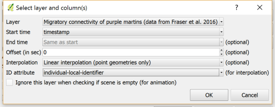
I created three ellipses per timestamp, to represent the three standard deviations. Opening QGIS (I used version: 2.12, Las Palmas) and going to Layer>Add Layer>Add SpatialLite Layer, we see the following dialog:

add_spatialite2.png

After adding the layer (say, for the second standard deviation ellipse), we can add it to Time Manager like so:

add_to_tm

We do the process three times to add the three types of ellipses, taking care to style each ellipse differently. I used transparent fill for the second and third standard deviation ellipses.

I also added the data of my  actual positions.

Here is an exported video of the trace (at a place in time where I go forward, backwards and forward again and then stay still).

gps

Conclusions

Looking at the relationship between the actual data and the GPS data, we can see the following:

  • Although the actual position differs from the measured one, the actual position always lies within one or two standard deviations of the measured position (so, inside the purple and golden ellipses).
  • The direction of movement has greater uncertainty (the ellipse is elongated across the line I am running on).
  • When I am standing still, the GPS position is still moving, and unfortunately does not converge to my actual stationary position, but drifts. More research is needed regarding what happens with the GPS data when the tracker is actually still.
  • The GPS position doesn’t jump erratically, which can be good, however, it seems to have trouble ‘catching up’ with the actual position. This means if we’re looking to measure velocity in particular, the GPS tracker might underestimate that.

These findings are empirical, since they are extracted from a single visualization, but we have already learned some new things. We have some new ideas for what questions to ask on a large scale in the data, what additional experiments to run in the future and what limitations we may need to be aware of.

Thanks for reading!

Footnote: Error Covariance Matrix calculations

The error covariance matrix is (according to the definitions of the sd* columns in the manual):

sde * sde sign(sdne) * sdne * sdne
sign(sdne) * sdne * sdne sdn * sdn

It is not a diagonal matrix, which means that the errors across the ‘north’ dimension and the ‘east’ dimension, are not exactly independent.

An important detail is that, while the position is given in longitudes and latitudes, the sdn, sde and sdne fields are in meters. To address this in the code, we convert the longitude and latitudes using UTM projection, so that they are also in meters (northings and eastings).

For more details on the mathematics used to plot the ellipses check out this article by Robert Eisele and the implementation of the ellipse calculations on my github.

TimeManager 2.5 is quite likely going to be the final TimeManager release for the QGIS 2 series. It comes with a couple of bug fixes and enhancements:

  • Fixed #245: updated help.htm
  • Fixed #240: now hiding unmanageable WFS layers
  • Fixed #220: fixed issues with label size
  • Fixed #194: now exposing additional functions: animation_time_frame_size, animation_time_frame_type, animation_start_datetime, animation_end_datetime

Besides updating the help, I also decided to display it more prominently in the settings dialog (similarly to how the help is displayed in the field calculator or in Processing):

So far, I haven’t started porting to QGIS 3 yet. If you are interested in TimeManager and want to help, please get in touch.

On this note, let me leave you with a couple of animation inspirations from the Twitterverse:

In this post, we use TimeManager to visualize the position of a moving object over time along a trajectory. This is another example of what is possible thanks to QGIS’ geometry generator feature. The result can look like this:

What makes this approach interesting is that the trajectory is stored in PostGIS as a LinestringM instead of storing individual trajectory points. So there is only one line feature loaded in QGIS:

(In part 2 of this series, we already saw how a geometry generator can be used to visualize speed along a trajectory.)

The layer is added to TimeManager using t_start and t_end attributes to define the trajectory’s temporal extent.

TimeManager exposes an animation_datetime() function which returns the current animation timestamp, that is, the timestamp that is also displayed in the TimeManager dock, as well as on the map (if we don’t explicitly disable this option).

Once TimeManager is set up, we can edit the line style to add a point marker to visualize the position of the moving object at the current animation timestamp. To do that, we interpolate the position along the trajectory segments. The first geometry generator expression splits the trajectory in its segments:

The second geometry generator expression interpolates the position on the segment that contains the current TimeManager animation time:

The WHEN statement compares the trajectory segment’s start and end times to the current TimeManager animation time. Afterwards, the line_interpolate_point function is used to draw the point marker at the correct position along the segment:

CASE 
WHEN (
m(end_point(geometry_n($geometry,@geometry_part_num)))
> second(age(animation_datetime(),to_datetime('1970-01-01 00:00')))
AND
m(start_point(geometry_n($geometry,@geometry_part_num)))
<= second(age(animation_datetime(),to_datetime('1970-01-01 00:00')))
)
THEN
line_interpolate_point( 
  geometry_n($geometry,@geometry_part_num),
  1.0 * (
    second(age(animation_datetime(),to_datetime('1970-01-01 00:00')))
	- m(start_point(geometry_n($geometry,@geometry_part_num)))
  ) / (
    m(end_point(geometry_n($geometry,@geometry_part_num)))
	- m(start_point(geometry_n($geometry,@geometry_part_num)))
  ) 
  * length(geometry_n($geometry,@geometry_part_num))
)
END

Here is the animation result for a part of the trajectory between 08:00 and 09:00:


This post is part of a series. Read more about movement data in GIS.

From 28th April to 1st May the QGIS project organized another successful developer meeting at the Linuxhotel in Essen, Germany. Here is a quick summary of the key topics I’ve been working on during these days.

New logo rollout

It’s time to get the QGIS 3 logo out there! We’ve started changing our social media profile pictures and Website headers to the new design: 

Resource sharing platform 

In QGIS 3, the resource sharing platform will be available by default – just like the plugin manager is today in QGIS 2. We are constantly looking for people to share their mapping resources with the community. During this developer meeting Paolo Cavallini and I added two more SVG collections:

Road sign SVGs by Bertrand Bouteilles & Roulex_45 (CC BY-SA 3.0)

SVGs by Yury Ryabov & Pavel Sergeev (CC-BY 3.0)

Unified Add Layer button

We also discussed the unified add layer dialog and are optimistic that it will make its way into 3.0. The required effort for a first version is currently being estimated by the developers at Boundless.

TimeManager

The new TimeManager version 2.4 fixes a couple of issues related to window resizing and display on HiDPI screens. Additionally, it now saves all label settings in the project file. This is the change log:

- Fixed #222: hide label if TimeManager is turned off
- Fixed #156: copy parent style to interpolation layer
- Fixed #109: save label settings in project
- Fixed window resizing issues in label options gui
- Fixed window resizing issues in video export gui
- Fixed HiDPI issues with arch gui

A common use case of the QGIS TimeManager plugin is visualizing tracking data such as animal migration data. This post illustrates the steps necessary to create an animation from bird migration data. I’m using a dataset published on Movebank:

Fraser KC, Shave A, Savage A, Ritchie A, Bell K, Siegrist J, Ray JD, Applegate K, Pearman M (2016) Data from: Determining fine-scale migratory connectivity and habitat selection for a migratory songbird by using new GPS technology. Movebank Data Repository. doi:10.5441/001/1.5q5gn84d.

It’s a CSV file which can be loaded into QGIS using the Add delimited text layer tool. Once loaded, we can get started:

1. Identify time and ID columns

Especially if you are new to the dataset, have a look at the attribute table and identify the attributes containing timestamps and ID of the moving object. In our sample dataset, time is stored in the aptly named timestamp attribute and uses ISO standard formatting %Y-%m-%d %H:%M:%S.%f. This format is ideal for TimeManager and we can use it without any changes. The object ID attribute is titled individual-local-identifier.

movebank_data

The dataset contains 128 positions of 14 different birds. This means that there are rather long gaps between consecutive observations. In our animation, we’ll want to fill these gaps with interpolated positions to get uninterrupted movement traces.

2. Configuring TimeManager

To set up the animation, go to the TimeManager panel and click Settings | Add Layer. In the following dialog we can specify the time and ID attributes which we identified in the previous step. We also enable linear interpolation. The interpolation option will create an additional point layer in the QGIS project, which contains the interpolated positions.

timemanager_settings

When using the interpolation option, please note that it currently only works if the point layer is styled with a Single symbol renderer. If a different renderer is configured, it will fail to create the interpolation layer.

Once the layer is configured, the minimum and maximum timestamps will be displayed in the TimeManager dock right bellow the time slider. For this dataset, it makes sense to set the Time frame size, that is the time between animation frames, to one day, so we will see one frame per day:

timemanager_dock

Now you can test the animation by pressing the TimeManager’s play button. Feel free to add more data, such as background maps or other layers, to your project. Besides exploring the animated data in QGIS, you can also create a video to share your results.

3. Creating a video

To export the animation, click the Export video button. If you are using Linux, you can export videos directly from QGIS. On Windows, you first need to export the animation frames as individual pictures, which you can then convert to a video (for example using the free Windows Movie Maker application).

These are the basic steps to set up an animation for migration data. There are many potential extensions to this animation, including adding permanent traces of past movements. While this approach serves us well for visualizing bird migration routes, it is easy to imagine that other movement data would require different interpolation approaches. Vehicle data, for example, would profit from network-constrained interpolation between observed positions.

If you find the TimeManager plugin useful, please consider supporting its development or getting involved. Many features, such as interpolation, are weekend projects that are still in a proof-of-concept stage. In addition, we have the huge upcoming challenge of migrating the plugin to Python 3 and Qt5 to support QGIS3 ahead of us. Happy QGISing!

This is a guest post by Karolina Alexiou (aka carolinux), Anita’s collaborator on the Time Manager plugin.

As of version 2.1.5, TimeManager provides some support for stepping through WMS-T layers, a format about which Anita has written  in the past.  From the official definition, the OpenGIS® Web Map Service Interface Standard (WMS) provides a simple HTTP interface for requesting geo-registered map images from one or more distributed geospatial databases. A WMS request defines the geographic layer(s) and area of interest to be processed. The response to the request is one or more geo-registered map images (returned as JPEG, PNG, etc) that can be displayed in a browser application. QGIS can display those images as a raster layer. The WMS-T standard allows the user of the service to set a time boundary in addition to a geographical boundary with their HTTP request.

We are going to add the following url as the web map provider service: http://mesonet.agron.iastate.edu/cgi-bin/wms/nexrad/n0r-t.cgi

From QGIS, go to Layer>Add Layer>Add WMS/WMST Layer and add a new server and connect to it. For the service we have chosen, we only need to specify a name and the url.

Select the top level layer, in our case named nexrad_base_reflect and click Add. Now you have added the layer to your QGIS project.

To add it to TimeManager as well, add it as a raster with the settings from the screenshot below. Start time and end time have the values 2005-08-29T03:10:00Z and 2005-08-30T03:10:00Z respectively, which is a period which overlaps with hurricane Katrina. Now, the WMS-T standard uses a handful of different time formats, and at this time, the plugin requires you to know this format and input the start and end values in this format. If there’s interest to sponsor this feature, in the future we may get the format directly from the web service description. The web service description is an XML document (see here for an example) which, among other information, contains a section that defines the format, default time and granularity of the time dimension.

add_raster

If we set the time step to 2 hours and click play, we will see that TimeManager renders each interval by querying the web map service for it, as you can see in this short video.

Querying the web service and waiting for the response takes some time. So, the plugin requires some patience for looking at this particular layer format in interactive mode. If we export the frames, however, we can get a nice result. This is an animation showing hurricane Katrina progressing over a 30 minute interval.

whoosh

If you want to sponsor further development of the Time Manager plugin, you can arrange a session with me – Karolina Alexiou – via Codementor.

Do you like the QGIS heatmap functionality? Did you know that QGIS can also create animated heatmaps?

The following video tutorial shows all necessary steps. To reproduce it, you can get the sample data from my Time Manager workshop at #QGIS2015.

Today was the final day of #QGIS2015 the first joint QGIS conference and developer meeting. I had the pleasure to meet Time Manager co-developer Karolina Alexiou aka carolinux in person and give a talk including a hands-on workshop on Time Manager together. Time Manager makes it possible to explore spatio-temporal data by creating animations directly in QGIS.

The talk presents QGIS visualization tools with a focus on efficient use of layer styling to both explore and present spatial data. Examples include the recently added heatmap style as well as sophisticated rule-based and data-defined styles. The focus of this presentation is exploring and presenting spatio-temporal data using the Time Manager plugin. A special treat are time-dependent styles using expression-based styling which access the current Time Manager timestamp.

To download the example data and QGIS projects download Time_Manager_Examples.zip.