The latest releases of MovingPandas and Trajectools come with many “under the hood” changes that aim to make your movement analytics faster:
- Instead of immediately creating a GeoPandas GeoDataFrame and populating the geometry column with Point objects, MovingPandas now has “lazy geometry column creation” that holds off on this operation until / if the geometries are actually needed. This way, for many operations, no geometry objects have to be generated at all.
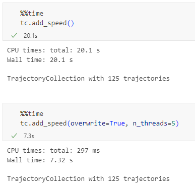
- MovingPandas TrajectorySplitters now support parallel processing and Trajectools uses parallel processing whenever available (e.g. for adding speed & direction metrics, detecting stops, splitting trajectories).
- When a minimum length is specified for trajectories, MovingPandas now avoids computing the total trajectory length and, instead, immediately stops once the threshold value has been reached (“early skip”).
- Trajectools now offers the option to skip computation of movement metrics (speed & direction). This way, we can skip unnecessary computations and leverage the lazy geometry column creation, wherever applicable.
Let’s have a look at some example performance measurements!
Example 1: MovingPandas ValueChangeSplitter
The ValueChangeSplitter splits trajectories when it detects a value change in the specified column. This is useful, for example, to split up public trajectories that contain a “next_stop” column.
The following graph shows ValueChangeSplitter runtimes for different minimum trajectory length settings (from 0 to 1km, 100km, and 10,000km):

We see that the new, lazy geometry column initialization outperforms the old original code in all cases (e.g. 57% runtime reduction for 1km), except for the worst-case scenario, when the original implementation discards all trajectories as too short right from the start. (For most use cases, min_length will be set to rather small values to avoid creation of undesired short trajectory fragments, similar to sliver polygons in classic geometry operations.)
Additionally, we can engage multiprocessing by setting the n_processes parameter, e.g. to the number of CPUs to achieve further speedup:

Example 2: Trajectools
By applying all above-mentioned speedup techniques, Trajectools is now considerably faster. For example, the following runtime reductions can be achieved by deactivating the “Add movement metrics (speed, direction)” option in the algorithm dialog:
- Create trajectories: 62%
- Spatiotemporal generalization (TDTR): 78%
- Temporal generalization: 81%
- Split trajectories at stops: 53%

I have also updated the default trajectory points output style. It now uses a graduated renderer to visualize the speed values (if they have been calculated) instead of the previously used data-defined override. This makes the style faster to customize and provides a user-friendly legend:

For more infos, have a look at:
Enjoy the latest performance increases!