This post covers how to add you own tools to expand Sextante’s ftools toolbox.
I was looking through Sextante for a tool that inserts additional nodes into a linestring at intervals of my choice. I couldn’t find that exact tool but I found something similar: Densify Geometries in ftools which adds the same number of nodes to all line segments. So I decided to modify Densify Geometries to fit my requirements.
Ftools scripts (such as DensifyGeometries.py) are located in ~/.qgis/python/plugins/sextante/ftools. To create my modified version, I just copied the original and modified the code to accept a densification interval instead of a number of nodes. Since I didn’t know how to add my new tool to Sextante I contacted the developer mailing list and after a short coffee break I had the answer (thanks Alexander!):
The new algorithm has to be exposed in the provider FToolsAlgorithmProvider.py. To do that: Add an import statement for the new algorithm (using existing statements as examples) and add the algorithm to the list self.alglist in the __init__() method. That’s it!
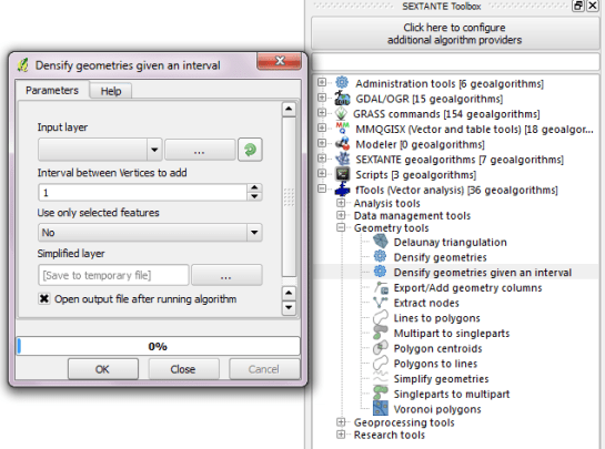
Sextante automatically creates the input form you can see in above screenshot. Very handy! And the new tool can be added to geoprocessing models just like any of the original ones.