Archive

QGIS

A common use case of the QGIS TimeManager plugin is visualizing tracking data such as animal migration data. This post illustrates the steps necessary to create an animation from bird migration data. I’m using a dataset published on Movebank:

Fraser KC, Shave A, Savage A, Ritchie A, Bell K, Siegrist J, Ray JD, Applegate K, Pearman M (2016) Data from: Determining fine-scale migratory connectivity and habitat selection for a migratory songbird by using new GPS technology. Movebank Data Repository. doi:10.5441/001/1.5q5gn84d.

It’s a CSV file which can be loaded into QGIS using the Add delimited text layer tool. Once loaded, we can get started:

1. Identify time and ID columns

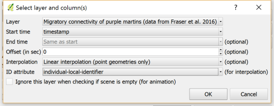
Especially if you are new to the dataset, have a look at the attribute table and identify the attributes containing timestamps and ID of the moving object. In our sample dataset, time is stored in the aptly named timestamp attribute and uses ISO standard formatting %Y-%m-%d %H:%M:%S.%f. This format is ideal for TimeManager and we can use it without any changes. The object ID attribute is titled individual-local-identifier.

movebank_data

The dataset contains 128 positions of 14 different birds. This means that there are rather long gaps between consecutive observations. In our animation, we’ll want to fill these gaps with interpolated positions to get uninterrupted movement traces.

2. Configuring TimeManager

To set up the animation, go to the TimeManager panel and click Settings | Add Layer. In the following dialog we can specify the time and ID attributes which we identified in the previous step. We also enable linear interpolation. The interpolation option will create an additional point layer in the QGIS project, which contains the interpolated positions.

timemanager_settings

When using the interpolation option, please note that it currently only works if the point layer is styled with a Single symbol renderer. If a different renderer is configured, it will fail to create the interpolation layer.

Once the layer is configured, the minimum and maximum timestamps will be displayed in the TimeManager dock right bellow the time slider. For this dataset, it makes sense to set the Time frame size, that is the time between animation frames, to one day, so we will see one frame per day:

timemanager_dock

Now you can test the animation by pressing the TimeManager’s play button. Feel free to add more data, such as background maps or other layers, to your project. Besides exploring the animated data in QGIS, you can also create a video to share your results.

3. Creating a video

To export the animation, click the Export video button. If you are using Linux, you can export videos directly from QGIS. On Windows, you first need to export the animation frames as individual pictures, which you can then convert to a video (for example using the free Windows Movie Maker application).

These are the basic steps to set up an animation for migration data. There are many potential extensions to this animation, including adding permanent traces of past movements. While this approach serves us well for visualizing bird migration routes, it is easy to imagine that other movement data would require different interpolation approaches. Vehicle data, for example, would profit from network-constrained interpolation between observed positions.

If you find the TimeManager plugin useful, please consider supporting its development or getting involved. Many features, such as interpolation, are weekend projects that are still in a proof-of-concept stage. In addition, we have the huge upcoming challenge of migrating the plugin to Python 3 and Qt5 to support QGIS3 ahead of us. Happy QGISing!

Broken Processing models are nasty and this error is particularly unpleasant:

...
File "/home/agraser/.qgis2/python/plugins/processing/modeler/
ModelerAlgorithm.py", line 110, in algorithm
self._algInstance = ModelerUtils.getAlgorithm(self.consoleName).getCopy()
AttributeError: 'NoneType' object has no attribute 'getCopy'

It shows up if you are trying to open a model in the model editor that contains an algorithm which Processing cannot find.

For example, when I upgraded to Ubuntu 16.04, installing a fresh QGIS version did not automatically install SAGA. Therefore, any model with a dependency on SAGA was broken with the above error message. Installing SAGA and restarting QGIS solves the issue.

In the previous post, Mickael shared a great map design. The download includes a print composer template, that you can use to recreate the design in a few simple steps:

1. Create a new composition based on a template

Open the Composer manager and configure it to use a specific template. Then you can select the .qpt template file and press the Add button to create a new composition based on the template.

2. Update image item paths

If the template uses images, the paths to the images most likely need to be fixed since the .qpt file stores absolute file paths instead of relative ones.

update_image_paths

With these steps, you’re now ready to use the design for your own maps. Happy QGISing!

This is a guest post by Mickael HOARAU @Oneil974

For those wishing to get a stylized map on QGIS composer, I’ve been working on a tutorial to share with you a project I’m working on. Fan of web design and GIS user since few years, I wanted to merge Material Design Style with Map composer. Here is a tutorial to show you how to make simply a Material Design Map style on QGIS.

This slideshow requires JavaScript.

You can download tutorial here:

Tutorial Material Design Map

And sources here:

Sources Material Design Map

An Atlas Powered version is coming soon!

Over the last two weeks, I had the pleasure to attend both the international FOSS4G conference in Bonn, Germany, as well as the regional FOSS4G-NOR in Oslo, Norway. Both events were superbly organized and provided tons of possibilities to share experiences and find new inspiration.

Talks at both conferences have been recorded and can be watched online: Bonn / Oslo

I enjoyed having the opportunity to give two very different talks. In Bonn, I presented work on pedestrian routing and navigation, which was developed within the PERRON project:

It was particularly nice that we had plenty of time for Q&A after this presentation since only two talks were scheduled for this session rather than the usual three. I’d also like to thank everyone for the great feedback – both in person and on Twitter!

In Oslo, I had the honor to give the opening keynote on OpenSource in general and the QGIS project in particular:

2 – Anita Graser – QGIS – A Community-powered GIS Project from krokskogstrollet on Vimeo.

Both conferences were packed with great sessions and talks. If I had to pick favorites from last week’s presentations, I would have to opt for Iván Sánchez presenting his latest projects, including what3fucks and geohaiku:

6 – Iván Sánchez Ortega, Mazemap – Addressing NSFW Geodesic Grids from krokskogstrollet on Vimeo.

Followed closely by the impressive project presentations of the student organizers of FOSS4G-NOR:

10 – Program Committee – What are the results when students use Open Source? from krokskogstrollet on Vimeo.

All three projects: OPPTUR, GISTYLE, and the flexible traffic web viewer were great demos of what can be achieved with open source tools. Mathilde’s GISTYLE project is also available on Github.

An inspiring GISummer comes to an end, but with so many videos to watch and workshop materials to explore, I’m convinced that the autumn will be no less exciting.

It’s been a great week in Bonn! I joined the other members of the QGIS project at the pre-FOSS4G code sprint at the Basecamp, the weirdest location we’ve had for a developer meeting so far. We used this opportunity to have a face-to-face meeting of the QGIS PSC  with special guests Matthias Kuhn (on QGIS 3.0 and bug tracker discussions) and Lene Fischer (on community team issues)  – notes here.

picture by Tim Sutton

QGIS PSC meeting in action (from left to right: Otto Dassau, Paolo Cavallini, Anita Graser, Andreas Neumann, Jürgen E. Fischer), picture by Tim Sutton

I also finally took the time to compile a blog post on the results of the QGIS user survey 2015.

The code sprint was also a great opportunity to present the results of Akbar Gumbira’s Google Summer of Code project: the QGIS Resource Sharing plugin. This plugin makes it possible to easily share resources (such as SVG icons, symbol definitions, QGIS styles, and Processing scripts) with other QGIS users through an interface that closely resembles the well-known QGIS Plugin Manager. Akbar has also prepared great presentation with background info and screencasts showcasing his project.

QGIS Resource Sharing presentation, picture by @foss4g

QGIS Resource Sharing presentation, picture by @foss4g

The plugin is now available in the Plugin Repository and we have created the official QGIS Resources repository on Github. If you have symbols or styles that you want to share with the community, please create a resource collection and send us a pull request to add it to the official list.

Thanks to all the organizers who worked hard to make this one of the most well-organized and enjoyable code sprints I’ve ever been to. You are awesome!

FOSS4G2016 is drawing closer quickly. To get in the mood for a week full of of geogeekery, Locate Press is offering a special FOSS4G discount for QGIS Map Design.

Use the code foss4gbonn to get 25% off your copy.

QGIS Map Design is the reference book to get if you want to bring your mapping skills up to speed. The book comes with a download for all our example map projects:

Looking forward to meeting you in Bonn!

Wrong navigation instructions can be annoying and sometimes even dangerous, but they happen. No dataset is free of errors. That’s why it’s important to assess the quality of datasets. One specific use case I previously presented at FOSS4G 2013 is the quality assessment of turn restrictions in OSM, which influence vehicle routing results.

The main idea is to compare OSM to another data source. For this example, I used turn restriction data from the City of Toronto. Of the more than 70,000 features in this dataset, I extracted a sample of about 500 turn restrictions around Ryerson University, which I had the pleasure of visiting in 2014.

As you can see from the following screenshot, OSM and the city’s dataset agree on 420 of 504 restrictions (83%), while 36 cases (7%) are in clear disagreement. The remaining cases require further visual inspection.

toronto_turns_overview

The following two examples show one case where the turn restriction is modelled in both datasets (on the left) and one case where OSM does not agree with the city data (on the right).
In the first case, the turn restriction (short green arrow) tells us that cars are not allowed to turn right at this location. An OSM-based router (here I used OpenRouteService.org) therefore finds a route (blue dashed arrow) which avoids the forbidden turn. In the second case, the router does not avoid the forbidden turn. We have to conclude that one of the two datasets is wrong.

If you want to learn more about the methodology, please check Graser, A., Straub, M., & Dragaschnig, M. (2014). Towards an open source analysis toolbox for street network comparison: indicators, tools and results of a comparison of OSM and the official Austrian reference graph. Transactions in GIS, 18(4), 510-526. doi:10.1111/tgis.12061.

Interestingly, the disagreement in the second example has been fixed by a recent edit (only 14 hours ago). We can see this in the OSM way history, which reveals that the line direction has been switched, but this change hasn’t made it into the routing databases yet:

This leads to the funny situation that the oneway is correctly displayed on the map but seemingly ignored by the routers:

toronto_okeefe_osrm

To evaluate the results of the automatic analysis, I wrote a QGIS script, which allows me to step through the results and visually compare turn restrictions and routing results. It provides a function called next() which updates a project variable called myvar. This project variable controls which features (i.e. turn restriction and associated route) are rendered. Finally, the script zooms to the route feature:

def next():
    f = features.next()
    id = f['TURN_ID']
    print "Going to %s" % (id)
    QgsExpressionContextUtils.setProjectVariable('myvar',id)
    iface.mapCanvas().zoomToFeatureExtent(f.geometry().boundingBox())
    if iface.mapCanvas().scale() < 500:
        iface.mapCanvas().zoomScale(500)

layer = iface.activeLayer()
features = layer.getFeatures()
next()

You can see it in action here:

I’d love to see this as an interactive web map where users can have a look at all results, compare with other routing services – or ideally the real world – and finally fix OSM where necessary.

This work has been in the making for a while. I’d like to thank the team of OpenRouteService.org who’s routing service I used (and who recently added support for North America) as well as my colleagues at Ryerson University in Toronto, who pointed me towards Toronto’s open data.

Reducing the number of “Add layer” buttons in the QGIS GUI is a commonly voiced wish. Multiple approaches have been discussed but no decision has been made so far. One idea is to use the existing browser functionality to replace the “Add layer” dialogs. Others are envisioning completely novel approaches.

Since the topic came up again today on Twitter, I decided to implement a quick & dirty version of a unified Add layer button. This way, I can comfortably reduce my Layer toolbar to three buttons using Settings | Customization …

layerToolBar

customization

I pretty much just kept the “Create new layer” button and the “Add delimited text layer” button because, as far as I know, there is no way to call the dialog from the browser. (Instead, CSVs are opened with OGR, which doesn’t have nearly as many nice features.)

And here it is in action:

(I recommend to undock the Browser panel to get the dialog-like behavior that you see in the video.)

To install the plugin: download it and unzip it into your QGIS plugin folder, then activate it in the plugin manager.

I would love to hear what you think about this UX experiment.

As announced in Salzburg a few days ago, I’m happy to present the lastest enhancement to my IDF router for QGIS: travel time routing and catchment computation.

Travel times for pedestrians and cyclists are computed using constant average speeds, while car travel times depend on the speed values provided by the road network data.

Catchment computations return the links that can be traversed completely within the given time (or distance limit). The current implementation does not deal with links at the edge of the catchment area, which can only be traversed partially.

Loading the whole network (2.7GB unzipped IDF) currently requires around 10GB of memory. One of the next plans therefore is to add a way to only load features within a specified bounding box.

Plans to turn this into a full-blown plugin will most likely have to wait for QGIS 3, which will ship with Python 3 and other updated libraries.

Screenshot 2016-07-17 22.04.54