Archive

Visualization

This post explores some cartographic features of QGIS while mapping the river network of Tirol, Austria. All data used is freely available.

For the background, I downloaded NASA SRTM elevation data from CGIAR-CSI and created a hillshade using Terrain Analysis tools in QGIS 1.8.

To emphasize both state borders and the fact that Tirol consists of two separate areas, I created a mask using the Difference tool and styled it a transparent white.

The river network is too dense to label all rivers on an A4 map. Expression-based labels make it possible to only label selected features. For this dataset, the expression limits labeling to features with certain values of GEW_WRRL attribute:

CASE WHEN (GEW_WRRL = '10.000 km2 Fluss' OR "GEW_WRRL"= '4.000 km2 Fluss' OR "GEW_WRRL"='1.000 km2 Fluss') AND length("GEW_NAME_A") < 10 THEN "GEW_NAME_A" END

Labels of neighboring areas together with map title, descriptions and scale bar were added in Print Composer.

Working with Print Composer, it is useful to know that you can use Copy&Paste to duplicate map components and right-click to lock them from being moved. Also, every new component by default comes with a black outline and white background which can (and should) be disabled/changed in “General options”.

This is the final QGIS Print Composer output – without any further post-processing in Inkscape or Gimp:

Today’s post is a short note-to-self.

This script lists available fonts and renders a small preview using Tkinter and pyprocessing.

from pyprocessing import *
import Tkinter
import tkFont

t = Tkinter.Toplevel() # without root window the following line fails
fonts = tkFont.families()
t.destroy()

size(1500,900)
fill(0)
rect(0,0,1500,900)
fill(255)

fontsize=14
lineheight=fontsize*1.2
y=lineheight
x=0

for font_name in fonts:
    print font_name
    font = createFont(font_name, fontsize)
    textFont(font)
    text("Hello world!   ("+font_name+")", x,y,1000,66)
    y+=lineheight
    if y >= 900:
        x+=500
        y=lineheight

run()

On the TODO list:

  • Find out how to turn these fonts bold or italics.

Waiting time is over, Gimp 2.8 is finally here. That is reason enough to take it for a quick test run!

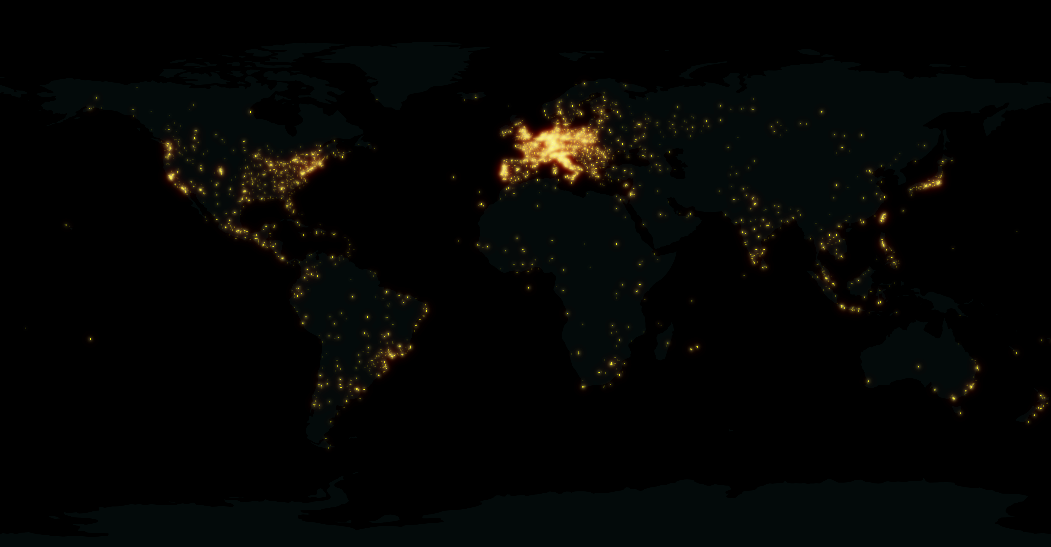
How about a new look for the QGIS user map?

This “glowing hot” map was made using the Gimp filter of the same name:

For the user point layer, I selected a simple point style with high transparency and separately exported land and user points from print composer.

user points as exported from QGIS

In Gimp, I applied the “glowing hot” filter to the user points and combined the layers. The trick here is to first use “Color to alpha” on the user point layer and turn black to transparent. This way, the “glowing hot” filter will only be applied to the remaining points.

Gimp 2.8 RC1 is close enough to the previous version to get comfortable fast. I like the single-window mode even if it’s hard to tell which part of the GUI has the focus sometimes.

Open source GIS and image editing for a perfect work flow.

So far, Time Manager has been limited to vector layers. Support for raster layers has been on the wish list for quite a while. I’ve been considering different approaches and for now I have settled with one that keeps the way how raster layers work as close to the workings of vector layers as possible:

All layers have to be loaded before they can be added to Time Manager. The layers are added one-by-one and start and end time values are defined. (This differs from vector layers where start/end attribute are defined instead.) All raster layers that are not within the current time frame are set to 100 % transparency.

I’m not certain yet whether this is a good approach though. I’ll probably keep trying different approaches for a while.

This is a screen cast of the current status:

The plugin source is available on Github, as usual. It’s still going to take a while until there will be a plugin package including this feature.

I’m looking forward to reading your comments here or on Youtube. Do you think this approach is usable?

Most maps of night time lights show the land masses lit brightly by city lights. But the oceans are not as dark as these maps suggest. NOAA/NGDC datasets available through edenextdata.com show very bright spots in the North Sea:

Night time lights trace the coast but illuminate the sea too.

The dataset description mentions that the sensors pick up moonlit clouds, lights from human settlements, fires, gas flares, heavily lit fishing boats, lightning and the aurora. So might these spots be fishing boats?

Update: As many comments have pointed out, bright spots in the seas show the locations of oil drilling rigs.

A very common approach for mapping point density is to use heat maps. If you are aiming for a different style, give hexagonal grids a try. The workflow is very simple in QGIS:

  1. Load the point layer
  2. Create a hexagonal grid using MMQGIS – Create Grid Layer
  3. Count points per polygon (Vector menu)

I’ve applied this method to an OGD dataset of the Viennese tree cadastre containing 119,744 tree positions:

Default style: One dot per tree

Rendering tree counts per hexagonal grid cell reveals some of Vienna’s greenest spots, such as the Prater or Türkenschanzpark.

Tree density in a hexagonal grid

There’s also a printable version.

Some notes on the necessary steps:

MMQGIS – Create Grid Layer performs great. Creating the 18,400 hexagons in this map was very fast. Note though, that this tool doesn’t seem to write correct projection information to the resulting Shapefile. Therefore it is necessary to set the projection manually after loading the file.

As a result, it is very likely that the Points in Polygon tool will warn you that the point and polygon layer are not in the same projection. I ignored the warning and everything went fine. This step was reasonably fast considering the number of points (119,744) and polygons (18,400).

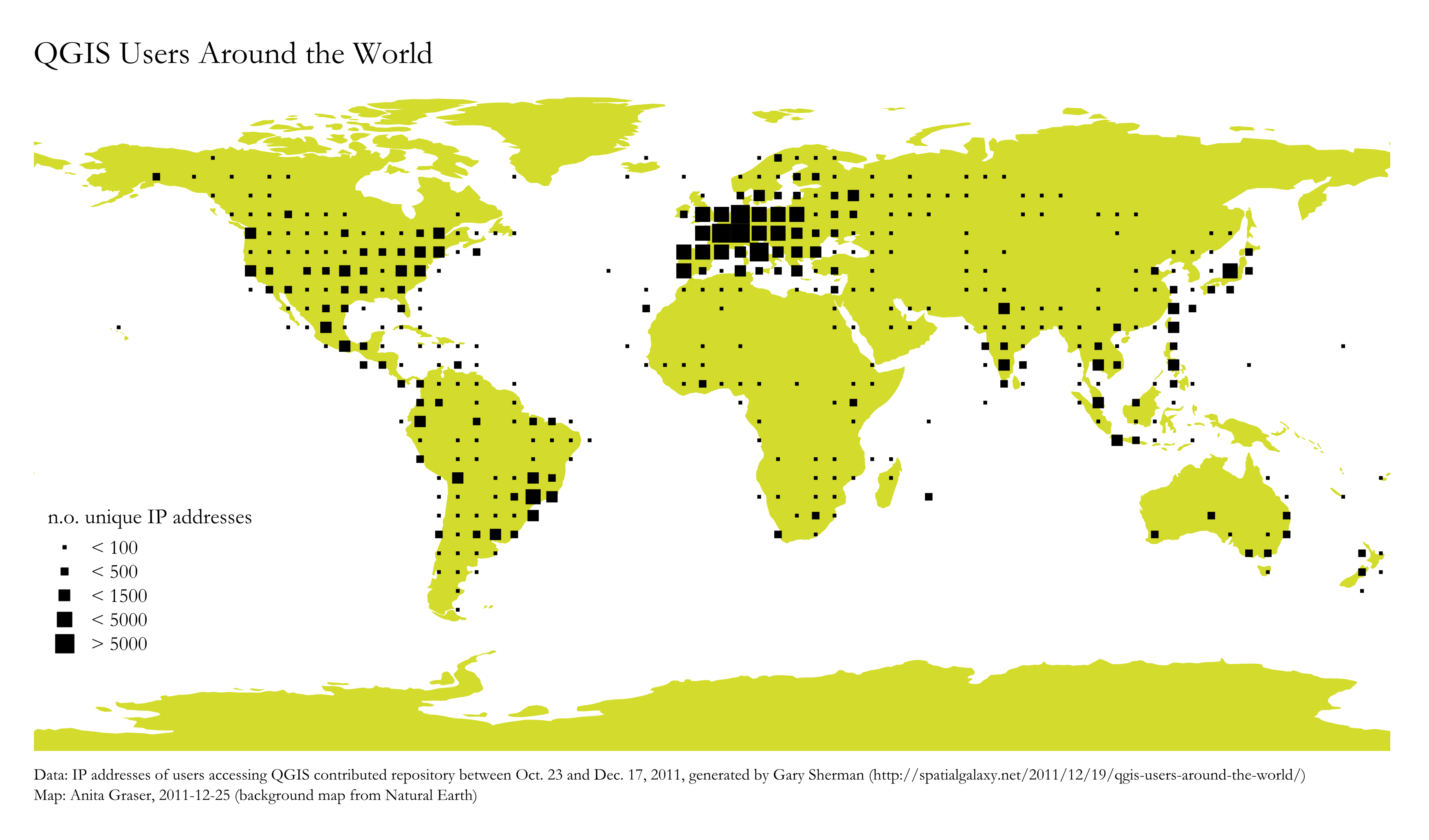
For “QGIS Users Around the World” Gary Sherman collected and geocoded a few weeks of accesses to the plugin repositories. This map is my first attempt at mapping the data for use in QGIS publications:

Considering the coarse resolution of geocoded IP addresses, I’ve decided to count the number of unique IP addresses within each area (5×5 degrees). We can make out a lot of activity in Europe, Japan, Brazil and the US. The high number of accesses from the US mid west are due to IPs being mapped to country-level only.

I would love to hear your feedback on this one!

You probably know this video from my previous post “Tweets to QGIS”. Today, I want to show you how it is done.

After importing the Twitter JSON file, I saved it as a Shapefile.
Every point in the Shapefile contains the timestamp of the tweet. Additionally, I added a second field called “forever” which will allow me to configure Time Manager to show features permanently.

A "forever" field will help with showing features permanently.

To create the flash effect you see in the video, we load the tweet Shapefile three times. Every layer gets a different role and style in the final animation:

  • Layer “start_flash” is a medium sized dot that marks the appearance of a new tweet.
  • Layer “big_flash” is a bigger dot of the same color which will appear after “start_flash”.
  • Layer “permanent” is a small dot that will be visible even after the flash vanishes.
Three layers with different styles will make the animation more interesting.

styling the tweet layers

We’ll plan the final animation with a time step size of 10 seconds. That means that every animation frame will cover a real-world timespan of 10 seconds.

We configure Time Manager by adding all three tweet layers:
Layer “start_flash” starts at the orginal time t. Layer “big_flash” gets an offset of -10 seconds, which means that it will display ten seconds after time t. Layer “permanent” gets an offset of -20 seconds and ends at time forever.

Layers can be timed using the "offset" feature.

Finally – in Time Manager dock – we can start the animation with a time step size of 10 seconds:

Use a time step size of 10 seconds so it fits to the offset values we specified earlier.

Besides watching the animation inside QGIS, Time Manager also enables you to export the animation to an image series using “Export Video” button. Actual video export is not implemented yet, but you can use mencoder (Windows users can download it from Gianluigi Tiesi’s site) on the resulting image series to create a video file:

mencoder "mf://*.PNG" -mf fps=10 -o output.avi -ovc lavc -lavcopts vcodec=mpeg4

Time offsets are a new feature in version 0.4 of Time Manager. You can get it directly from the project SVN and soon from the official QGIS repo.

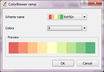
Colorbrewer is a great resource for visually pleasing gradients that can be used for mapping. It was already possible to use color brewer ramps in QGIS but it was necessary to create the ramp with the final number of classes in mind.

Creating a Colobrewer ramp

That’s why I sat down and created continuous ramps from the Colorbrewer data:

Colorbrewer Ramps in QGIS Style Manager

If you want to use them, just import the following XML file into QGIS Style Manager: https://github.com/anitagraser/QGIS-resources/tree/master/symbols

For a big selection of point, line and polygon styles check “QGIS symbology set” by S.S. Rebelious.

When giving presentations using a computer that’s not your own, trying to show video clips can end badly. It’s much safer to use animated GIFs instead. Luckily it’s easy to convert videos to animated GIF on the command line using mplayer:

mplayer movie.avi -vo gif89a:output=movie.gif -vf scale=600:337 -ss 4 

This command converts “movie.avi” to “movie.gif”, rescales the output to 600:337 and starts at second 4 of the video – skipping the beginning.