Archive

Author Archives: underdark

This fifth part in my series on QGIS 2.0 Print Composer presents

Map grids

There are numerous different options for map grids in the new composer but a picture is worth a thousand words:

printcomposer_grids

The upper-left map features a zebra frame style and coordinate labels aligned horizontally and vertically.

The upper-right map shows a normal frame with labels written inside the frame instead of outside. This grid shows an additional offset.

The lower-left map has no frame but customized, colored and dashed grid lines.

Finally, the lower-right map shows a cross grid with default horizontal coordinate labels.

Today’s spotlight is on a feature which you’ll really love if you have to arrange a little more text on a print layout:

HTML labels

Regular labels are limited to one font, size and color. With the new “Render as HTML” option, you gain flexibility to use HTML tags to style your text by adding headers, lists and even images (note the QGIS logo I added by pointing to the image online):

printcomposer_html

After guide lines and multi-column legends, today’s focus is on

Overview maps

Small overview maps are used to help the reader get an idea of where the region displayed on the main map is located. In the new Print Composer, it’s simple to add such overviews: Add the main map as usual. Then add another map object to the composition an go to the “Overview” section. There, you can specify that the second map object should be an overview map for the first one: Just specify “Map 0” in the dropdown list:

printcomposer_overview

After yesterday’s first post on guide lines & snapping for user-friendly map element arrangement, we’ll have a look at another great new addition:

Multi-column legends

In the panel on the right, there is a new section called “Columns”. Here we can create multi-column legend layouts by specifying the desired number of columns. Add some spacing too. It will make the result look more balanced.

By default, Print Composer tries to keep all classes of one layer in one column. You can override this behavior – as I did in this example – by ticking “Split Layers”:

printcomposer_columns

Another useful trick is to use text wrapping for long class labels. This option can be found in the legend’s “Main properties” right at the top of the side panel. In this example, I specified wrap on the pipe “|” symbol and inserted this symbol into the longer class names to force a line break:

printcomposer_wraplegendtext

This is the first post in a series dedicated solely to Print Composer in QGIS 2.0 which you can already admire in recent nightly builds.

Guide lines & snapping for user-friendly map element arrangement

Arranging map elements has never been easier: Elements can be moved as freely as before but now they will automatically try to align with other elements on the page or the page borders. Additional red guide lines help interpret the snapping behavior.

printcomposer_guides

Did you know that there is a version of ColorBrewer that does not require Flash?

Enjoy! Pure Javascript and zero loading times: http://colorbrewer2.org/js/

colorbrewerjs

Group Stats is a plugin for QGIS which makes it easy to calculate statistics for feature groups in a vector layer. Note that the plugin is still marked “experimental” so you have to allow experimental plugins in order to install it. I tried this plugin for the first time today and decided to write this post because it didn’t seem immediately obvious how to use it.

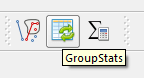
The plugin button is added to the vector toolbar and of course you can access it via vector menu.

groupstatsicon

The example I want to show is: How to calculate the total area of each Corine Land Cover (CLC) class per state.

corineAT

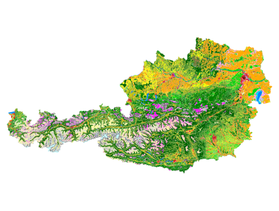
After adding state information to the CLC datasets by intersecting CLC and state geometries from Natural Earth we can get started with Group Stats.

groupstats

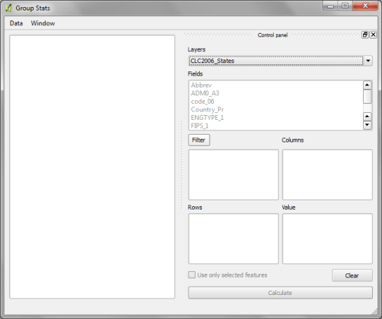
The big area on the left will display the results. The input fields are on the right. The general idea is to drag and drop fields and/or functions into the “columns”, “rows” and “values” sections. (Double-clicking field names does not do anything.) To remove fields again, you have to drop them back into the field list.

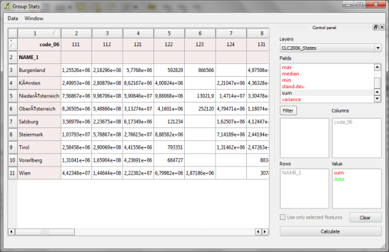
To calculate the total area of of each Corine Land Cover (CLC) class per state, I chose land cover classes as columns, state names as rows and sum of areas as values:

groupstatsclc

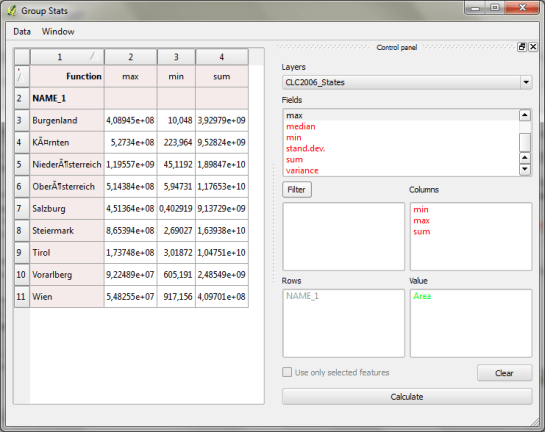
It’s also possible to add multiple functions in the columns/rows input sections to calculate different statistics at once:

groupstats_functions

Group Stats can be used in many cases that otherwise require a Spreadsheet software. The results can be exported to CSV easily. Usability could certainly be improved by allowing common interactions such as removing fields by pressing the delete key or adding fields by double-clicking.

and thank you for a great 2012!

The view counter shows a staggering 250,000 views for last year. If that isn’t a reason to celebrate!

Here’s a quick recap with the top ten posts last year which were split between the two main topics pgRouting and QGIS:

  1. A Beginner’s Guide to pgRouting
  2. Table Joins – A New Feature in QGIS 1.7
  3. How to Specify Data Types of CSV Columns for Use in QGIS
  4. QGIS Server on Windows7 Step-by-step
  5. Osm2po Part 2 – PgRouting on OSM the Easy Way
  6. An osm2po Quickstart
  7. QGIS Server on Ubuntu Step-by-step
  8. Converting MXD to QGIS Project File
  9. Stamen Maps for QGIS
  10. Mapping Density with Hexagonal Grids

All the best for 2013!

So far, QGIS does not come with many default symbols. Quite often one just needs two or three colors that go well together. That’s why I created a series of simple fill symbols based on ColorBrewer. They are available on Github QGIS-resources:

As always, these XMLs can be imported using Style Manager.

polysymbols

Another great addition to QGIS-resources was added this week by user aplannersguide. He shared his styles for osm2pgsql layers:

bdd73ba0-4ad3-11e2-8d74-1327374e522c

This post covers how to add you own tools to expand Sextante’s ftools toolbox.

I was looking through Sextante for a tool that inserts additional nodes into a linestring at intervals of my choice. I couldn’t find that exact tool but I found something similar: Densify Geometries in ftools which adds the same number of nodes to all line segments. So I decided to modify Densify Geometries to fit my requirements.

Ftools scripts (such as DensifyGeometries.py) are located in ~/.qgis/python/plugins/sextante/ftools. To create my modified version, I just copied the original and modified the code to accept a densification interval instead of a number of nodes. Since I didn’t know how to add my new tool to Sextante I contacted the developer mailing list and after a short coffee break I had the answer (thanks Alexander!):

The new algorithm has to be exposed in the provider FToolsAlgorithmProvider.py. To do that: Add an import statement for the new algorithm (using existing statements as examples) and add the algorithm to the list self.alglist in the __init__() method. That’s it!

sextante_with_mytool

Sextante automatically creates the input form you can see in above screenshot. Very handy! And the new tool can be added to geoprocessing models just like any of the original ones.