Archive

Visualization

In the first part of the Movement Data in GIS series, I discussed some of the common issues of modeling movement data in GIS, followed by a recommendation to model trajectories as LinestringM features in PostGIS to simplify analyses and improve query performance.

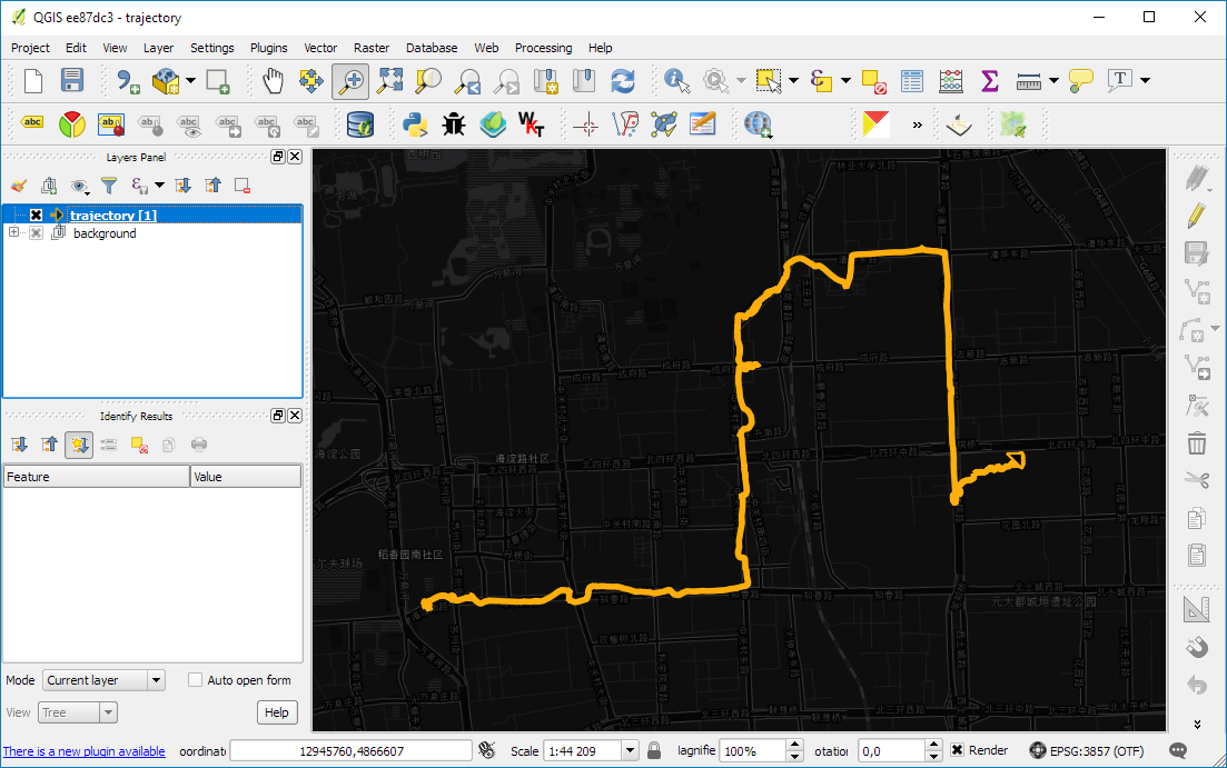
Of course, we don’t only want to analyse movement data within the database. We also want to visualize it to gain a better understanding of the data or communicate analysis results. For example, take one trajectory:

(data credits: GeoLife project)

Visualizing movement direction is easy: just slap an arrow head on the end of the line and done. What about movement speed? Sure! Mean speed, max speed, which should it  be?

Speed along the trajectory, a value for each segment between consecutive positions.

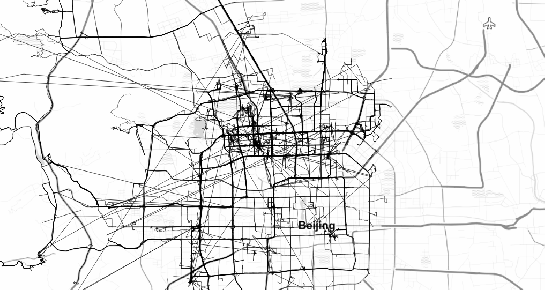
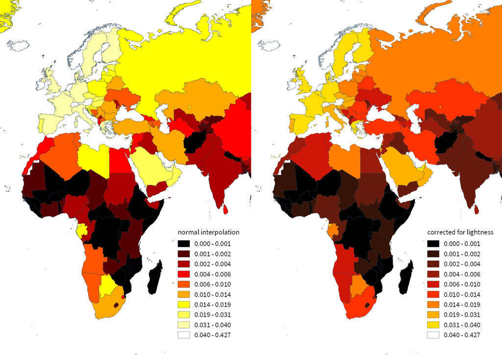
With the usual GIS data model, we are back to square one. A line usually has one color and width. Of course we can create doted and dashed lines but that’s not getting us anywhere here. To visualize speed variations along the trajectory, we therefore split the original trajectory into its segments, 1429 in this case. Then we can calculate speed for each segment and use a graduated or data defined renderer to show the results:

trajectory_segment_features

Speed along trajectory: red = slow to blue = fast

Very unsatisfactory! We had to increase the number of features 1429 times just to show speed variations along the trajectory, even though the original single trajectory feature already contained all the necessary information and QGIS does support geometries with measurement values.

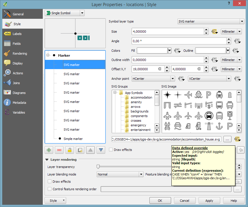
Starting from QGIS 2.14, we have an alternative way to deal with this issue. We can stick to the original single trajectory feature and render it using the new geometry generator symbol layer. (This functionality is also used under the hood of the 2.5D renderer.) Using the segments_to_lines() function, the geometry generator basically creates individual segment lines on the fly:

geomgenerator

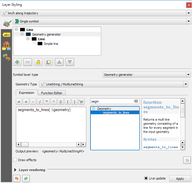
Segments_to_lines( $geometry) returns a multi line geometry consisting of a line for every segment in the input geometry

Once this is set up, we can style the segments with a data-defined expression that determines the speed on the segment and returns the respective color along a color ramp:

segment_speed_color

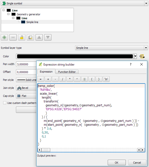
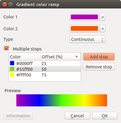
Speed is calculated using the length of the segment and the time between segment start and end point. Then speed values from 0 to 50 km/h are mapped to the red-yellow-blue color ramp:

ramp_color(
  'RdYlBu',
  scale_linear(
    length( 
      transform(
	    geometry_n($geometry,@geometry_part_num),
		'EPSG:4326','ESRI:54027'
		)
    ) / (
      m(end_point(  geometry_n($geometry,@geometry_part_num))) -
      m(start_point(geometry_n($geometry,@geometry_part_num)))
    ) * 3.6,
    0,50,
    0,1
  )
)

Thanks a lot to @nyalldawson for all the help figuring out the details!

While the following map might look just like the previous one in the end, note that we now only deal with the original single line feature:

trajectory_geomgenerator

Similar approaches can be used to label segments or positions along the trajectory without having to break the original feature. Thanks to the geometry generator functionality, we can make direct use of the LinestringM data model for trajectory visualization.


This post is part of a series. Read more about movement data in GIS.

A common use case of the QGIS TimeManager plugin is visualizing tracking data such as animal migration data. This post illustrates the steps necessary to create an animation from bird migration data. I’m using a dataset published on Movebank:

Fraser KC, Shave A, Savage A, Ritchie A, Bell K, Siegrist J, Ray JD, Applegate K, Pearman M (2016) Data from: Determining fine-scale migratory connectivity and habitat selection for a migratory songbird by using new GPS technology. Movebank Data Repository. doi:10.5441/001/1.5q5gn84d.

It’s a CSV file which can be loaded into QGIS using the Add delimited text layer tool. Once loaded, we can get started:

1. Identify time and ID columns

Especially if you are new to the dataset, have a look at the attribute table and identify the attributes containing timestamps and ID of the moving object. In our sample dataset, time is stored in the aptly named timestamp attribute and uses ISO standard formatting %Y-%m-%d %H:%M:%S.%f. This format is ideal for TimeManager and we can use it without any changes. The object ID attribute is titled individual-local-identifier.

movebank_data

The dataset contains 128 positions of 14 different birds. This means that there are rather long gaps between consecutive observations. In our animation, we’ll want to fill these gaps with interpolated positions to get uninterrupted movement traces.

2. Configuring TimeManager

To set up the animation, go to the TimeManager panel and click Settings | Add Layer. In the following dialog we can specify the time and ID attributes which we identified in the previous step. We also enable linear interpolation. The interpolation option will create an additional point layer in the QGIS project, which contains the interpolated positions.

timemanager_settings

When using the interpolation option, please note that it currently only works if the point layer is styled with a Single symbol renderer. If a different renderer is configured, it will fail to create the interpolation layer.

Once the layer is configured, the minimum and maximum timestamps will be displayed in the TimeManager dock right bellow the time slider. For this dataset, it makes sense to set the Time frame size, that is the time between animation frames, to one day, so we will see one frame per day:

timemanager_dock

Now you can test the animation by pressing the TimeManager’s play button. Feel free to add more data, such as background maps or other layers, to your project. Besides exploring the animated data in QGIS, you can also create a video to share your results.

3. Creating a video

To export the animation, click the Export video button. If you are using Linux, you can export videos directly from QGIS. On Windows, you first need to export the animation frames as individual pictures, which you can then convert to a video (for example using the free Windows Movie Maker application).

These are the basic steps to set up an animation for migration data. There are many potential extensions to this animation, including adding permanent traces of past movements. While this approach serves us well for visualizing bird migration routes, it is easy to imagine that other movement data would require different interpolation approaches. Vehicle data, for example, would profit from network-constrained interpolation between observed positions.

If you find the TimeManager plugin useful, please consider supporting its development or getting involved. Many features, such as interpolation, are weekend projects that are still in a proof-of-concept stage. In addition, we have the huge upcoming challenge of migrating the plugin to Python 3 and Qt5 to support QGIS3 ahead of us. Happy QGISing!

Since I’ve started working, transport and movement data have been at the core of many of my projects. The spatial nature of movement data makes it interesting for GIScience but typical GIS tools are not a particularly good match.

Dealing with the temporal dynamics of geographic processes is one of the grand challenges for Geographic Information Science. Geographic Information Systems (GIS) and related spatial analysis methods are quite adept at handling spatial dimensions of patterns and processes, but the temporal and coupled space-time attributes of phenomena are difficult to represent and examine with contemporary GIS. (Dr. Paul M. Torrens, Center for Urban Science + Progress, New York University)

It’s still a hot topic right now, as the variety of related publications and events illustrates. For example, just this month, there is an Animove two-week professional training course (18–30 September 2016, Max-Planck Institute for Ornithology, Lake Konstanz) as well as the GIScience 2016 Workshop on Analysis of Movement Data (27 September 2016, Montreal, Canada).

Space-time cubes and animations are classics when it comes to visualizing movement data in GIS. They can be used for some visual analysis but have their limitations, particularly when it comes to working with and trying to understand lots of data. Visualization and analysis of spatio-temporal data in GIS is further complicated by the fact that the temporal information is not standardized in most GIS data formats. (Some notable exceptions of formats that do support time by design are GPX and NetCDF but those aren’t really first-class citizens in current desktop GIS.)

Most commonly, movement data is modeled as points (x,y, and optionally z) with a timestamp, object or tracker id, and potential additional info, such as speed, status, heading, and so on. With this data model, even simple questions like “Find all tracks that start in area A and end in area B” can become a real pain in “vanilla” desktop GIS. Even if the points come with a sequence number, which makes it easy to identify the start point, getting the end point is tricky without some custom code or queries. That’s why I have been storing the points in databases in order to at least have the powers of SQL to deal with the data. Even so, most queries were still painfully complex and performance unsatisfactory.

So I reached out to the Twitterverse asking for pointers towards moving objects database extensions for PostGIS and @bitnerd, @pwramsey, @hruske, and others replied. Amongst other useful tips, they pointed me towards the new temporal support, which ships with PostGIS 2.2. It includes the following neat functions:

  • ST_IsValidTrajectory — Returns true if the geometry is a valid trajectory.
  • ST_ClosestPointOfApproach — Returns the measure at which points interpolated along two lines are closest.
  • ST_DistanceCPA — Returns the distance between closest points of approach in two trajectories.
  • ST_CPAWithin — Returns true if the trajectories’ closest points of approach are within the specified distance.

Instead of  points, these functions expect trajectories that are stored as LinestringM (or LinestringZM) where M is the time dimension. This approach makes many analyses considerably easier to handle. For example, clustering trajectory start and end locations and identifying the most common connections:

animation_clusters

(data credits: GeoLife project)

Overall, it’s an interesting and promising approach but there are still some open questions I’ll have to look into, such as: Is there an efficient way to store additional info for each location along the trajectory (e.g. instantaneous speed or other status)? How well do desktop GIS play with LinestringM data and what’s the overhead of dealing with it?


This post is part of a series. Read more about movement data in GIS.

This is a guest post by Mickael HOARAU @Oneil974

For those wishing to get a stylized map on QGIS composer, I’ve been working on a tutorial to share with you a project I’m working on. Fan of web design and GIS user since few years, I wanted to merge Material Design Style with Map composer. Here is a tutorial to show you how to make simply a Material Design Map style on QGIS.

This slideshow requires JavaScript.

You can download tutorial here:

Tutorial Material Design Map

And sources here:

Sources Material Design Map

An Atlas Powered version is coming soon!

A previous version of this post has been published in German on Die bemerkenswerte Karte.

Visualizations of mobility data such as taxi or bike sharing trips have become very popular. One of the best most recent examples is cf. city flows developed by Till Nagel and Christopher Pietsch at the FH Potsdam. cf. city flows visualizes the rides in bike sharing systems in New York, Berlin and London at different levels of detail, from overviews of the whole city to detailed comparisons of individual stations:

The visualizations were developed using Unfolding, a library to create interactive maps and geovisualizations in Processing (the other Processing … not the QGIS Processing toolbox) and Java. (I tinkered with the Python port of Processing in 2012, but this is certainly on a completely different level.)

The insights into the design process, which are granted in the methodology section section of the project website are particularly interesting. Various approaches for presenting traffic flows between the stations were tested. Building on initial simple maps, where stations were connected by straight lines, consecutive design decisions are described in detail:

The results are impressive. Particularly the animated trips convey the dynamics of urban mobility very well:

However, a weak point of this (and many similar projects) is the underlying data. This is also addressed directly by the project website:

Lacking actual GPS tracks, the trip trajectories are rendered as smooth paths of the calculated optimal bike routes

This means that the actual route between start and drop off location is not known. The authors therefore estimated the routes using HERE’s routing service. The visualization therefore only shows one of many possible routes. However, cyclists don’t necessarily choose the “best” route as determined by an algorithm – be it the most direct or otherwise preferred. The visualization does not account for this uncertainty in the route selection. Rather, it gives the impression that the cyclist actually traveled on a certain route. It would therefore be undue to use this visualization to derive information about the popularity of certain routes (for example, for urban planning). Moreover, the data only contains information about the fulfilled demand, since only trips that were really performed are recorded. Demand for trips which could not take place due to lack of bicycles or stations, is therefore missing.

As always: exercise some caution when interpreting statistics or visualizations and then sit back and enjoy the animations.

If you want to read more about GIS and transportation modelling, check out
Loidl, M.; Wallentin, G.; Cyganski, R.; Graser, A.; Scholz, J.; Haslauer, E. GIS and Transport Modeling—Strengthening the Spatial Perspective. ISPRS Int. J. Geo-Inf. 2016, 5, 84. (It’s open access.)

FOSS4G2016 is drawing closer quickly. To get in the mood for a week full of of geogeekery, Locate Press is offering a special FOSS4G discount for QGIS Map Design.

Use the code foss4gbonn to get 25% off your copy.

QGIS Map Design is the reference book to get if you want to bring your mapping skills up to speed. The book comes with a download for all our example map projects:

Looking forward to meeting you in Bonn!

If you follow me on Twitter, you’ve probably seen previews of my experiments with round maps. These experiments were motivated by a recent question on GIS.stackexchange whether this type of map can be created in QGIS and while it’s not very convenient right now, it is definitely possible:

http://www.quantarctica.org

All maps in this post are created using data from the Quantarctica project.

I’ve been planing to try the Quantarctica datasets for a long time and this use case is just perfect. When you download and open their project, you’ll see that they have already clipped all datasets to a circle around Antarctica:

Quantarctica project with some custom styling

Quantarctica project with some custom styling

Since the map of the full extent of the dataset is already clipped to a circle, the overview map is easy to deal with. The detail map on the other hand is rectangular by default:

circle_maps_start

Since we cannot change the shape of the map item, we have to use a mask instead. To create a circular mask, we can add an ellipse shape:

circle_maps_addellipse

The main challenge when creating the mask is that there is no inverted polygon renderer for shapes in print composer. I’ve evaluated two workarounds: First, I created a style with a wide white outline that would cover all map parts outside the circle shape. But this solution slowed the print composer down a lot. An alternative, which doesn’t suffer from this slowdown is using draw effects:

circle_maps_mask_style

In particular, I created a big outer glow effect:

circle_maps_mask_style_effect

Note that the effect only works if the symbol itself is not transparent. That’s why I set the symbol fill to black and used the Lighten blending mode:

circle_maps_mask

Voilà! Both maps are nicely circular.

It is worth noting though that this workaround has a downside: it is not possible to create automatic grids/graticules for these maps. The graticule in the overview map only works because it is a layer in the main project that was already clipped to the circular shape.

Finally, you can add more depth to your map by adding shadows. To create the shadow effect, I added additional ellipse items which are styled with a drop shadow draw effect. If you only enable the drop shadow effect, you will notice that the shadow is cut off at the ellipse bounding box. To avoid this undesired effect, you can add a transform effect, which reduces the size of the drawn shape and it’s shadow so that the shadow fits into the bounding box:

circle_maps_mask_shadow_effect

It requires some manual adjustments to place the shadow at the optimal location on top of the mask:

circle_maps_mask_shadow

Add another ellipse to create the shadow for the overview map.

For more cartography tips and tricks check my new book QGIS Map Design or join my QGIS training courses.

Following up on last week’s post, Nyall has continued his work on the QGIS gradient editor:

Latest version of the new QGIS interactive gradient edit. This now includes an interactive plot of the color hue/saturation/lightness/alpha, allowing a visual overview of these color components and easy editing.

Another equally awesome demo has been posted by Nathan, who is currently working on usability improvements for labeling and styling without blocking dialogs:

This is going to be great for map design work because it makes many complex styles much easier to create since you can interact with the map and attribute table at the same time.

These are definitely two developments to follow closely!

Interesting developments going on if you like creating your own gradients. After all, that’s not as easy as it might initially seem, as Gregor Aisch describes in his post “Mastering Multi-hued Color Scales with Chroma.js”:

The issues with simple color interpolations, which include nonuniform changes in lightness between classes, also haunt us in cartography. Just have a look at the map and legend on the left-hand side, which has been created using a normal custom QGIS gradient with colors ranging from black to red, yellow and finally white. We end up with three classes in yellow which are nearly impossible to tell apart:

comparing_ramps

For comparison, on the right side, I’ve used Gregor’s corrected color ramp, which ensures that lightness changes evenly from one class to the next.

Wouldn’t it be great if the built-in gradient tool in QGIS could correct for lightness? Too bad the current dialog is not that great:

My first reaction therefore was to write a short script to import gradients from Gregor’s Chroma.js Color Scale Helper into QGIS:

https://twitter.com/underdarkGIS/status/716389969850404864

But we’ll probably have a much better solution in QGIS soon since Nyall Dawson has picked up the idea and is already working on a completely new version of the gradient tool. You can see a demo of the current work in progress here:

I’m really looking forward to trying this out once it hits master!

Today’s post was motivated by a question on GIS.StackExchange, which is looking for an automated way to symbolize the amenities available at a location using a series of icons, like this:

Screenshot 2016-03-19 23.02.30

Assuming the information is available in  a format similar to this example attribute table

Screenshot 2016-03-19 23.02.00

we can create a symbol, which adapts to the values in the icon columns using data-defined overrides:

Screenshot 2016-03-19 23.04.17

The five potential symbol locations are aligned next to each other using offsets. We use the following expression to determine the correct SVG symbol:

CASE
WHEN "icon4" = 'dinner'
 THEN 'C:/OSGeo4W64/apps/qgis-dev/svg/entertainment/amenity=restaurant.svg'
WHEN "icon4" = 'sleep'
 THEN 'C:/OSGeo4W64/apps/qgis-dev/svg/accommodation/accommodation_hotel2.svg'
WHEN "icon4" = 'ship'
 THEN 'C:/OSGeo4W64/apps/qgis-dev/svg/transport/amenity=ferry_terminal.svg'
WHEN "icon4" = 'house'
 THEN 'C:/OSGeo4W64/apps/qgis-dev/svg/accommodation/accommodation_house.svg'
 ELSE  ''
END

To hide icons if the icon value is NULL, the marker size is set to 0 using, for example:

CASE
WHEN "icon4" is not NULL
 THEN 4
 ELSE 0
END

Finally, to ensure that the labels don’t cover the icons, we can use the cartographic label placement with the position priority set to ‘TR,TL,BL’, which restricts labels to the top right, top left, and bottom left position.

Screenshot 2016-03-19 23.04.43

With these settings in place, we can zoom out and the labeling algorithm picks the most suitable position from the list of allowed positions:

Screenshot 2016-03-19 23.02.11

For more cartography tips and tricks check my new book QGIS Map Design or join my QGIS training courses.