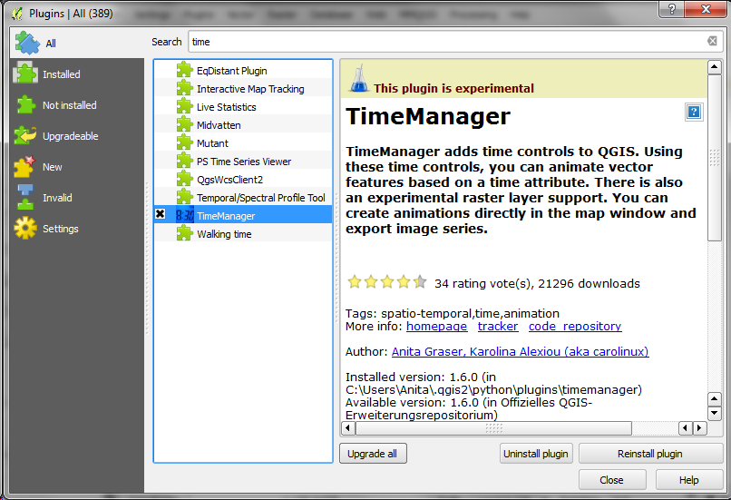
The talk presents QGIS visualization tools with a focus on efficient use of layer styling to both explore and present spatial data. Examples include the recently added heatmap style as well as sophisticated rule-based and data-defined styles. The focus of this presentation is exploring and presenting spatio-temporal data using the Time Manager plugin. A special treat are time-dependent styles using expression-based styling which access the current Time Manager timestamp.
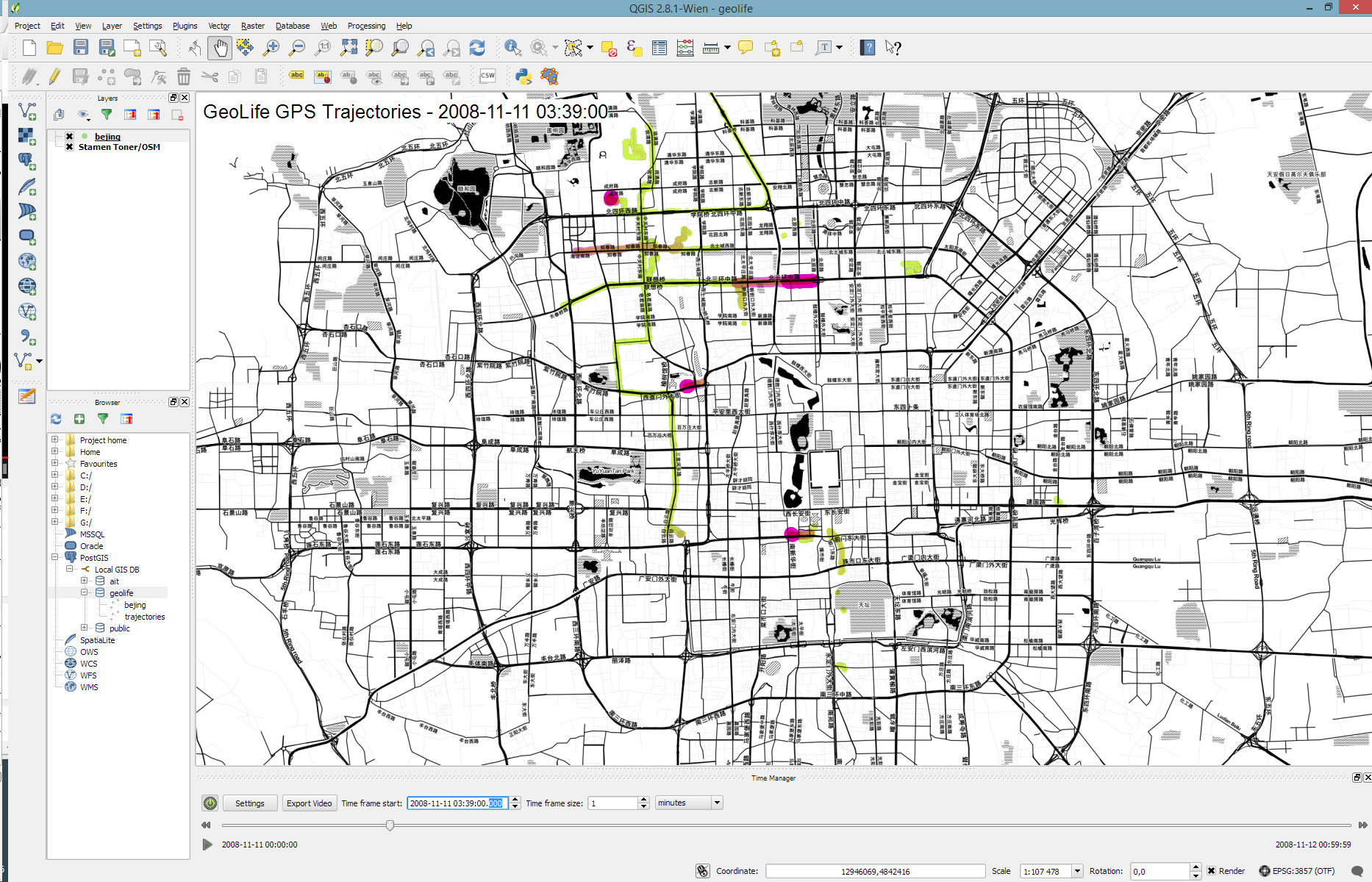
Today’s post is a short tutorial for creating trajectory animations with a fadeout effect using QGIS Time Manager. This is the result we are aiming for:
The animation shows the current movement in pink which fades out and leaves behind green traces of the trajectories.
About the data
GeoLife GPS Trajectories were collected within the (Microsoft Research Asia) Geolife project by 182 users in a period of over three years (from April 2007 to August 2012). [1,2,3] The GeoLife GPS Trajectories download contains many text files organized in multiple directories. The data files are basically CSVs with 6 lines of header information. They contain the following fields:
Field 1: Latitude in decimal degrees.
Field 2: Longitude in decimal degrees.
Field 3: All set to 0 for this dataset.
Field 4: Altitude in feet (-777 if not valid).
Field 5: Date – number of days (with fractional part) that have passed since 12/30/1899.
Field 6: Date as a string.
Field 7: Time as a string.
Data prep: PostGIS
Since any kind of GIS operation on text files will be quite inefficient, I decided to load the data into a PostGIS database. This table of millions of GPS points can then be sliced into appropriate chunks for exploration, for example, a day in Beijing:
CREATE MATERIALIZED VIEW geolife.beijing
AS SELECT trajectories.id,
trajectories.t_datetime,
trajectories.t_datetime + interval '1 day' as t_to_datetime,
trajectories.geom,
trajectories.oid
FROM geolife.trajectories
WHERE st_dwithin(trajectories.geom,
st_setsrid(
st_makepoint(116.3974589,
39.9388838),
4326),
0.1)
AND trajectories.t_datetime >= '2008-11-11 00:00:00'
AND trajectories.t_datetime < '2008-11-12 00:00:00'
WITH DATA
Trajectory viz: a fadeout effect for point markers
The idea behind this visualization is to show both the current movement as well as the history of the trajectories. This can be achieved with a fadeout effect which leaves behind traces of past movement while the most recent positions are highlighted to stand out.
Map tiles by Stamen Design, under CC BY 3.0. Data by OpenStreetMap, under ODbL.
This effect can be created using a Single Symbol renderer with a marker symbol with two symbol layers: one layer serves as the highlights layer (pink) while the second layer represents the traces (green) which linger after the highlights disappear. Feature blending is used to achieve the desired effect for overlapping markers.
The highlights layer has two expression-based properties: color and size. The color fades to white and the point size shrinks as the point ages. The age can be computed by comparing the point’s t_datetime timestamp to the Time Manager animation time $animation_datetime.
[1] Yu Zheng, Lizhu Zhang, Xing Xie, Wei-Ying Ma. Mining interesting locations and travel sequences from GPS trajectories. In Proceedings of International conference on World Wild Web (WWW 2009), Madrid Spain. ACM Press: 791-800.
[2] Yu Zheng, Quannan Li, Yukun Chen, Xing Xie, Wei-Ying Ma. Understanding Mobility Based on GPS Data. In Proceedings of ACM conference on Ubiquitous Computing (UbiComp 2008), Seoul, Korea. ACM Press: 312-321.
[3] Yu Zheng, Xing Xie, Wei-Ying Ma, GeoLife: A Collaborative Social Networking Service among User, location and trajectory. Invited paper, in IEEE Data Engineering Bulletin. 33, 2, 2010, pp. 32-40.
Over the last couple of weeks, Karolina has been very busy improving and expanding Time Manager. This post is to announce the 1.6 release of Time Manager which brings you many fixes and exciting new features.
What’s this feature interpolation you’re talking about?
Interpolation is really helpful if you have multiple observations of the same (moving) real-world object at different points in time and you want to visualize the movement between the observations. This can be used to visualize animal paths, vehicle tracks, or any other movement in space.
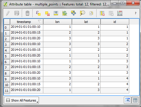
The following example shows a simple layer which contains 12 point features (3 for each id value).
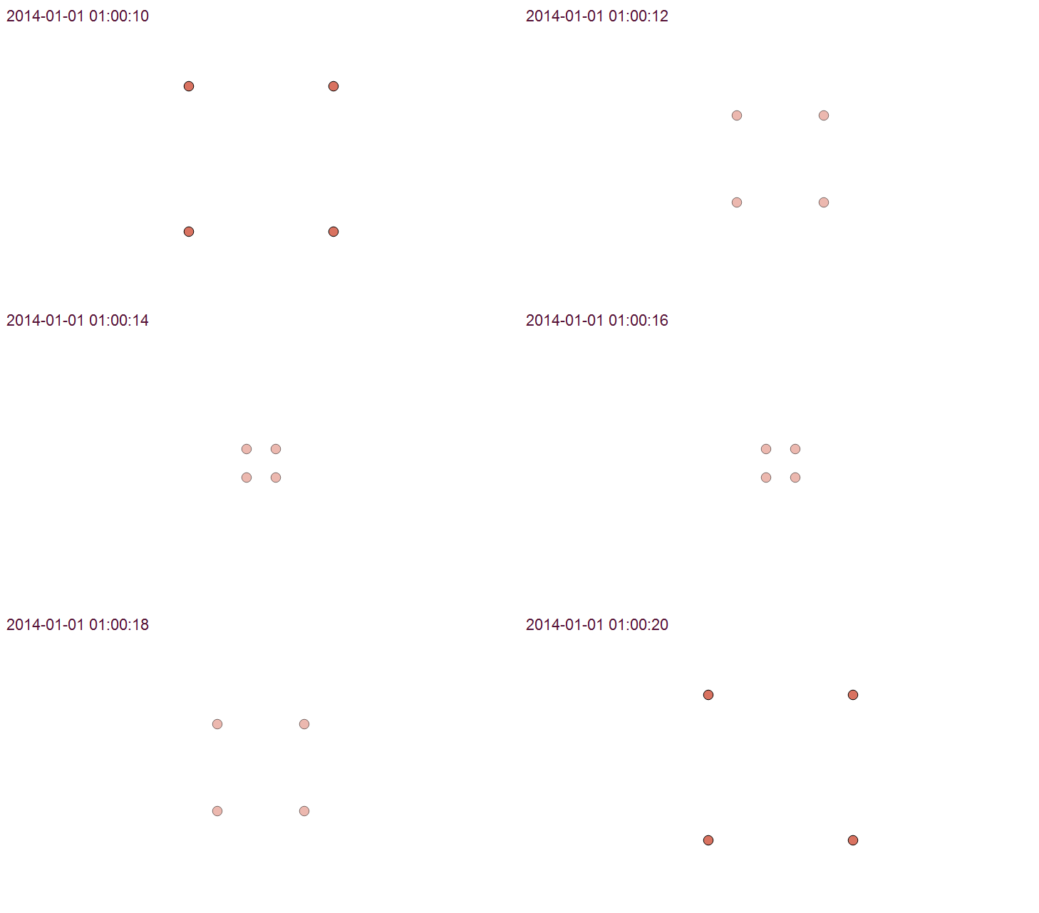
Using Time Manager interpolation, it is easy to create animations with interpolated positions between observations:
How is it done?
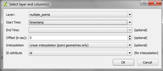
When you open the Time Manager 1.6 Settings | Add layer dialog, you will find a new option for interpolation settings. This first version supports linear interpolation of point features but more options might be added in the future. Note how the id attribute is specified to let Time Manager know which features belong to the same real-world object.
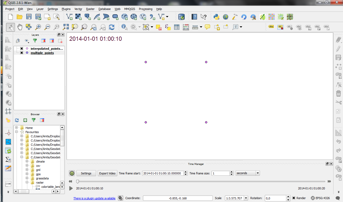
For the interpolation, Time Manager creates a new layer which contains the interpolated features. You can see this layer in the layer list.
I’m really looking forward to seeing all the great animations this feature will enable. Thanks Karolina for making this possible!
Since the 2.8 release is done, the QGIS team has been busy with a small side project: setting up a series of shops for fans of QGIS. Right now, the following shops are available:
North America
There is a US and a Canadian shop. Additionally, there is also the possibility to design your own products (US, Canada).
Europe
There’s also a series of European shops, for example for the UK, Germany, and France. There are more, if Spreadshirt has a site for your country, there’s probably a QGIS shop too.
LTR stands for “Long Term Release”. This means that QGIS now has a system in place to provide a one-year stable release with backported bug fixes. The idea behind LTR is to have a stable platform for enterprises and organizations that don’t want to update their software and training materials more often than once a year. To make the LTR a success, users and developers alike should be aware that bug fixes should be applied to both the LTR branch as well as the normal development branch. If you are interested in the details, you can find more info in the corresponding QGIS Enhancement Proposal.
Users who enjoy working with the cutting-edge version will be able to follow the regular four-monthly release cycle like last year.
What’s new?
This new version comes with many great new features which you can explore in the official visual changelog. It’s really hard to pick but my personal favorites are:
On the layer styling front, there are two great additions: raster image fills and a live heatmap renderer which makes it possible to create dynamic heatmaps on the fly.
We all know that QGIS is great for designing maps but did you know that QGIS is also great for interactive web maps? It is! Just check out qgis2leaf and qgis2threejs.
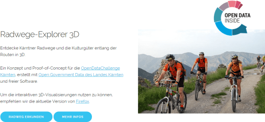
To give these two plugins a test run and learn some responsive web design, I developed a small concept page presenting cycle routes in 3D.
Qgis2leaf makes it possible to generate Leaflet maps from QGIS layers. It provides access to different background maps and it’s easy to replace them in the final HTML file in case you need something more exotic. I also added another layer with custom popups with images but that was done manually.
The web maps use data CC-BY-3.0: Land Kärnten – data.ktn.gv.at
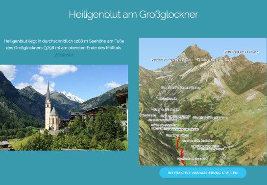
This is a great way to explore elevation data. I also think that the labeling capabilities add an interesting touch. Controlling the 3D environment takes some getting used to, but if you can handle Google Earth in your browser, this is no different.
The issue we have to deal with is there is no gradient line style yet … But there are polygon gradient fills. So we can buffer the line and style the buffers. It’s a bit of an exercise in data-defined styling though:
Before creating the buffer layer, we need to add the coordinates of the line start and end node to the line attributes. This is easy to do using the Field Calculator functions xat and yat, for example xat(0) for the x coordinate of the start node and yat(-1) for the y coordinate of the end node.
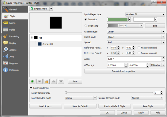
Then we can buffer the lines and start styling the buffers. As mentioned, we’ll use the Gradient fill Symbol layer type.
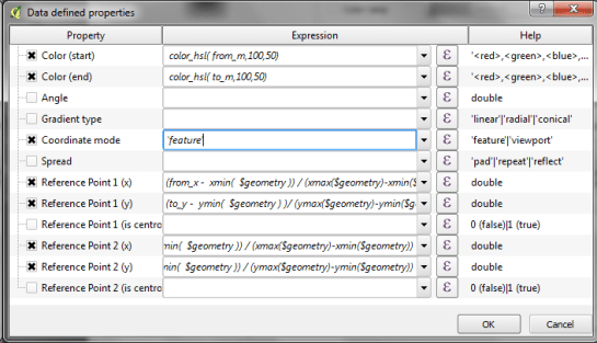
The interesting part happens in the Data-defined properties. The start and end colors are computed from the measurement values from_m and to_m. Next, it’s important to use the feature coordinate mode because this will ensure that the coordinate system for the color gradient is based on the feature extent (with [0,0] in the upper left corner of the feature bbox).
Once that’s set up, we can compute the gradient start and end positions based on the line start and end node locations which we added to the attribute table in the beginning. If you’re wondering why Reference point 1 y is based on to_y (y coordinate of the line end point) rather than from_y, it’s due to the difference in coordinate origins in the geometry and the color gradient coordinate space: [0,0] is the lower left corner for the geometries but the upper left corner for the color gradient.
As the title suggests, this is a really hackish solution for gradient line symbols. It will only provide reasonable results for straight – or close to straight – lines. But I’m very confident that we’ll have a real gradient line style in QGIS sooner or later.
That’s nice but with this approach we only get to enjoy the complete design in the print composer but not in the main window. So what other options do we have? – SVG fills to the rescue!
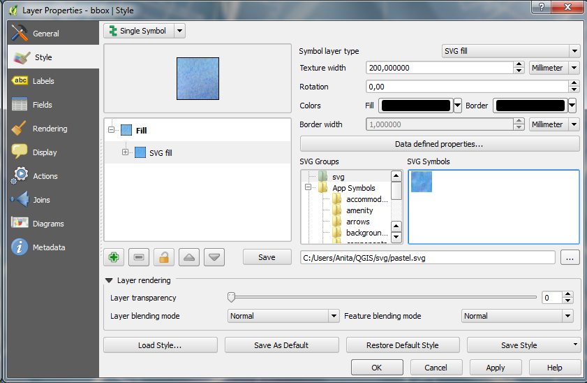
But first we need a suitable SVG with this nice pastel style. I used Gimp to create a seamless version of the pastel image and then embedded the image in an SVG using Inkscape:
In QGIS, this SVG can now be used in any SVG fill. It’s important to set the Texture width setting to a quite high value when working with SVGs containing big textures, otherwise the images will be rendered very small and the repeating patterns will be very obvious.
Once the background is in place, we can add the line work and labels. The roads are white with black outlines for bridges which – together with the Lighten blending mode – produce the desired effect:
It’s the end of December and time to recap 2014. Therefore, I decided to have a look at what this year has brought us. There were plenty of great posts for both casual and power users as well as developers. Here is my pick of the top 10 posts from the QGIS Planet blog aggregator.
More great features and posts are sure to come next year. For example, Nyall is currently running a campaign on Kickstarter to add Live Layer Effects such as drop shadow effects to QGIS. Please support it if you can.