written together with my fellow co-authors and EMERALDS project team members Argyrios Kyrgiazos and Helen McKenzie.
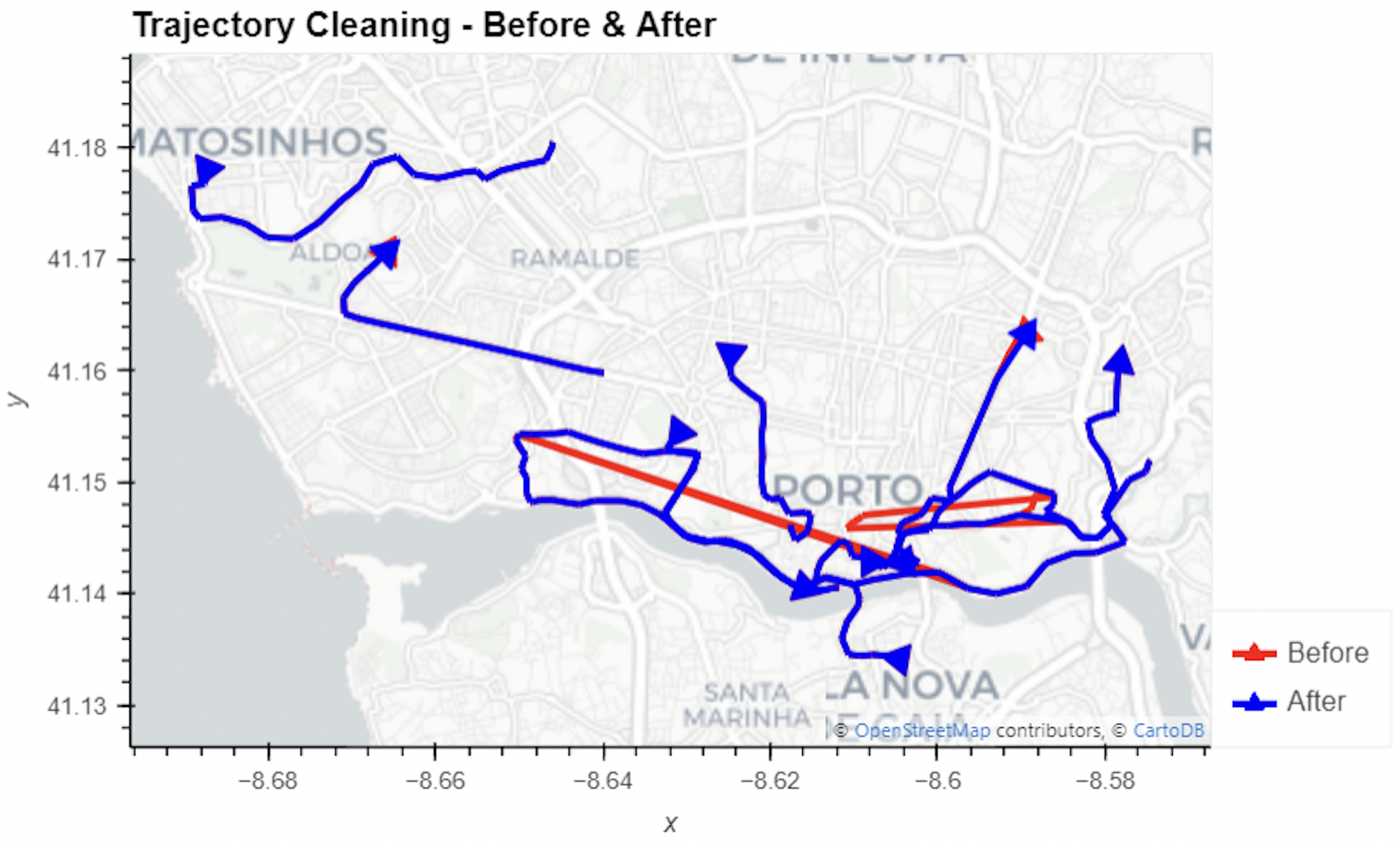
In this blog post, we walk you through a trajectory hotspot analysis using open taxi trajectory data from Kaggle, combining data preparation with MovingPandas (including the new OutlierCleaner illustrated above) and spatiotemporal hotspot analysis from Carto.
In a recent post, we looked into a graph-based model for maritime mobility data and how it may be represented in Neo4J. Today, I want to look into another type of mobility data: public transport schedules in GTFS format.
Since a GTFS export is basically a ZIP archive full of CSVs, we will be making good use of Neo4Js CSV loading capabilities. The basic script for importing the stops file and creating point geometries from lat and lon values would be:
LOAD CSV with headers
FROM "file:///stops.txt"
AS row
CREATE (:Stop {
   stop_id: row["stop_id"],
   name: row["stop_name"],
   location: point({
    longitude: toFloat(row["stop_lon"]),
    latitude: toFloat(row["stop_lat"])
    })
})
This requires that the stops.txt is located in the import directory of your Neo4J database. When we run the above script and the file is missing, Neo4J will tell us where it tried to look for it. In my case, the directory ended up being:
So, let’s put all GTFS CSVs into that directory and we should be good to go.
Let’s start with the agency file:
load csv with headers from
'file:///agency.txt' as row
create (a:Agency {
   id: row.agency_id,
   name: row.agency_name,
   url: row.agency_url,
   timezone: row.agency_timezone,
   lang: row.agency_lang
});
… Added 1 label, created 1 node, set 5 properties, completed after 31 ms.
The routes file does not include agency info but, luckily, there is only one agency, so we can hard-code it:
load csv with headers from
'file:///routes.txt' as row
match (a:Agency {id: "rigassatiksme"})
create (a)-[:OPERATES]->(r:Route {
   id: row.route_id,
   shortName: row.route_short_name,
   longName: row.route_long_name,
   type: toInteger(row.route_type)
});
… Added 81 labels, created 81 nodes, set 324 properties, created 81 relationships, completed after 28 ms.
From stops, I’m removing non-existent or empty columns:
load csv with headers from
'file:///stops.txt' as row
create (s:Stop {
   id: row.stop_id,
   name: row.stop_name,
   location: point({
      latitude: toFloat(row.stop_lat),
      longitude: toFloat(row.stop_lon)
   }),
   code: row.stop_code
});
… Added 1671 labels, created 1671 nodes, set 5013 properties, completed after 71 ms.
From trips, I’m also removing non-existent or empty columns:
load csv with headers from
'file:///trips.txt' as row
match (r:Route {id: row.route_id})
create (r)<-[:USES]-(t:Trip {
   id: row.trip_id,
   serviceId: row.service_id,
   headSign: row.trip_headsign,
   direction_id: toInteger(row.direction_id),
   blockId: row.block_id,
   shapeId: row.shape_id
});
… Added 14427 labels, created 14427 nodes, set 86562 properties, created 14427 relationships, completed after 875 ms.
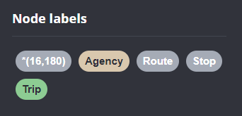
Slowly getting there. We now have around 16k nodes in our graph:
Finally, it’s stop times time. This is where the serious information is. This file is much larger than all previous ones with over 300k lines (i.e. times when an PT vehicle stops).
:auto
load csv with headers from
'file:///stop_times.txt' as row
CALL { with row
match (t:Trip {id: row.trip_id}), (s:Stop {id: row.stop_id})
create (t)<-[:BELONGS_TO]-(st:StopTime {
   arrivalTime: row.arrival_time,
   departureTime: row.departure_time,
   stopSequence: toInteger(row.stop_sequence)})-[:STOPS_AT]->(s)
} IN TRANSACTIONS OF 10 ROWS;
… Added 351388 labels, created 351388 nodes, set 1054164 properties, created 702776 relationships, completed after 1364220 ms.
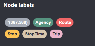
As you can see, this took a while. But now we have all nodes in place:
The final statement adds additional relationships between consecutive stop times:
call apoc.periodic.iterate('match (t:Trip) return t',
'match (t)<-[:BELONGS_TO]-(st) with st order by st.stopSequence asc
with collect(st) as stops
unwind range(0, size(stops)-2) as i
with stops[i] as curr, stops[i+1] as next
merge (curr)-[:NEXT_STOP]->(next)', {batchmode: "BATCH", parallel:true, parallel:true, batchSize:1});
This fails with: There is no procedure with the name apoc.periodic.iterate registered for this database instance. Please ensure you've spelled the procedure name correctly and that the procedure is properly deployed.
So, let’s install APOC. That’s a plugin which we can install into our database from within Neo4J Desktop:
After restarting the db, we can run the query:
No errors. Sounds good.
Let’s have a look at what we ended up with. Here are 25 random Trips. I expanded one of them to show its associated StopTimes. We can see the relations between consecutive StopTimes and I’ve expanded the final five StopTimes to show their linked Stops:
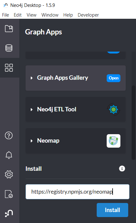
I also wanted to visualize the stops on a map. And there used to be a neat app called Neomap which can be installed easily:
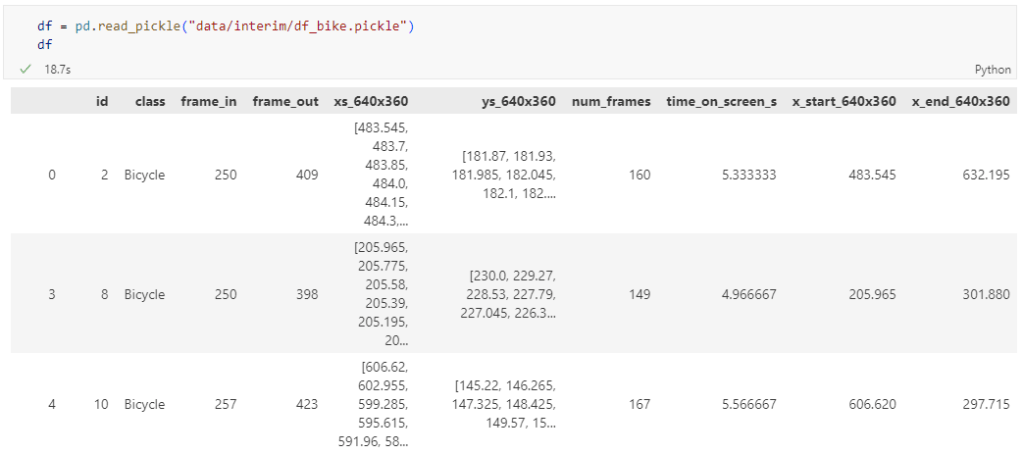
The bicycle trajectory coordinates are stored in two separate lists: xs_640x360 and ys640x360:
This format is kind of similar to the Kaggle Taxi dataset, we worked with in the previous post. However, to use the solution we implemented there, we need to combine the x and y coordinates into nice (x,y) tuples:
Afterwards, we can create the points and compute the proper timestamps from the frame numbers:
def compute_datetime(row):
    # some educated guessing going on here: the paper states that the video covers 2021-06-09 07:00-08:00
    d = datetime(2021,6,9,7,0,0) + (row['frame_in'] + row['running_number']) * timedelta(seconds=2)
    return d
def create_point(xy):
    try:
        return Point(xy)
    except TypeError:  # when there are nan values in the input data
        return None
new_df = df.head().explode('coordinates')
new_df['geometry'] = new_df['coordinates'].apply(create_point)
new_df['running_number'] = new_df.groupby('id').cumcount()
new_df['datetime'] = new_df.apply(compute_datetime, axis=1)
new_df.drop(columns=['coordinates', 'frame_in', 'running_number'], inplace=True)
new_df
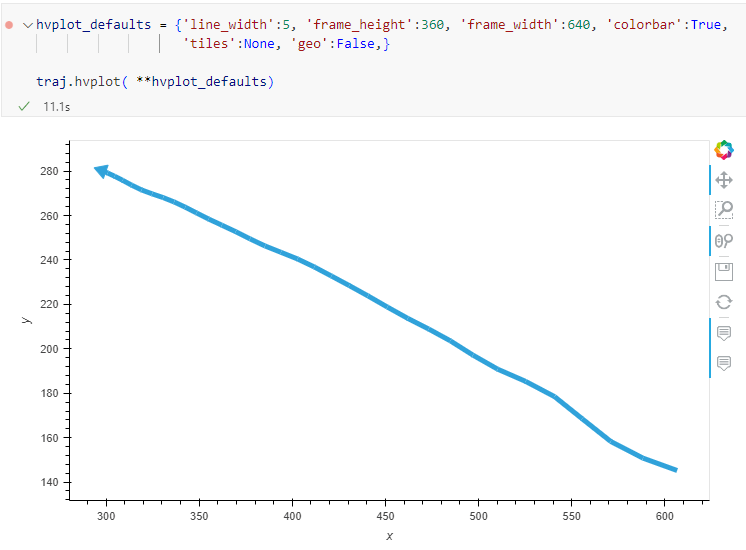
Once the points and timestamps are ready, we can create the MovingPandas TrajectoryCollection. Note how we explicitly state that there is no CRS for this dataset (crs=None):
Similarly, to plot these trajectories, we should tell hvplot that it should not fetch any background map tiles (’tiles’:None) and that the coordinates are not geographic (‘geo’:False):
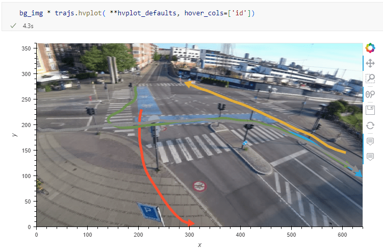
One important caveat is that speed will be calculated in pixels per second. So when we plot the bicycle speed, the segments closer to the camera will appear faster than the segments in the background:
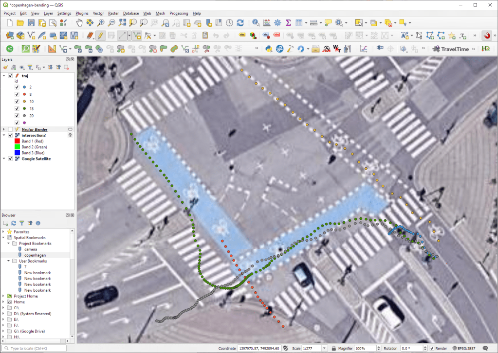
To fix this issue, we would have to correct for the distortions of the camera lens and perspective. I’m sure that there is specialized software for this task but, for the purpose of this post, I’m going to grab the opportunity to finally test out the VectorBender plugin.
Georeferencing the trajectories using QGIS VectorBender plugin
Let’s load the five test trajectories and the camera image to QGIS. To make sure that they align properly, both are set to the same CRS and I’ve created the following basic world file for the camera image:
1
0
0
-1
0
360
Then we can use the VectorBender tools to georeference the trajectories by linking locations from the camera image to locations on aerial images. You can see the whole process in action here:
After around 15 minutes linking control points, VectorBender comes up with the following georeferenced trajectory result:
Not bad for a quick-and-dirty hack. Some points on the borders of the image could not be georeferenced since I wasn’t always able to identify suitable control points at the camera image borders. So it won’t be perfect but should improve speed estimates.
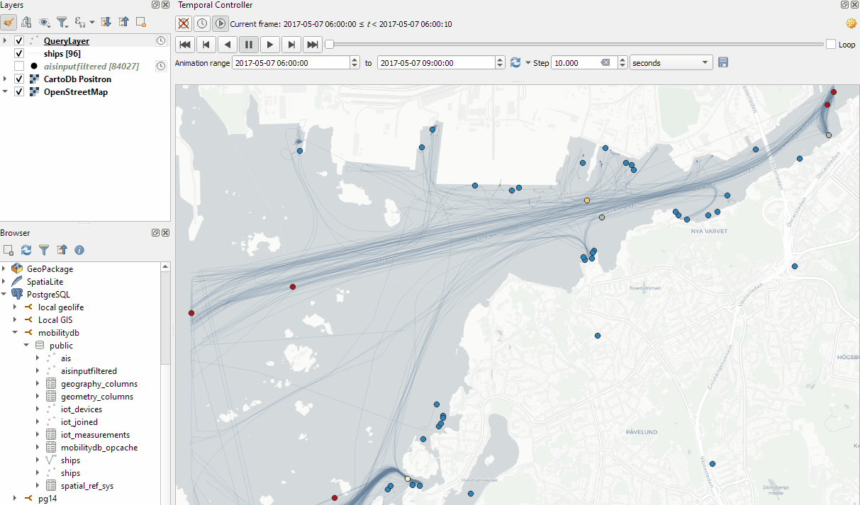
In the previous post, we — creatively ;-) — used MobilityDB to visualize stationary IOT sensor measurements.
This post covers the more obvious use case of visualizing trajectories. Thus bringing together the MobilityDB trajectories created in Detecting close encounters using MobilityDB 1.0 and visualization using Temporal Controller.
Like in the previous post, the valueAtTimestamp function does the heavy lifting. This time, we also apply it to the geometry time series column called trip:
Today’s post presents an experiment in modelling a common scenario in many IOT setups: time series of measurements at stationary sensors. The key idea I want to explore is to use MobilityDB’s temporal data types, in particular the tfloat_inst and tfloat_seq for instances and sequences of temporal float values, respectively.
For info on how to set up MobilityDB, please check my previous post.
Setting up our DB tables
As a toy example, let’s create two IOT devices (in table iot_devices) with three measurements each (in table iot_measurements) and join them to create the tfloat_seq (in table iot_joined):
CREATE TABLE iot_devices (
    id integer,
    geom geometry(Point, 4326)
);

INSERT INTO iot_devices (id, geom) VALUES
(1, ST_SetSRID(ST_MakePoint(1,1), 4326)),
(2, ST_SetSRID(ST_MakePoint(2,3), 4326));

CREATE TABLE iot_measurements (
    device_id integer,
    t timestamp,
    measurement float
);

INSERT INTO iot_measurements (device_id, t, measurement) VALUES
(1, '2022-10-01 12:00:00', 5.0),
(1, '2022-10-01 12:01:00', 6.0),
(1, '2022-10-01 12:02:00', 10.0),
(2, '2022-10-01 12:00:00', 9.0),
(2, '2022-10-01 12:01:00', 6.0),
(2, '2022-10-01 12:02:00', 1.5);

CREATE TABLE iot_joined AS
SELECT
    dev.id,
    dev.geom,
    tfloat_seq(array_agg(
        tfloat_inst(m.measurement, m.t) ORDER BY t
    )) measurements
FROM iot_devices dev
JOIN iot_measurements m
  ON dev.id = m.device_id
GROUP BY dev.id, dev.geom;
We can load the resulting layer in QGIS but QGIS won’t be happy about the measurements column because it does not recognize its data type:
Query layer with valueAtTimestamp
Instead, what we can do is create a query layer that fetches the measurement value at a specific timestamp:
SELECT id, geom,
    valueAtTimestamp(measurements, '2022-10-01 12:02:00')
FROM iot_joined
Which gives us a layer that QGIS is happy with:
Time for TemporalController
Now the tricky question is: how can we wire our query layer to the Temporal Controller so that we can control the timestamp and animate the layer?
I don’t have a GUI solution yet but here’s a way to do it with PyQGIS: whenever the Temporal Controller signal updateTemporalRange is emitted, our update_query_layer function gets the current time frame start time and replaces the datetime in the query layer’s data source with the current time:
l = iface.activeLayer()
tc = iface.mapCanvas().temporalController()

def update_query_layer():
    tct = tc.dateTimeRangeForFrameNumber(tc.currentFrameNumber()).begin().toPyDateTime()
    s = l.source()
    new = re.sub(r"(\d{4})-(\d{2})-(\d{2}) (\d{2}):(\d{2}):(\d{2})", str(tct), s)
    l.setDataSource(new, l.sourceName(), l.dataProvider().name())

tc.updateTemporalRange.connect(update_query_layer)
Future experiments will have to show how this approach performs on lager datasets but it’s exciting to see how MobilityDB’s temporal types may be visualized in QGIS without having to create tables/views that join a geometry to each and every individual measurement.
Cartographers use all kind of tricks to make their maps look deceptively simple. Yet, anyone who has ever tried to reproduce a cartographer’s design using only automatic GIS styling and labeling knows that the devil is in the details.
This post was motivated by Mika Hall’s retro map style.
There are a lot of things going on in this design but I want to draw your attention to the labels – and particularly their background:
Detail of Mike’s map (c) Mike Hall. You can see that the rail lines stop right before they would touch the A in Valencia (or any other letters in the surrounding labels).
This kind of effect cannot be achieved by good old label buffers because no matter which color we choose for the buffer, there will always be cases when the chosen color is not ideal, for example, when some labels are on land and some over water:
Ordinary label buffers are not always ideal.
Label masks to the rescue!
Selective label masks enable more advanced designs.
Here’s how it’s done:
Selective masking has actually been around since QGIS 3.12. There are two things we need to take care of when setting up label masks:
1. First we need to enable masks in the label settings for all labels we want to mask (for example the city labels). The mask tab is conveniently located right next to the label buffer tab:
2. Then we can go to the layers we want to apply the masks to (for example the railroads layer). Here we can configure which symbol layers should be affected by which mask:
Note: The order of steps is important here since the “Mask sources” list will be empty as long as we don’t have any label masks enabled and there is currently no help text explaining this fact.
I’m also using label masks to keep the inside of the large city markers (the ones with a star inside a circle) clear of visual clutter. In short, I’m putting a circle-shaped character, such as ◍, over the city location:
In the text tab, we can specify our one-character label and – later on – set the label opacity to zero.To ensure that the label stays in place, pick the center placement in “Offset from Point” mode.
Once we are happy with the size and placement of this label, we can then reduce the label’s opacity to 0, enable masks, and configure the railroads layer to use this mask.
As a general rule of thumb, it makes sense to apply the masks to dark background features such as the railways, rivers, and lake outlines in our map design:
Resulting map with label masks applied to multiple labels including city and marine area labels masking out railway lines and ferry connections as well as rivers and lake outlines.
If you have never used label masks before, I strongly encourage you to give them a try next time you work on a map for public consumption because they provide this little extra touch that is often missing from GIS maps.
Here’s a quick preview of the resulting app in action:
To create this app, I defined a single function called my_plot which takes the address and desired buffer size as input parameters. Using Panel’s interact and servable methods, I’m then turning this function into the interactive app you’ve seen above:
To open the Panel preview, press the green Panel button in the Jupyter Lab toolbar:
I really enjoy building spatial data exploration apps this way, because I can start off with a Jupyter notebook and – once I’m happy with the functionality – turn it into a pretty app that provides a user-friendly exterior and hides the underlying complexity that might scare away stakeholders.
Give it a try and share your own adventures. I’d love to see what you come up with.
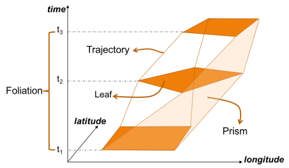
The MovingPoint example seems to describe a storm, including its path (temporalGeometry), pressure, wind strength, and class values (temporalProperties):
You can give the current implementation a spin using this MyBinder notebook
An exciting future step would be to experiment with extending MovingPandas to support the MovingPolygon MF-JSON examples. MovingPolygons can change their size and orientation as they move. I’m not yet sure, however, if the number of polygon nodes can change between time steps and how this would be reflected by the prism concept presented in the draft specification:
As an update of the tutorial from previous years, I created a tutorial showing how to make a simple and dynamic color map with charts in QGIS.
In this tutorial you can see some of interesting features of QGIS and its community plugins. Here you’ll see variables, expressions, filters, QuickOSM and DataPlotly plugins and much more. You just need to use QGIS 3.24 Tisler version.
Many of you certainly have already heard of and/or even used Leafmap by Qiusheng Wu.
Leafmap is a Python package for interactive spatial analysis with minimal coding in Jupyter environments. It provides interactive maps based on folium and ipyleaflet, spatial analysis functions using WhiteboxTools and whiteboxgui, and additional GUI elements based on ipywidgets.
This way, Leafmap achieves a look and feel that is reminiscent of a desktop GIS:
Recently, Qiusheng has started an additional project: the geospatial meta package which brings together a variety of different Python packages for geospatial analysis. As such, the main goals of geospatial are to make it easier to discover and use the diverse packages that make up the spatial Python ecosystem.
Besides the usual suspects, such as GeoPandas and of course Leafmap, one of the packages included in geospatial is MovingPandas. Thanks, Qiusheng!
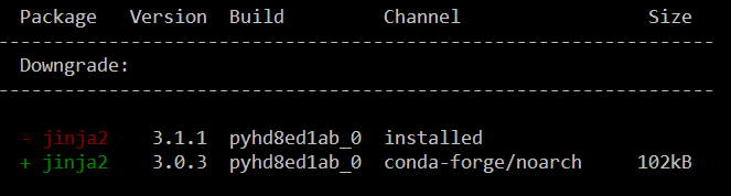
I’ve tested the mamba install today and am very happy with how this worked out. There is just one small hiccup currently, which is related to an upstream jinja2 issue. After installing geospatial, I therefore downgraded jinja:
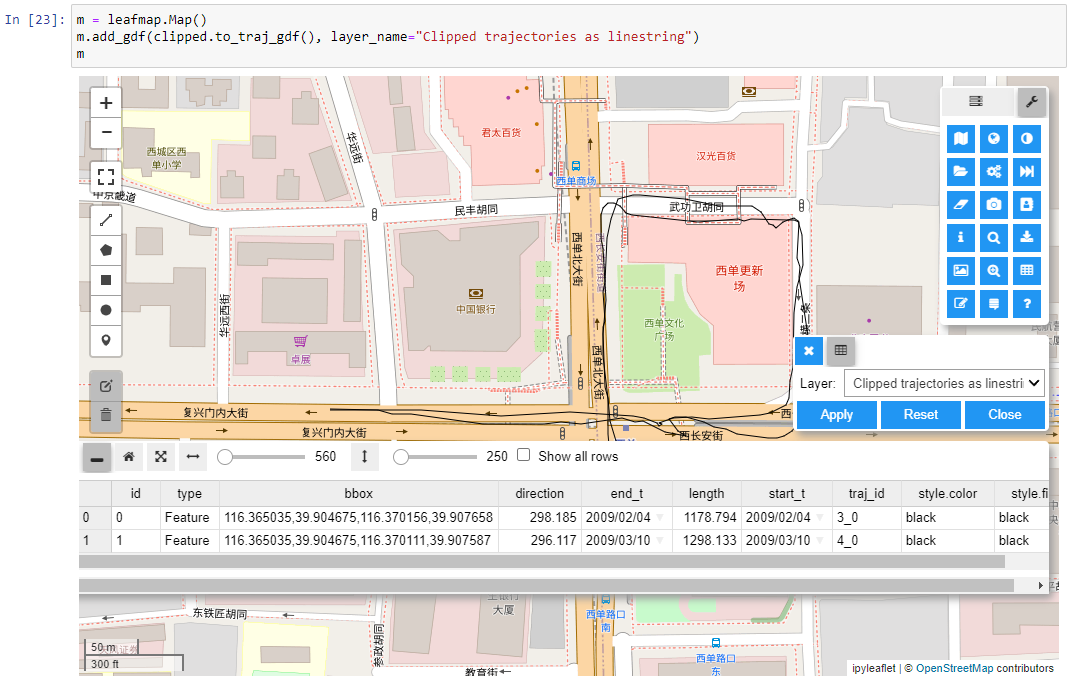
Of course, I had to try Leafmap and MovingPandas in action together. Therefore, I fired up one of the MovingPandas example notebook (here the example on clipping trajectories using polygons). As you can see, the integration is pretty smooth since Leafmap already support drawing GeoPandas GeoDataFrames and MovingPandas can convert trajectories to GeoDataFrames (both lines and points):
Clipped trajectory segments as linestrings in LeafmapLeafmap includes an attribute table view that can be activated on user request to show, e.g. trajectory informationAnd, of course, we can also map the original trajectory points
Geospatial also includes the new dask-geopandas library which I’m very much looking forward to trying out next.