The QGISUC2025 team has done an awesome job recording and editing the conference presentations. All “presentation” type talks where the presenter has accepted to be published are now available in a dedicated list on the QGIS Youtube channel.
I also had the pleasure of presenting our Trajectools plugin and you can see this talk here:
Thank you to all the organizers, speakers, and participants for the great time!
The latest releases of MovingPandas and Trajectools come with many “under the hood” changes that aim to make your movement analytics faster:
Instead of immediately creating a GeoPandas GeoDataFrame and populating the geometry column with Point objects, MovingPandas now has “lazy geometry column creation” that holds off on this operation until / if the geometries are actually needed. This way, for many operations, no geometry objects have to be generated at all.
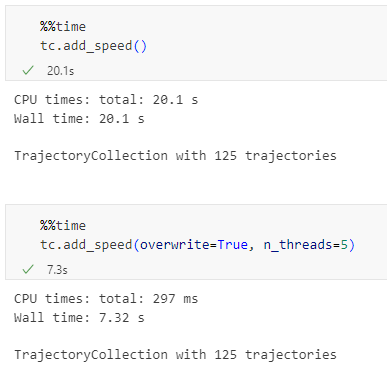
MovingPandas TrajectorySplitters now support parallel processing and Trajectools uses parallel processing whenever available (e.g. for adding speed & direction metrics, detecting stops, splitting trajectories).
When a minimum length is specified for trajectories, MovingPandas now avoids computing the total trajectory length and, instead, immediately stops once the threshold value has been reached (“early skip”).
Trajectools now offers the option to skip computation of movement metrics (speed & direction). This way, we can skip unnecessary computations and leverage the lazy geometry column creation, wherever applicable.
Let’s have a look at some example performance measurements!
Example 1: MovingPandas ValueChangeSplitter
The ValueChangeSplitter splits trajectories when it detects a value change in the specified column. This is useful, for example, to split up public trajectories that contain a “next_stop” column.
The following graph shows ValueChangeSplitter runtimes for different minimum trajectory length settings (from 0 to 1km, 100km, and 10,000km):
We see that the new, lazy geometry column initialization outperforms the old original code in all cases (e.g. 57% runtime reduction for 1km), except for the worst-case scenario, when the original implementation discards all trajectories as too short right from the start. (For most use cases, min_length will be set to rather small values to avoid creation of undesired short trajectory fragments, similar to sliver polygons in classic geometry operations.)
Additionally, we can engage multiprocessing by setting the n_processes parameter, e.g. to the number of CPUs to achieve further speedup:
Example 2: Trajectools
By applying all above-mentioned speedup techniques, Trajectools is now considerably faster. For example, the following runtime reductions can be achieved by deactivating the “Add movement metrics (speed, direction)” option in the algorithm dialog:
Create trajectories: 62%
Spatiotemporal generalization (TDTR): 78%
Temporal generalization: 81%
Split trajectories at stops: 53%
I have also updated the default trajectory points output style. It now uses a graduated renderer to visualize the speed values (if they have been calculated) instead of the previously used data-defined override. This makes the style faster to customize and provides a user-friendly legend:
At the end of yesterday’s TimeGPT for mobility post, we concluded that TimeGPT’s trainingset probably included a copy of the popular BikeNYC timeseries dataset and that, therefore, we were not looking at a fair comparison.
Naturally, it’s hard to find mobility timeseries datasets online that haven’t been widely disseminated and therefore may have slipped past the scrapers of foundation model builders.
So I scoured the Austrian open government data portal and came up with a bike-share dataset from Vienna.
Here are eight of the 120 stations in the dataset. I’ve resampled the number of available bicycles to the maximum hourly value and made a cutoff mid August (before a larger data collection cap and the less busy autumn and winter seasons):
Models
To benchmark TimeGPT, I computed different baseline predictions. I used statsforecast’s HistoricAverage, SeasonalNaive, and AutoARIMA models and computed predictions for horizons of 1 hour, 12 hours, and 24 hours.
Here are examples of the 12-hour predictions:
We can see how Historic Average is pretty much a straight line of the average past value. A little more sophisticated, SeasonalNaive assumes that the future will be a repeat of the past (i.e. the previous day), which results in the shifted curve we can see in the above examples. Finally, there’s AutoARIMA which seems to do a better job than the first two models but also takes much longer to compute.
For comparison, here’s TimeGPT with 12 hours horizon:
In the following table, you’ll find the best model highlighted in bold. Unsurprisingly, this best model is for the 1 hour horizon. The best models for 12 and 24 hours are marked in italics.
Model
Horizon
RMSE
HistoricAverage
1
7.0229
HistoricAverage
12
7.0195
HistoricAverage
24
7.0426
SeasonalNaive
1
7.8703
SeasonalNaive
12
7.7317
SeasonalNaive
24
7.8703
AutoARIMA
1
2.2639
AutoARIMA
12
5.1505
AutoARIMA
24
6.3881
TimeGPT
1
2.3193
TimeGPT
12
4.8383
TimeGPT
24
5.6671
AutoARIMA and TimeGPT are pretty closely tied. Interestingly, the SeasonalNaive model performs even worse than the very simple HistoricAverage, which is an indication of the irregular nature of the observed phenomenon (probably caused by irregular restocking of stations, depending on the system operator’s decisions).
Conclusion & next steps
Overall, TimeGPT struggles much more with the longer horizons than in the previous BikeNYC experiment. The error more than doubled between the 1 hour and 12 hours prediction. TimeGPT’s prediction quality barely out-competes AutoARIMA’s for 12 and 24 hours.
I’m tempted to test AutoARIMA for the BikeNYC dataset to further complete this picture.
Of course, the SharedMobility.ai dataset has been online for a while, so I cannot be completely sure that we now have a fair comparison. For that, we would need a completely new / previously unpublished dataset.
tldr; Maybe. Preliminary results certainly are impressive.
Introduction
Crowd and flow predictions have been very popular topics in mobility data science. Traditional forecasting methods rely on classic machine learning models like ARIMA, later followed by deep learning approaches such as ST-ResNet.
More recently, foundation models for timeseries forecasting, such as TimeGPT, Chronos, and LagLlama have been introduced. A key advantage of these models is their ability to generate zero-shot predictions — meaning that they can be applied directly to new tasks without requiring retraining for each scenario.
In this post, I want to compare TimeGPT’s performance against traditional approaches for predicting city-wide crowd flows.
In the first version, I applied TimeGPT’s historical forecast function to generate flow predictions. However, there was an issue: the built-in historic forecast function ignores the horizon parameter, thus making it impossible to control the horizon and make a fair comparison.
Refinements
In the second version, I therefore added backtesting with customizable forecast horizon to evaluate TimeGPT’s forecasts over multiple time windows.
To reproduce the original experiments as truthfully as possible, both inflows and outflows were included in the experiments.
I ran TimeGPT for different forecasting horizons: 1 hour, 12 hours, and 24 hours. (In the original paper (Zhang et al. 2017), only one-step-ahead (1 hour) forecasting is performed but it is interesting to explore the effects of the additional challenge resulting from longer forecast horizons.) Here’s an example of the 24-hour forecast:
The predictions pick up on the overall daily patterns but the peaks are certainly hit-and-miss.
For comparison, here are some results for the easier 1-hour forecast:
Not bad. Let’s run the numbers! (And by that I mean: let’s measure the error.)
Results
The original paper provides results (RMSE, i.e. smaller is better) for multiple traditional ML models and DL models. Addition our experiments to these results, we get:
Model
RMSE
ARIMA
10.56
SARIMA
10.07
VAR
9.92
DeepST-C
8.39
DeepST-CP
7.64
DeepST-CPT
7.56
DeepST-CPTM
7.43
ST-ResNet
6.33
TimeGPT (horizon=1)
5.70
TimeGPT (horizon=12)
7.62
TimeGPT (horizon=24)
8.93
Key takeaways
TimeGPT with a 1 hour horizon outperforms all ML and DL models.
For longer horizons, TimeGPT’s accuracy declines but remains competitive with DL approaches.
TimeGPT’s pre-trained nature means that we can immediately make predictions without any prior training.
Conclusion & next steps
These preliminary results suggest that timeseries foundation models, such as TimeGPT, are a promising tool. However, a key limitation of the presented experiment remains: since BikeNYC data has been public for a long time, it is well possible that TimeGPT has seen this dataset during its training. This raises questions about how well it generalizes to truly unseen datasets. To address this, the logical next step would be to test TimeGPT and other foundation models on an entirely new dataset to better evaluate its robustness.
We also know that DL model performance can be improved by providing more training data. It is therefore reasonable to assume that specialized DL models will outperform foundation models once they are trained with enough data. But in the absence of large-enough training datasets, foundation models can be an option.
In today’s post, we (that is, Gaspard Merten from Universite Libre de Bruxelles and yours truly) are going to dive deep into how to analyze public transport data, using both schedule and real time information. This collaboration has been made possible by the EMERALDS project.
Today, we’ll discuss the aspect of handling realtime GTFS data and how we approach analytics that combine both data sources.
About Realtime GTFS
Many of us have come to rely on real-time public transport updates in apps like Google Maps. These apps are powered by standardized data formats that ensure different systems can communicate. Google first introduced GTFS in 2005, a format designed to organize transit schedules, stop locations, and other static transit information. Then, in 2011, they introduced GTFS Realtime (GTFS-RT), which added the capability to include live updates on vehicle positions, delays, speeds, and much more.
However, as the name suggests, GTFS Realtime is all about live data. This means that while GTFS-RT APIs are useful for providing real-time insights, they don’t hold historical data for analytics. Moreover, most transit agencies don’t keep past GTFS-RT records, and even fewer make them available to the public. This can be a significant challenge for anyone looking to analyze past trends and extract valuable insights from the data. For this reason, we had to implement our own solution to efficiently archive GTFS-RT files while making sure the files could be queried easily.
There are two main challenges in the implementation of such a solution:
Data Volume: While individual GTFS-RT files are relatively small—typically ranging from 50KB to 500KB depending on the public transport network size—the challenge lies in ingestion frequency. With an average file size of 100KB and updates every 5 seconds, a full day’s worth of data quickly scales up to 1.728GB.
Data Usability: GTFS-RT is a deeply nested format based on Protobuf, making direct conversion into a more accessible structure like a DataFrame difficult. Efficiently unnesting the data without losing critical details would significantly improve usability and streamline analysis.
Parquet to the Rescue
Storing and analyzing real-time transit data efficiently isn’t just about saving space—it’s about making the data easy to work with. Luckily, modern data formats have come a long way, allowing us to store massive amounts of data while keeping retrieval and analytics processing fast. One of the best tools for the job is Apache Parquet, a columnar storage format originally designed for Hadoop but now widely adopted in data science. With built-in support in libraries like Polars and Pandas, it’s become a go-to choice for handling large datasets efficiently. Moreover, Parquet can be converted to GeoParquet for smoother integration with GIS such as GeoPandas.
What makes Parquet particularly well-suited for GTFS Realtime data is the way it compresses columnar data. It leverages multiple compression algorithms and encodings, significantly reducing file sizes while keeping access speeds high. However, to get the most out of Parquet’s compression, we need to be smart about how we structure our data. Simply converting each GTFS-RT file into its own Parquet file might give us around 60% compression, which is decent. But if we group all GTFS-RT records for an entire hour into a single file, we can push that number up to 95%. The reason? A lot of transit data—like trip IDs and stop locations—doesn’t change much within an hour, while other values, such as coordinates, often share common elements. By organizing data in larger batches, we allow Parquet’s compression algorithms to work their magic, drastically reducing storage needs. And with a smaller disk footprint, retrieval is faster, making the entire analytics pipeline more efficient.
One more challenge to tackle is the structure of the data itself. GTFS-RT files tend to be highly nested, which isn’t an issue for Parquet but can be problematic for most data science tools. While Parquet technically supports nested structures, many analytical frameworks don’t handle them well. To fix this, we apply a lightweight preprocessing step to “unnest” the data. In the original GTFS-RT format, the vehicle position feed is deeply nested, making it difficult to work with. But once unnesting is applied, the structure becomes flat, with clear column names derived from the original hierarchy. This makes it easy to convert the data into a table format, ensuring smooth integration with tools commonly used by data scientists.
The GTFS-RT Pipelines
With this in mind, let’s walk through the two pipelines we built to store and retrieve GTFS-RT data efficiently.
The entire system relies on two key pipelines that work together. The first pipeline fetches GTFS-RT data from an API every five seconds, processes it, and stores it in an S3 bucket. The second pipeline runs hourly, gathering all the individual files from the past hour, merging them into a single Parquet file, and saving it back to the bucket in a structured format. We will now take a look at each pipeline in more detail.
Pipeline 1: Fetching and Storing Data
The first step in the process is retrieving GTFS-RT data. This is done via an API, which returns files in the Protocol Buffer (ProtoBuf) format. Fortunately, Google provides libraries (such as gtfs-realtime-bindings) that make it easy to parse ProtoBuf and convert it into a more accessible format like JSON.
Once we have the data in JSON format, we need to split it based on entity type. GTFS-RT files contain different types of data, such as TripUpdate, which provides updated arrival times for stops, and VehiclePosition, which tracks real-time locations and speeds. Not all GTFS-RT feeds contain every entity type, but TripUpdate and VehiclePosition are the most commonly used. The full list of entity types can be found in the GTFS Realtime documentation.
We separate entity types because they have different schemas, making it difficult to store them in a single Parquet file. Keeping each entity type separate not only improves organization but also enhances compression efficiency. Once split, we apply the same unnesting process as described earlier, ensuring the data is structured in a way that’s easy to analyze. After that, we convert the data into a data frame and store it as a Parquet file in memory before uploading it to an S3 bucket. The files follow a structured naming convention like this:
This format makes it easy to navigate the storage bucket manually while also ensuring seamless integration with the second pipeline.
Pipeline 2: Merging and Optimizing Storage
The second pipeline’s job is to take all the small Parquet files generated by Pipeline 1 and merge them into a single, optimized file per hour. To do this, it scans the storage bucket for the earliest unprocessed “hour folder” and begins processing from there. This design ensures that if the pipeline is temporarily interrupted, it can easily resume without skipping any data.
Once it identifies the files to merge, the pipeline loads them, assigns a proper timestamp to each record, and concatenates them into a single Parquet table. The final file is then uploaded to the S3 bucket using the following naming convention:
{feed_type}/YYYY-MM-DD/hour/HH.parquet
If any files fail to merge, they are renamed with the prefix unmerged_{date-isoformat}.parquet for manual inspection. After successfully storing the merged file, the pipeline deletes the individual files to keep storage clean and avoid unnecessary clutter.
One critical advantage of converting GTFS-RT data into Parquet early in the process is that it prevents memory overload. If we had to merge raw GTFS-RT files instead of pre-converted Parquet files, we would likely run into memory constraints, especially on standard servers with limited RAM. This makes Parquet not just a storage solution but an enabler of efficient large-scale processing.
Ready for Analytics
In this section, we will explore how to use the GTFS-RT data for public transport analytics. Specifically, we want to compute delays, that is, the difference between the scheduled travel time and the real travel time.
The previously created Parquet files can be loaded into QGIS as tables without geometries. To turn them into point layers, we use the “Create points layer from table” algorithm from the Processing “Vector creation” toolbox. And once we convert the unixtimes to datetimes (using the datetime_from_epoch function), we have a point layer that is ready for use in Trajectools.
Let’s have a look at one bus route. Bus 3 is one of the busiest routes in Riga. We apply a filter to the point layer which reveals the location of the route.
Computing segment travel times
Computing travel times on public transport segments, i.e. between two scheduled stops, comes with a couple of challenges:
The GTFS-RT location updates are provided in a rather sparse fashion with irregular reporting intervals. It is not clear that we “see” every stop that happens.
We cannot rely solely on stop detection since, sometimes, a vehicle will not come to a halt at scheduled stop locations (if nobody wants to get off or on)
The stop ID, representing the next stop the vehicle will visit, is not always exact. Updates are often delayed and happen some time after passing the stop.
Here’s an example visualization of the stop ID information of a single trip of bus 3, overlaid on top of the GTFS route and stops (in red):
To compute the desired delays, we decided to compare GTFS-RT travel times based on stop ID info with the scheduled travel times. To get the GTFS-RT travel times, we use Trajectools and create trajectories by splitting at stop ID change using the Split by value change algorithm:
Computing delays
The final step is to compute travel time differences between schedule and real time. For this, we implemented a SQL join that matches GTFS-RT trajectories with the corresponding entry in the GTFS schedule using route information and temporal information:
The temporal information is important since the schedule accounts for different travel times during peak hours and off peak:
This information is extracted from the GTFS schedule using the Trajectools Extract segments algorithm, if we chose the “Add scheduled speeds” option:
This will add the time windows, speeds, and runtimes per segment to the resulting segment layer:
Joining the GTFS-RT trajectories with the scheduled segment information, we compute delays for every segment and trip. For example, here are the resulting delays for trip ‘AUTO3-18-1-240501-ab-2230’:
Red lines mark segments where time is lost compared to the schedule, while blue lines indicate that the vehicle traversed the segment faster than the schedule suggested.
What’s next
When interpreting the results, it is important to acknowledge the effects caused by the timing of the next stop ID updates in the real-time GTFS feed. Sometimes, these updates come very late and thus introduce distortions where one segment’s travel time gets too long and the other too short.
We will continue refining the analytics and related libraries, including the QGIS Trajectools plugin, to facilitate analytics of GTFS-RT & GTFS.
After successful testing of this analytics approach in Riga, we aim to transfer it to other cities. But for this to work, public transport companies need ways to efficiently store their data and, ideally, to release them openly to allow for analysis.
The pipelines we described, help keep storage needs low, which allows us to drastically reduce costs (for a year we would only have a few gigabytes, which is inexpensive to store in S3 storage). Let us know if you would be interested in an online platform on which one could register a GTFS-RT feed & GTFS, which would then automatically start being archived (in exchange, the provider would only need to accept sharing the archives as open data, at no cost for them).
Today marks the release of Trajectools 2.3 which brings a new set of algorithms, including trajectory generalizing, cleaning, and smoothing.
To give you a quick impression of what some of these algorithms would be useful for, this post introduces a trajectory preprocessing workflow that is quite general-purpose and can be adapted to many different datasets.
We start out with the Geolife sample dataset which you can find in the Trajectools plugin directory’s sample_data subdirectory. This small dataset includes 5908 points forming 5 trajectories, based on the trajectory_id field:
We first split our trajectories by observation gaps to ensure that there are no large gaps in our trajectories. Let’s make at cut at 15 minutes:
This splits the original 5 trajectories into 11 trajectories:
When we zoom, for example, to the two trajectories in the north western corner, we can see that the trajectories are pretty noisy and there’s even a spike / outlier at the western end:
If we label the points with the corresponding speeds, we can see how unrealistic they are: over 300 km/h!
Let’s remove outliers over 50 km/h:
Better but not perfect:
Let’s smooth the trajectories to get rid of more of the jittering.
(You’ll need to pip/mamba install the optional stonesoup library to get access to this algorithm.)
Depending on the noise values we chose, we get more or less smoothing:
Let’s zoom out to see the whole trajectory again:
Feel free to pan around and check how our preprocessing affected the other trajectories, for example:
If you downloaded Trajectools 2.1 and ran into troubles due to the introduced scikit-mobility and gtfs_functions dependencies, please update to Trajectools 2.2.
This new version makes it easier to set up Trajectools since MovingPandas is pip-installable on most systems nowadays and scikit-mobility and gtfs_functions are now truly optional dependencies. If you don’t install them, you simply will not see the extra algorithms they add:
If you encounter any other issues with Trajectools or have questions regarding its usage, please let me know in the Trajectools Discussions on Github.
Last week, I had the pleasure to meet some of the people behind the OGC Moving Features Standard Working group at the IEEE Mobile Data Management Conference (MDM2024). While chatting about the Moving Features (MF) support in MovingPandas, I realized that, after the MF-JSON update & tutorial with official sample post, we never published a complete tutorial on working with MF-JSON encoded data in MovingPandas.
The current MovingPandas development version (to be release as version 0.19) supports:
Reading MF-JSON MovingPoint (single trajectory features and trajectory collections)
Writing MovingPandas Trajectories and TrajectoryCollections to MF-JSON MovingPoint
This means that we can now go full circle: reading — writing — reading.
Reading MF-JSON
Both MF-JSON MovingPoint encoding and Trajectory encoding can be read using the MovingPandas function read_mf_json(). The complete Jupyter notebook for this tutorial is available in the project repo.
import json
with open('mf5.json', 'w') as json_file:
    json.dump(mf_json, json_file, indent=4)
tc = mpd.read_mf_json('mf5.json', traj_id_property='trajectory_id' )
Conclusion
The implemented MF-JSON support covers the basic usage of the encodings. There are some fine details in the standard, such as the distinction of time-varying attribute with linear versus step-wise interpolation, which MovingPandas currently does not support.
If you are working with movement data, I would appreciate if you can give the improved MF-JSON support a spin and report back with your experiences.
Today marks the 2.1 release of Trajectools for QGIS. This release adds multiple new algorithms and improvements. Since some improvements involve upstream MovingPandas functionality, I recommend to also update MovingPandas while you’re at it.
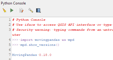
If you have installed QGIS and MovingPandas via conda / mamba, you can simply:
Afterwards, you can check that the library was correctly installed using:
import movingpandas as mpd
mpd.show_versions()
Trajectools 2.1
The new Trajectools algorithms are:
Trajectory overlay — Intersect trajectories with polygon layer
Privacy — Home work attack (requires scikit-mobility)
This algorithm determines how easy it is to identify an individual in a dataset. In a home and work attack the adversary knows the coordinates of the two locations most frequently visited by an individual.
Furthermore, we have fixed issue with previously ignored minimum trajectory length settings.
Scikit-mobility and gtfs_functions are optional dependencies. You do not need to install them, if you do not want to use the corresponding algorithms. In any case, they can be installed using mamba and pip:
This is the first version without the “experimental” flag. If you look at the plugin release history, you will see that the previous release was from 2020. That’s quite a while ago and a lot has happened since, including the development of MovingPandas.
Let’s have a look what’s new!
The old “Trajectories from point layer”, “Add heading to points”, and “Add speed (m/s) to points” algorithms have been superseded by the new “Create trajectories” algorithm which automatically computes speeds and headings when creating the trajectory outputs.
“Day trajectories from point layer” is covered by the new “Split trajectories at time intervals” which supports splitting by hour, day, month, and year.
“Clip trajectories by extent” still exists but, additionally, we can now also “Clip trajectories by polygon layer”
There are two new event extraction algorithms to “Extract OD points” and “Extract OD points”, as well as the related “Split trajectories at stops”. Additionally, we can also “Split trajectories at observation gaps”.
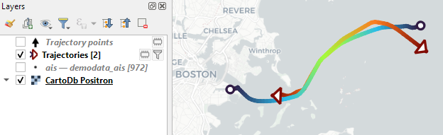
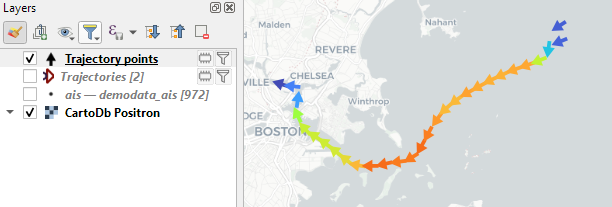
Trajectory outputs, by default, come as a pair of a point layer and a line layer. Depending on your use case, you can use both or pick just one of them. By default, the line layer is styled with a gradient line that makes it easy to see the movement direction:
while the default point layer style shows the movement speed:
How to use Trajectools
Trajectools 2.0 is powered by MovingPandas. You will need to install MovingPandas in your QGIS Python environment. I recommend installing both QGIS and MovingPandas from conda-forge:
The plugin download includes small trajectory sample datasets so you can get started immediately.
Outlook
There is still some work to do to reach feature parity with MovingPandas. Stay tuned for more trajectory algorithms, including but not limited to down-sampling, smoothing, and outlier cleaning.
I’m also reviewing other existing QGIS plugins to see how they can complement each other. If you know a plugin I should look into, please leave a note in the comments.